v11.x.x updates feature branch #9342
Merged
Conversation
This file contains hidden or bidirectional Unicode text that may be interpreted or compiled differently than what appears below. To review, open the file in an editor that reveals hidden Unicode characters.
Learn more about bidirectional Unicode characters
 sophschneider
changed the title
sophschneider
changed the title
…9227)

<!--
  ☝️How to write a good PR title:
- Prefix it with [ComponentName] (if applicable), for example: [Button]
  - Start with a verb, for example: Add, Delete, Improve, Fix…
  - Give as much context as necessary and as little as possible
  - Prefix it with [WIP] while it’s a work in progress
-->

### WHY are these changes introduced?

Feature flag needed for rollout.
Resolves Shopify/archive-polaris-backlog-2024#33
Resolves Shopify/archive-polaris-backlog-2024#32

<!--
  Context about the problem that’s being addressed.
-->

### WHAT is this pull request doing?

* Add documented feature flag to AppProvider FeaturesContext.
* Add explicit type (for better DX).
* Add storybook story for QA
* Add addon-panel widget to storybook for toggling feature flag for
stories.

### How to 🎩

🖥 [Local development
instructions](https://github.com/Shopify/polaris/blob/main/README.md#local-development)
🗒 [General tophatting
guidelines](https://github.com/Shopify/polaris/blob/main/documentation/Tophatting.md)
📄 [Changelog
guidelines](https://github.com/Shopify/polaris/blob/main/.github/CONTRIBUTING.md#changelog)

<!--
  Give as much information as needed to experiment with the component
  in the playground.
-->

<details>
<summary>Copy-paste this code in
<code>playground/Playground.tsx</code>:</summary>

```jsx
import React from 'react';
import {Page} from '../src';

export function Playground() {
  return (
    <Page title="Playground">
      {/* Add the code you want to test in here */}
    </Page>
  );
}
```

</details>

### 🎩 checklist

- [ ] Tested on
[mobile](https://github.com/Shopify/polaris/blob/main/documentation/Tophatting.md#cross-browser-testing)
- [ ] Tested on [multiple
browsers](https://help.shopify.com/en/manual/shopify-admin/supported-browsers)
- [ ] Tested for
[accessibility](https://github.com/Shopify/polaris/blob/main/documentation/Accessibility%20testing.md)
- [ ] Updated the component's `README.md` with documentation changes
- [ ] [Tophatted
documentation](https://github.com/Shopify/polaris/blob/main/documentation/Tophatting%20documentation.md)
changes in the style guide

---------

Co-authored-by: Sophie Schneider <sophie.schneider@shopify.com>
### WHY are these changes introduced?

Fix `feature` -> `features`
[typo](#9227) in the storybook
AppProviderDecorator so the toggle works on all stories. Also removed
the button toggle from the AppProvider summer editions story to avoid
confusion between two toggle mechanisms

### How to 🎩
Toggle feature in control panel

https://5d559397bae39100201eedc1-zlfuvdfzep.chromatic.com/?path=/story/all-components-appprovider--with-summer-editions-feature
Help with toggling between current and se23

Toggles a class on the document root that we can hook into via a handy
sass var:

```scss
  #{$se23} & {
    --pc-button-color: var(--p-text);
  }
```

---------

Co-authored-by: Lo Kim <lo.kim@shopify.com>
Remerging #9264  into v11.x.x to fix bad rebase

Co-authored-by: kyledurand <kyle.durand@shopify.com>
Remerging #9241  into v11.x.x to fix bad rebase

---------

Co-authored-by: Kyle Durand <kyledurand@users.noreply.github.com>
Co-authored-by: Lo Kim <lo.kim@shopify.com>
Co-authored-by: kyledurand <kyle.durand@shopify.com>
Co-authored-by: Aaron Casanova <32409546+aaronccasanova@users.noreply.github.com>
Remerging #9261  into v11.x.x to fix bad rebase

---------

Co-authored-by: Kyle Durand <kyledurand@users.noreply.github.com>
Co-authored-by: Lo Kim <lo.kim@shopify.com>
Co-authored-by: kyledurand <kyle.durand@shopify.com>
Remerging #9271 into v11.x.x to
fix bad rebase
### WHY are these changes introduced?

AppProvider stories importing AlphaCard, conflicts with rename in latest
v11-major.

### WHAT is this pull request doing?
* Resolves this in the affected stories, by importing the correct Card
component.
* Removes unused imports `useState` and `Button` from the
AppProvider.stories.tsx file
Part of Shopify/archive-polaris-backlog-2024#12

---------

Co-authored-by: Sara Hill <sara.hill@shopify.com>
First round of text color additions

From mapped values
[here](https://www.figma.com/file/hL9XRyHGqU8wUtLdOgs0vI/Polaris-Uplift-Library?type=design&node-id=9011%3A154956&t=A1SKamPybQ0FYnpn-1)

Part of Shopify/archive-polaris-backlog-2024#12
<!--
  ☝️How to write a good PR title:
- Prefix it with [ComponentName] (if applicable), for example: [Button]
  - Start with a verb, for example: Add, Delete, Improve, Fix…
  - Give as much context as necessary and as little as possible
  - Prefix it with [WIP] while it’s a work in progress
-->

### WHY are these changes introduced?

Fixes: Shopify/archive-polaris-backlog-2024#21

<!--
  Context about the problem that’s being addressed.
-->

### WHAT is this pull request doing?

<!--
  Summary of the changes committed.

Before / after screenshots are appreciated for UI changes. Make sure to
include alt text that describes the screenshot.

If you include an animated gif showing your change, wrapping it in a
details tag is recommended. Gifs usually autoplay, which can cause
accessibility issues for people reviewing your PR:

    <details>
      <summary>Summary of your gif(s)</summary>
      <img src="..." alt="Description of what the gif shows">
    </details>
-->

<!-- ℹ️ Delete the following for small / trivial changes -->

### How to 🎩

🖥 [Local development
instructions](https://github.com/Shopify/polaris/blob/main/README.md#local-development)
🗒 [General tophatting
guidelines](https://github.com/Shopify/polaris/blob/main/documentation/Tophatting.md)
📄 [Changelog
guidelines](https://github.com/Shopify/polaris/blob/main/.github/CONTRIBUTING.md#changelog)

<!--
  Give as much information as needed to experiment with the component
  in the playground.
-->

<details>
<summary>Copy-paste this code in
<code>playground/Playground.tsx</code>:</summary>

```jsx
import React from 'react';
import {Page} from '../src';

export function Playground() {
  return (
    <Page title="Playground">
      {/* Add the code you want to test in here */}
    </Page>
  );
}
```

</details>

### 🎩 checklist

- [ ] Tested on
[mobile](https://github.com/Shopify/polaris/blob/main/documentation/Tophatting.md#cross-browser-testing)
- [ ] Tested on [multiple
browsers](https://help.shopify.com/en/manual/shopify-admin/supported-browsers)
- [ ] Tested for
[accessibility](https://github.com/Shopify/polaris/blob/main/documentation/Accessibility%20testing.md)
- [ ] Updated the component's `README.md` with documentation changes
- [ ] [Tophatted
documentation](https://github.com/Shopify/polaris/blob/main/documentation/Tophatting%20documentation.md)
changes in the style guide

---------

Co-authored-by: Lo Kim <lo.kim@shopify.com>
Previous selector had a specificity of (0,2,1) meaning it would be
fairly difficult to override. The new value is (0,1,0)


[Before](https://polypane.app/css-specificity-calculator/#selector=html%5Bclass*%3D'Polaris-Summer-Editions-2023'%5D%20.Link)


[After](https://polypane.app/css-specificity-calculator/#selector=%3Awhere(html%5Bclass*%3D'Polaris-Summer-Editions-2023'%5D)%20.Link)

---------

Co-authored-by: Aaron Casanova <32409546+aaronccasanova@users.noreply.github.com>
This adds the ability to generate gray tokens with alpha values for the
new transparency subset
<!--
  ☝️How to write a good PR title:
- Prefix it with [ComponentName] (if applicable), for example: [Button]
  - Start with a verb, for example: Add, Delete, Improve, Fix…
  - Give as much context as necessary and as little as possible
  - Prefix it with [WIP] while it’s a work in progress
-->

### WHY are these changes introduced?

prefixing the `experimental` keyword on the color Aliases allows us to
use the experimental tokens where the Alias types are used. For example,
on the [Box
component](https://polaris.shopify.com/components/layout-and-structure/box)
you could now use the experimental tokens as a background without type
errors.

```
<Box background={'experimental-bg-input-hover'} />
```
### WHY are these changes introduced?

Closes: Shopify/archive-polaris-backlog-2024#19

### WHAT is this pull request doing?

> Note: These banner updates have been decoupled from the button updates
so the buttons you see here are not reflective of the final design. The
dismiss button spacing may have to be modified once the iconOnly plain
buttons have been merged into `v11.x.x`
> Design review: because of above, I'm going to hold off on getting a
design review for the Banner until the Buttons are merged in. issue to
track this
[here](Shopify/archive-polaris-backlog-2024#81)

Adds updates to Banner, Figma
[here](https://www.figma.com/file/jLLkmo9r28hiqPvf4s90E4/Polaris-Components-TESTING?type=design&node-id=20%3A21&t=0DtfsDGV6aOiQ0LC-1)

### How to 🎩
[Banners with code from this PR
only](https://5d559397bae39100201eedc1-albyebzmvm.chromatic.com/?path=/story/all-components-banner--with-footer-call-to-action&globals=polarisSummerEditions2023:true)
[Storybook Banners with new
Buttons](https://5d559397bae39100201eedc1-cadqnumaid.chromatic.com/?path=/story/all-components-banner--with-footer-call-to-action&globals=polarisSummerEditions2023:true)

### 🎩 checklist

- [x] Tested on
[mobile](https://github.com/Shopify/polaris/blob/main/documentation/Tophatting.md#cross-browser-testing)

| Browser |  In page | In content |
|-|-|-|
| Pixel 7 latest Chrome | <img width="100" alt="Screenshot 2023-05-29 at
3 35 59 PM"
src="https://github.com/Shopify/polaris/assets/20652326/85a05f8a-ba46-4977-9577-372d98c4f34b">
| <img width="100" alt="Screenshot 2023-05-29 at 3 34 28 PM"
src="https://github.com/Shopify/polaris/assets/20652326/08d61ffc-67c1-448f-9caf-dde57c89ece6">
|
| iphone 13 latest Safari | <img width="100" alt="Screenshot 2023-05-29
at 3 40 09 PM"
src="https://github.com/Shopify/polaris/assets/20652326/80f305e6-8cf8-4b8e-88ec-3ff904878791">
| <img width="100" alt="Screenshot 2023-05-29 at 3 40 34 PM"
src="https://github.com/Shopify/polaris/assets/20652326/e2c9144b-4fce-457b-9217-31d1a46f94c6">
|

- [x] Tested on [multiple
browsers](https://help.shopify.com/en/manual/shopify-admin/supported-browsers)

| Browser |  In page | In content |
|-|-|-|
| OSX Chrome | <img width="100" alt="Screenshot 2023-05-29 at 3 52 52
PM"
src="https://github.com/Shopify/polaris/assets/20652326/a7291465-1784-4d42-8446-bb19d7da8157">
| <img width="100" alt="Screenshot 2023-05-29 at 3 52 43 PM"
src="https://github.com/Shopify/polaris/assets/20652326/10bb1c8f-1715-4428-9169-16a8c0ae2247">
|
| OSX Safari | <img width="100" alt="Screenshot 2023-05-29 at 3 51 36
PM"
src="https://github.com/Shopify/polaris/assets/20652326/ed3f3622-6593-4e47-962b-d5be151ee8ff">
| <img width="100" alt="Screenshot 2023-05-29 at 3 51 25 PM"
src="https://github.com/Shopify/polaris/assets/20652326/fce81a97-43fd-4674-b47c-e06326dae29c">
|
| OSX Firefox | <img width="100" alt="Screenshot 2023-05-29 at 3 49 20
PM"
src="https://github.com/Shopify/polaris/assets/20652326/8eb1b7e6-c64b-4a7a-9e55-b0a6d8c5df57">
| <img width="100" alt="Screenshot 2023-05-29 at 3 49 05 PM"
src="https://github.com/Shopify/polaris/assets/20652326/b123cc34-5637-4d52-9327-35504f8358a8">
|
| Windows 11 latest Edge | <img width="100" alt="Screenshot 2023-05-29
at 3 42 13 PM"
src="https://github.com/Shopify/polaris/assets/20652326/2a06d755-5b28-4be3-ab90-7a1c092a8aed">
| <img width="100" alt="Screenshot 2023-05-29 at 3 41 51 PM"
src="https://github.com/Shopify/polaris/assets/20652326/01ebbc8d-994c-466f-87f5-d33248dbe05c">
|

- [x] Tested for
[accessibility](https://github.com/Shopify/polaris/blob/main/documentation/Accessibility%20testing.md)
- [x] Lighthouse a11y and axe (automated tests) on banner stories were
100%
  - [x] Works as expected on VoiceOver and in VoiceOver Rotor
  - [x] Works as expected with keyboard only
There are a couple of different ways we can do this outlined
[here](Shopify/archive-polaris-backlog-2024#12 (comment))

Fixes: Shopify/archive-polaris-backlog-2024#65
### WHY are these changes introduced?

Fixes Shopify/archive-polaris-backlog-2024#70
Fixes Shopify/archive-polaris-backlog-2024#69

Couple of options here, and I don't love this one but I figured I'd put
the exploration up anyway.

We need a value of 6px which would mean a token 1.5. Our current naming
convention doesn't really support adding a decimal value that isn't zero
trailing. i.e. we have space-05 representing 0.5 but space-15 would mean
something completely different.

This adds underscore aliases to decimal values that already exist and
also adds a value for `space-1_5`


The other option, since this is a one off would just be to use calc() to
get 6px out of the current tokens but we'll still need a decimal
solution for borders
### WHY are these changes introduced?

Fixes Shopify/archive-polaris-backlog-2024#66

<!--
  Context about the problem that’s being addressed.
-->

### WHAT is this pull request doing?

- Adds experimental value for `shadow-inset-lg` and `shadow-xl` tokens
- Adds `shadow-experimental-card-sm` and `shadow-experimental-card-sm`
tokens

### 🎩 checklist

- [ ] Tested on
[mobile](https://github.com/Shopify/polaris/blob/main/documentation/Tophatting.md#cross-browser-testing)
- [ ] Tested on [multiple
browsers](https://help.shopify.com/en/manual/shopify-admin/supported-browsers)
- [ ] Tested for
[accessibility](https://github.com/Shopify/polaris/blob/main/documentation/Accessibility%20testing.md)
- [ ] Updated the component's `README.md` with documentation changes
- [ ] [Tophatted
documentation](https://github.com/Shopify/polaris/blob/main/documentation/Tophatting%20documentation.md)
changes in the style guide
<!--
  ☝️How to write a good PR title:
- Prefix it with [ComponentName] (if applicable), for example: [Button]
  - Start with a verb, for example: Add, Delete, Improve, Fix…
  - Give as much context as necessary and as little as possible
  - Prefix it with [WIP] while it’s a work in progress
-->

### WHY are these changes introduced?

Replaces #9256

Fixes Shopify/archive-polaris-backlog-2024#24

---------

Co-authored-by: Yuraima Estevez <4642404+yurm04@users.noreply.github.com>
<!--
  ☝️How to write a good PR title:
- Prefix it with [ComponentName] (if applicable), for example: [Button]
  - Start with a verb, for example: Add, Delete, Improve, Fix…
  - Give as much context as necessary and as little as possible
  - Prefix it with [WIP] while it’s a work in progress
-->

### WHY are these changes introduced?

Fixes Shopify/archive-polaris-backlog-2024#23

<!--
  Context about the problem that’s being addressed.
-->

### WHAT is this pull request doing?

<!--
  Summary of the changes committed.

Before / after screenshots are appreciated for UI changes. Make sure to
include alt text that describes the screenshot.

If you include an animated gif showing your change, wrapping it in a
details tag is recommended. Gifs usually autoplay, which can cause
accessibility issues for people reviewing your PR:

    <details>
      <summary>Summary of your gif(s)</summary>
      <img src="..." alt="Description of what the gif shows">
    </details>
-->

<!-- ℹ️ Delete the following for small / trivial changes -->

### How to 🎩

🖥 [Local development
instructions](https://github.com/Shopify/polaris/blob/main/README.md#local-development)
🗒 [General tophatting
guidelines](https://github.com/Shopify/polaris/blob/main/documentation/Tophatting.md)
📄 [Changelog
guidelines](https://github.com/Shopify/polaris/blob/main/.github/CONTRIBUTING.md#changelog)

<!--
  Give as much information as needed to experiment with the component
  in the playground.
-->

<details>
<summary>Copy-paste this code in
<code>playground/Playground.tsx</code>:</summary>

```jsx
import React from 'react';
import {Page} from '../src';

export function Playground() {
  return (
    <Page title="Playground">
      {/* Add the code you want to test in here */}
    </Page>
  );
}
```

</details>

### 🎩 checklist

- [ ] Tested on
[mobile](https://github.com/Shopify/polaris/blob/main/documentation/Tophatting.md#cross-browser-testing)
- [ ] Tested on [multiple
browsers](https://help.shopify.com/en/manual/shopify-admin/supported-browsers)
- [ ] Tested for
[accessibility](https://github.com/Shopify/polaris/blob/main/documentation/Accessibility%20testing.md)
- [ ] Updated the component's `README.md` with documentation changes
- [ ] [Tophatted
documentation](https://github.com/Shopify/polaris/blob/main/documentation/Tophatting%20documentation.md)
changes in the style guide

---------

Co-authored-by: Sophie Schneider <thesophieschneider@gmail.com>
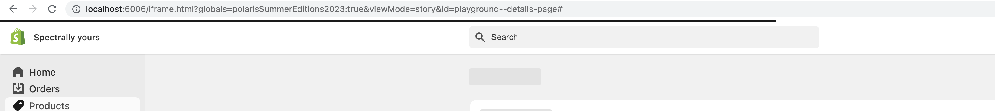
Also adds footer help to details page for testing / completeness
### WHY are these changes introduced?

Part of Shopify/archive-polaris-backlog-2024#10

### WHAT is this pull request doing?

Update Navigation styles for v11

### How to 🎩

🖥 [Local development
instructions](https://github.com/Shopify/polaris/blob/main/README.md#local-development)
🗒 [General tophatting
guidelines](https://github.com/Shopify/polaris/blob/main/documentation/Tophatting.md)
📄 [Changelog
guidelines](https://github.com/Shopify/polaris/blob/main/.github/CONTRIBUTING.md#changelog)

<details>
<summary>Copy-paste this code in
<code>playground/Playground.tsx</code>:</summary>

```jsx
import React from 'react';
import {
  HomeMinor,
  MarketingMinor,
  OrdersMinor,
  ProductsMinor,
  ViewMinor,
} from '@shopify/polaris-icons';

import {Frame, Navigation} from '../src';

export function Playground() {
  const [selected, setSelected] = React.useState('home');

  return (
    <Frame>
      <Navigation location="/">
        <Navigation.Section
          items={[
            {
              url: '#',
              excludePaths: ['#'],
              label: 'Home',
              icon: HomeMinor,
              onClick: () => setSelected('home'),
              matches: selected === 'home',
              secondaryAction: {
                url: '#',
                accessibilityLabel: 'View your online store',
                icon: ViewMinor,
                tooltip: {
                  content: 'View your online store',
                },
              },
            },
            {
              url: '#',
              excludePaths: ['#'],
              label: 'Orders',
              icon: OrdersMinor,
              badge: '15',
              onClick: () => setSelected('orders'),
              matches: selected === 'orders',
              subNavigationItems: [
                {
                  url: '#',
                  excludePaths: ['#'],
                  disabled: false,
                  label: 'Drafts',
                  onClick: () => setSelected('drafts'),
                  matches: selected === 'drafts',
                },
                {
                  url: '#',
                  excludePaths: ['#'],
                  disabled: false,
                  label: 'Shipping labels',
                  onClick: () => setSelected('shippinglabels'),
                  matches: selected === 'shippinglabels',
                },
              ],
            },
            {
              url: '#',
              excludePaths: ['#'],
              label: 'Marketing',
              icon: MarketingMinor,
              badge: '15',
              onClick: () => setSelected('marketing'),
              matches: selected === 'marketing',
              secondaryAction: {
                url: '#',
                accessibilityLabel: 'View your online store',
                icon: ViewMinor,
                tooltip: {
                  content: 'View your online store',
                },
              },
              subNavigationItems: [
                {
                  url: '#',
                  excludePaths: ['#'],
                  disabled: false,
                  label: 'Reports',
                  onClick: () => setSelected('reports'),
                  matches: selected === 'reports',
                },
                {
                  url: '#',
                  excludePaths: ['#'],
                  disabled: false,
                  label: 'Live view',
                  onClick: () => setSelected('liveView'),
                  matches: selected === 'liveView',
                },
              ],
            },
            {
              url: '#',
              label: 'Products',
              icon: ProductsMinor,
              onClick: () => setSelected('products'),
              matches: selected === 'products',
              subNavigationItems: [
                {
                  url: '#',
                  disabled: false,
                  label: 'Inventory',
                  onClick: () => setSelected('inventory'),
                  matches: selected === 'inventory',
                },
                {
                  url: '#',
                  disabled: false,
                  label: 'Transfers',
                  onClick: () => setSelected('transfers'),
                  matches: selected === 'transfers',
                },
                {
                  url: '#',
                  excludePaths: ['#'],
                  disabled: false,
                  label: 'Collections',
                  onClick: () => setSelected('collections'),
                  matches: selected === 'collections',
                },
                {
                  url: '#',
                  disabled: false,
                  label: 'Gift cards',
                  onClick: () => setSelected('gift_cards'),
                  matches: selected === 'gift_cards',
                },
                {
                  url: '#',
                  disabled: false,
                  label: 'Price lists',
                  onClick: () => setSelected('price_lists'),
                  matches: selected === 'price_lists',
                },
              ],
            },
          ]}
        />
      </Navigation>
    </Frame>
  );
}
```

</details>

### 🎩 checklist

- [ ] Tested on
[mobile](https://github.com/Shopify/polaris/blob/main/documentation/Tophatting.md#cross-browser-testing)
- [x] Tested on [multiple
browsers](https://help.shopify.com/en/manual/shopify-admin/supported-browsers)
- [ ] Tested for
[accessibility](https://github.com/Shopify/polaris/blob/main/documentation/Accessibility%20testing.md)
- [ ] Updated the component's `README.md` with documentation changes
- [ ] [Tophatted
documentation](https://github.com/Shopify/polaris/blob/main/documentation/Tophatting%20documentation.md)
changes in the style guide
### WHY are these changes introduced?

Resolves https://github.com/Shopify/polaris-summer-editions/issues/72


### WHAT is this pull request doing?

- Updates the Spinner `fill` color

### How to 🎩

Review on
[Storybook](https://5d559397bae39100201eedc1-pyvdrbupij.chromatic.com/?path=/story/all-components-spinner--all)
- Ensure beta flagged Spinner styles render as expected
- Ensure no regressions to the existing Spinner styles
### WHY are these changes introduced?

Resolves https://github.com/Shopify/polaris-summer-editions/issues/73


### WHAT is this pull request doing?

- Updates the Tooltip `box-shadow`

### How to 🎩

Review on
[Storybook](https://5d559397bae39100201eedc1-ukshupxrax.chromatic.com/?path=/story/all-components-tooltip--all&globals=polarisSummerEditions2023:true)
- Ensure beta flagged Tooltip styles render as expected
- Ensure no regressions to the existing Tooltip styles
<!--
  ☝️How to write a good PR title:
- Prefix it with [ComponentName] (if applicable), for example: [Button]
  - Start with a verb, for example: Add, Delete, Improve, Fix…
  - Give as much context as necessary and as little as possible
  - Prefix it with [WIP] while it’s a work in progress
-->

### WHY are these changes introduced?

Fixes Shopify/archive-polaris-backlog-2024#22

<!--
  Context about the problem that’s being addressed.
-->

### WHAT is this pull request doing?

<!--
  Summary of the changes committed.

Before / after screenshots are appreciated for UI changes. Make sure to
include alt text that describes the screenshot.

If you include an animated gif showing your change, wrapping it in a
details tag is recommended. Gifs usually autoplay, which can cause
accessibility issues for people reviewing your PR:

    <details>
      <summary>Summary of your gif(s)</summary>
      <img src="..." alt="Description of what the gif shows">
    </details>
-->

<!-- ℹ️ Delete the following for small / trivial changes -->

### How to 🎩

🖥 [Local development
instructions](https://github.com/Shopify/polaris/blob/main/README.md#local-development)
🗒 [General tophatting
guidelines](https://github.com/Shopify/polaris/blob/main/documentation/Tophatting.md)
📄 [Changelog
guidelines](https://github.com/Shopify/polaris/blob/main/.github/CONTRIBUTING.md#changelog)

<!--
  Give as much information as needed to experiment with the component
  in the playground.
-->

<details>
<summary>Copy-paste this code in
<code>playground/Playground.tsx</code>:</summary>

```jsx
import React from 'react';
import {Page} from '../src';

export function Playground() {
  return (
    <Page title="Playground">
      {/* Add the code you want to test in here */}
    </Page>
  );
}
```

</details>

### 🎩 checklist

- [ ] Tested on
[mobile](https://github.com/Shopify/polaris/blob/main/documentation/Tophatting.md#cross-browser-testing)
- [ ] Tested on [multiple
browsers](https://help.shopify.com/en/manual/shopify-admin/supported-browsers)
- [ ] Tested for
[accessibility](https://github.com/Shopify/polaris/blob/main/documentation/Accessibility%20testing.md)
- [ ] Updated the component's `README.md` with documentation changes
- [ ] [Tophatted
documentation](https://github.com/Shopify/polaris/blob/main/documentation/Tophatting%20documentation.md)
changes in the style guide

---------

Co-authored-by: Jess Telford <jess+github@jes.st>
### WHY are these changes introduced?

Resolves https://github.com/Shopify/polaris-summer-editions/issues/17

### WHAT is this pull request doing?

- Adds new Button styles behind the `se23` beta flag
- Maps `outline` prop to `default` behind the beta flag
- Adds new `primarySuccess` prop for new button style behind the beta
flag

Further follow up work to `Button` in the following issues:
- https://github.com/Shopify/polaris-summer-editions/issues/80
- https://github.com/Shopify/polaris-summer-editions/issues/83
- https://github.com/Shopify/polaris-summer-editions/issues/84
- https://github.com/Shopify/polaris-summer-editions/issues/91

<!-- ℹ️ Delete the following for small / trivial changes -->

### How to 🎩

Review on
[Storybook](https://5d559397bae39100201eedc1-iaopcwourz.chromatic.com/?path=/story/all-components-button--default&globals=polarisSummerEditions2023:true)
- Ensure beta flagged Button styles render as expected
- Ensure no regressions to the existing Button styles

🖥 [Local development
instructions](https://github.com/Shopify/polaris/blob/main/README.md#local-development)
🗒 [General tophatting
guidelines](https://github.com/Shopify/polaris/blob/main/documentation/Tophatting.md)
📄 [Changelog
guidelines](https://github.com/Shopify/polaris/blob/main/.github/CONTRIBUTING.md#changelog)

### 🎩 checklist

- [ ] Tested on
[mobile](https://github.com/Shopify/polaris/blob/main/documentation/Tophatting.md#cross-browser-testing)
- [ ] Tested on [multiple
browsers](https://help.shopify.com/en/manual/shopify-admin/supported-browsers)
- [ ] Tested for
[accessibility](https://github.com/Shopify/polaris/blob/main/documentation/Accessibility%20testing.md)
- [ ] Updated the component's `README.md` with documentation changes
- [ ] [Tophatted
documentation](https://github.com/Shopify/polaris/blob/main/documentation/Tophatting%20documentation.md)
changes in the style guide
### WHY are these changes introduced?

Before, children nodes were horizontally stacking since they were a
child of a horizontal stack. This wraps `children` in a `Box` to keep
the multi node children styled consistently. I also added stories for
content links which is a common multi children node pattern to pass into
the `Banner`.

> Ignore the wonky dismiss button, that will be fixed in [this
issue](Shopify/archive-polaris-backlog-2024#91)

### WHAT is this pull request doing?
<img width="1017" alt="Screenshot 2023-06-02 at 11 21 04 AM"
src="https://github.com/Shopify/polaris/assets/20652326/8c83ea2f-d236-4408-b335-710774f8715d">
<img width="1020" alt="Screenshot 2023-06-02 at 11 19 21 AM"
src="https://github.com/Shopify/polaris/assets/20652326/6464cb9e-3197-4b90-9ce5-4d68d028b289">

### How to 🎩


### 🎩 checklist

- [x] Tested on
[mobile](https://github.com/Shopify/polaris/blob/main/documentation/Tophatting.md#cross-browser-testing)
- [x] Tested on [multiple
browsers](https://help.shopify.com/en/manual/shopify-admin/supported-browsers)
- [x] Tested for
[accessibility](https://github.com/Shopify/polaris/blob/main/documentation/Accessibility%20testing.md)
### WHY are these changes introduced?

Fixes https://github.com/Shopify/polaris-summer-editions/issues/67

### WHAT is this pull request doing?

Adds an underline on `Link` hover behind the beta flag

### How to 🎩

Review on [Storybook]()

- Ensure beta flagged `Link` styles render as expected
- Ensure no regressions to the existing `Link` styles
Co-authored-by: Aveline <aveline@users.noreply.github.com>
Co-authored-by: Kyle <kyledurand@users.noreply.github.com>
Co-authored-by: Sophie <qt314@users.noreply.github.com>
sophschneider
commented
Jun 2, 2023
sophschneider
commented
Jun 2, 2023
alex-page
approved these changes
Jun 5, 2023
Merged
alex-page
pushed a commit
that referenced
this pull request
Jun 7, 2023
This PR was opened by the [Changesets
release](https://github.com/changesets/action) GitHub action. When
you're ready to do a release, you can merge this and the packages will
be published to npm automatically. If you're not ready to do a release
yet, that's fine, whenever you add more changesets to main, this PR will
be updated.


# Releases
## @shopify/polaris-icons@7.1.0

### Minor Changes

- [#9328](#9328)
[`f907a55a1`](f907a55)
Thanks
[@richardmarquezshopify](https://github.com/richardmarquezshopify)! -
Added GaugeMajor, GaugeMinor

## @shopify/polaris-tokens@7.1.0

### Minor Changes

- [#9385](#9385)
[`9c9e80ed1`](9c9e80e)
Thanks [@kyledurand](https://github.com/kyledurand)! - Added new
experimental tokens

## @shopify/polaris-cli@0.2.3

### Patch Changes

-   Updated dependencies \[]:
    -   @shopify/polaris-migrator@0.19.1

## @shopify/polaris-codemods@0.1.4

### Patch Changes

- Updated dependencies
\[[`9c9e80ed1`](9c9e80e)]:
    -   @shopify/polaris-tokens@7.1.0
    -   @shopify/stylelint-polaris@13.0.1

## @shopify/polaris-migrator@0.19.1

### Patch Changes

- Updated dependencies
\[[`9c9e80ed1`](9c9e80e)]:
    -   @shopify/polaris-tokens@7.1.0
    -   @shopify/stylelint-polaris@13.0.1

## @shopify/polaris@11.1.1

### Patch Changes

- [#9342](#9342)
[`6dcd69ab6`](6dcd69a)
Thanks [@qt314](https://github.com/qt314)! - Fixed small screen
horizontal overflow by changing `Banner` focus ring from `box-shadow` to
`outline`


- [#9342](#9342)
[`6dcd69ab6`](6dcd69a)
Thanks [@qt314](https://github.com/qt314)! - Removed unused transition
delay param from focus-ring mixin


- [#9342](#9342)
[`6dcd69ab6`](6dcd69a)
Thanks [@qt314](https://github.com/qt314)! - Add
polarisSummerEditions2023 feature flag to AppProvider context.


- [#9361](#9361)
[`52edd1faa`](52edd1f)
Thanks [@qt314](https://github.com/qt314)! - Added `disabled` variant
prop to Labelled


- [#9342](#9342)
[`6dcd69ab6`](6dcd69a)
Thanks [@qt314](https://github.com/qt314)! - Add `primarySuccess`
variant prop to `Button`

- Updated dependencies
\[[`9c9e80ed1`](9c9e80e),
[`f907a55a1`](f907a55)]:
    -   @shopify/polaris-tokens@7.1.0
    -   @shopify/polaris-icons@7.1.0

## @shopify/stylelint-polaris@13.0.1

### Patch Changes

- Updated dependencies
\[[`9c9e80ed1`](9c9e80e)]:
    -   @shopify/polaris-tokens@7.1.0

## polaris.shopify.com@0.55.1

### Patch Changes

- Updated dependencies
\[[`9c9e80ed1`](9c9e80e),
[`6dcd69ab6`](6dcd69a),
[`6dcd69ab6`](6dcd69a),
[`6dcd69ab6`](6dcd69a),
[`f907a55a1`](f907a55),
[`52edd1faa`](52edd1f),
[`6dcd69ab6`](6dcd69a)]:
    -   @shopify/polaris-tokens@7.1.0
    -   @shopify/polaris@11.1.1
    -   @shopify/polaris-icons@7.1.0

Co-authored-by: github-actions[bot] <github-actions[bot]@users.noreply.github.com>
juzser
added a commit
to juzser/polaris
that referenced
this pull request
Jul 27, 2023
See [issue
here](https://github.com/Shopify/polaris-summer-editions/issues/96) for
steps and how to tophat

See previous commits and PRs

---------

Co-authored-by: Charles <cc.lee@live.com.au>
Co-authored-by: Kyle Durand <kyledurand@users.noreply.github.com>
Co-authored-by: Lo Kim <lo.kim@shopify.com>
Co-authored-by: kyledurand <kyle.durand@shopify.com>
Co-authored-by: Aaron Casanova <32409546+aaronccasanova@users.noreply.github.com>
Co-authored-by: Sara Hill <sara.hill@shopify.com>
Co-authored-by: aveline <aveline@users.noreply.github.com>
Co-authored-by: Yuraima Estevez <4642404+yurm04@users.noreply.github.com>
Co-authored-by: Yuraima Estevez <yuraima.estevez@shopify.com>
Co-authored-by: Mateus Ferreira <mateus.ferreira@shopify.com>
Co-authored-by: Laura Griffee <laura@mailzone.com>
Co-authored-by: Jess Telford <jess+github@jes.st>
Co-authored-by: Sophie <qt314@users.noreply.github.com>
Co-authored-by: Alex Page <hi@alexpage.dev>
Co-authored-by: Jess Telford <jess.telford@shopify.com>
juzser
pushed a commit
to juzser/polaris
that referenced
this pull request
Jul 27, 2023
This PR was opened by the [Changesets
release](https://github.com/changesets/action) GitHub action. When
you're ready to do a release, you can merge this and the packages will
be published to npm automatically. If you're not ready to do a release
yet, that's fine, whenever you add more changesets to main, this PR will
be updated.


# Releases
## @shopify/polaris-icons@7.1.0

### Minor Changes

- [Shopify#9328](Shopify#9328)
[`f907a55a1`](Shopify@f907a55)
Thanks
[@richardmarquezshopify](https://github.com/richardmarquezshopify)! -
Added GaugeMajor, GaugeMinor

## @shopify/polaris-tokens@7.1.0

### Minor Changes

- [Shopify#9385](Shopify#9385)
[`9c9e80ed1`](Shopify@9c9e80e)
Thanks [@kyledurand](https://github.com/kyledurand)! - Added new
experimental tokens

## @shopify/polaris-cli@0.2.3

### Patch Changes

-   Updated dependencies \[]:
    -   @shopify/polaris-migrator@0.19.1

## @shopify/polaris-codemods@0.1.4

### Patch Changes

- Updated dependencies
\[[`9c9e80ed1`](Shopify@9c9e80e)]:
    -   @shopify/polaris-tokens@7.1.0
    -   @shopify/stylelint-polaris@13.0.1

## @shopify/polaris-migrator@0.19.1

### Patch Changes

- Updated dependencies
\[[`9c9e80ed1`](Shopify@9c9e80e)]:
    -   @shopify/polaris-tokens@7.1.0
    -   @shopify/stylelint-polaris@13.0.1

## @shopify/polaris@11.1.1

### Patch Changes

- [Shopify#9342](Shopify#9342)
[`6dcd69ab6`](Shopify@6dcd69a)
Thanks [@qt314](https://github.com/qt314)! - Fixed small screen
horizontal overflow by changing `Banner` focus ring from `box-shadow` to
`outline`


- [Shopify#9342](Shopify#9342)
[`6dcd69ab6`](Shopify@6dcd69a)
Thanks [@qt314](https://github.com/qt314)! - Removed unused transition
delay param from focus-ring mixin


- [Shopify#9342](Shopify#9342)
[`6dcd69ab6`](Shopify@6dcd69a)
Thanks [@qt314](https://github.com/qt314)! - Add
polarisSummerEditions2023 feature flag to AppProvider context.


- [Shopify#9361](Shopify#9361)
[`52edd1faa`](Shopify@52edd1f)
Thanks [@qt314](https://github.com/qt314)! - Added `disabled` variant
prop to Labelled


- [Shopify#9342](Shopify#9342)
[`6dcd69ab6`](Shopify@6dcd69a)
Thanks [@qt314](https://github.com/qt314)! - Add `primarySuccess`
variant prop to `Button`

- Updated dependencies
\[[`9c9e80ed1`](Shopify@9c9e80e),
[`f907a55a1`](Shopify@f907a55)]:
    -   @shopify/polaris-tokens@7.1.0
    -   @shopify/polaris-icons@7.1.0

## @shopify/stylelint-polaris@13.0.1

### Patch Changes

- Updated dependencies
\[[`9c9e80ed1`](Shopify@9c9e80e)]:
    -   @shopify/polaris-tokens@7.1.0

## polaris.shopify.com@0.55.1

### Patch Changes

- Updated dependencies
\[[`9c9e80ed1`](Shopify@9c9e80e),
[`6dcd69ab6`](Shopify@6dcd69a),
[`6dcd69ab6`](Shopify@6dcd69a),
[`6dcd69ab6`](Shopify@6dcd69a),
[`f907a55a1`](Shopify@f907a55),
[`52edd1faa`](Shopify@52edd1f),
[`6dcd69ab6`](Shopify@6dcd69a)]:
    -   @shopify/polaris-tokens@7.1.0
    -   @shopify/polaris@11.1.1
    -   @shopify/polaris-icons@7.1.0

Co-authored-by: github-actions[bot] <github-actions[bot]@users.noreply.github.com>
AnnaCheba
pushed a commit
to AnnaCheba/polaris
that referenced
this pull request
Apr 22, 2024
### WHY are these changes introduced?

See [issue
here](Shopify/archive-polaris-backlog-2024#96) for
steps and how to tophat

### WHAT is this pull request doing?

See previous commits and PRs

---------

Co-authored-by: Charles <cc.lee@live.com.au>
Co-authored-by: Kyle Durand <kyledurand@users.noreply.github.com>
Co-authored-by: Lo Kim <lo.kim@shopify.com>
Co-authored-by: kyledurand <kyle.durand@shopify.com>
Co-authored-by: Aaron Casanova <32409546+aaronccasanova@users.noreply.github.com>
Co-authored-by: Sara Hill <sara.hill@shopify.com>
Co-authored-by: aveline <aveline@users.noreply.github.com>
Co-authored-by: Yuraima Estevez <4642404+yurm04@users.noreply.github.com>
Co-authored-by: Yuraima Estevez <yuraima.estevez@shopify.com>
Co-authored-by: Mateus Ferreira <mateus.ferreira@shopify.com>
Co-authored-by: Laura Griffee <laura@mailzone.com>
Co-authored-by: Jess Telford <jess+github@jes.st>
Co-authored-by: Sophie <qt314@users.noreply.github.com>
Co-authored-by: Alex Page <hi@alexpage.dev>
Co-authored-by: Jess Telford <jess.telford@shopify.com>
ascherkus
pushed a commit
to ascherkus/polaris
that referenced
this pull request
Feb 19, 2025
This PR was opened by the [Changesets
release](https://github.com/changesets/action) GitHub action. When
you're ready to do a release, you can merge this and the packages will
be published to npm automatically. If you're not ready to do a release
yet, that's fine, whenever you add more changesets to main, this PR will
be updated.


# Releases
## @shopify/polaris-icons@7.1.0

### Minor Changes

- [Shopify#9328](Shopify#9328)
[`f907a55a1`](Shopify@2888410)
Thanks
[@richardmarquezshopify](https://github.com/richardmarquezshopify)! -
Added GaugeMajor, GaugeMinor

## @shopify/polaris-tokens@7.1.0

### Minor Changes

- [Shopify#9385](Shopify#9385)
[`9c9e80ed1`](Shopify@dad3f4c)
Thanks [@kyledurand](https://github.com/kyledurand)! - Added new
experimental tokens

## @shopify/polaris-cli@0.2.3

### Patch Changes

-   Updated dependencies \[]:
    -   @shopify/polaris-migrator@0.19.1

## @shopify/polaris-codemods@0.1.4

### Patch Changes

- Updated dependencies
\[[`9c9e80ed1`](Shopify@dad3f4c)]:
    -   @shopify/polaris-tokens@7.1.0
    -   @shopify/stylelint-polaris@13.0.1

## @shopify/polaris-migrator@0.19.1

### Patch Changes

- Updated dependencies
\[[`9c9e80ed1`](Shopify@dad3f4c)]:
    -   @shopify/polaris-tokens@7.1.0
    -   @shopify/stylelint-polaris@13.0.1

## @shopify/polaris@11.1.1

### Patch Changes

- [Shopify#9342](Shopify#9342)
[`6dcd69ab6`](Shopify@cd98772)
Thanks [@qt314](https://github.com/qt314)! - Fixed small screen
horizontal overflow by changing `Banner` focus ring from `box-shadow` to
`outline`


- [Shopify#9342](Shopify#9342)
[`6dcd69ab6`](Shopify@cd98772)
Thanks [@qt314](https://github.com/qt314)! - Removed unused transition
delay param from focus-ring mixin


- [Shopify#9342](Shopify#9342)
[`6dcd69ab6`](Shopify@cd98772)
Thanks [@qt314](https://github.com/qt314)! - Add
polarisSummerEditions2023 feature flag to AppProvider context.


- [Shopify#9361](Shopify#9361)
[`52edd1faa`](Shopify@d8ebe77)
Thanks [@qt314](https://github.com/qt314)! - Added `disabled` variant
prop to Labelled


- [Shopify#9342](Shopify#9342)
[`6dcd69ab6`](Shopify@cd98772)
Thanks [@qt314](https://github.com/qt314)! - Add `primarySuccess`
variant prop to `Button`

- Updated dependencies
\[[`9c9e80ed1`](Shopify@dad3f4c),
[`f907a55a1`](Shopify@2888410)]:
    -   @shopify/polaris-tokens@7.1.0
    -   @shopify/polaris-icons@7.1.0

## @shopify/stylelint-polaris@13.0.1

### Patch Changes

- Updated dependencies
\[[`9c9e80ed1`](Shopify@dad3f4c)]:
    -   @shopify/polaris-tokens@7.1.0

## polaris.shopify.com@0.55.1

### Patch Changes

- Updated dependencies
\[[`9c9e80ed1`](Shopify@dad3f4c),
[`6dcd69ab6`](Shopify@cd98772),
[`6dcd69ab6`](Shopify@cd98772),
[`6dcd69ab6`](Shopify@cd98772),
[`f907a55a1`](Shopify@2888410),
[`52edd1faa`](Shopify@d8ebe77),
[`6dcd69ab6`](Shopify@cd98772)]:
    -   @shopify/polaris-tokens@7.1.0
    -   @shopify/polaris@11.1.1
    -   @shopify/polaris-icons@7.1.0

Co-authored-by: github-actions[bot] <github-actions[bot]@users.noreply.github.com>
Sign up for free
to join this conversation on GitHub.
Already have an account?
Sign in to comment
9 participants
Add this suggestion to a batch that can be applied as a single commit.
This suggestion is invalid because no changes were made to the code.
Suggestions cannot be applied while the pull request is closed.
Suggestions cannot be applied while viewing a subset of changes.
Only one suggestion per line can be applied in a batch.
Add this suggestion to a batch that can be applied as a single commit.
Applying suggestions on deleted lines is not supported.
You must change the existing code in this line in order to create a valid suggestion.
Outdated suggestions cannot be applied.
This suggestion has been applied or marked resolved.
Suggestions cannot be applied from pending reviews.
Suggestions cannot be applied on multi-line comments.
Suggestions cannot be applied while the pull request is queued to merge.
Suggestion cannot be applied right now. Please check back later.
WHY are these changes introduced?
See issue here for steps and how to tophat
WHAT is this pull request doing?
See previous commits and PRs