add summer editions 2023 feature flag to AppProvider FeaturesContext #9227
Conversation
| @@ -1,5 +1,6 @@ | |||
| export interface FeaturesConfig { | |||
| [key: string]: boolean; | |||
There was a problem hiding this comment.
explicit summer_editions boolean add to FeaturesConfig type for dx
| return ( | ||
| <PolarisTestProvider | ||
| i18n={translations} | ||
| features={{newDesignLanguage: true}} |
There was a problem hiding this comment.
not sure why this is still here since this was something we removed in v6 (afaik from the docs)
size-limit report 📦
|
|
Notably @alex-page it appears the |
.changeset/khaki-eggs-shout.md
Outdated
| '@shopify/polaris': patch | ||
| --- | ||
|
|
||
| Add polaris_summer_editions_2023 feature flag to AppProvider context. |
There was a problem hiding this comment.
could we name this polarisSummerEditions2023 instead? if not eslint in Shopify/web gets mad (typescript-eslint/naming-convention)

There was a problem hiding this comment.
Yes. The underscore approach is for the beta flag or feature flag.
polaris-react/src/components/AppProvider/AppProvider.stories.tsx
Outdated
Show resolved
Hide resolved
|
@gwyneplaine It should be fine for consumers to control the feature flag via the |
Co-authored-by: Sophie Schneider <sophie.schneider@shopify.com>
Co-authored-by: Sophie Schneider <sophie.schneider@shopify.com>
Co-authored-by: Sophie Schneider <sophie.schneider@shopify.com>
Co-authored-by: Sophie Schneider <sophie.schneider@shopify.com>
Co-authored-by: Sophie Schneider <sophie.schneider@shopify.com>
|
hmm I think the story is broken |

AppProvider story isn't wrapped in an AppProvider, which is why that global toggle doesn't work. |
|
Thanks!! |


hmm it doesnt work in any other story either. I think the |
### WHY are these changes introduced?

Fix `feature` -> `features`
[typo](#9227) in the storybook
AppProviderDecorator so the toggle works on all stories. Also removed
the button toggle from the AppProvider summer editions story to avoid
confusion between two toggle mechanisms

### How to 🎩
Toggle feature in control panel

https://5d559397bae39100201eedc1-zlfuvdfzep.chromatic.com/?path=/story/all-components-appprovider--with-summer-editions-feature
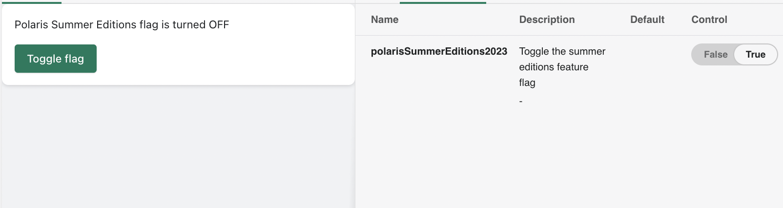
…9227)

<!--
  ☝️How to write a good PR title:
- Prefix it with [ComponentName] (if applicable), for example: [Button]
  - Start with a verb, for example: Add, Delete, Improve, Fix…
  - Give as much context as necessary and as little as possible
  - Prefix it with [WIP] while it’s a work in progress
-->

### WHY are these changes introduced?

Feature flag needed for rollout.
Resolves Shopify/archive-polaris-backlog-2024#33
Resolves Shopify/archive-polaris-backlog-2024#32

<!--
  Context about the problem that’s being addressed.
-->

### WHAT is this pull request doing?

* Add documented feature flag to AppProvider FeaturesContext.
* Add explicit type (for better DX).
* Add storybook story for QA
* Add addon-panel widget to storybook for toggling feature flag for
stories.

### How to 🎩

🖥 [Local development
instructions](https://github.com/Shopify/polaris/blob/main/README.md#local-development)
🗒 [General tophatting
guidelines](https://github.com/Shopify/polaris/blob/main/documentation/Tophatting.md)
📄 [Changelog
guidelines](https://github.com/Shopify/polaris/blob/main/.github/CONTRIBUTING.md#changelog)

<!--
  Give as much information as needed to experiment with the component
  in the playground.
-->

<details>
<summary>Copy-paste this code in
<code>playground/Playground.tsx</code>:</summary>

```jsx
import React from 'react';
import {Page} from '../src';

export function Playground() {
  return (
    <Page title="Playground">
      {/* Add the code you want to test in here */}
    </Page>
  );
}
```

</details>

### 🎩 checklist

- [ ] Tested on
[mobile](https://github.com/Shopify/polaris/blob/main/documentation/Tophatting.md#cross-browser-testing)
- [ ] Tested on [multiple
browsers](https://help.shopify.com/en/manual/shopify-admin/supported-browsers)
- [ ] Tested for
[accessibility](https://github.com/Shopify/polaris/blob/main/documentation/Accessibility%20testing.md)
- [ ] Updated the component's `README.md` with documentation changes
- [ ] [Tophatted
documentation](https://github.com/Shopify/polaris/blob/main/documentation/Tophatting%20documentation.md)
changes in the style guide

---------

Co-authored-by: Sophie Schneider <sophie.schneider@shopify.com>
### WHY are these changes introduced?

Fix `feature` -> `features`
[typo](#9227) in the storybook
AppProviderDecorator so the toggle works on all stories. Also removed
the button toggle from the AppProvider summer editions story to avoid
confusion between two toggle mechanisms

### How to 🎩
Toggle feature in control panel

https://5d559397bae39100201eedc1-zlfuvdfzep.chromatic.com/?path=/story/all-components-appprovider--with-summer-editions-feature
…9227)

<!--
  ☝️How to write a good PR title:
- Prefix it with [ComponentName] (if applicable), for example: [Button]
  - Start with a verb, for example: Add, Delete, Improve, Fix…
  - Give as much context as necessary and as little as possible
  - Prefix it with [WIP] while it’s a work in progress
-->

Feature flag needed for rollout.
Resolves Shopify/archive-polaris-backlog-2024#33
Resolves Shopify/archive-polaris-backlog-2024#32

<!--
  Context about the problem that’s being addressed.
-->

* Add documented feature flag to AppProvider FeaturesContext.
* Add explicit type (for better DX).
* Add storybook story for QA
* Add addon-panel widget to storybook for toggling feature flag for
stories.

🖥 [Local development
instructions](https://github.com/Shopify/polaris/blob/main/README.md#local-development)
🗒 [General tophatting
guidelines](https://github.com/Shopify/polaris/blob/main/documentation/Tophatting.md)
📄 [Changelog
guidelines](https://github.com/Shopify/polaris/blob/main/.github/CONTRIBUTING.md#changelog)

<!--
  Give as much information as needed to experiment with the component
  in the playground.
-->

<details>
<summary>Copy-paste this code in
<code>playground/Playground.tsx</code>:</summary>

```jsx
import React from 'react';
import {Page} from '../src';

export function Playground() {
  return (
    <Page title="Playground">
      {/* Add the code you want to test in here */}
    </Page>
  );
}
```

</details>

- [ ] Tested on
[mobile](https://github.com/Shopify/polaris/blob/main/documentation/Tophatting.md#cross-browser-testing)
- [ ] Tested on [multiple
browsers](https://help.shopify.com/en/manual/shopify-admin/supported-browsers)
- [ ] Tested for
[accessibility](https://github.com/Shopify/polaris/blob/main/documentation/Accessibility%20testing.md)
- [ ] Updated the component's `README.md` with documentation changes
- [ ] [Tophatted
documentation](https://github.com/Shopify/polaris/blob/main/documentation/Tophatting%20documentation.md)
changes in the style guide

---------

Co-authored-by: Sophie Schneider <sophie.schneider@shopify.com>
4 participants
WHY are these changes introduced?
Feature flag needed for rollout.
Resolves https://github.com/Shopify/polaris-summer-editions/issues/33
Resolves https://github.com/Shopify/polaris-summer-editions/issues/32
WHAT is this pull request doing?
How to 🎩
🖥 Local development instructions
🗒 General tophatting guidelines
📄 Changelog guidelines
Copy-paste this code in
playground/Playground.tsx:🎩 checklist
README.mdwith documentation changes