Remote Content Browsing: Clean the library page when displaying other available libraries#10354
Remote Content Browsing: Clean the library page when displaying other available libraries#10354
Conversation
 github-actions
bot
added
APP: Learn
github-actions
bot
added
APP: Learn
Build Artifacts
|
|
Thank you @AllanOXDi (This appears very promising!) |
 marcellamaki
left a comment
marcellamaki
left a comment
marcellamaki
left a comment
There was a problem hiding this comment.
Hi @AllanOXDi - this PR has some amazing improvement. The accurate channels are displaying, you've done some nice code cleanup, and it's definitely getting close to being done.
From my perspective, there are three remaining things to address.
- Polishing up the UI. You're close, but I know we can make the designers 😍 by getting it pixel perfect. I've added some suggestions - including some things that are more general suggestions and some specific code recommendations to try. Cards in particular are hard. I would suggest you take a first attempt at implementing some of this feedback, but we can have a cohack early next week for anything you get stuck on and work through it together. (It may just be me googling "How to do ____ with CSS" 😄
- A few accessibility questions. These could be done in follow up, but I don't want to neglect them. I've tagged @radinamatic for her input here.
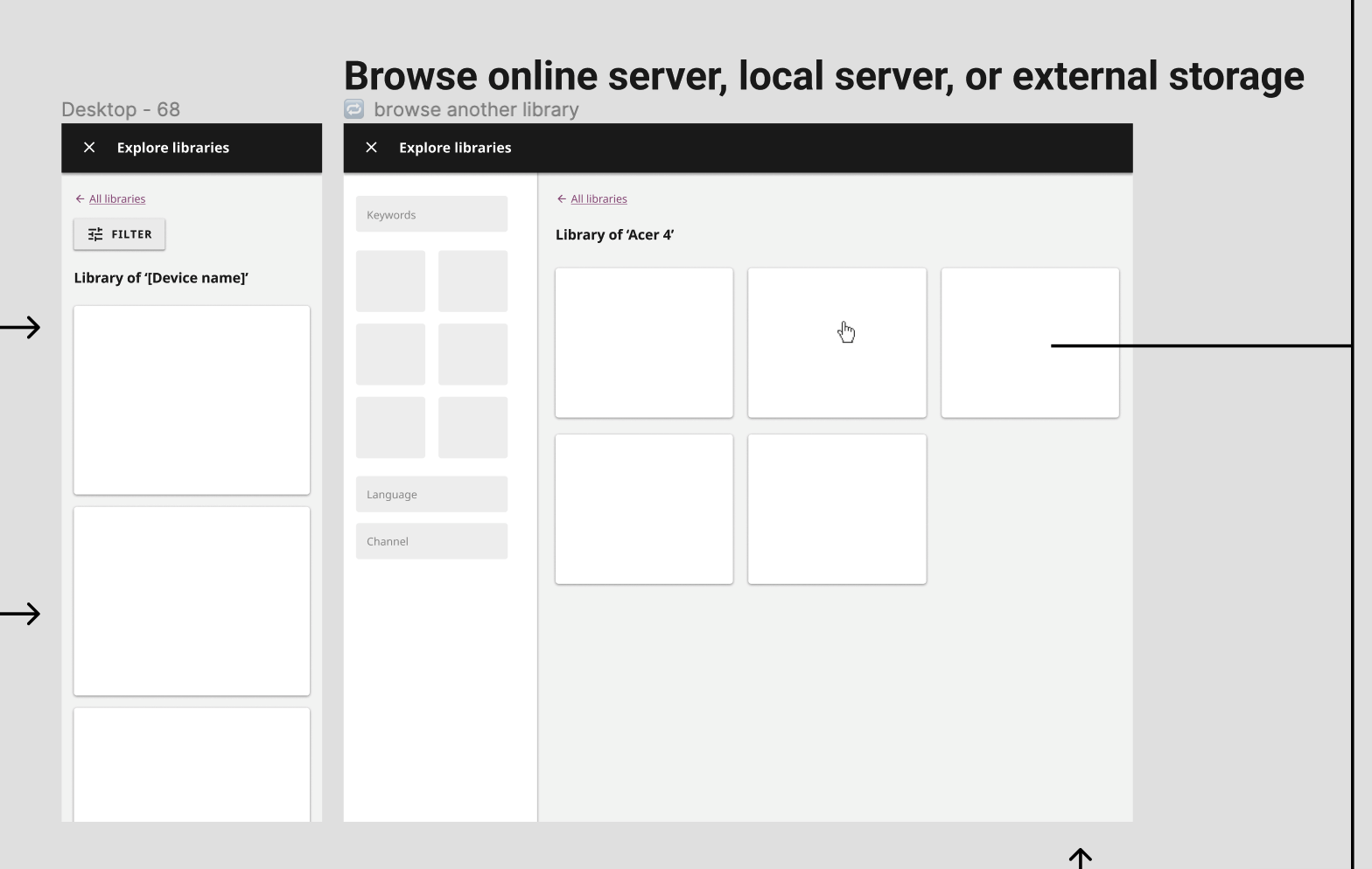
- There are some routing things that I am a bit confused by. I think we might be missing a page - the page that is neither the "Explore Libraries" page, nor actually a "Topic" or content page within a remote library, but the page for that device's library itself. For example "Richard's Classroom Library". This is what should open when you click the "Explore" button, either here, or from the "Explore Libraries" Page. I'm not clear on whether this still has to be implemented, or if I don't know what the correct route is that I should recommend to you. Do you or @akolson have any thoughts here? It's totally fine if it is still on the to-do list and I am happy to help with the implementation as well.
| <ExploreCard | ||
| :style="cardStyle" | ||
| class="card-main-wrapper" | ||
| /> |
There was a problem hiding this comment.
This looks great! I would suggest updating this to include the in the slot, wrapped around the explore card, like this
            <KGridItem :layout="{ span: cardColumnSpan, alignment: 'auto' }">
              <ExploreCard
                :style="cardStyle"
              />
            </KGridItem>
This helps the card go smoothly into the existing grid, and sets the width of the card using the grid, so it changes based on the screen size, just like the other channel cards.
card-grid-2.mp4
It is not the most straightforward, and it does require adding this computed prop cardColumnSpan from where it is defined in ChannelCardGroupGrid for consistency. (You had been using it before and then cleaned it up. Sorry to ask you to put it back 😄)
If anyone has a suggestion for a slightly less messy approach (cc @akolson @MisRob ?), I would be happy for you to recommend something here to Allan that might be better :) This was just the best way I could figure out adding the card into the grid without changing that component too much
There was a problem hiding this comment.
Yes, I think that generally speaking, using grid items within a grid ensures consistency, that's how grid components are intended to be used.
There was a problem hiding this comment.
It may be simpler to wrap the newly added slot in the ChannelCardGroupGrid in KGridItem:
<KGridItem>
  <slot></slot>
</KGridItem>
(however it depends on how that new slot was intended, I'm not familiar with the whole pull request)
There was a problem hiding this comment.
It may be simpler to wrap the newly added slot in the ChannelCardGroupGrid in KGridItem
Yes, that's a good idea @MisRob!
|
|
||
| <LearnAppBarPage | ||
| :appBarTitle="appBarTitle" | ||
| :appBarTitle="learnString('learnLabel')" |
There was a problem hiding this comment.
I'm not sure why this is changed?
There was a problem hiding this comment.
I am note sure too! I am cross checking.
| :layout8="{ span: 4 }" | ||
| :layout4="{ span: 4 }" | ||
| > | ||
| <div v-if="searching" style="padding-top:20px"> |
There was a problem hiding this comment.
You do have this condition here, which is great, but right now it is just set to True always. Maybe @jredrejo's recent PR with the device connection status can be helpful to reference once it is merged, and the same logic can be used here.
The string that is displayed should change based on whether Kolibri is looking for devices on the network, or displaying devices.
The styles for this text should be
fontSize: '12px',
color: this.$themeTokens.annotation,
| <div> | ||
| <KGrid> | ||
| <KGridItem | ||
| :layout12="{ span: 8 }" |
There was a problem hiding this comment.
I think keeping this with { span: 6 } as you had makes the spacing closer to the spec.
| /> | ||
| </div> | ||
| </div> | ||
| </div> |
There was a problem hiding this comment.
This could be simplified to have just slightly fewer <div>s
<div v-if="searching" class="sync-status">
     <span>
         {{ $tr('searchingOtherLibrary') }}
      </span>
      <div class="network-device-refresh">
      <KButton appearance="basic-link" >
             {{ coreString('refresh') }}
        </KButton>
         <KIcon  icon="wifi" />
     </div>
</div>
I also started playing around with classes regarding the spacing. You don't have to add exactly this, but here are some ideas to get you going:
  .sync-status {
    position: absolute;
    right: 16px;
    top : 40%;
  }

  .network-device-refresh {
    display: inline-block;
    margin: 0 4px;
  }
To have the position: absolute work in the right place (within the parent), the parent container - in this case the KGridItem also needs a position. I tried adding
.sync-display {
    position: relative;
  }
There are three things I am trying to achieve with this code:
- When there is space enough on the screen, keep the text all in one line with all items in a row. Try to not wrap the text, even if the items are adjacent:
- As the window gets smaller, have the "Refresh" with the icon "break" together, meaning that the icon and the "Refresh" text always move together
- Keep this information aligned to the right of the grid
I think what I have is a start, but I encourage you to play around with it a little bit yourself!
There was a problem hiding this comment.
My second thought here is actually a question for @radinamatic - I am now thinking for both this display, and for @jredrejo's connection status display PR, we might want to have an
aria-live="polite" and an extra label that conveys the "meaning" of the wifi icon. (It is clearer in José's PR, because the text says "Disconnected" when it appears and he has added the ariaLabel to the icon button, but we may still need the "interruption added").
For this scenario, there are three possible strings to display based on connection status:
- Searching for libraries around you.
- No other libraries around you right now
- Showing all available libraries around you.
Unfortunately I did not think about specific wording here, but we do have various connection status indicators, including 'Successfully reconnected!' elsewhere in the codebase that could perhaps be repurposed.
I am imagining something like the following possible combinations as the "announcement" (these are all existing strings) - maybe both included in the "interruption" but the first part associated with the icon and the second part would be the relevant text?
- "Your device seems to be disconnected." "Searching for libraries around you."
- "Successfully reconnected!" "No other libraries around you right now"
- "Successfully reconnected!" "Showing all available libraries around you."
There was a problem hiding this comment.
Hmm, not entirely. Jose's PR checks for a particular device's availability. I think we would need to do more to achieve the other states that Marcella mentions here. Also, 2. and 3. are a consequence of successfully reconnecting back to a particular device and a successful reload of libraries within that device
| mixins: [commonCoreStrings], | ||
| computed: { | ||
| exploreLibraries() { | ||
| return { name: PageNames.EXPLORE_LIBRARIES }; |
There was a problem hiding this comment.
I think you may want to use a link that goes directly to the library of this device, similar to what @akolson uses within the LibraryItem
      libraryPageRoute() {
        return {
          name: PageNames.LIBRARY,
          params: {
            deviceId: this.deviceId,
          },
        };
      },
To me, if the user is clicking on the explore within a particular library, it seems helpful to bring them to that specific library, rather than the entire "explore libraries" page.
There was a problem hiding this comment.
That was my initial thought. But when I was chatting with @akolson about this. He suggested that we should route to explore Library page. If I got him right. we could make a follow up issue to address this in a different PR. As this PR is just to display the remote content on the library page?
There was a problem hiding this comment.
Hi @AllanOXDi, I think I didn't understand the context of your question, my apologies, but Marcella is right about how this should be implemented and swapping out the current exploreLibraries property for the libraryPageRoute property as suggested Marcella should do the trick without having to open a different PR as i think we already have a devivcId prop within LibraryPage component. Please confirm this if you get to proceed with this :)
There was a problem hiding this comment.
Great! Thanks, I have updated it.
| } | ||
|
|
||
| .view-all-card { | ||
| width: 370px; |
There was a problem hiding this comment.
This width is overriding the use of the grid. You can remove it. I do think it would be good to add a height however - the max height of the cards in figma is 80px. This should be updated here and in the UnpinnedDevice cards.
| <p v-if="channels"> | ||
| {{ channels }} {{ $tr('channels', { count: channels }) }} | ||
| </p> | ||
| </div> |
There was a problem hiding this comment.
This is another place where the number of divs can be reduced.
The spacing and alignment of cards is tricky to get right. Here is how I thought about this card (please excuse my terrible penmanship):
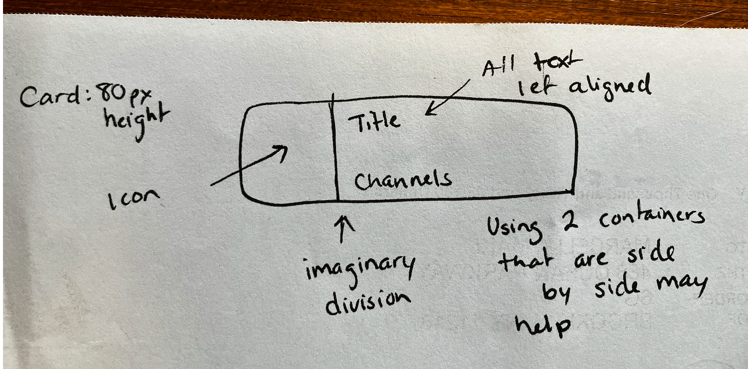
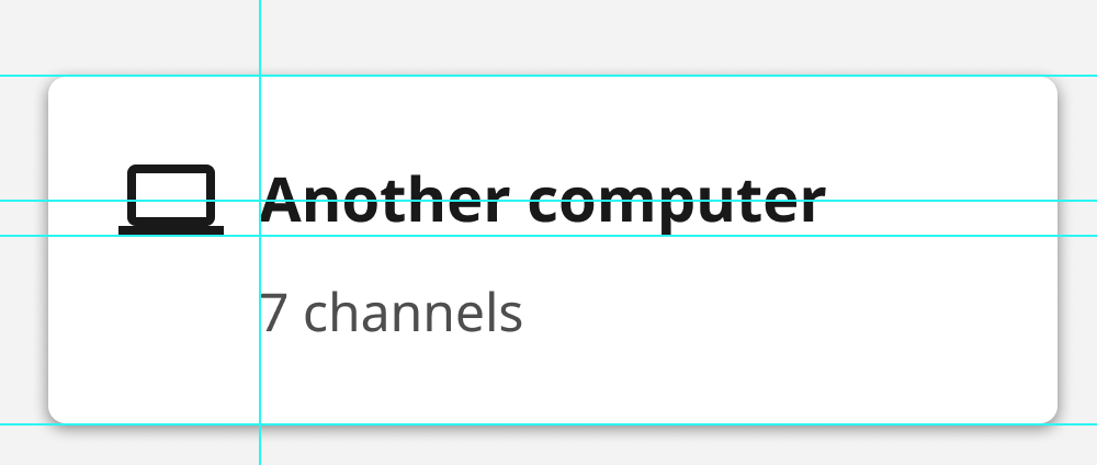
- First, you can set a specific height on your card, based on the spec (80px)
- The next thing I looked for was how the card was divided up. I see a few different sections:
- The left part of the card has the icon in it, only.
- The other piece of the card has text, and the text is left-aligned
- Using the text truncation is a great idea 👍
- I think using an absolute position for the "Channels" text would make the cards look cleaner. By this I mean, the channels text should always appear in the same bottom part of the card, whether the title portion is one or two lines. Using absolute positioning can help with this.
| display: inline-flex; | ||
| width: 100%; | ||
| max-height: 258px; | ||
| width: 350px; |
There was a problem hiding this comment.
I think you should be able to remove all of the styles on this page, as they seem to be only used for the Explore card? If so, anything for that care can be defined in that file. It is redundant and makes it a little bit confusing to debug, and things might be overwriting each other in confusing ways.
I just checked in with @rtibbles about this and he will add this page in follow-up, based on his previous work, which is just a conditionalized display of the existing library page. Sorry for my confusion here! |
|
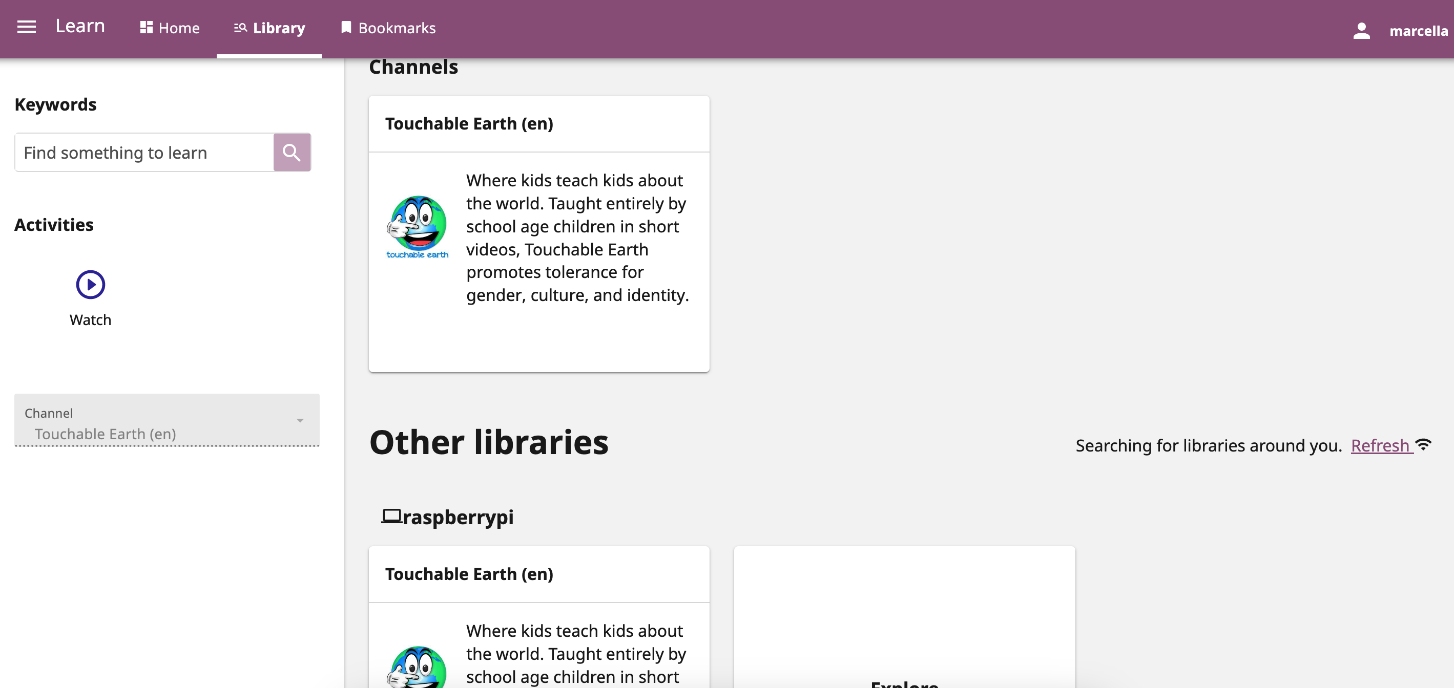
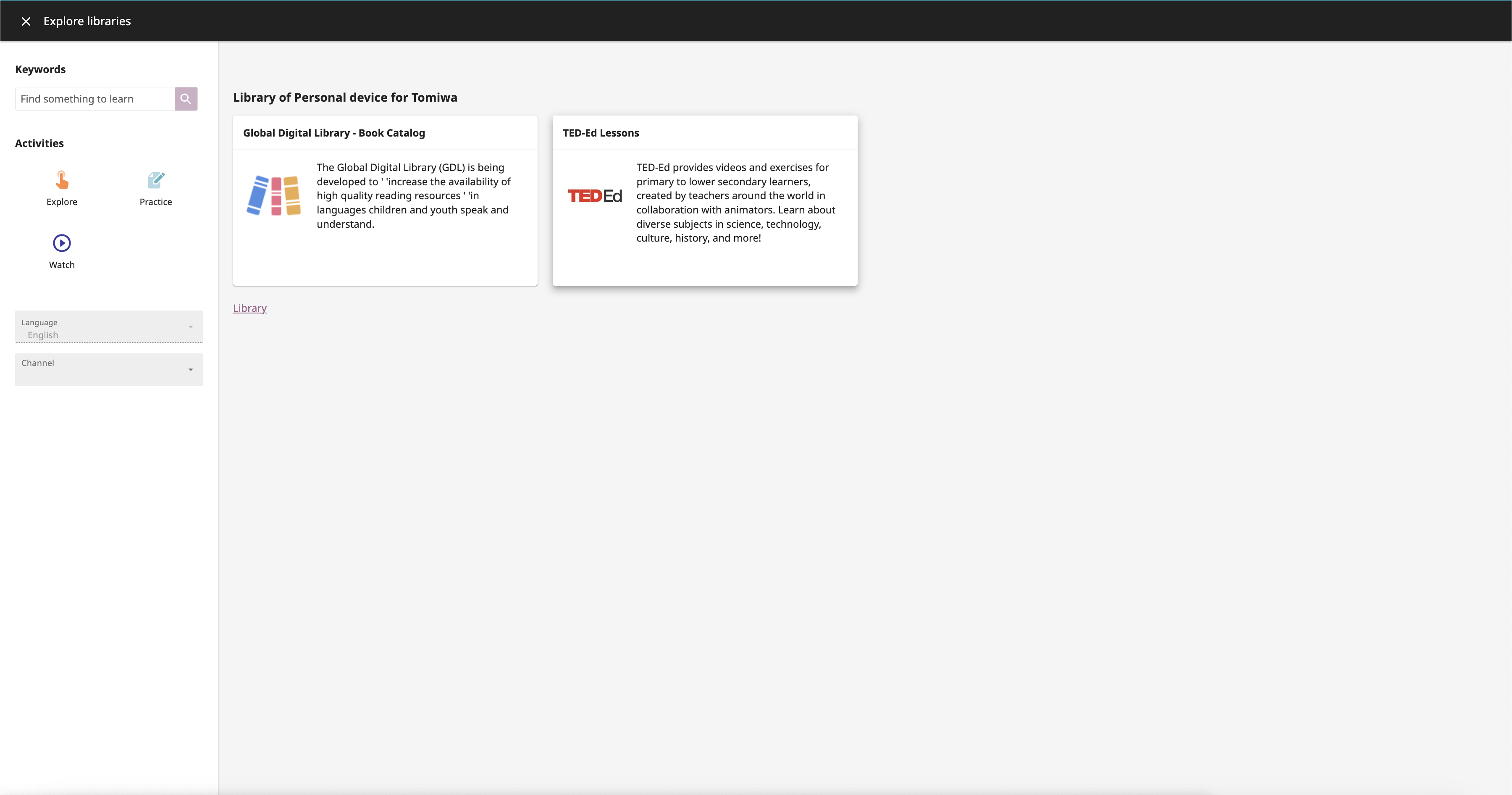
Hi @marcellamaki, I think this page already exists. Actually we reused the Library page to create this intermediary page in #10227 and that should cover it. cc @rtibbles. Below is an example |
 github-actions
bot
added
APP: Device
github-actions
bot
added
APP: Device
 AllanOXDi
force-pushed
the
remote_content_browsing_functionality
branch
from
AllanOXDi
force-pushed
the
remote_content_browsing_functionality
branch
from
ffba889 to
46610c4
Compare
github-actions
bot
removed
APP: Facility
|
Review feedbacks resolved in #10420 |
5 participants
Summary
This PR clean the library page when displaying other available libraries.
References
Reviewer guidance
Please see the figma design
Testing checklist
PR process
Reviewer checklist
yarnandpip)