Refactor StateLabel 🚀 #311
Conversation
|
This pull request is automatically deployed with Now. |
| display: inline-flex; | ||
| align-items: center; | ||
| padding: ${props => (props.small ? `0.125em ${theme.space[1]}px` : `${theme.space[1]}px ${theme.space[2]}px`)}; | ||
| font-weight: 600; |
There was a problem hiding this comment.
If we have fontWeight defined in our theme can we reference the theme value here?
There was a problem hiding this comment.
We could, but it's not defined yet - I can add it in, what font weights should we use?
There was a problem hiding this comment.
Agreed: we should add fontWeight to the list of system props and set defaultProps.fontWeight = 'bold' rather than hard-coding this.
There was a problem hiding this comment.
I don't think we want fontWeight to be a prop on this component, but yeah I agree we should add font weight to our theme! We can do that as a follow up, and replace any other instances at that time.
There was a problem hiding this comment.
Ah, so maybe: font-weight: ${themeGet('fontWeights.bold')}?
|
Thanks for working on this @emplums the current StateLabel api is definitely confusing and needs work. After looking at this it's raising some questions some questions for me (apologies if I'm contradicting my past self):
Perhaps we should make a more flexible label that takes any background color, has small, medium, large, xl sizes with an option for pixel value, and optionally can have a drop-shadow (in dotcom Labels sometimes have drop shadows, sometimes don't). Then make a less flexible but specific StateLabel that accounts for the states we need, with the props for size, and with or without icon. Example StateLabel
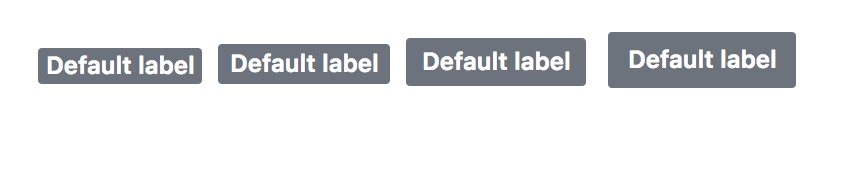
Example LabelDefault props should probably be gray with white text. |
|
@broccolini I'm cool with this! I'll refactor to see how it feels |
|
Ok @broccolini I've got this a little closer - the StateLabel component should have the API you've mentioned, except I didn't add the I'm still working through Label - it's got most of the API you've mentioned, but I'm still thinking through how to handle the size props. Should the sizes correspond to the amount of padding that we add to the element? If so, do you have any suggestions on what the levels should be? The current label (which I'm guessing will correspond to small: |
StateLabel
Yeah I thought that maybe we used the label a lot without icons but I can't find any instances 🤔. Can always add later if needed. I did just realize we need to account for issues as well as pull requests though. They have different Icons but the same colors. Schemes would be somethings like issueOpen, pullOpen, issueClosed, pullClosed, pullMerged - open to other suggestions. LabelsTo get this right we'll need to do an audit in dotcom, however I think you could ship something that heads in the right direction. Below are some examples from dotcom based off this issue https://github.com/github/design-systems/issues/444 in our design systems repo. Issue sidebar labels: Large/xl labels in issues: State labels: Based on this quick audit, these sizes might work and attempts to cover some of the common sizes. But please adjust if doesn't work in practice. We might also consider using ems entirely instead of pixels.
Only question I have is which one we make the default. It feels like the current default label size, small, will be the most commonly used, but feels odd to have medium, large, and xl size props and not small. |
|
@broccolini what if we did: and make medium the default?? I think it makes more sense to call |
|
Sorry the current small state label is 4px not 8px! I'm fine going with the above solution. My only concern is that 95% of the time when we use labels they will need to add the |
|
@broccolini ahh ok that makes more sense 😂 It looked super weird with 8px! I'm not sure if you noticed but I made the current sizing (that's default in I also added in the different states for issues + PRs on state labels, so the schemes now are: |
src/Label.js
Outdated
| } | ||
| } | ||
| ${color} ${props => (props.dropshadow ? 'box-shadow: inset 0 -1px 0 rgba(27, 31, 35, 0.12)' : '')}; |
There was a problem hiding this comment.
eslint is making me put these on the same line, though it hurts my eyezzzzzzzzz
src/Label.js
Outdated
| } | ||
| } | ||
| ${color} //eslint-disable-line |
There was a problem hiding this comment.
I had to put this here in order to get eslint to shut up about this being on it's own line 😭
There was a problem hiding this comment.
That's crazy. What if you put a semicolon at the end?
src/StateLabel.js
Outdated
| color && color !== 'yellow' ? `State--${color}` : null | ||
| ) | ||
| const getOcticon = (scheme, small) => | ||
| small ? <Octicon mr={1} width="1em" icon={octiconMap[scheme]} /> : <Octicon mr={1} icon={octiconMap[scheme]} /> |
There was a problem hiding this comment.
This smells funky to me since all it's actually varying is the width prop. Could we inline it back in the render function like so?
<Octicon icon={octiconMap[scheme]} mr={1} width={small ? '1em' : null} />There was a problem hiding this comment.
No, because setting the width to null here overrides the width set in the SVG and makes it the wrong size. I tried that first!
There was a problem hiding this comment.
Oof. Maybe something like this? 😬
const octiconProps = small ? {width: '1em'} : {}
// ...
<Octicon mr={1} icon={octiconMap[scheme]} {...octiconProps} />
This PR refactors the StateLabel component using Emotion + gets rid of remaining Primer CSS classes & takes a stab at rethinking the prop API 🙀 PLUS addresses: #232 and #257 and #191.
🚨 BREAKING CHANGES! 🚨
stateprop. I felt like having astateprop was a bit overkill on this component, and the API would be much simpler if you allowed users to pass any Icon + anyschemeinstead of trying to map thestateto an icon + background color.iconprop -> instead of passing a full Octiocon wrapper, just pass the icon you'd like to use. Example:icon={Check}Notes:
To make it even more flexible we could even remove the
schemeprop and have users set that viabg, but since the State component in Primer CSS right now sets some pretty specific colors, I thought it would be nice to keep theschemeprop.See additional comments in code.
Closes #232
Closes #257
Closes #191
Merge checklist