Recommend using Close instead of OK #8410
Conversation
 kellydanma
force-pushed
the
kellydanma/close-vs-accept
branch
from
kellydanma
force-pushed
the
kellydanma/close-vs-accept
branch
from
6431d5d to
286e9af
Compare
There was a problem hiding this comment.
This is great, @kellydanma! I committed a few changes, and have one open question/action item around a UI example for Accept, and whether or not we should require a Decline option.
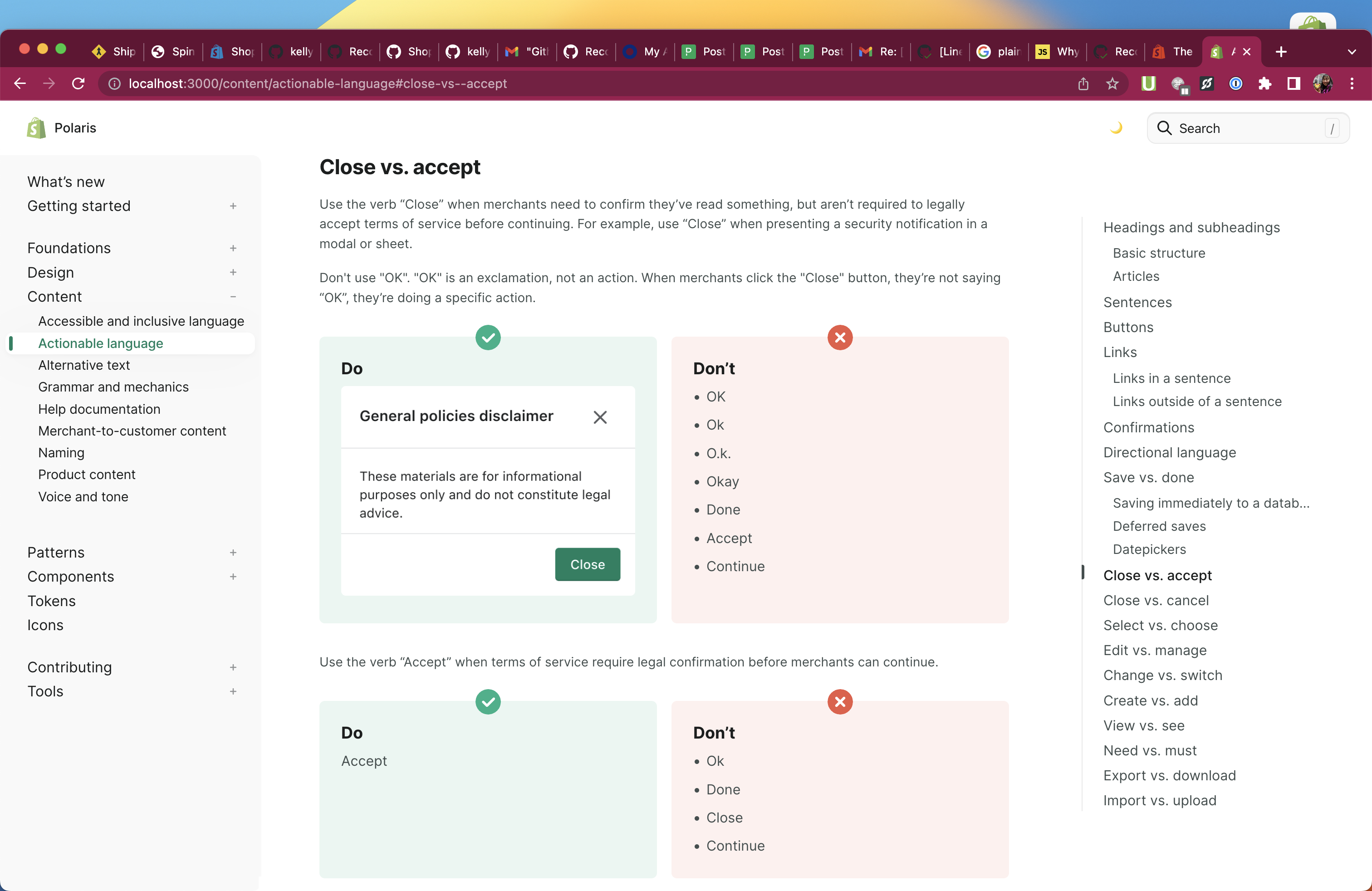
| #### Do | ||
|
|
||
|  | ||
|  |
There was a problem hiding this comment.
I've added an updated image here, but it's not full width, for some reason. Still trying to sort that out. Will update!
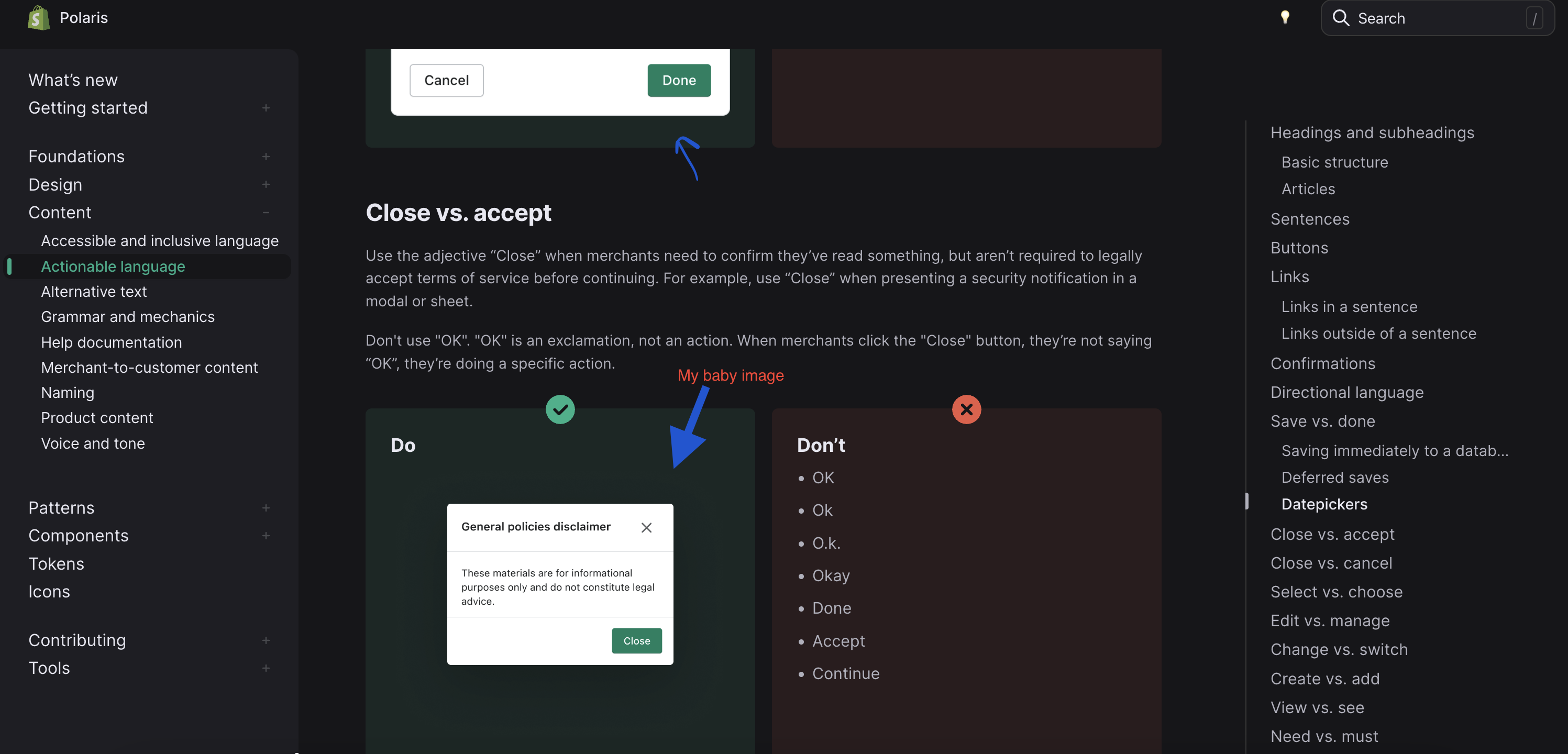
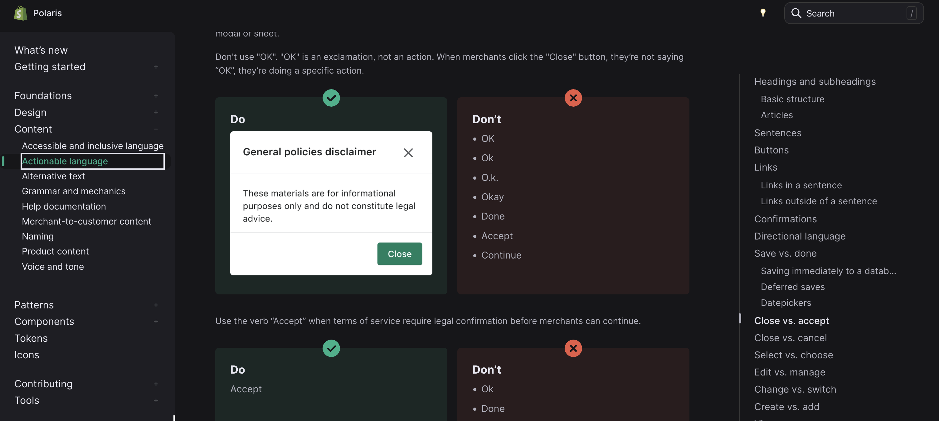
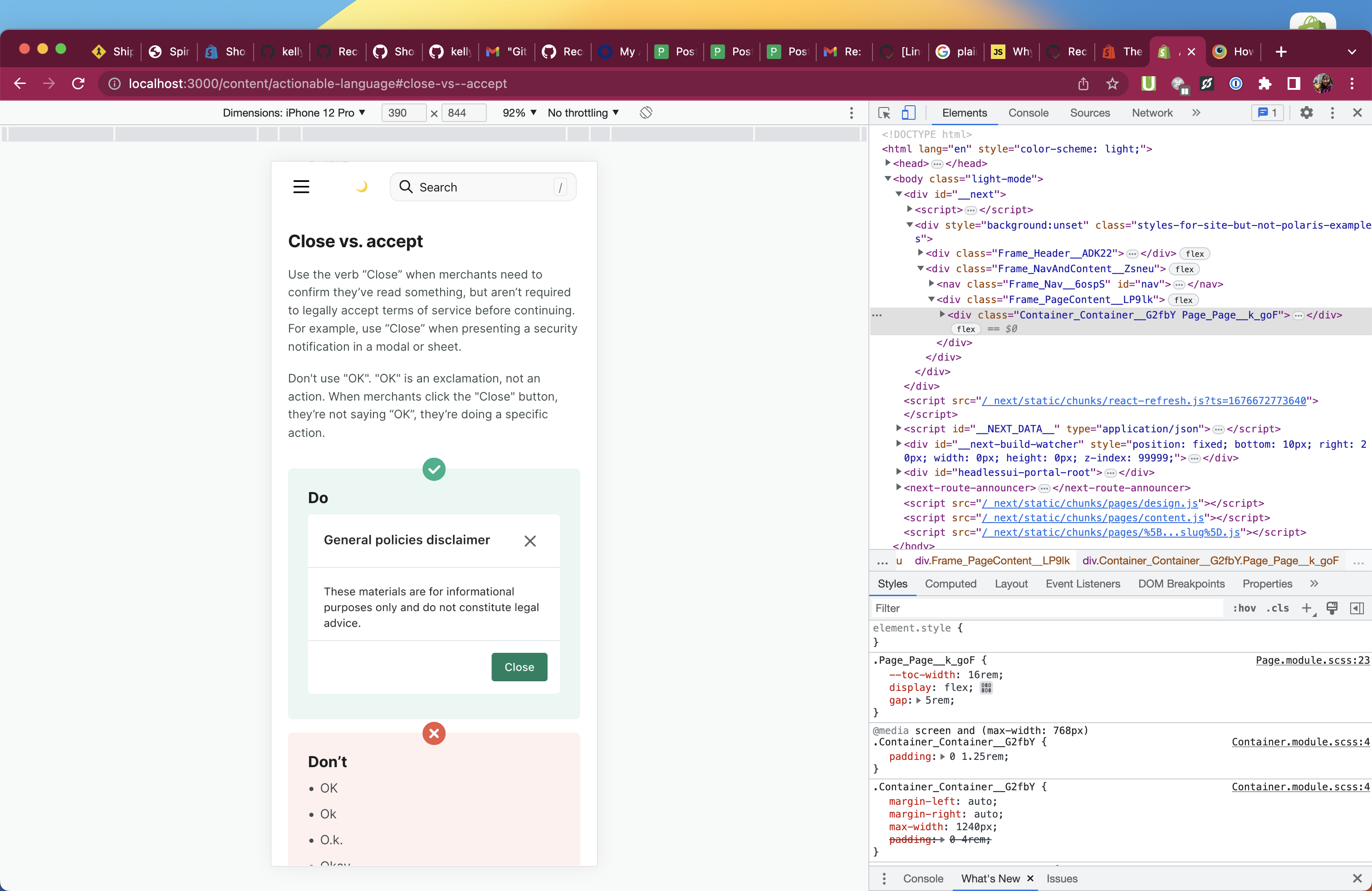
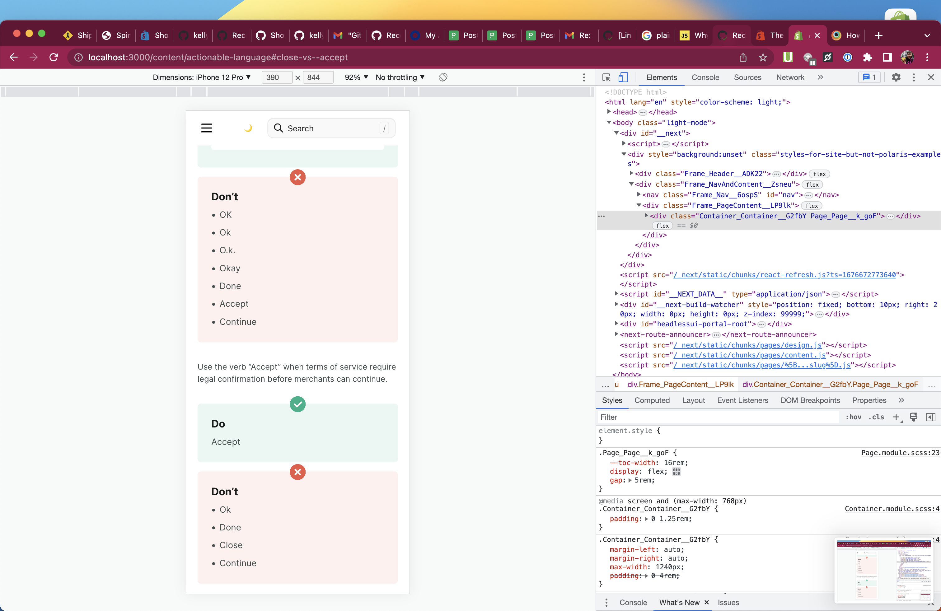
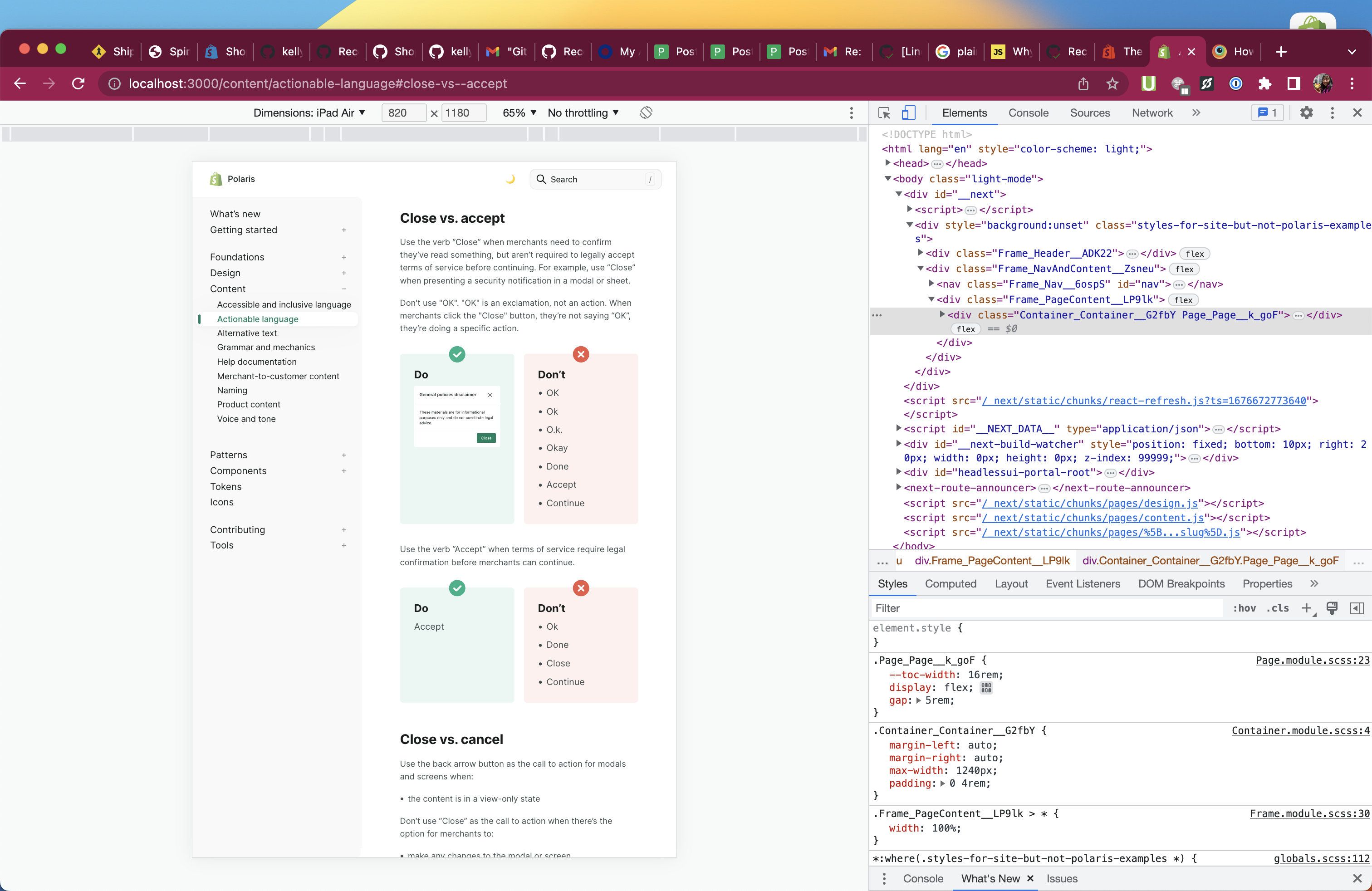
| Use the verb “Accept” when terms of service require legal confirmation before merchants can continue. | ||
|
|
||
| <!-- dodont --> | ||
|
|
There was a problem hiding this comment.
I think the "Do" example for Accept should also have a UI image. I was going to make one, but as I was thinking about potential copy, I was wondering if using Accept also requires us to have a Decline button? If so, which is the default action? These are questions we probably want to have answers for and then document. Do you have any current opinions or product examples? cc @kellydanma @tichri
There was a problem hiding this comment.
I was wondering if using Accept also requires us to have a Decline button
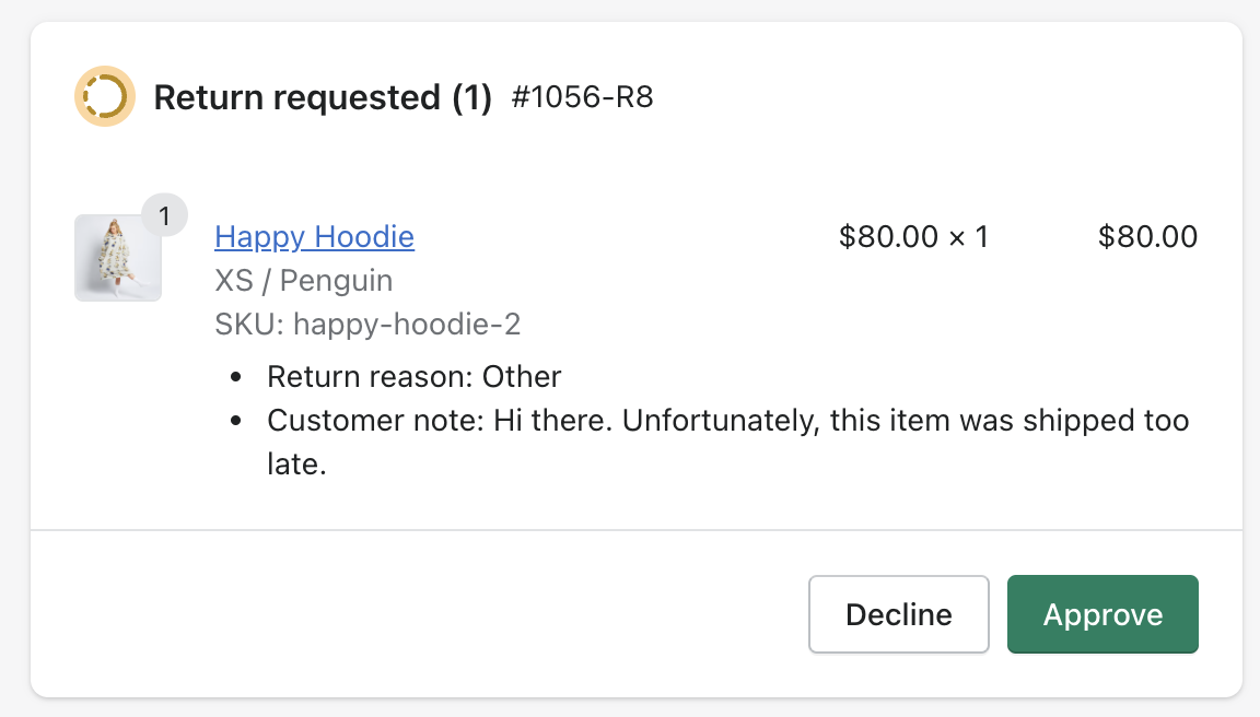
I agree. We always include Decline as a secondary action in the return request workflow on my team, for example:
However, I think adding recommendations for a Decline button opens other questions:
- When do we use "decline" vs. "reject" vs. "dismiss"?
- When do we use "accept" vs. "approve?
Let's keep this PR small and limited to to its changeset: Recommend using Close instead of OK. I can create a new issue to discuss recommendations for a Decline button so we can ship incremental improvements 😄
There was a problem hiding this comment.
@jjgali Many thanks for the updates! 👏
I will pull your changes and tophat them, then update the PR description.
| Use the verb “Accept” when terms of service require legal confirmation before merchants can continue. | ||
|
|
||
| <!-- dodont --> | ||
|
|
There was a problem hiding this comment.
I was wondering if using Accept also requires us to have a Decline button
I agree. We always include Decline as a secondary action in the return request workflow on my team, for example:
However, I think adding recommendations for a Decline button opens other questions:
- When do we use "decline" vs. "reject" vs. "dismiss"?
- When do we use "accept" vs. "approve?
Let's keep this PR small and limited to to its changeset: Recommend using Close instead of OK. I can create a new issue to discuss recommendations for a Decline button so we can ship incremental improvements 😄
This PR was opened by the [Changesets
release](https://github.com/changesets/action) GitHub action. When
you're ready to do a release, you can merge this and the packages will
be published to npm automatically. If you're not ready to do a release
yet, that's fine, whenever you add more changesets to main, this PR will
be updated.


# Releases
## @shopify/stylelint-polaris@8.0.0

### Major Changes

- [#8467](#8467)
[`9ab93132a`](9ab9313)
Thanks [@chloerice](https://github.com/chloerice)! - Configured
`selector-disallowed-list` to disallow Polaris component class name
overrides

### Patch Changes

- Updated dependencies
\[[`0e9fa8433`](0e9fa84),
[`b1768f037`](b1768f0)]:
    -   @shopify/polaris-tokens@6.6.1

## @shopify/polaris-migrator@0.14.0

### Minor Changes

- [#8071](#8071)
[`319479143`](3194791)
Thanks [@itwasmattgregg](https://github.com/itwasmattgregg)! - Added a
migration for updating the Page component `breadcrumbs` prop to use an
object instead of an array

### Patch Changes

- Updated dependencies
\[[`0e9fa8433`](0e9fa84),
[`9ab93132a`](9ab9313),
[`b1768f037`](b1768f0)]:
    -   @shopify/polaris-tokens@6.6.1
    -   @shopify/stylelint-polaris@8.0.0

## @shopify/polaris@10.32.0

### Minor Changes

- [#8454](#8454)
[`4799b6550`](4799b65)
Thanks [@chazdean](https://github.com/chazdean)! - Removed default
spacing from `Inline`


- [#8484](#8484)
[`cbbb5648c`](cbbb564)
Thanks [@aveline](https://github.com/aveline)! - Removed default `gap`
from `Columns`


- [#8135](#8135)
[`c60617518`](c606175)
Thanks [@itwasmattgregg](https://github.com/itwasmattgregg)! -
Deprecated the `Page` `breadcrumbs` prop in favor of the new
`backAction` prop.


- [#8441](#8441)
[`3537b3aeb`](3537b3a)
Thanks [@kyledurand](https://github.com/kyledurand)! - Deprecated
TextContainer in favor of AlphaStack


- [#8418](#8418)
[`4018ee268`](4018ee2)
Thanks [@kyledurand](https://github.com/kyledurand)! - Deprecated Grid
component
    Update documentation for deprecated components


- [#8413](#8413)
[`7bbe096e4`](7bbe096)
Thanks [@zakwarsame](https://github.com/zakwarsame)! - updating bulk
actions strings

### Patch Changes

- [#8387](#8387)
[`7f0f2cad1`](7f0f2ca)
Thanks [@aveline](https://github.com/aveline)! - Updated `Columns` to
accept columns aliases


- [#8115](#8115)
[`cc706f4ce`](cc706f4)
Thanks [@mrcthms](https://github.com/mrcthms)! - Grouped PageActions
actions at the trailing edge of the container


- [#8470](#8470)
[`f5e450357`](f5e4503)
Thanks [@aveline](https://github.com/aveline)! - Removed default margin
from `Bleed`

- Updated dependencies
\[[`0e9fa8433`](0e9fa84),
[`b1768f037`](b1768f0)]:
    -   @shopify/polaris-tokens@6.6.1

## @shopify/polaris-cli@0.1.13

### Patch Changes

- Updated dependencies
\[[`319479143`](3194791)]:
    -   @shopify/polaris-migrator@0.14.0

## @shopify/polaris-tokens@6.6.1

### Patch Changes

- [#8456](#8456)
[`0e9fa8433`](0e9fa84)
Thanks [@aaronccasanova](https://github.com/aaronccasanova)! - Updated
`border-caution-subdued` and `border-success-subdued` tokens to improve
color contrast


- [#8483](#8483)
[`b1768f037`](b1768f0)
Thanks [@aaronccasanova](https://github.com/aaronccasanova)! - Adjusted
colors to meet color contrast requirements

## polaris.shopify.com@0.37.0

### Minor Changes

- [#8454](#8454)
[`4799b6550`](4799b65)
Thanks [@chazdean](https://github.com/chazdean)! - Removed default
spacing from `Inline`


- [#7843](#7843)
[`3840f49e9`](3840f49)
Thanks [@gwyneplaine](https://github.com/gwyneplaine)! - ## Reboot
Pattern Guidance

    -   New layout primitives `Stack`, `Box`, `Grid`, `Row`.
    -   Playroom patched to support larger code snippets.
- New designs and content for the
[patterns](https://polaris.shopify.com/patterns) pages.
    -   Deprecated old patterns:
        ||Old|New|
        \|--\|--\|--\|
        \|**design-patterns** \| `/patterns/design-patterns` \| `404`\|
        \|**page-layouts** \| `/patterns/page-layouts` \| `404`\|
\|**error-messages** \| `/patterns/error-messages` \|
`/content/error-messages`\|
\|**help-content** \| `/patterns/help-content` \|
`/content/help-content`\|
\|**loading** \| `/patterns/loading` \| `/patterns-legacy/loading`\|
\|**new-badge** \| `/patterns/new-badge` \|
`/patterns-legacy/new-badge`\|
\|**pickers** \| `/patterns/pickers` \| `/patterns-legacy/pickers`\|
\|**text-fields** \| `/patterns/text-fields` \|
`/patterns-legacy/text-fields`\|
- Page padding and max-width adjusted such that live previews for
components and patterns always display the desktop breakpoint.


- [#8466](#8466)
[`3b32f3477`](3b32f34)
Thanks [@itwasmattgregg](https://github.com/itwasmattgregg)! - Adds
documentation for the Page breadcrumbs migration

### Patch Changes

- [#8475](#8475)
[`ba7280068`](ba72800)
Thanks [@chloerice](https://github.com/chloerice)! - Added documentation
for `selector-disallowed-list` `@shopify/stylelint/polaris` rule


- [#8474](#8474)
[`00028952d`](0002895)
Thanks [@jesstelford](https://github.com/jesstelford)! - Refactor
hideFromNav logic to support breadcrumbs


- [#8490](#8490)
[`16f5a3638`](16f5a36)
Thanks [@jesstelford](https://github.com/jesstelford)! - Add caveats to
code examples in Patterns


- [#8491](#8491)
[`39704dccf`](39704dc)
Thanks [@jesstelford](https://github.com/jesstelford)! - Add 'New'
status badge to Patterns nav item


- [#8422](#8422)
[`3975668a2`](3975668)
Thanks [@kyledurand](https://github.com/kyledurand)! - Organized
categories on components page


- [#8473](#8473)
[`597b78ba2`](597b78b)
Thanks [@gwyneplaine](https://github.com/gwyneplaine)! - Remove draft
pattern pages from PatternsPage


- [#8477](#8477)
[`c67d1a5b6`](c67d1a5)
Thanks [@kyledurand](https://github.com/kyledurand)! - Fix global types
file


- [#8418](#8418)
[`4018ee268`](4018ee2)
Thanks [@kyledurand](https://github.com/kyledurand)! - Deprecated Grid
component
    Update documentation for deprecated components


- [#8489](#8489)
[`0a525643d`](0a52564)
Thanks [@raquelbreternitz](https://github.com/raquelbreternitz)! - Add
new page on alt text


- [#8410](#8410)
[`2312cbb6a`](2312cbb)
Thanks [@kellydanma](https://github.com/kellydanma)! - Use Close instead
of OK

- Updated dependencies
\[[`7f0f2cad1`](7f0f2ca),
[`4799b6550`](4799b65),
[`cbbb5648c`](cbbb564),
[`c60617518`](c606175),
[`cc706f4ce`](cc706f4),
[`f5e450357`](f5e4503),
[`3537b3aeb`](3537b3a),
[`0e9fa8433`](0e9fa84),
[`4018ee268`](4018ee2),
[`7bbe096e4`](7bbe096),
[`b1768f037`](b1768f0)]:
    -   @shopify/polaris@10.32.0
    -   @shopify/polaris-tokens@6.6.1

Co-authored-by: github-actions[bot] <github-actions[bot]@users.noreply.github.com>
<!--
  ☝️How to write a good PR title:
- Prefix it with [ComponentName] (if applicable), for example: [Button]
  - Start with a verb, for example: Add, Delete, Improve, Fix…
  - Give as much context as necessary and as little as possible
  - Prefix it with [WIP] while it’s a work in progress
-->

### WHY are these changes introduced?

<!--
  Context about the problem that’s being addressed.
-->

When merchants need to dismiss a modal, they `Close` the modal. Today,
we use `OK` when merchants don't need to _officially accept_, but `OK`
is not an action. We should use language in buttons that better reflect
the action merchants need to take.

1️⃣ `Close` also translates well into other languages.

2️⃣ `OK` does not translate super well. `OK` is often translated as:

<details>
<summary>
OK (just uses the English word)
</summary>
<img width="668" alt="italian"
src="https://user-images.githubusercontent.com/43160110/219497027-2480290f-d807-43c0-91b4-b40f93e30976.png">
</details>

<details>
<summary>
Okay (language-specific spelling of Okay, not OK)
</summary>
<img width="670" alt="16-01-ylzgp-iqq83"
src="https://user-images.githubusercontent.com/43160110/219498749-c60f0cbf-a648-44a0-9523-b7e36d3dfe97.png">

</details>

<details>
<summary>
Accept (eg. Aceptar in Spanish)
</summary>
<img width="664" alt="16-00-fay6k-ux1nx"
src="https://user-images.githubusercontent.com/43160110/219498903-d3c54159-5ca3-48c9-8e70-98e594f87e2e.png">
</details>


<details>
<summary>
Sure, Certain (eg. 确定 in Chinese)
</summary>

<img width="662" alt="chinese"
src="https://user-images.githubusercontent.com/43160110/219501039-166f9492-c5c6-4b97-be25-8de50f13f0cb.png">
</details>

`OK` has an ambiguous translation while `Close` does not. Let's use
`Close` to be more straightforward!

### WHAT is this pull request doing?

<!--
  Summary of the changes committed.

Before / after screenshots are appreciated for UI changes. Make sure to
include alt text that describes the screenshot.

If you include an animated gif showing your change, wrapping it in a
details tag is recommended. Gifs usually autoplay, which can cause
accessibility issues for people reviewing your PR:

    <details>
      <summary>Summary of your gif(s)</summary>
      <img src="..." alt="Description of what the gif shows">
    </details>
-->

<!-- ℹ️ Delete the following for small / trivial changes -->

### How to 🎩

🖥 [Local development
instructions](https://github.com/Shopify/polaris/blob/main/README.md#local-development)
🗒 [General tophatting
guidelines](https://github.com/Shopify/polaris/blob/main/documentation/Tophatting.md)
📄 [Changelog
guidelines](https://github.com/Shopify/polaris/blob/main/.github/CONTRIBUTING.md#changelog)

<!--
  Give as much information as needed to experiment with the component
  in the playground.
-->

<img width="1512" alt="Screenshot 2023-02-17 at 14 26 34"
src="https://user-images.githubusercontent.com/43160110/219805555-a55c4b3d-07a6-484d-bdb4-d77e3682692d.png">

<details>
<summary>
Desktop (Chrome)
</summary>
<img width="1512" alt="Screenshot 2023-02-17 at 14 26 34"
src="https://user-images.githubusercontent.com/43160110/219805555-a55c4b3d-07a6-484d-bdb4-d77e3682692d.png">
</details>


<details>
<summary>
Desktop (Safari)
</summary>
<img width="1512" alt="Screenshot 2023-02-17 at 14 32 56"
src="https://user-images.githubusercontent.com/43160110/219808123-1259f8e9-a43f-470a-8587-1633b2a6b398.png">

</details>

<details>
<summary>
iPhone 12 Pro
</summary>

<img width="1512" alt="Screenshot 2023-02-17 at 14 29 48"
src="https://user-images.githubusercontent.com/43160110/219806916-9ab6db1f-50bc-4410-9d21-78c56495d0c9.png">
<img width="1512" alt="Screenshot 2023-02-17 at 14 29 57"
src="https://user-images.githubusercontent.com/43160110/219806958-b26d653d-4fc3-40d6-b994-f0cd7f90548f.png">

</details>

<details>
<summary>
iPad Air
</summary>

<img width="1512" alt="Screenshot 2023-02-17 at 14 30 45"
src="https://user-images.githubusercontent.com/43160110/219807213-e26b894a-4fcf-447f-a01f-682b8d636734.png">


</details>


### 🎩 checklist

- [x] Tested on
[mobile](https://github.com/Shopify/polaris/blob/main/documentation/Tophatting.md#cross-browser-testing)
- [x] Tested on [multiple
browsers](https://help.shopify.com/en/manual/shopify-admin/supported-browsers)
- [ ] Tested for
[accessibility](https://github.com/Shopify/polaris/blob/main/documentation/Accessibility%20testing.md)
- [x] Updated the component's `README.md` with documentation changes
- [x] [Tophatted
documentation](https://github.com/Shopify/polaris/blob/main/documentation/Tophatting%20documentation.md)
changes in the style guide

---------

Co-authored-by: jjgali <77791660+jjgali@users.noreply.github.com>
This PR was opened by the [Changesets
release](https://github.com/changesets/action) GitHub action. When
you're ready to do a release, you can merge this and the packages will
be published to npm automatically. If you're not ready to do a release
yet, that's fine, whenever you add more changesets to main, this PR will
be updated.


# Releases
## @shopify/stylelint-polaris@8.0.0

### Major Changes

- [Shopify#8467](Shopify#8467)
[`9ab93132a`](Shopify@9ab9313)
Thanks [@chloerice](https://github.com/chloerice)! - Configured
`selector-disallowed-list` to disallow Polaris component class name
overrides

### Patch Changes

- Updated dependencies
\[[`0e9fa8433`](Shopify@0e9fa84),
[`b1768f037`](Shopify@b1768f0)]:
    -   @shopify/polaris-tokens@6.6.1

## @shopify/polaris-migrator@0.14.0

### Minor Changes

- [Shopify#8071](Shopify#8071)
[`319479143`](Shopify@3194791)
Thanks [@itwasmattgregg](https://github.com/itwasmattgregg)! - Added a
migration for updating the Page component `breadcrumbs` prop to use an
object instead of an array

### Patch Changes

- Updated dependencies
\[[`0e9fa8433`](Shopify@0e9fa84),
[`9ab93132a`](Shopify@9ab9313),
[`b1768f037`](Shopify@b1768f0)]:
    -   @shopify/polaris-tokens@6.6.1
    -   @shopify/stylelint-polaris@8.0.0

## @shopify/polaris@10.32.0

### Minor Changes

- [Shopify#8454](Shopify#8454)
[`4799b6550`](Shopify@4799b65)
Thanks [@chazdean](https://github.com/chazdean)! - Removed default
spacing from `Inline`


- [Shopify#8484](Shopify#8484)
[`cbbb5648c`](Shopify@cbbb564)
Thanks [@aveline](https://github.com/aveline)! - Removed default `gap`
from `Columns`


- [Shopify#8135](Shopify#8135)
[`c60617518`](Shopify@c606175)
Thanks [@itwasmattgregg](https://github.com/itwasmattgregg)! -
Deprecated the `Page` `breadcrumbs` prop in favor of the new
`backAction` prop.


- [Shopify#8441](Shopify#8441)
[`3537b3aeb`](Shopify@3537b3a)
Thanks [@kyledurand](https://github.com/kyledurand)! - Deprecated
TextContainer in favor of AlphaStack


- [Shopify#8418](Shopify#8418)
[`4018ee268`](Shopify@4018ee2)
Thanks [@kyledurand](https://github.com/kyledurand)! - Deprecated Grid
component
    Update documentation for deprecated components


- [Shopify#8413](Shopify#8413)
[`7bbe096e4`](Shopify@7bbe096)
Thanks [@zakwarsame](https://github.com/zakwarsame)! - updating bulk
actions strings

### Patch Changes

- [Shopify#8387](Shopify#8387)
[`7f0f2cad1`](Shopify@7f0f2ca)
Thanks [@aveline](https://github.com/aveline)! - Updated `Columns` to
accept columns aliases


- [Shopify#8115](Shopify#8115)
[`cc706f4ce`](Shopify@cc706f4)
Thanks [@mrcthms](https://github.com/mrcthms)! - Grouped PageActions
actions at the trailing edge of the container


- [Shopify#8470](Shopify#8470)
[`f5e450357`](Shopify@f5e4503)
Thanks [@aveline](https://github.com/aveline)! - Removed default margin
from `Bleed`

- Updated dependencies
\[[`0e9fa8433`](Shopify@0e9fa84),
[`b1768f037`](Shopify@b1768f0)]:
    -   @shopify/polaris-tokens@6.6.1

## @shopify/polaris-cli@0.1.13

### Patch Changes

- Updated dependencies
\[[`319479143`](Shopify@3194791)]:
    -   @shopify/polaris-migrator@0.14.0

## @shopify/polaris-tokens@6.6.1

### Patch Changes

- [Shopify#8456](Shopify#8456)
[`0e9fa8433`](Shopify@0e9fa84)
Thanks [@aaronccasanova](https://github.com/aaronccasanova)! - Updated
`border-caution-subdued` and `border-success-subdued` tokens to improve
color contrast


- [Shopify#8483](Shopify#8483)
[`b1768f037`](Shopify@b1768f0)
Thanks [@aaronccasanova](https://github.com/aaronccasanova)! - Adjusted
colors to meet color contrast requirements

## polaris.shopify.com@0.37.0

### Minor Changes

- [Shopify#8454](Shopify#8454)
[`4799b6550`](Shopify@4799b65)
Thanks [@chazdean](https://github.com/chazdean)! - Removed default
spacing from `Inline`


- [Shopify#7843](Shopify#7843)
[`3840f49e9`](Shopify@3840f49)
Thanks [@gwyneplaine](https://github.com/gwyneplaine)! - ## Reboot
Pattern Guidance

    -   New layout primitives `Stack`, `Box`, `Grid`, `Row`.
    -   Playroom patched to support larger code snippets.
- New designs and content for the
[patterns](https://polaris.shopify.com/patterns) pages.
    -   Deprecated old patterns:
        ||Old|New|
        \|--\|--\|--\|
        \|**design-patterns** \| `/patterns/design-patterns` \| `404`\|
        \|**page-layouts** \| `/patterns/page-layouts` \| `404`\|
\|**error-messages** \| `/patterns/error-messages` \|
`/content/error-messages`\|
\|**help-content** \| `/patterns/help-content` \|
`/content/help-content`\|
\|**loading** \| `/patterns/loading` \| `/patterns-legacy/loading`\|
\|**new-badge** \| `/patterns/new-badge` \|
`/patterns-legacy/new-badge`\|
\|**pickers** \| `/patterns/pickers` \| `/patterns-legacy/pickers`\|
\|**text-fields** \| `/patterns/text-fields` \|
`/patterns-legacy/text-fields`\|
- Page padding and max-width adjusted such that live previews for
components and patterns always display the desktop breakpoint.


- [Shopify#8466](Shopify#8466)
[`3b32f3477`](Shopify@3b32f34)
Thanks [@itwasmattgregg](https://github.com/itwasmattgregg)! - Adds
documentation for the Page breadcrumbs migration

### Patch Changes

- [Shopify#8475](Shopify#8475)
[`ba7280068`](Shopify@ba72800)
Thanks [@chloerice](https://github.com/chloerice)! - Added documentation
for `selector-disallowed-list` `@shopify/stylelint/polaris` rule


- [Shopify#8474](Shopify#8474)
[`00028952d`](Shopify@0002895)
Thanks [@jesstelford](https://github.com/jesstelford)! - Refactor
hideFromNav logic to support breadcrumbs


- [Shopify#8490](Shopify#8490)
[`16f5a3638`](Shopify@16f5a36)
Thanks [@jesstelford](https://github.com/jesstelford)! - Add caveats to
code examples in Patterns


- [Shopify#8491](Shopify#8491)
[`39704dccf`](Shopify@39704dc)
Thanks [@jesstelford](https://github.com/jesstelford)! - Add 'New'
status badge to Patterns nav item


- [Shopify#8422](Shopify#8422)
[`3975668a2`](Shopify@3975668)
Thanks [@kyledurand](https://github.com/kyledurand)! - Organized
categories on components page


- [Shopify#8473](Shopify#8473)
[`597b78ba2`](Shopify@597b78b)
Thanks [@gwyneplaine](https://github.com/gwyneplaine)! - Remove draft
pattern pages from PatternsPage


- [Shopify#8477](Shopify#8477)
[`c67d1a5b6`](Shopify@c67d1a5)
Thanks [@kyledurand](https://github.com/kyledurand)! - Fix global types
file


- [Shopify#8418](Shopify#8418)
[`4018ee268`](Shopify@4018ee2)
Thanks [@kyledurand](https://github.com/kyledurand)! - Deprecated Grid
component
    Update documentation for deprecated components


- [Shopify#8489](Shopify#8489)
[`0a525643d`](Shopify@0a52564)
Thanks [@raquelbreternitz](https://github.com/raquelbreternitz)! - Add
new page on alt text


- [Shopify#8410](Shopify#8410)
[`2312cbb6a`](Shopify@2312cbb)
Thanks [@kellydanma](https://github.com/kellydanma)! - Use Close instead
of OK

- Updated dependencies
\[[`7f0f2cad1`](Shopify@7f0f2ca),
[`4799b6550`](Shopify@4799b65),
[`cbbb5648c`](Shopify@cbbb564),
[`c60617518`](Shopify@c606175),
[`cc706f4ce`](Shopify@cc706f4),
[`f5e450357`](Shopify@f5e4503),
[`3537b3aeb`](Shopify@3537b3a),
[`0e9fa8433`](Shopify@0e9fa84),
[`4018ee268`](Shopify@4018ee2),
[`7bbe096e4`](Shopify@7bbe096),
[`b1768f037`](Shopify@b1768f0)]:
    -   @shopify/polaris@10.32.0
    -   @shopify/polaris-tokens@6.6.1

Co-authored-by: github-actions[bot] <github-actions[bot]@users.noreply.github.com>
3 participants
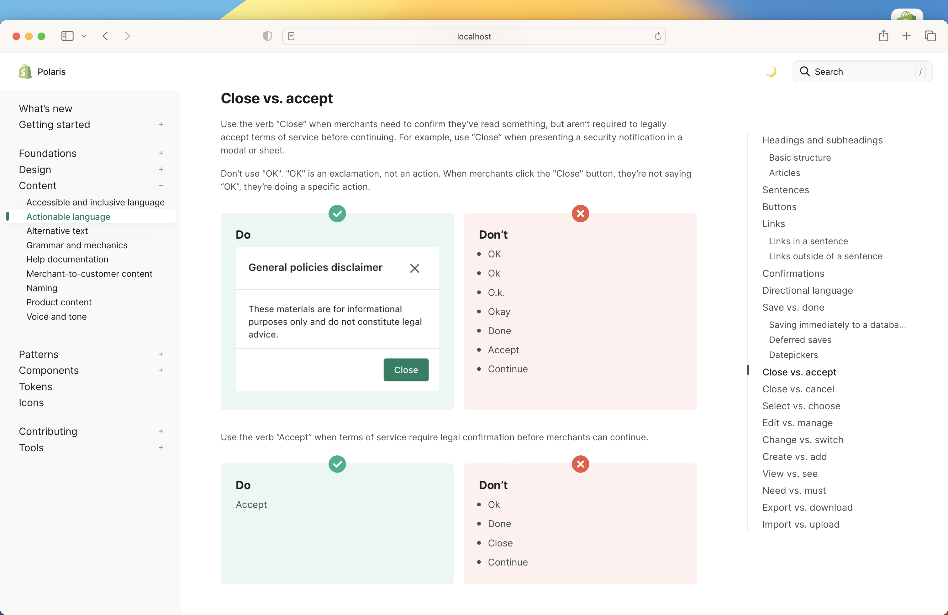
WHY are these changes introduced?
When merchants need to dismiss a modal, they
Closethe modal. Today, we useOKwhen merchants don't need to officially accept, butOKis not an action. We should use language in buttons that better reflect the action merchants need to take.1️⃣
Closealso translates well into other languages.2️⃣
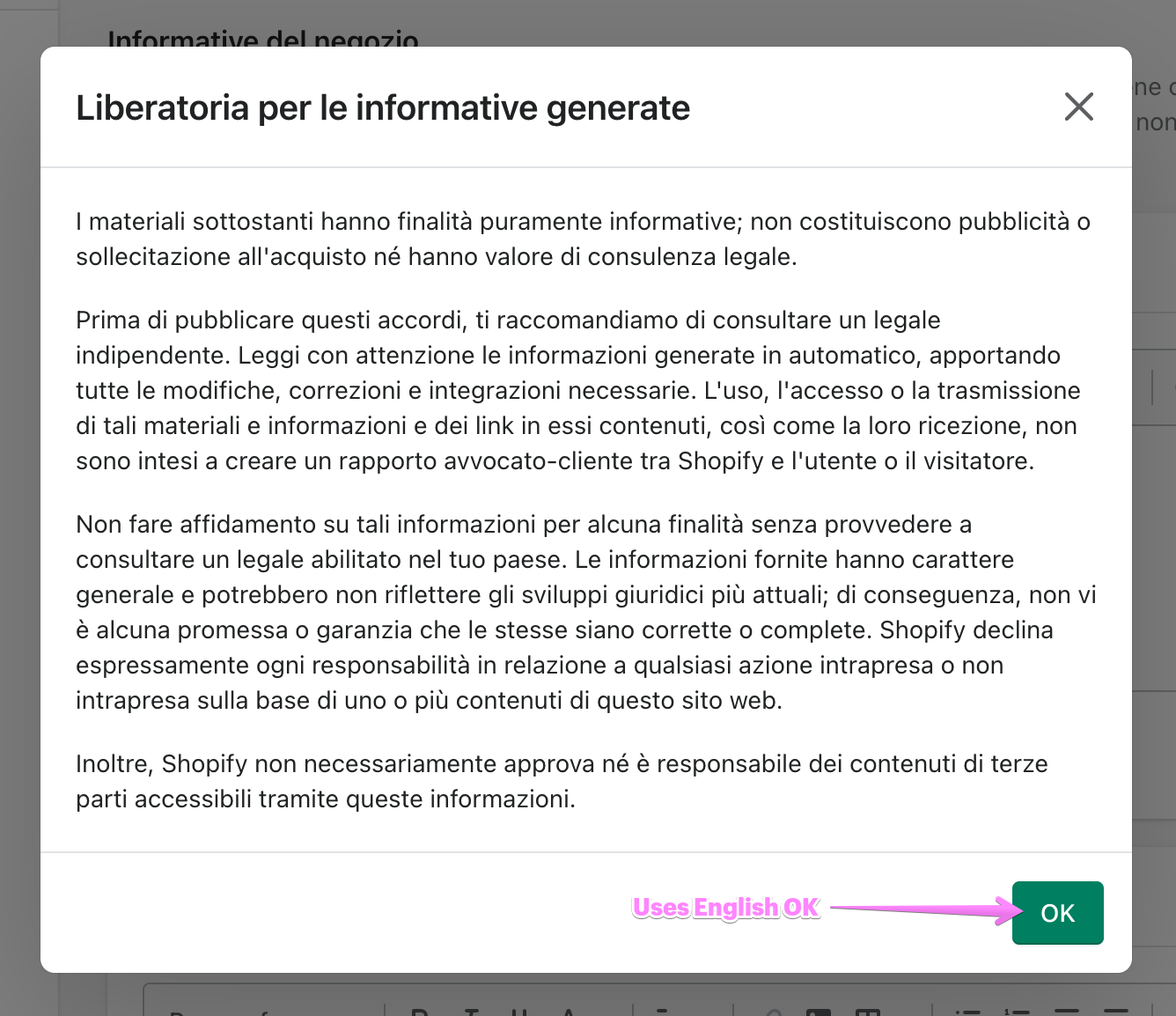
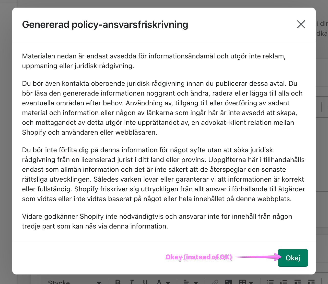
OKdoes not translate super well.OKis often translated as:OK (just uses the English word)
Okay (language-specific spelling of Okay, not OK)
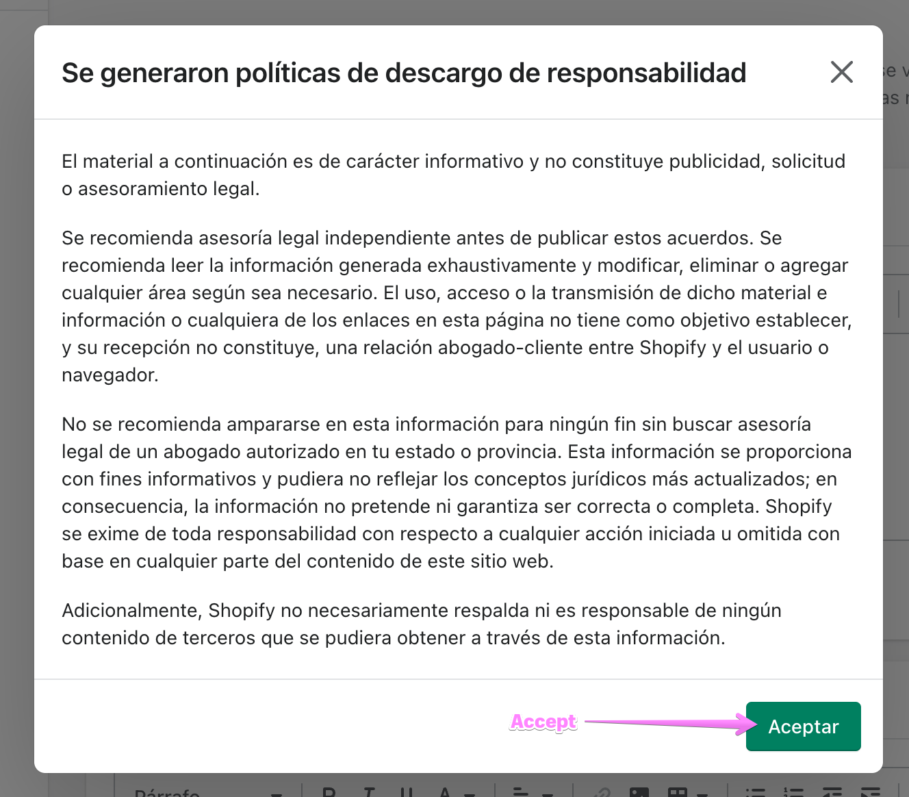
Accept (eg. Aceptar in Spanish)
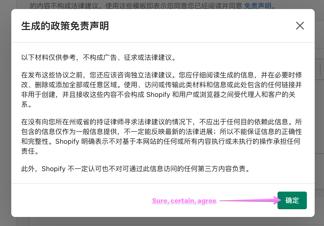
Sure, Certain (eg. 确定 in Chinese)
OKhas an ambiguous translation whileClosedoes not. Let's useCloseto be more straightforward!WHAT is this pull request doing?
How to 🎩
🖥 Local development instructions
🗒 General tophatting guidelines
📄 Changelog guidelines
Desktop (Chrome)
Desktop (Safari)
iPhone 12 Pro
iPad Air
🎩 checklist
README.mdwith documentation changes