Add variant to KeyboardKey component #8288
Conversation
 rcd00
force-pushed
the
hack-days-update-KeyboardKey
branch
2 times, most recently
from
rcd00
force-pushed
the
hack-days-update-KeyboardKey
branch
2 times, most recently
from
77f9bc8 to
c41b71f
Compare
rcd00
changed the title
size-limit report 📦
|
There was a problem hiding this comment.
maybe a question for @ardakaracizmeli , but are we fully replacing the keyboard key styling to this one with the grey bg?
Yup, the idea is to fully replace |
rcd00
force-pushed
the
hack-days-update-KeyboardKey
branch
2 times, most recently
from
df60873 to
25e1c88
Compare
|
Chromatic looks a little off but Storybook looks correct for keyboard key small Chromatic: Storybook: |
There was a problem hiding this comment.
Code looks good but I'd like to run the latest update by @sarahill again.
Sara are we cool with changing small variant to all caps?
👌sorry didn't get to mention but @ardakaracizmeli actually confirmed this but open to feedback! |
update style of the default KeyboardKey component
add small size variant
rcd00
force-pushed
the
hack-days-update-KeyboardKey
branch
from
949858e to
cef8f04
Compare
This PR was opened by the [Changesets
release](https://github.com/changesets/action) GitHub action. When
you're ready to do a release, you can merge this and the packages will
be published to npm automatically. If you're not ready to do a release
yet, that's fine, whenever you add more changesets to main, this PR will
be updated.


# Releases
## @shopify/stylelint-polaris@9.0.0

### Major Changes

- [#8657](#8657)
[`764f17d86`](764f17d)
Thanks [@alex-page](https://github.com/alex-page)! - Turn on
reportNeedlessDisables for all comments

## @shopify/polaris-migrator@0.16.0

### Minor Changes

- [#8272](#8272)
[`cccd69848`](cccd698)
Thanks [@lgriffee](https://github.com/lgriffee)! - Create migrations to
replace deprecated custom properties in polaris-react v11.0.0 and v9.0.0

### Patch Changes

- Updated dependencies
\[[`764f17d86`](764f17d)]:
    -   @shopify/stylelint-polaris@9.0.0

## @shopify/polaris@10.36.0

### Minor Changes

- [#8555](#8555)
[`696473b82`](696473b)
Thanks [@clarkjennings](https://github.com/clarkjennings)! - Added a
forward `ref` to permit programmatic scrolling for `Scrollable`
(example: `scrollRef.current?.scrollTo(0)`)


- [#8650](#8650)
[`078cf9aea`](078cf9a)
Thanks [@kyledurand](https://github.com/kyledurand)! - Deprecated
breadcrumbs prop on SkeletonPage, added backAction prop with story


- [#8586](#8586)
[`83bde8690`](83bde86)
Thanks [@tatianau](https://github.com/tatianau)! - Made hiding the
stepper arrows for inputs of type "number" and revealing them on hover
and focus the default `TextField` behaviour to mimic the default browser
experience


- [#8288](#8288)
[`d27a361c2`](d27a361)
Thanks [@rcd00](https://github.com/rcd00)! - Updated the style of
keyboard component and add optional size prop


- [#8600](#8600)
[`515a62f3b`](515a62f)
Thanks [@kyledurand](https://github.com/kyledurand)! - Fixed list reset
class from not applying to ordered lists


- [#8655](#8655)
[`fb373c3e1`](fb373c3)
Thanks [@stewx](https://github.com/stewx)! - Adjust CSS for expanded
navigation section to remove unwanted space during collapse/expand

### Patch Changes

- [#8595](#8595)
[`437a3bbf1`](437a3bb)
Thanks [@KateWood](https://github.com/KateWood)! - Added option zebra
striping to `IndexTable`
([#8595](#8595))


- [#8626](#8626)
[`ff70ab3d1`](ff70ab3)
Thanks [@alex-page](https://github.com/alex-page)! - Fix border radius
on active/pressed navigation items


- [#8644](#8644)
[`62b712362`](62b7123)
Thanks [@alex-page](https://github.com/alex-page)! - Remove unnecessary
stylelint-disable comments


- [#8651](#8651)
[`446ba341c`](446ba34)
Thanks [@aveline](https://github.com/aveline)! - Updated default stack
order custom property


- [#8659](#8659)
[`3e7e0837d`](3e7e083)
Thanks [@mrcthms](https://github.com/mrcthms)! - Removed comments after
stylelint rule changes that are breaking the rules


- [#8606](#8606)
[`230786ace`](230786a)
Thanks [@alex-page](https://github.com/alex-page)! - Remove unused
shared scss functions and move low usage or low value functions into
components


- [#8629](#8629)
[`6ee523a5f`](6ee523a)
Thanks [@mrcthms](https://github.com/mrcthms)! - Updated the animation
duration and box-shadow for the `Tooltip`

## @shopify/polaris-cli@0.1.17

### Patch Changes

- Updated dependencies
\[[`cccd69848`](cccd698)]:
    -   @shopify/polaris-migrator@0.16.0

## polaris.shopify.com@0.39.0

### Minor Changes

- [#8604](#8604)
[`65a678d29`](65a678d)
Thanks [@lgriffee](https://github.com/lgriffee)! - Added a `shadow`
token page


- [#8615](#8615)
[`4aacd1983`](4aacd19)
Thanks [@yurm04](https://github.com/yurm04)! - Added search event that
sets the default google parameters in addition to custom


- [#8613](#8613)
[`1a36ed60c`](1a36ed6)
Thanks [@yurm04](https://github.com/yurm04)! - Added 'engagement'
category to search event


- [#8272](#8272)
[`cccd69848`](cccd698)
Thanks [@lgriffee](https://github.com/lgriffee)! - Create migrations to
replace deprecated custom properties in polaris-react v11.0.0 and v9.0.0

### Patch Changes

- [#8621](#8621)
[`dca759b0b`](dca759b)
Thanks [@jesstelford](https://github.com/jesstelford)! - Fix <Code>
renderer on Patterns pages to support code blocks without meta


- [#8622](#8622)
[`613f637c9`](613f637)
Thanks [@gwyneplaine](https://github.com/gwyneplaine)! - Fix minor
layout bugs in app-settings-layout pattern code example


- [#8379](#8379)
[`c8207636c`](c820763)
Thanks [@nayeobkim](https://github.com/nayeobkim)! - Updated
documentation and guidance for `AlphaCard`, `AlphaStack`, `Box`,
`Bleed`, `Columns`, and `Inline`


- [#8614](#8614)
[`3526fc2fc`](3526fc2)
Thanks [@laurkim](https://github.com/laurkim)! - Added best practices to
`Text`, `AlphaCard`, and `AlphaStack`


- [#8616](#8616)
[`74f0bc42a`](74f0bc4)
Thanks [@kyledurand](https://github.com/kyledurand)! - Fixed icon page
layout


- [#8602](#8602)
[`575b351d5`](575b351)
Thanks [@yurm04](https://github.com/yurm04)! - Added search tracking
using google analytics

- Updated dependencies
\[[`696473b82`](696473b),
[`437a3bbf1`](437a3bb),
[`078cf9aea`](078cf9a),
[`83bde8690`](83bde86),
[`ff70ab3d1`](ff70ab3),
[`62b712362`](62b7123),
[`446ba341c`](446ba34),
[`d27a361c2`](d27a361),
[`3e7e0837d`](3e7e083),
[`230786ace`](230786a),
[`6ee523a5f`](6ee523a),
[`515a62f3b`](515a62f),
[`fb373c3e1`](fb373c3)]:
    -   @shopify/polaris@10.36.0

Co-authored-by: github-actions[bot] <github-actions[bot]@users.noreply.github.com>
<!--
  ☝️How to write a good PR title:
- Prefix it with [ComponentName] (if applicable), for example: [Button]
  - Start with a verb, for example: Add, Delete, Improve, Fix…
  - Give as much context as necessary and as little as possible
  - Prefix it with [WIP] while it’s a work in progress
-->

### WHY are these changes introduced?

Part of the Online store editor Keyboard Shortcut enhancement -
[Figma](https://www.figma.com/file/qRogDRYEpj1CokjAY06WKi/OSE-Keyboard-Shortcuts?node-id=1734%3A15442)

Update styling of the default `KeyboardKey` component and adds optional
`size` prop.

<details open>
<summary>Screenshots</summary>
<br>

Before:

<img width="79" alt="image"
src="https://user-images.githubusercontent.com/24706433/223430091-cbeefee6-4843-4c4d-8ffc-edf6b1dd01c5.png">

### Change

Default:

<img width="460" alt="image"
src="https://user-images.githubusercontent.com/24706433/223429825-381e6be6-a7ff-42fb-a95e-6d9e9aa197e8.png">

Small:

<img width="307" alt="image"
src="https://user-images.githubusercontent.com/24706433/223895796-a835346f-9a42-448c-9b9c-0c408995da5d.png">

</details>


<!--
  Context about the problem that’s being addressed.

-->

### WHAT is this pull request doing?

<!--
  Summary of the changes committed.

Before / after screenshots are appreciated for UI changes. Make sure to
include alt text that describes the screenshot.

If you include an animated gif showing your change, wrapping it in a
details tag is recommended. Gifs usually autoplay, which can cause
accessibility issues for people reviewing your PR:

    <details>
      <summary>Summary of your gif(s)</summary>
      <img src="..." alt="Description of what the gif shows">
    </details>
-->

Update `KeyboardKey` component to add an optional property `variant`,
which can take `small` as a value. A `KeyboardKey` component with this
variant will be used in tooltips to display the keyboard shortcut of an
action.

<!-- ℹ️ Delete the following for small / trivial changes -->

### How to 🎩

🖥 [Local development
instructions](https://github.com/Shopify/polaris/blob/main/README.md#local-development)
🗒 [General tophatting
guidelines](https://github.com/Shopify/polaris/blob/main/documentation/Tophatting.md)
📄 [Changelog
guidelines](https://github.com/Shopify/polaris/blob/main/.github/CONTRIBUTING.md#changelog)

<!--
  Give as much information as needed to experiment with the component
  in the playground.
-->

<details>
<summary>Copy-paste this code in
<code>playground/Playground.tsx</code>:</summary>

```jsx
import React from 'react';
import {Page} from '../src';

export function Playground() {
  return (
    <Page title="Playground">
      {/* Add the code you want to test in here */}
    </Page>
  );
}
```

</details>

### 🎩 checklist

- [ ] Tested on
[mobile](https://github.com/Shopify/polaris/blob/main/documentation/Tophatting.md#cross-browser-testing)
- [ ] Tested on [multiple
browsers](https://help.shopify.com/en/manual/shopify-admin/supported-browsers)
- [x] Tested for
[accessibility](https://github.com/Shopify/polaris/blob/main/documentation/Accessibility%20testing.md)
- [x] [Tophatted
documentation](https://github.com/Shopify/polaris/blob/main/documentation/Tophatting%20documentation.md)
changes in the style guide
This PR was opened by the [Changesets
release](https://github.com/changesets/action) GitHub action. When
you're ready to do a release, you can merge this and the packages will
be published to npm automatically. If you're not ready to do a release
yet, that's fine, whenever you add more changesets to main, this PR will
be updated.


# Releases
## @shopify/stylelint-polaris@9.0.0

### Major Changes

- [Shopify#8657](Shopify#8657)
[`764f17d86`](Shopify@764f17d)
Thanks [@alex-page](https://github.com/alex-page)! - Turn on
reportNeedlessDisables for all comments

## @shopify/polaris-migrator@0.16.0

### Minor Changes

- [Shopify#8272](Shopify#8272)
[`cccd69848`](Shopify@cccd698)
Thanks [@lgriffee](https://github.com/lgriffee)! - Create migrations to
replace deprecated custom properties in polaris-react v11.0.0 and v9.0.0

### Patch Changes

- Updated dependencies
\[[`764f17d86`](Shopify@764f17d)]:
    -   @shopify/stylelint-polaris@9.0.0

## @shopify/polaris@10.36.0

### Minor Changes

- [Shopify#8555](Shopify#8555)
[`696473b82`](Shopify@696473b)
Thanks [@clarkjennings](https://github.com/clarkjennings)! - Added a
forward `ref` to permit programmatic scrolling for `Scrollable`
(example: `scrollRef.current?.scrollTo(0)`)


- [Shopify#8650](Shopify#8650)
[`078cf9aea`](Shopify@078cf9a)
Thanks [@kyledurand](https://github.com/kyledurand)! - Deprecated
breadcrumbs prop on SkeletonPage, added backAction prop with story


- [Shopify#8586](Shopify#8586)
[`83bde8690`](Shopify@83bde86)
Thanks [@tatianau](https://github.com/tatianau)! - Made hiding the
stepper arrows for inputs of type "number" and revealing them on hover
and focus the default `TextField` behaviour to mimic the default browser
experience


- [Shopify#8288](Shopify#8288)
[`d27a361c2`](Shopify@d27a361)
Thanks [@rcd00](https://github.com/rcd00)! - Updated the style of
keyboard component and add optional size prop


- [Shopify#8600](Shopify#8600)
[`515a62f3b`](Shopify@515a62f)
Thanks [@kyledurand](https://github.com/kyledurand)! - Fixed list reset
class from not applying to ordered lists


- [Shopify#8655](Shopify#8655)
[`fb373c3e1`](Shopify@fb373c3)
Thanks [@stewx](https://github.com/stewx)! - Adjust CSS for expanded
navigation section to remove unwanted space during collapse/expand

### Patch Changes

- [Shopify#8595](Shopify#8595)
[`437a3bbf1`](Shopify@437a3bb)
Thanks [@KateWood](https://github.com/KateWood)! - Added option zebra
striping to `IndexTable`
([Shopify#8595](Shopify#8595))


- [Shopify#8626](Shopify#8626)
[`ff70ab3d1`](Shopify@ff70ab3)
Thanks [@alex-page](https://github.com/alex-page)! - Fix border radius
on active/pressed navigation items


- [Shopify#8644](Shopify#8644)
[`62b712362`](Shopify@62b7123)
Thanks [@alex-page](https://github.com/alex-page)! - Remove unnecessary
stylelint-disable comments


- [Shopify#8651](Shopify#8651)
[`446ba341c`](Shopify@446ba34)
Thanks [@aveline](https://github.com/aveline)! - Updated default stack
order custom property


- [Shopify#8659](Shopify#8659)
[`3e7e0837d`](Shopify@3e7e083)
Thanks [@mrcthms](https://github.com/mrcthms)! - Removed comments after
stylelint rule changes that are breaking the rules


- [Shopify#8606](Shopify#8606)
[`230786ace`](Shopify@230786a)
Thanks [@alex-page](https://github.com/alex-page)! - Remove unused
shared scss functions and move low usage or low value functions into
components


- [Shopify#8629](Shopify#8629)
[`6ee523a5f`](Shopify@6ee523a)
Thanks [@mrcthms](https://github.com/mrcthms)! - Updated the animation
duration and box-shadow for the `Tooltip`

## @shopify/polaris-cli@0.1.17

### Patch Changes

- Updated dependencies
\[[`cccd69848`](Shopify@cccd698)]:
    -   @shopify/polaris-migrator@0.16.0

## polaris.shopify.com@0.39.0

### Minor Changes

- [Shopify#8604](Shopify#8604)
[`65a678d29`](Shopify@65a678d)
Thanks [@lgriffee](https://github.com/lgriffee)! - Added a `shadow`
token page


- [Shopify#8615](Shopify#8615)
[`4aacd1983`](Shopify@4aacd19)
Thanks [@yurm04](https://github.com/yurm04)! - Added search event that
sets the default google parameters in addition to custom


- [Shopify#8613](Shopify#8613)
[`1a36ed60c`](Shopify@1a36ed6)
Thanks [@yurm04](https://github.com/yurm04)! - Added 'engagement'
category to search event


- [Shopify#8272](Shopify#8272)
[`cccd69848`](Shopify@cccd698)
Thanks [@lgriffee](https://github.com/lgriffee)! - Create migrations to
replace deprecated custom properties in polaris-react v11.0.0 and v9.0.0

### Patch Changes

- [Shopify#8621](Shopify#8621)
[`dca759b0b`](Shopify@dca759b)
Thanks [@jesstelford](https://github.com/jesstelford)! - Fix <Code>
renderer on Patterns pages to support code blocks without meta


- [Shopify#8622](Shopify#8622)
[`613f637c9`](Shopify@613f637)
Thanks [@gwyneplaine](https://github.com/gwyneplaine)! - Fix minor
layout bugs in app-settings-layout pattern code example


- [Shopify#8379](Shopify#8379)
[`c8207636c`](Shopify@c820763)
Thanks [@nayeobkim](https://github.com/nayeobkim)! - Updated
documentation and guidance for `AlphaCard`, `AlphaStack`, `Box`,
`Bleed`, `Columns`, and `Inline`


- [Shopify#8614](Shopify#8614)
[`3526fc2fc`](Shopify@3526fc2)
Thanks [@laurkim](https://github.com/laurkim)! - Added best practices to
`Text`, `AlphaCard`, and `AlphaStack`


- [Shopify#8616](Shopify#8616)
[`74f0bc42a`](Shopify@74f0bc4)
Thanks [@kyledurand](https://github.com/kyledurand)! - Fixed icon page
layout


- [Shopify#8602](Shopify#8602)
[`575b351d5`](Shopify@575b351)
Thanks [@yurm04](https://github.com/yurm04)! - Added search tracking
using google analytics

- Updated dependencies
\[[`696473b82`](Shopify@696473b),
[`437a3bbf1`](Shopify@437a3bb),
[`078cf9aea`](Shopify@078cf9a),
[`83bde8690`](Shopify@83bde86),
[`ff70ab3d1`](Shopify@ff70ab3),
[`62b712362`](Shopify@62b7123),
[`446ba341c`](Shopify@446ba34),
[`d27a361c2`](Shopify@d27a361),
[`3e7e0837d`](Shopify@3e7e083),
[`230786ace`](Shopify@230786a),
[`6ee523a5f`](Shopify@6ee523a),
[`515a62f3b`](Shopify@515a62f),
[`fb373c3e1`](Shopify@fb373c3)]:
    -   @shopify/polaris@10.36.0

Co-authored-by: github-actions[bot] <github-actions[bot]@users.noreply.github.com>
5 participants
WHY are these changes introduced?
Part of the Online store editor Keyboard Shortcut enhancement - Figma
Update styling of the default
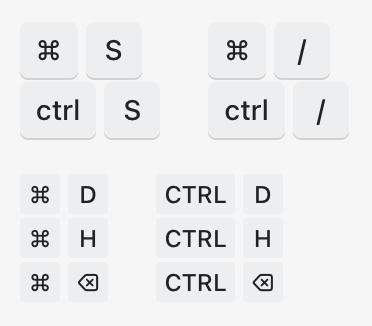
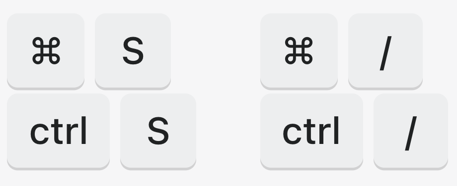
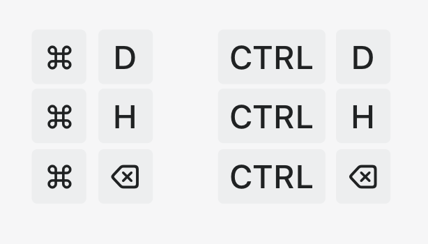
KeyboardKeycomponent and adds optionalsizeprop.Screenshots
Before:
Change
Default:
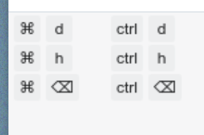
Small:
WHAT is this pull request doing?
Update
KeyboardKeycomponent to add an optional propertyvariant, which can takesmallas a value. AKeyboardKeycomponent with this variant will be used in tooltips to display the keyboard shortcut of an action.How to 🎩
🖥 Local development instructions
🗒 General tophatting guidelines
📄 Changelog guidelines
Copy-paste this code in
playground/Playground.tsx:🎩 checklist