[List] Add spacing property #7939
Conversation
size-limit report 📦
|
 acidio
force-pushed
the
list-component-spacing-prop
branch
from
acidio
force-pushed
the
list-component-spacing-prop
branch
from
fed1d9e to
049be15
Compare
 laurkim
left a comment
laurkim
left a comment
laurkim
left a comment
There was a problem hiding this comment.
Added a comment above about the margin for the last item in lists that needs to be updated to resolve the unintended UI changes it's causing.
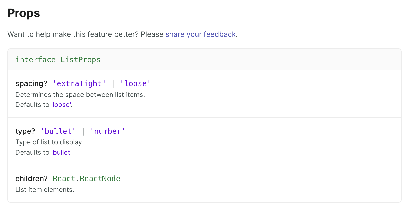
| export interface ListProps { | ||
| /** | ||
| * Determines the space between list items | ||
| * @default 'loose' |
There was a problem hiding this comment.
Tysm for adding context with JSDoc! 💯 🌟
 laurkim
force-pushed
the
list-component-spacing-prop
branch
from
laurkim
force-pushed
the
list-component-spacing-prop
branch
from
adaea17 to
7ae3aa4
Compare
laurkim
left a comment
laurkim
left a comment
There was a problem hiding this comment.
Changes lgtm 👍
I ran the yarn get-props script for our style guide to pick up the new spacing prop for the List component. There were merge conflicts on the props.json file when I tried to do it so I had to rebase this branch off latest main.
Updated List component page:
Oh, thank you, I didn't know about this command, TIL :) |
|
Closes #5791 |
This PR was opened by the [Changesets
release](https://github.com/changesets/action) GitHub action. When
you're ready to do a release, you can merge this and the packages will
be published to npm automatically. If you're not ready to do a release
yet, that's fine, whenever you add more changesets to main, this PR will
be updated.


# Releases
## @shopify/polaris@10.17.0

### Minor Changes

- [#7408](#7408)
[`7ffd87f7d`](7ffd87f)
Thanks [@laurkim](https://github.com/laurkim)! - - Refactored
`ChoiceList` to use primitive Layout components
    -   Added support for `legend` element to `Box`
    -   Added support for `fieldset` element to `AlphaStack`


- [#7978](#7978)
[`fb0ed3805`](fb0ed38)
Thanks [@kyledurand](https://github.com/kyledurand)! - Added
`printHidden` prop to `Box`


- [#7408](#7408)
[`7ffd87f7d`](7ffd87f)
Thanks [@laurkim](https://github.com/laurkim)! - Updated `Banner`
component to use new layout primitives


- [#7408](#7408)
[`7ffd87f7d`](7ffd87f)
Thanks [@laurkim](https://github.com/laurkim)! - Refactored `Modal` and
its children components to use layout primitives


- [#7963](#7963)
[`f94cf1496`](f94cf14)
Thanks [@aveline](https://github.com/aveline)! - Updated `AlphaStack`
docs for `align` prop


- [#7408](#7408)
[`7ffd87f7d`](7ffd87f)
Thanks [@laurkim](https://github.com/laurkim)! - Refactored
`AccountConnection` to use new layout primitives


- [#7915](#7915)
[`81fd3fd5b`](81fd3fd)
Thanks [@melaniedamilig](https://github.com/melaniedamilig)! - - Added
the `onAnimationEnd` prop to `Collapsible`
- Fixed a bug in `Filters` where focus was moved to collapsed filter
contents before the `Collapsible` animation ended


- [#7956](#7956)
[`30cdd2e23`](30cdd2e)
Thanks [@aveline](https://github.com/aveline)! - Updated `Box` allowable
aria roles


- [#7939](#7939)
[`8b31e3983`](8b31e39)
Thanks [@acidio](https://github.com/acidio)! - Added support for
`spacing` prop to List component allowing for a more compact list

### Patch Changes

- [#7925](#7925)
[`4e33e1ced`](4e33e1c)
Thanks [@jas7457](https://github.com/jas7457)! - Updated `IndexTable`
and `ProgressBar` to no longer log errors about deprecated
`React.findDOMNode`

## @shopify/plugin-polaris@0.0.23

### Patch Changes

- Updated dependencies
\[[`bfb537780`](bfb5377)]:
    -   @shopify/polaris-migrator@0.10.2

## @shopify/polaris-migrator@0.10.2

### Patch Changes

- [#7979](#7979)
[`bfb537780`](bfb5377)
Thanks [@samrose3](https://github.com/samrose3)! - Early exit if target
function isn't present for the scss-replace-duration and
scss-replace-easing migrations

- Updated dependencies
\[[`af0ceb8c6`](af0ceb8),
[`e7712e7a5`](e7712e7)]:
    -   @shopify/stylelint-polaris@5.0.2

## @shopify/stylelint-polaris@5.0.2

### Patch Changes

- [#7954](#7954)
[`af0ceb8c6`](af0ceb8)
Thanks [@aaronccasanova](https://github.com/aaronccasanova)! - Use
RegExp pattern to exclude reporting invalid scope disables and address
memory issues


- [#7919](#7919)
[`e7712e7a5`](e7712e7)
Thanks [@qt314](https://github.com/qt314)! - Deduped converage rules
that were in multiple categories

## polaris.shopify.com@0.28.0

### Minor Changes

- [#7963](#7963)
[`f94cf1496`](f94cf14)
Thanks [@aveline](https://github.com/aveline)! - Updated `AlphaStack`
docs for `align` prop

### Patch Changes

- [#7921](#7921)
[`502530597`](5025305)
Thanks [@martenbjork](https://github.com/martenbjork)! - Fixed border
radius of component images in the overview page.

- Updated dependencies
\[[`7ffd87f7d`](7ffd87f),
[`fb0ed3805`](fb0ed38),
[`7ffd87f7d`](7ffd87f),
[`7ffd87f7d`](7ffd87f),
[`f94cf1496`](f94cf14),
[`4e33e1ced`](4e33e1c),
[`7ffd87f7d`](7ffd87f),
[`81fd3fd5b`](81fd3fd),
[`30cdd2e23`](30cdd2e),
[`8b31e3983`](8b31e39)]:
    -   @shopify/polaris@10.17.0

Co-authored-by: github-actions[bot] <github-actions[bot]@users.noreply.github.com>
<!-- ☝️How to write a good PR title: - Prefix it with [ComponentName] (if applicable), for example: [Button] - Start with a verb, for example: Add, Delete, Improve, Fix… - Give as much context as necessary and as little as possible - Prefix it with [WIP] while it’s a work in progress --> ### WHY are these changes introduced? This PR is a follow up of[compact list](https://shopify.slack.com/archives/C4Y8N30KD/p1670936155108179) [the conversation about having a more](https://shopify.slack.com/archives/C4Y8N30KD/p1671128757572269?thread_ts=1670952079.108219&cid=C4Y8N30KD) for places in admin where we have limited space and where the page can get really long because of the amount of items on it. <details> <summary>Current example</summary> 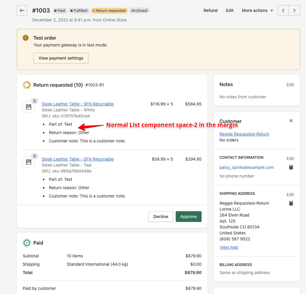 </details> <details> <summary>Intended example</summary>  </details> <!-- Context about the problem that’s being addressed. --> ### WHAT is this pull request doing? Adding a `spacing` property to the `List` component allowing us to have a more compact version of the list. The `spacing` options are `extraTight | loose`, the last been the default one so it doesn't break current usage. | Before | After | | - | - | | 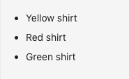 |  | <!-- Summary of the changes committed. Before / after screenshots are appreciated for UI changes. Make sure to include alt text that describes the screenshot. If you include an animated gif showing your change, wrapping it in a details tag is recommended. Gifs usually autoplay, which can cause accessibility issues for people reviewing your PR: <details> <summary>Summary of your gif(s)</summary> <img src="..." alt="Description of what the gif shows"> </details> --> <!-- ℹ️ Delete the following for small / trivial changes --> ### How to 🎩 🖥 [Local development instructions](https://github.com/Shopify/polaris/blob/main/README.md#local-development) 🗒 [General tophatting guidelines](https://github.com/Shopify/polaris/blob/main/documentation/Tophatting.md) 📄 [Changelog guidelines](https://github.com/Shopify/polaris/blob/main/.github/CONTRIBUTING.md#changelog) <!-- Give as much information as needed to experiment with the component in the playground. --> <details> <summary>Copy-paste this code in <code>playground/Playground.tsx</code>:</summary> ```jsx import React from 'react'; import {List, Page} from '../src'; export function Playground() { return ( <Page title="Playground"> <List spacing="extraTight"> <List.Item>Yellow shirt</List.Item> <List.Item>Red shirt</List.Item> <List.Item>Green shirt</List.Item> </List> </Page> ); } ``` </details> ### 🎩 checklist - [ ] Tested on [mobile](https://github.com/Shopify/polaris/blob/main/documentation/Tophatting.md#cross-browser-testing) - [x] Tested on [multiple browsers](https://help.shopify.com/en/manual/shopify-admin/supported-browsers) - [ ] Tested for [accessibility](https://github.com/Shopify/polaris/blob/main/documentation/Accessibility%20testing.md) - [ ] Updated the component's `README.md` with documentation changes - [ ] [Tophatted documentation](https://github.com/Shopify/polaris/blob/main/documentation/Tophatting%20documentation.md) changes in the style guide Co-authored-by: Lo Kim <lo.kim@shopify.com>
<!-- ☝️How to write a good PR title: - Prefix it with [ComponentName] (if applicable), for example: [Button] - Start with a verb, for example: Add, Delete, Improve, Fix… - Give as much context as necessary and as little as possible - Prefix it with [WIP] while it’s a work in progress --> ### WHY are these changes introduced? This PR is a follow up of[compact list](https://shopify.slack.com/archives/C4Y8N30KD/p1670936155108179) [the conversation about having a more](https://shopify.slack.com/archives/C4Y8N30KD/p1671128757572269?thread_ts=1670952079.108219&cid=C4Y8N30KD) for places in admin where we have limited space and where the page can get really long because of the amount of items on it. <details> <summary>Current example</summary>  </details> <details> <summary>Intended example</summary>  </details> <!-- Context about the problem that’s being addressed. --> ### WHAT is this pull request doing? Adding a `spacing` property to the `List` component allowing us to have a more compact version of the list. The `spacing` options are `extraTight | loose`, the last been the default one so it doesn't break current usage. | Before | After | | - | - | |  |  | <!-- Summary of the changes committed. Before / after screenshots are appreciated for UI changes. Make sure to include alt text that describes the screenshot. If you include an animated gif showing your change, wrapping it in a details tag is recommended. Gifs usually autoplay, which can cause accessibility issues for people reviewing your PR: <details> <summary>Summary of your gif(s)</summary> <img src="..." alt="Description of what the gif shows"> </details> --> <!-- ℹ️ Delete the following for small / trivial changes --> ### How to 🎩 🖥 [Local development instructions](https://github.com/Shopify/polaris/blob/main/README.md#local-development) 🗒 [General tophatting guidelines](https://github.com/Shopify/polaris/blob/main/documentation/Tophatting.md) 📄 [Changelog guidelines](https://github.com/Shopify/polaris/blob/main/.github/CONTRIBUTING.md#changelog) <!-- Give as much information as needed to experiment with the component in the playground. --> <details> <summary>Copy-paste this code in <code>playground/Playground.tsx</code>:</summary> ```jsx import React from 'react'; import {List, Page} from '../src'; export function Playground() { return ( <Page title="Playground"> <List spacing="extraTight"> <List.Item>Yellow shirt</List.Item> <List.Item>Red shirt</List.Item> <List.Item>Green shirt</List.Item> </List> </Page> ); } ``` </details> ### 🎩 checklist - [ ] Tested on [mobile](https://github.com/Shopify/polaris/blob/main/documentation/Tophatting.md#cross-browser-testing) - [x] Tested on [multiple browsers](https://help.shopify.com/en/manual/shopify-admin/supported-browsers) - [ ] Tested for [accessibility](https://github.com/Shopify/polaris/blob/main/documentation/Accessibility%20testing.md) - [ ] Updated the component's `README.md` with documentation changes - [ ] [Tophatted documentation](https://github.com/Shopify/polaris/blob/main/documentation/Tophatting%20documentation.md) changes in the style guide Co-authored-by: Lo Kim <lo.kim@shopify.com>
This PR was opened by the [Changesets
release](https://github.com/changesets/action) GitHub action. When
you're ready to do a release, you can merge this and the packages will
be published to npm automatically. If you're not ready to do a release
yet, that's fine, whenever you add more changesets to main, this PR will
be updated.


# Releases
## @shopify/polaris@10.17.0

### Minor Changes

- [Shopify#7408](Shopify#7408)
[`7ffd87f7d`](Shopify@7ffd87f)
Thanks [@laurkim](https://github.com/laurkim)! - - Refactored
`ChoiceList` to use primitive Layout components
    -   Added support for `legend` element to `Box`
    -   Added support for `fieldset` element to `AlphaStack`


- [Shopify#7978](Shopify#7978)
[`fb0ed3805`](Shopify@fb0ed38)
Thanks [@kyledurand](https://github.com/kyledurand)! - Added
`printHidden` prop to `Box`


- [Shopify#7408](Shopify#7408)
[`7ffd87f7d`](Shopify@7ffd87f)
Thanks [@laurkim](https://github.com/laurkim)! - Updated `Banner`
component to use new layout primitives


- [Shopify#7408](Shopify#7408)
[`7ffd87f7d`](Shopify@7ffd87f)
Thanks [@laurkim](https://github.com/laurkim)! - Refactored `Modal` and
its children components to use layout primitives


- [Shopify#7963](Shopify#7963)
[`f94cf1496`](Shopify@f94cf14)
Thanks [@aveline](https://github.com/aveline)! - Updated `AlphaStack`
docs for `align` prop


- [Shopify#7408](Shopify#7408)
[`7ffd87f7d`](Shopify@7ffd87f)
Thanks [@laurkim](https://github.com/laurkim)! - Refactored
`AccountConnection` to use new layout primitives


- [Shopify#7915](Shopify#7915)
[`81fd3fd5b`](Shopify@81fd3fd)
Thanks [@melaniedamilig](https://github.com/melaniedamilig)! - - Added
the `onAnimationEnd` prop to `Collapsible`
- Fixed a bug in `Filters` where focus was moved to collapsed filter
contents before the `Collapsible` animation ended


- [Shopify#7956](Shopify#7956)
[`30cdd2e23`](Shopify@30cdd2e)
Thanks [@aveline](https://github.com/aveline)! - Updated `Box` allowable
aria roles


- [Shopify#7939](Shopify#7939)
[`8b31e3983`](Shopify@8b31e39)
Thanks [@acidio](https://github.com/acidio)! - Added support for
`spacing` prop to List component allowing for a more compact list

### Patch Changes

- [Shopify#7925](Shopify#7925)
[`4e33e1ced`](Shopify@4e33e1c)
Thanks [@jas7457](https://github.com/jas7457)! - Updated `IndexTable`
and `ProgressBar` to no longer log errors about deprecated
`React.findDOMNode`

## @shopify/plugin-polaris@0.0.23

### Patch Changes

- Updated dependencies
\[[`bfb537780`](Shopify@bfb5377)]:
    -   @shopify/polaris-migrator@0.10.2

## @shopify/polaris-migrator@0.10.2

### Patch Changes

- [Shopify#7979](Shopify#7979)
[`bfb537780`](Shopify@bfb5377)
Thanks [@samrose3](https://github.com/samrose3)! - Early exit if target
function isn't present for the scss-replace-duration and
scss-replace-easing migrations

- Updated dependencies
\[[`af0ceb8c6`](Shopify@af0ceb8),
[`e7712e7a5`](Shopify@e7712e7)]:
    -   @shopify/stylelint-polaris@5.0.2

## @shopify/stylelint-polaris@5.0.2

### Patch Changes

- [Shopify#7954](Shopify#7954)
[`af0ceb8c6`](Shopify@af0ceb8)
Thanks [@aaronccasanova](https://github.com/aaronccasanova)! - Use
RegExp pattern to exclude reporting invalid scope disables and address
memory issues


- [Shopify#7919](Shopify#7919)
[`e7712e7a5`](Shopify@e7712e7)
Thanks [@qt314](https://github.com/qt314)! - Deduped converage rules
that were in multiple categories

## polaris.shopify.com@0.28.0

### Minor Changes

- [Shopify#7963](Shopify#7963)
[`f94cf1496`](Shopify@f94cf14)
Thanks [@aveline](https://github.com/aveline)! - Updated `AlphaStack`
docs for `align` prop

### Patch Changes

- [Shopify#7921](Shopify#7921)
[`502530597`](Shopify@5025305)
Thanks [@martenbjork](https://github.com/martenbjork)! - Fixed border
radius of component images in the overview page.

- Updated dependencies
\[[`7ffd87f7d`](Shopify@7ffd87f),
[`fb0ed3805`](Shopify@fb0ed38),
[`7ffd87f7d`](Shopify@7ffd87f),
[`7ffd87f7d`](Shopify@7ffd87f),
[`f94cf1496`](Shopify@f94cf14),
[`4e33e1ced`](Shopify@4e33e1c),
[`7ffd87f7d`](Shopify@7ffd87f),
[`81fd3fd5b`](Shopify@81fd3fd),
[`30cdd2e23`](Shopify@30cdd2e),
[`8b31e3983`](Shopify@8b31e39)]:
    -   @shopify/polaris@10.17.0

Co-authored-by: github-actions[bot] <github-actions[bot]@users.noreply.github.com>
2 participants
WHY are these changes introduced?
This PR is a follow up ofcompact list the conversation about having a more for places in admin where we have limited space and where the page can get really long because of the amount of items on it.
Current example
Intended example
WHAT is this pull request doing?
Adding a
spacingproperty to theListcomponent allowing us to have a more compact version of the list.The
spacingoptions areextraTight | loose, the last been the default one so it doesn't break current usage.How to 🎩
🖥 Local development instructions
🗒 General tophatting guidelines
📄 Changelog guidelines
Copy-paste this code in
playground/Playground.tsx:🎩 checklist
README.mdwith documentation changes