Reviewer UI (first version) #57
Merged
Conversation
This file contains hidden or bidirectional Unicode text that may be interpreted or compiled differently than what appears below. To review, open the file in an editor that reveals hidden Unicode characters.
Learn more about bidirectional Unicode characters
55916ba to
086e9da
Compare
|
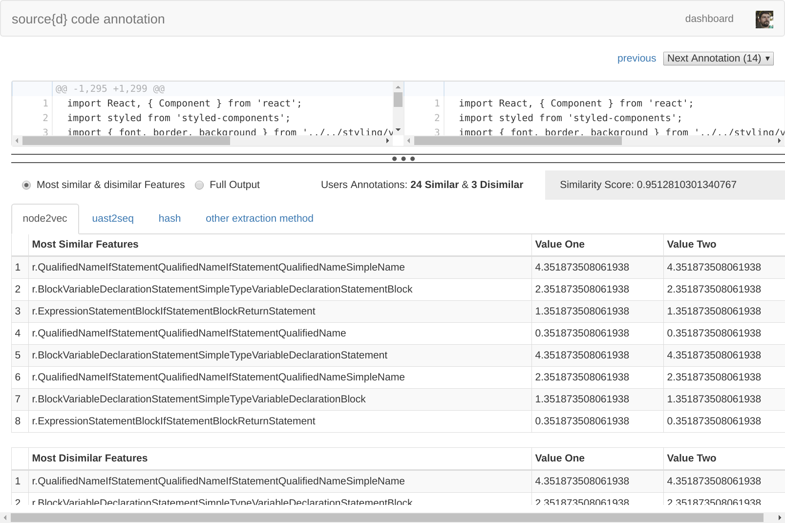
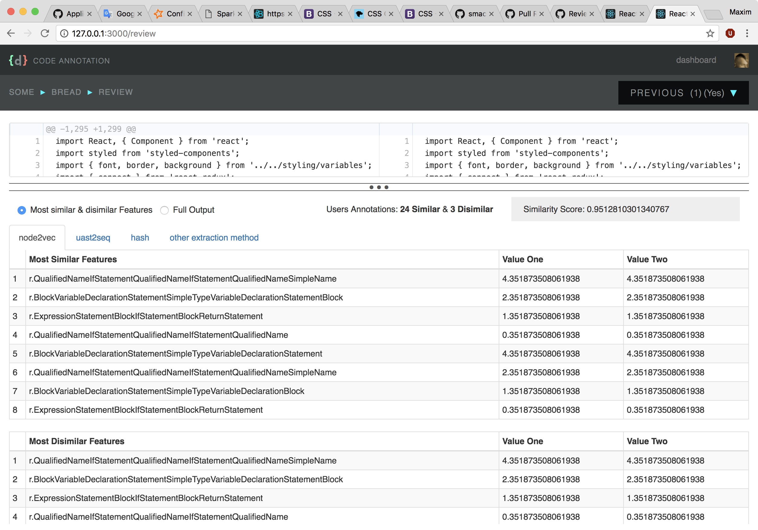
@smacker great! For changes that touch UI part, I find that also having a screenshot attached to PR helps to speed up the review process. |
|
@bzz screenshot added |
086e9da to
2de0966
Compare
|
Looks like a very good first version I've seen just one issue, the contents appear to go past the width no matter my window size: And a couple of comments:
|
carlosms
approved these changes
Feb 8, 2018
|
Thanks, @carlosms I didn't have the bug with the width of the table. Will try to reproduce. I want to rebase this PR using new components, so @ricardobaeta will be able to start doing visual design on this page without reimplementing the work he did already for annotation page. |
efa560c to
36e9216
Compare
|
Rebased on #65 to unlock Ricardo.
Problem with table width is fixed. |
Signed-off-by: Maxim Sukharev <maxim@sourced.tech>
36e9216 to
41cc887
Compare
4 tasks
Sign up for free
to join this conversation on GitHub.
Already have an account?
Sign in to comment
3 participants
Add this suggestion to a batch that can be applied as a single commit.
This suggestion is invalid because no changes were made to the code.
Suggestions cannot be applied while the pull request is closed.
Suggestions cannot be applied while viewing a subset of changes.
Only one suggestion per line can be applied in a batch.
Add this suggestion to a batch that can be applied as a single commit.
Applying suggestions on deleted lines is not supported.
You must change the existing code in this line in order to create a valid suggestion.
Outdated suggestions cannot be applied.
This suggestion has been applied or marked resolved.
Suggestions cannot be applied from pending reviews.
Suggestions cannot be applied on multi-line comments.
Suggestions cannot be applied while the pull request is queued to merge.
Suggestion cannot be applied right now. Please check back later.
Part of #47
Based on #45
It's a little different from wireframes:
P.S. There is some magic of mixing grid with flexbox because I had no choice.