In-Browser Visual Design #53
Conversation
|
@ricardobaeta I added a screenshot to the PR description. It's something that should be mandatory in PR modifying the UI ;) |
| border-radius: 0; | ||
| height: 39px; | ||
| padding-left: 4px; | ||
| width: 64px; |
There was a problem hiding this comment.
If you jump to an assignation with already provided feedback, the selector is broken.

I think that with should be as wider as the longest value possible.
There was a problem hiding this comment.
Yes @dpordomingo . It will be addressed when dealing with the component.
|
|
||
| a:hover { | ||
| text-decoration: none; | ||
| color: #fff; |
There was a problem hiding this comment.
when the user is in the finish stage, the hover effect is not visible

There was a problem hiding this comment.
@dpordomingo All stages are going to be visually designed as well. From start to finish. For now we're only addressing the annotation screen.
|
|
||
| .navbar-default .navbar-nav > li > a:hover { | ||
| text-decoration: none; | ||
| color: #fff; |
There was a problem hiding this comment.
when the user is in the finish stage, the hover effect is not visible

There was a problem hiding this comment.
@dpordomingo Same as previous comment. Thank you :)
| .ex-footer { | ||
| border-top: @navbar-default-border; | ||
| margin-bottom: 20px; | ||
| background: #2c3132; |
There was a problem hiding this comment.
I found many repeated colors.
- Do you think would be a good idea to have a
palette.lessstylesheet to define each color, and then reuse its values? - We have 18 different colors. Do you think that the palette could be compressed more considering the most similar?
Here are the colors I found in our app:
(duplicated color, means it is repeated in different places in our stylesheets)
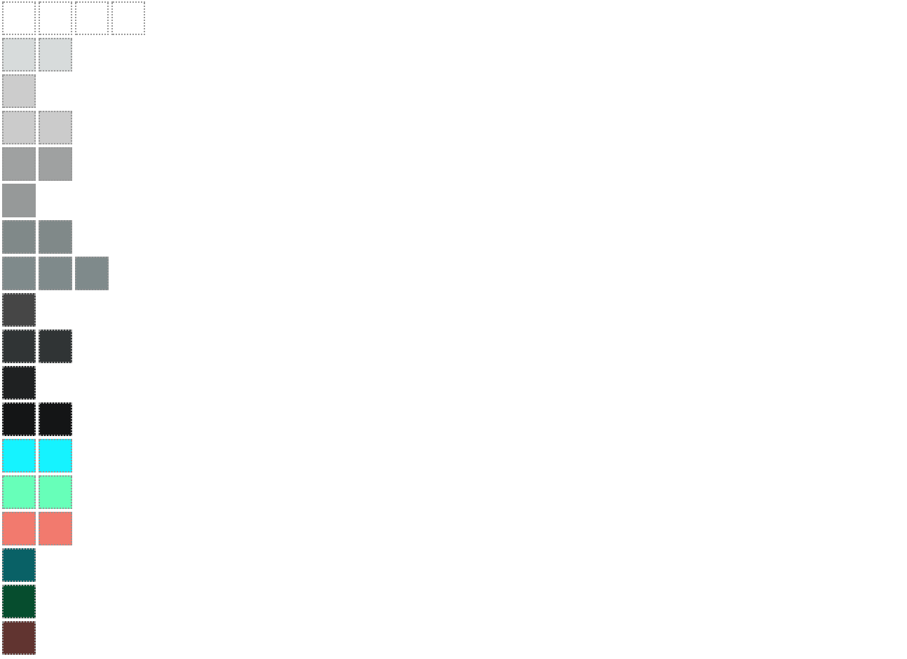
in raw:
#ffffff x4
#d8dcdc x2
rgba(0, 0, 0, 0.2)
#cccccc x2
#a0a2a2 x2
#979a9a
#818a8a x2
#808b8c x3
#444444
#2c3132 x2
#191b1c
#0c0d0e x2
#00f3ff x2
#66ffba x2
#f37b6f x2
#006166
#004c2a
#61312c
src/components/PageHeader.js
Outdated
| <Navbar.Header> | ||
| <Navbar.Brand> | ||
| <a href="/">source{'{d}'} code annotation</a> | ||
| <h1><a href="/"><img alt="source{d} code annotation" src="/sourced-code-annotation-logo.svg" />code annotation</a></h1> |
There was a problem hiding this comment.
The CI fails because this piece of code is not properly indented.
It should be:
        <Navbar.Brand>
          <h1>
            <a href="/">
              <img
                alt="source{d} code annotation"
                src="/sourced-code-annotation-logo.svg"
              />
              code annotation
            </a>
          </h1>
</Navbar.Brand>There was a problem hiding this comment.
@dpordomingo Thanks, done!
|
It looks awesome! How would we proceed @ricardobaeta from here ? Usual flow would be that PR creator would solicit the feedback and incorporate it into this branch. |
|
I'm thinking about to take some code from here and create new PR with few components like that new "select" component, new buttons, breadcrumbs. They won't be used yet, but we will have high-quality code in master with them. After that, we can update UI to this dark theme and use those new components. What do you think guys? @bzz @ricardobaeta @dpordomingo |
|
@smacker I would say that I would address first the comments & suggestion on this PR. We're trying a workflow here, wireframes > implementation > visual design in-browser, and I would say we need to learn if this is a good fit for us and get the results of the experiment. Today I'll address the comments & suggestions and update the PR. What would you say @bzz ? |
|
@ricardobaeta the problem is we can't merge it as it is now. Some work which is done here is going to be common for different pages. That's why they must be moved to components. |
|
an alternative could be that @ricardobaeta would rebase this PR over current |
|
@dpordomingo The current master would have already the components? |
|
nope, but it would solve the conflicts, and the code after being merged could be the starting point for @smacker to extract components. |
db31402 to
78ee51e
Compare
|
@dpordomingo @smacker Commited changes and forced pushed. |
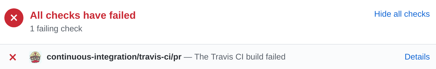
There was a problem hiding this comment.
LGTM, but not to Travis CI.
You can check the error clicking in Details button, and then (in Travis) scrolling down to spot the errors.
To ensuring there is no errors in the things you are about to commit, you can run before commiting:
CI=1 make test-frontend;
CI=1 make lint;
Both commands should pass properly before committing in order to obtain the green icon by our CI.
src/pages/Experiment.less
Outdated
| letter-spacing: 1px; | ||
| padding-right: 8px; | ||
| padding-top: 1px; | ||
| } |
There was a problem hiding this comment.
missing new line;
all files should finish with (only one) line break.
There was a problem hiding this comment.
Thanks @dpordomingo ! Will iterate, commit and push.
|
@ricardobaeta @smacker @dpordomingo @ricardobaeta - is there anything except CI and #53 (comment) that blocks merge it? If not, let's address it and merge asap, so it can be 'componentized' in subsequent PRs from there. |
|
@bzz the main problem is broken pages. Finish/Review pages will look bad if we merge it. That's why I suggest to make components first and then apply them. |
|
@smacker I think it's ok to merge faster, basically as soon as feedback from above is addressed, even if new pages would not look not so good, but they can be fixed in subsequent PRs.
Sorry, I must have missed this. Could you please attach a link to the issue as well? |
|
as you wish. But I prefer don't break master much. |
|
Already addressed the new line at end of file as requested. For now, as I understand, from my side all things are ok. |
|
Not yet, sorry @ricardobaeta
And it should be:
To do so, you can follow this hint #53 (review) if you need assistance, ping me when I arrive the office (~12:30), and I'll help you with that 🗡️ |
|
Reworked PR: #65 |
Initial work on Code Annotation Visual Design
caa4d11 to
6d2cb3c
Compare
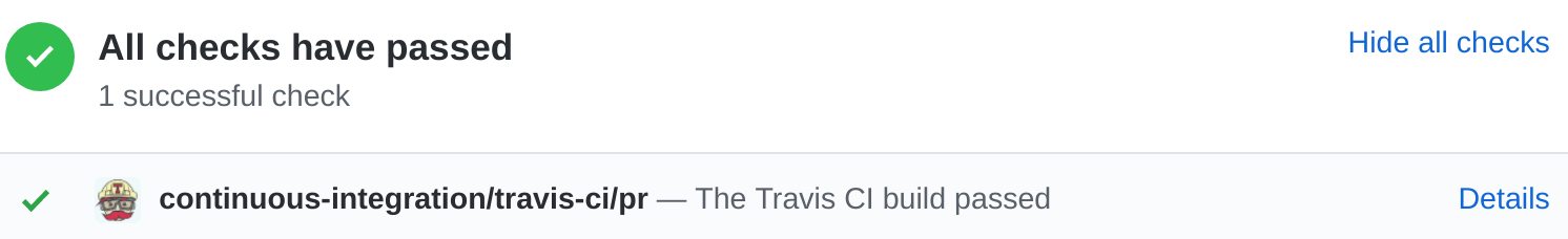
There was a problem hiding this comment.
LGTM
Great work @ricardobaeta
Could you?
- open an issue with pending things
- squash before merging
|
@ricardobaeta The only thing to address is:
|
|
@dpordomingo #68 ;) |
Multiple updates, clean and improvements
@bzz @smacker @dpordomingo @carlosms
This is the initial work on Code Annotation Visual Design. Only the annotation UI is designed yet. The other UI's are still subject to further design.
I would like to propose to apply a dark theme to the code visualisation and syntax highlighting as well.
Excuse me for the less mistakes, and some other changes that will imply changing code structure.
I have ideas on further developments that I will address as features requests.