Enhanced Learn's landing page #1271
Conversation
|
@avsm and @patricoferris, sorry to disturb at the moment. |
|
Thanks for this! I've pushed it to the staging.ocaml.org so it can be inspected. |
|
@avsm Thank you once again for reviewing it. 🙏 |
|
Hi @IIITM-Jay, Thanks for the hard work. I was reviewing this quickly on staging.ocaml.org and I think maybe it can be improved for mobile devices. What do you think?
|
|
Thank you @patricoferris for your valuable suggestions and feedback. Surely, I will push some more commits with respect to the appropriate modifications required. 🙏 |
New Changes Incorporated
Resultant Output
|
|
Hi @patricoferris , Meanwhile appropriate and necessary changes are made to the French Version. cc: @avsm |
|
Hi @patricoferris is the above layout okay for mobile devices |
|
Hi @avsm, I think now the conflicts has been resolved successfully 🙏 |
|
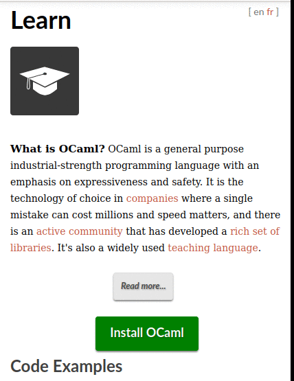
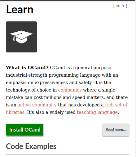
Hi @IIITM-Jay sorry for not getting round to this. I'm not completely convinced by the layout of the mobile version, the large hat on its own, the body of text and then two buttons doesn't flow as well as I think it could. Perhaps we could take inspiration from #1254? |
Hi @patricoferris, I am not clear by the large hat on its own, may I request for any further elaboration... |
|
@avsm, may I request any feedback from your side on this... 🙏 |
|
Hi @patricoferris,
I am planning to complete these three works, as a part of revamping learn's landing page, in three different PRs in order to avoid difficulties while reviewing it and also to make sure that there should not be any confusion when changes have to be made in the same file for three different goals, in case may arise. Having said this, I have worked on it, to have the proper matching alignments in order to give the following view:
Hence, may I request @patricoferris for your valuable suggestions and feedback 🙏, so that I can proceed further for pushing the required commit. |
|
Now pushed to staging.ocaml.org to verify it vs the current live site. |
|
sorry, @avsm I had only attached the screenshot of the changes that I have done locally in my last comment and was collecting feedback and respective suggestions on the same and then was thinking to push the required commit after having met all the necessary requirements (mentioned too in my comment). Therefore, may I request to push it again on the staging site so that we can be able to see the desired changes 🙏 |
|
Hi, @patricoferris, any further feedback and valuable suggestions from your side... |
|
This has now been pushed to the staging.ocaml.org site with the latest version of the changeset. |
|
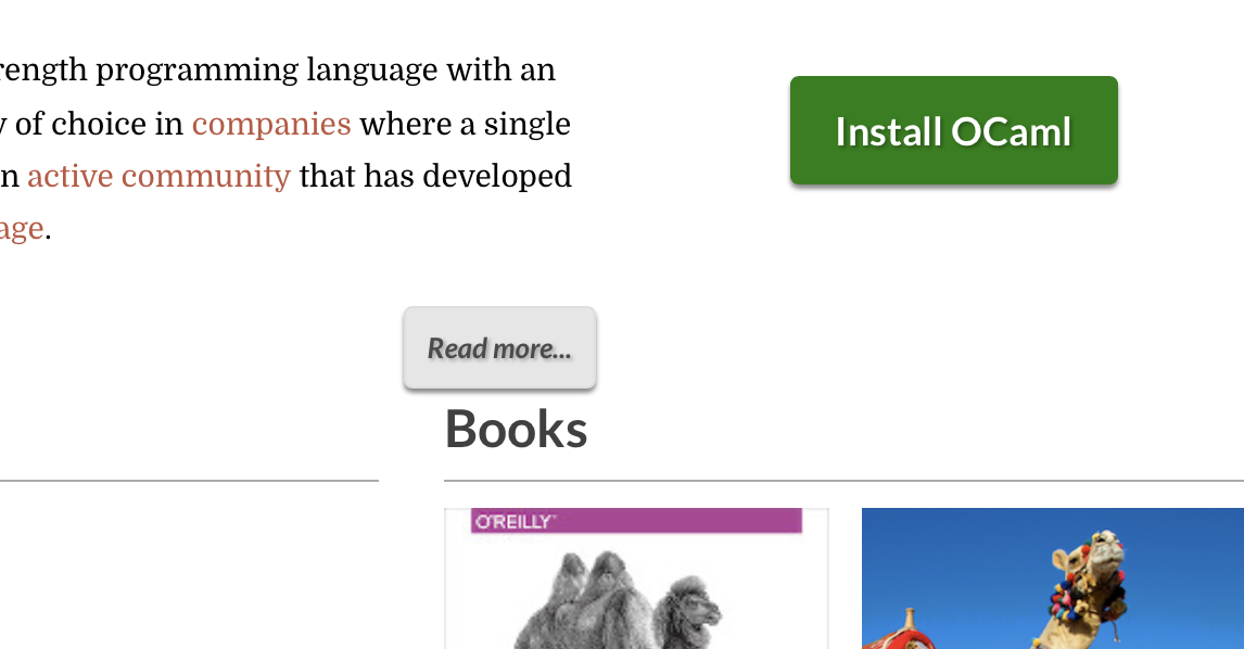
Just one tweak here; see the spacing on a larger desktop: it would be nice if there was more padding between the "read more" and the section below.
|
|
Just converting this to a draft PR until @IIITM-Jay has a chance to make the changes requested by @patricoferris |
Issues
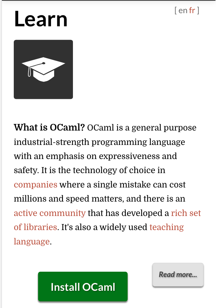
Currently the Read more link is written (with small tag) in continuation with the Introductory paragraph of the Learn's landing page, consequently which is not able to give more emphasis on the Read more link.
Changes Incorporated
Resultant Output as expected
Additional Changes