Chakra UI: Migrate Action card #8009
Conversation
 nikkhielseath
requested review from
corwintines,
jmcook1186,
minimalsm,
pettinarip,
samajammin and
wackerow
as code owners
nikkhielseath
requested review from
corwintines,
jmcook1186,
minimalsm,
pettinarip,
samajammin and
wackerow
as code owners
 nikkhielseath
changed the title
nikkhielseath
changed the title
✅ ethereum-org-website-dev deploy preview ready
|
src/components/ActionCard.tsx
Outdated
| <ImageWrapper | ||
| isRight={isRight} | ||
| isBottom={isBottom} | ||
| <Link |
There was a problem hiding this comment.
Instead of wrapping this component with a Link, lets use the LinkOverlay component that Chakra offers for this specific scenario https://chakra-ui.com/docs/components/link-overlay/usage
I did a similar implementation in #7721
There was a problem hiding this comment.
Ahh, I see. So, if I understand the usage correctly, the whole card will be wrapped in a LinkBox and then, I can just wrap the heading in a LinkOverlay
And the LinkBox will elevate this link in a way that to the user it looks like the whole card is a link.
src/components/ActionCard.tsx
Outdated
| transform: scale(1.02); | ||
| } | ||
| ` | ||
| const LinkFocusStyles = { |
There was a problem hiding this comment.
| const LinkFocusStyles = { | |
| const linkFocusStyles = { |
src/components/ActionCard.tsx
Outdated
| ` | ||
| const LinkFocusStyles = { | ||
| textDecoration: "none", | ||
| borderRadius: "4px", |
There was a problem hiding this comment.
| borderRadius: "4px", | |
| borderRadius: "base", |
src/components/ActionCard.tsx
Outdated
| minH={"260px"} | ||
| bg={"cardGradient"} | ||
| direction={"row"} |
There was a problem hiding this comment.
| minH={"260px"} | |
| bg={"cardGradient"} | |
| direction={"row"} | |
| minH="260px" | |
| bg="cardGradient" | |
| direction="row" |
| direction={"row"} | ||
| justify={isRight ? "flex-end" : "center"} | ||
| align={isBottom ? "flex-end" : "center"} | ||
| className="action-card-image-wrapper" |
There was a problem hiding this comment.
- @pettinarip remove & refactor this class
src/components/ActionCard.tsx
Outdated
| className="action-card-image-wrapper" | ||
| boxShadow="inset 0px -1px 0px rgba(0, 0, 0, 0.1)" | ||
| > | ||
| {!isImageURL && <Image image={image} alt={alt || ""} />} |
There was a problem hiding this comment.
Lets use the Image from Chakra. https://chakra-ui.com/docs/components/image/usage
<Image as="GatsbyImage" ...>| </Content> | ||
| </Card> | ||
| </Flex> | ||
| <Box p={6} className="action-card-content"> |
There was a problem hiding this comment.
- @pettinarip remove & refactor this class
Make use of LinkBox
and LinkOverlay from
ChakraUI instead of
wrapping the whole
component with a Link
nikkhielseath
force-pushed
the
refactor/#6374-action-card
branch
from
ea95b32 to
1fb7316
Compare
nikkhielseath
force-pushed
the
refactor/#6374-action-card
branch
from
fcd4c05 to
70159a0
Compare
| </Flex> | ||
| <Box p={6} className="action-card-content"> | ||
| <Heading as="h3" fontSize="2xl" mt={2} mb={4}> | ||
| <LinkOverlay |
There was a problem hiding this comment.
Wrapping the title with LinkOverlay based on the suggested refactor
| <ImageWrapper | ||
| isRight={isRight} | ||
| isBottom={isBottom} | ||
| <LinkBox |
There was a problem hiding this comment.
I have divided the Link styles between LinkBox and Overlay.
src/components/ActionCard.tsx
Outdated
| alt={alt || ""} | ||
| as={GatsbyImage} | ||
| maxH="257px" | ||
| maxW={{ base: "372px", sm: "311px" }} |
There was a problem hiding this comment.
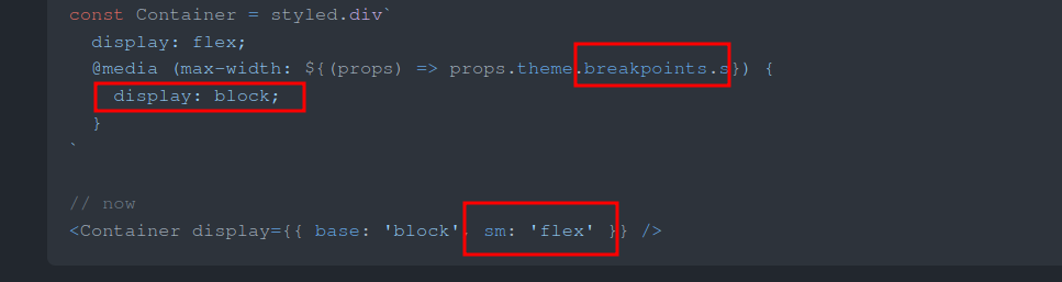
Okay, as suggested, I am using Image. The breakpoint thing was nice to know about. Thank you for mentioning that in the Migration Guide. But, just to inform you the example the in Migration Guide is inversed.
There was a problem hiding this comment.
@SNikhill keep in mind here that in this example you provided and the Image with styled components are using a max-width media query, but when using Chakra tokens by default use min-width. So the example in the migration guide is actually correct! 😄
Therefore, what you provided needs to be reversed.
| maxW={{ base: "372px", sm: "311px" }} | |
| maxW={{ base: "311px", sm: "372px" }} |
There was a problem hiding this comment.
Ahh, okay. Thank you for explaining that.
There was a problem hiding this comment.
Hey @SNikhill !
Following up on this PR as it has grown a little stale. I've provided some thoughts. 😸
An aside: @pettinarip It appears that this component has an existing broken layout (Check at roughly 414px - 500px screen widths). Probably save a fix for post migration in a separate PR?
src/components/ActionCard.tsx
Outdated
| alt={alt || ""} | ||
| as={GatsbyImage} | ||
| maxH="257px" | ||
| maxW={{ base: "372px", sm: "311px" }} |
There was a problem hiding this comment.
@SNikhill keep in mind here that in this example you provided and the Image with styled components are using a max-width media query, but when using Chakra tokens by default use min-width. So the example in the migration guide is actually correct! 😄
Therefore, what you provided needs to be reversed.
| maxW={{ base: "372px", sm: "311px" }} | |
| maxW={{ base: "311px", sm: "372px" }} |
src/components/ActionCard.tsx
Outdated
| {title} | ||
| </LinkOverlay> | ||
| </Heading> | ||
| <Text mb={0} opacity={0.8}> |
There was a problem hiding this comment.
opacity will break the LinkBox behavior when hovering over this text due to CSS Stacking context, resulting in the text not being clickable. I suggest the following to maintain accessibility with color contrast.
This requires the use of the
useColorModeValuehook from Chakra
Before the component return:
const descriptionColor = useColorModeValue("blackAlpha.700", "whiteAlpha.800")and then...
| <Text mb={0} opacity={0.8}> | |
| <Text mb={0} color={descriptionColor}> |
There was a problem hiding this comment.
Thank you for the information! I have made the change.
Co-authored-by: Tyler Pfledderer <tyler.pfledderer@gmail.com>
|
Congrats, your important contribution to this open-source project has earned you a GitPOAP! Be sure to join the Ethereum.org discord if you are interested in contributing further to the project or have any questions for the team. GitPOAP: 2023 Ethereum.org Contributor: Head to gitpoap.io & connect your GitHub account to mint! Learn more about GitPOAPs here. |
4 participants
Migrating styles from Styled Components to Chakra UI
Description
Refactor the ActionCard component to use
the components provided by Chakra UI
Related Issue