Rebuild EmptyState component with layout primitives
#7809
Conversation
size-limit report 📦
|
Closes: #7580 This slightly moves the checkbox handle 2px to the left. This means it now lines up with our 20px padding instead of 22px from the card edge. Also improves vertical alignment of the checkboxes and bulk select on xs screens Before | After ---|--- 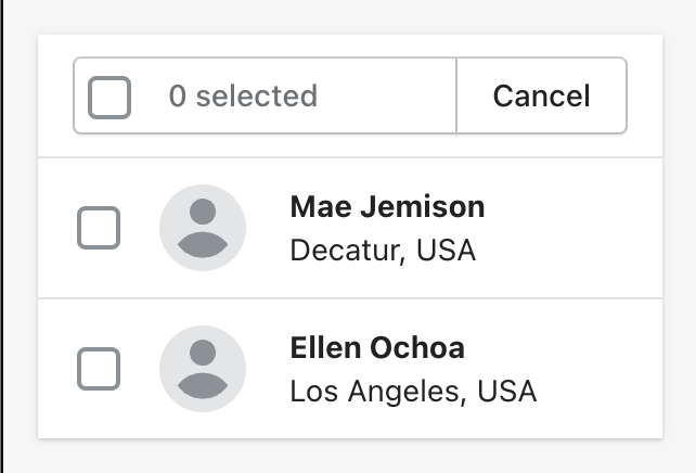 | 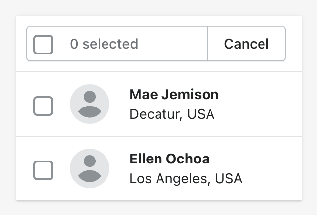 The only CSS that remains is for interactive elements, interactive behavior (hover, focus), and transitions (which are being removed in https://github.com/Shopify/polaris/pull/7290/files).
|
Hi Yuraima, if I understood everything correctly, 5px padding is totally fine. Actually I am surprised that we didn't have any paddings. I guess we rely on illustration having paddings themselves. Anyhow, I think this is fine! |
### WHY are these changes introduced?

Fixes #7458

Co-authored-by: Lo Kim <lo.kim@shopify.com>
| } | ||
| } | ||
|
|
||
| .imageContained { |
There was a problem hiding this comment.
had to keep this class because we don't do responsive props in Image
| --pc-stack-gap-xl: var(--pc-stack-gap-lg); | ||
| display: flex; | ||
| flex-direction: column; | ||
| flex-direction: var(--pc-stack-order); |
There was a problem hiding this comment.
we need to set flex-direction: column-reverser for the withinContentContainer style below so adding order AlphaStack
There was a problem hiding this comment.
I would break out the update to AlphaStack and create a separate PR against main. That way reverseOrder is immediately available on AlphaStack in case others need to use it. Otherwise the change will be stuck on this branch which isn't going to get merged in for a while yet.
| parameters: { | ||
| // Sets a delay for EmptyState because there is a slight layout shift | ||
| // when first rendered. | ||
| chromatic: {delay: 300}, |
There was a problem hiding this comment.
trying this out in response to the height shift difference in the chromatic test
…erse` (#7842)

<!--
  ☝️How to write a good PR title:
- Prefix it with [ComponentName] (if applicable), for example: [Button]
  - Start with a verb, for example: Add, Delete, Improve, Fix…
  - Give as much context as necessary and as little as possible
  - Prefix it with [WIP] while it’s a work in progress
-->

### WHY are these changes introduced?

We need `flex-direction: column-reverse` in order to rebuild
`EmptyState`. Adding this to `AlphaStack`

Supports #7809

<!--
  Context about the problem that’s being addressed.
-->

### WHAT is this pull request doing?

<!--
  Summary of the changes committed.

Before / after screenshots are appreciated for UI changes. Make sure to
include alt text that describes the screenshot.

If you include an animated gif showing your change, wrapping it in a
details tag is recommended. Gifs usually autoplay, which can cause
accessibility issues for people reviewing your PR:

    <details>
      <summary>Summary of your gif(s)</summary>
      <img src="..." alt="Description of what the gif shows">
    </details>
-->

<!-- ℹ️ Delete the following for small / trivial changes -->

### How to 🎩

🖥 [Local development
instructions](https://github.com/Shopify/polaris/blob/main/README.md#local-development)
🗒 [General tophatting
guidelines](https://github.com/Shopify/polaris/blob/main/documentation/Tophatting.md)
📄 [Changelog
guidelines](https://github.com/Shopify/polaris/blob/main/.github/CONTRIBUTING.md#changelog)

<!--
  Give as much information as needed to experiment with the component
  in the playground.
-->

<details>
<summary>Copy-paste this code in
<code>playground/Playground.tsx</code>:</summary>

```jsx
import React from 'react';
import {Page} from '../src';

export function Playground() {
  return (
    <Page title="Playground">
      {/* Add the code you want to test in here */}
    </Page>
  );
}
```

</details>

### 🎩 checklist

- [ ] Tested on
[mobile](https://github.com/Shopify/polaris/blob/main/documentation/Tophatting.md#cross-browser-testing)
- [ ] Tested on [multiple
browsers](https://help.shopify.com/en/manual/shopify-admin/supported-browsers)
- [ ] Tested for
[accessibility](https://github.com/Shopify/polaris/blob/main/documentation/Accessibility%20testing.md)
- [ ] Updated the component's `README.md` with documentation changes
- [ ] [Tophatted
documentation](https://github.com/Shopify/polaris/blob/main/documentation/Tophatting%20documentation.md)
changes in the style guide
b39c6cc to
c63d455
Compare
b3ea392 to
c85cb2d
Compare
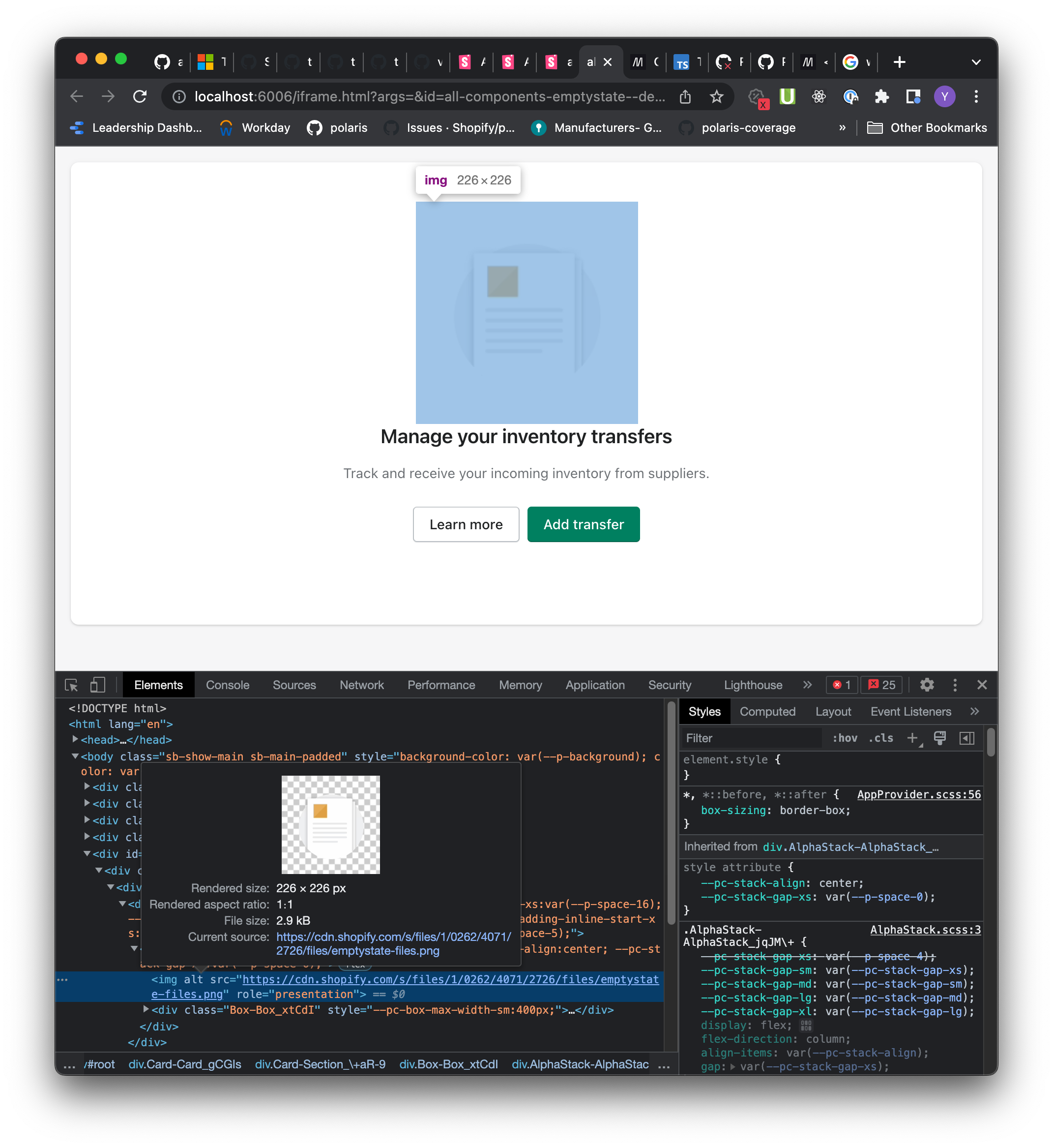
Fixes [#7564](#7564)

- Remove max-width from AlphaStack
- Rebuild EmptyState with layout components

DEPENDS ON #7842. Merge that in first then bring
`layout-rebuild-batch-2` up to date with `main` and then merge in those
changes into this branch

### [✅ RESOLVED] UX Review
There is a discrepancy in the size of the image container. The update
`EmptyState` component image container is 5px smaller in height than the
production one. The comparison below shows the production version
(first) vs the update component (second). This results in about 5px
additional whitespace in the prod version. This different is due to the
production version relying on a flex property on the image container
that we don't currently implement. Is this difference acceptable or
should we adjust the image container size somehow?

<details>
<summary>Compare image container whitespace before and after</summary>


https://user-images.githubusercontent.com/4642404/204934759-3363b103-5118-4335-ab87-79edaa5d0634.mov

Production image size
<img width="1071" alt="prod-size"
src="https://user-images.githubusercontent.com/4642404/204935557-dc3ea1c8-778f-4644-8c2b-62d524b2f03b.png">

Updated ima
<img width="1071" alt="updated-size"
src="https://user-images.githubusercontent.com/4642404/204935620-be70ec16-0ece-432e-9105-64e94ba2525c.png">


</details>

Co-authored-by: Kyle Durand <kyledurand@users.noreply.github.com>
Co-authored-by: aveline <aveline@users.noreply.github.com>
Co-authored-by: Lo Kim <lo.kim@shopify.com>
Co-authored-by: Chaz Dean <59836805+chazdean@users.noreply.github.com>
…erse` (Shopify#7842)

<!--
  ☝️How to write a good PR title:
- Prefix it with [ComponentName] (if applicable), for example: [Button]
  - Start with a verb, for example: Add, Delete, Improve, Fix…
  - Give as much context as necessary and as little as possible
  - Prefix it with [WIP] while it’s a work in progress
-->

### WHY are these changes introduced?

We need `flex-direction: column-reverse` in order to rebuild
`EmptyState`. Adding this to `AlphaStack`

Supports Shopify#7809

<!--
  Context about the problem that’s being addressed.
-->

### WHAT is this pull request doing?

<!--
  Summary of the changes committed.

Before / after screenshots are appreciated for UI changes. Make sure to
include alt text that describes the screenshot.

If you include an animated gif showing your change, wrapping it in a
details tag is recommended. Gifs usually autoplay, which can cause
accessibility issues for people reviewing your PR:

    <details>
      <summary>Summary of your gif(s)</summary>
      <img src="..." alt="Description of what the gif shows">
    </details>
-->

<!-- ℹ️ Delete the following for small / trivial changes -->

### How to 🎩

🖥 [Local development
instructions](https://github.com/Shopify/polaris/blob/main/README.md#local-development)
🗒 [General tophatting
guidelines](https://github.com/Shopify/polaris/blob/main/documentation/Tophatting.md)
📄 [Changelog
guidelines](https://github.com/Shopify/polaris/blob/main/.github/CONTRIBUTING.md#changelog)

<!--
  Give as much information as needed to experiment with the component
  in the playground.
-->

<details>
<summary>Copy-paste this code in
<code>playground/Playground.tsx</code>:</summary>

```jsx
import React from 'react';
import {Page} from '../src';

export function Playground() {
  return (
    <Page title="Playground">
      {/* Add the code you want to test in here */}
    </Page>
  );
}
```

</details>

### 🎩 checklist

- [ ] Tested on
[mobile](https://github.com/Shopify/polaris/blob/main/documentation/Tophatting.md#cross-browser-testing)
- [ ] Tested on [multiple
browsers](https://help.shopify.com/en/manual/shopify-admin/supported-browsers)
- [ ] Tested for
[accessibility](https://github.com/Shopify/polaris/blob/main/documentation/Accessibility%20testing.md)
- [ ] Updated the component's `README.md` with documentation changes
- [ ] [Tophatted
documentation](https://github.com/Shopify/polaris/blob/main/documentation/Tophatting%20documentation.md)
changes in the style guide
Fixes #7564
DEPENDS ON #7842. Merge that in first then bring
layout-rebuild-batch-2up to date withmainand then merge in those changes into this branch[✅ RESOLVED] UX Review
There is a discrepancy in the size of the image container. The update
EmptyStatecomponent image container is 5px smaller in height than the production one. The comparison below shows the production version (first) vs the update component (second). This results in about 5px additional whitespace in the prod version. This different is due to the production version relying on a flex property on the image container that we don't currently implement. Is this difference acceptable or should we adjust the image container size somehow?Compare image container whitespace before and after
compare-empty-state.mov
Production image size

Updated ima
