Skip to content
Merged
Show file tree
Hide file tree
Changes from all commits
Commits
File filter

Filter by extension

Filter by extension

Conversations
Failed to load comments.
Loading
Jump to
Jump to file
Failed to load files.
Loading
Diff view
Diff view
17 changes: 8 additions & 9 deletions _includes/Header.html
Original file line number Diff line number Diff line change
Expand Up @@ -37,21 +37,20 @@
</svg>
<h4>Digital Garden</h4>
</a>
<a role="button" class="navbar-burger" aria-label="menu" aria-expanded="false" data-target="navbarBasicExample">
<span aria-hidden="true"></span>
</a>
<!-- TODO: Show darkmode in mobile -->
<div class="navbar-item is-hidden">
<div class="navbar-item navbar-dark-mode__mobile is-hidden-tablet" onclick="modeSwitcher()">
<div class="buttons">
<a class="button is-text">
<span class="icon is-small">
<img src="../assets/img/sun.svg">
<img src="../assets/img/sun.svg" id="theme-toggle-img--mobile">
</span>
</a>
</div>
</div>
<a role="button" class="navbar-burger" aria-label="menu" aria-expanded="false" data-target="navbarBasicExample">
<span aria-hidden="true"></span>
</a>
</div>

<div id="navbarBasicExample" class="navbar-menu">
Expand Down Expand Up @@ -82,5 +81,5 @@ <h4>Digital Garden</h4>
</div>
</div>
</nav>

<script src="/assets/js/Hamburger.js"></script>

4 changes: 2 additions & 2 deletions _layouts/Post.html
Original file line number Diff line number Diff line change
Expand Up @@ -98,14 +98,14 @@
{%- if site.preferences.homepage.enabled -%}
<a class="button is-text" onclick="window.location.assign('/notes');">
{%- else -%}
<a class="button is-text" onclick="window.location.assign('/');"></a>
<a class="button is-text" onclick="window.location.assign('/');">
{%- endif -%}
<span class="icon is-small">
<svg width="12" height="20" viewBox="0 0 12 20" fill="none"
xmlns="http://www.w3.org/2000/svg">
<path fill-rule="evenodd" clip-rule="evenodd"
d="M11.0309 0.468998C11.1007 0.538667 11.1561 0.62143 11.1939 0.712548C11.2318 0.803665 11.2512 0.901347 11.2512 0.999998C11.2512 1.09865 11.2318 1.19633 11.1939 1.28745C11.1561 1.37857 11.1007 1.46133 11.0309 1.531L2.56038 10L11.0309 18.469C11.1717 18.6098 11.2508 18.8008 11.2508 19C11.2508 19.1992 11.1717 19.3902 11.0309 19.531C10.89 19.6718 10.699 19.7509 10.4999 19.7509C10.3007 19.7509 10.1097 19.6718 9.96887 19.531L0.968875 10.531C0.899031 10.4613 0.843616 10.3786 0.805806 10.2874C0.767997 10.1963 0.748535 10.0986 0.748535 10C0.748535 9.90135 0.767997 9.80367 0.805806 9.71255C0.843616 9.62143 0.899031 9.53867 0.968875 9.469L9.96887 0.468998C10.0385 0.399153 10.1213 0.343739 10.2124 0.305929C10.3035 0.26812 10.4012 0.248657 10.4999 0.248657C10.5985 0.248657 10.6962 0.26812 10.7873 0.305929C10.8784 0.343739 10.9612 0.399153 11.0309 0.468998Z"
fill="var(--text-sub)" />
fill="var(--text-main)" />
</svg>
</span>
</a>
Expand Down
14 changes: 11 additions & 3 deletions assets/css/main.css
Original file line number Diff line number Diff line change
Expand Up @@ -348,6 +348,9 @@ table th {
text-align: right !important; }

@media screen and (max-width: 768px) {
html {
font-size: 12px;
}
.has-text-centered-mobile {
Copy link
Contributor Author

Choose a reason for hiding this comment

The reason will be displayed to describe this comment to others. Learn more.

the base font size changed to 12px, though this doesn't make a 1:1 map with actual design for mobile for typography.

text-align: center !important; } }

Expand Down Expand Up @@ -2385,7 +2388,7 @@ body.has-navbar-fixed-bottom {

.navbar-brand,
.navbar-tabs {
align-items: stretch;
align-items: center;
display: flex;
flex-shrink: 0;
min-height: 3.25rem; }
Expand Down Expand Up @@ -3812,8 +3815,10 @@ a.navbar-item,
--columnGap: 2rem; } }

.section {
padding: 3rem 1.5rem; }
padding: 1rem; }
@media screen and (min-width: 1024px) {
.section {
padding: 3rem 1rem; }
.section.is-medium {
padding: 9rem 1.5rem; }
.section.is-large {
Expand Down Expand Up @@ -3865,7 +3870,10 @@ a.navbar-item,
.note-page-section {
background: var(--bg-main);
border-radius: 8px;
position: relative; }
position: relative;
padding: 0.75rem;
margin: 0 -0.75rem;
}

.section.is-note .box {
background: var(--bg-sub); }
Expand Down
18 changes: 17 additions & 1 deletion assets/css/style.css
Original file line number Diff line number Diff line change
Expand Up @@ -87,9 +87,23 @@ header {

main {
min-height: 300px;
padding-right: 10px;
}

.buttons.for-back-home:not(:last-child) {
margin-left: 0;
margin-bottom: 1rem;
}

.navbar-item.navbar-dark-mode__mobile {
flex-grow: 1;
justify-content: flex-end;
}

@media screen and (min-width: 768px) {
.buttons.for-back-home:not(:last-child) {
margin-left: 2rem;
}
}

/* Phrasing Style: H1, H2, H3, H4, H5, H6, P, A, UL, LI */

Expand Down Expand Up @@ -576,8 +590,10 @@ hr {
list-style: decimal;
display: inline-block;
background: var(--bg-sub);
/* @hiran, do we need this border radius? - @asim */
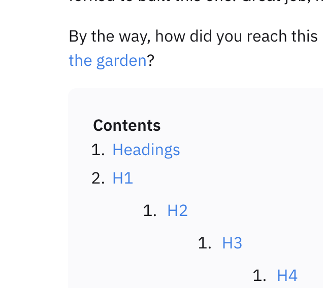
border-radius: 8px;
width: 100%;
Copy link
Contributor Author

Choose a reason for hiding this comment

The reason will be displayed to describe this comment to others. Learn more.

only this component have a border radius I think
image

Copy link
Contributor

Choose a reason for hiding this comment

The reason will be displayed to describe this comment to others. Learn more.

Yes, I will remove this. TOC Desktop also needs some minor cleanup, like margin-left

margin: 0;
}

#markdown-toc a {
Expand Down
23 changes: 23 additions & 0 deletions assets/js/Hamburger.js
Original file line number Diff line number Diff line change
@@ -0,0 +1,23 @@
document.addEventListener('DOMContentLoaded', () => {

// Get all "navbar-burger" elements
const $navbarBurgers = Array.prototype.slice.call(document.querySelectorAll('.navbar-burger'), 0);
// Check if there are any navbar burgers
if ($navbarBurgers.length > 0) {

// Add a click event on each of them
$navbarBurgers.forEach( el => {
el.addEventListener('click', () => {

// Get the target from the "data-target" attribute
const target = el.dataset.target;
const $target = document.getElementById(target);

// Toggle the "is-active" class on both the "navbar-burger" and the "navbar-menu"
el.classList.toggle('is-active');
$target.classList.toggle('is-active');

});
});
}
});
25 changes: 15 additions & 10 deletions assets/js/modeswitcher.js
Original file line number Diff line number Diff line change
Expand Up @@ -7,20 +7,25 @@ Creative Commons Attribution 4.0 International License
let systemInitiatedDark = window.matchMedia("(prefers-color-scheme: dark)");
let theme = sessionStorage.getItem('theme');

function changeIconImgSrc(src) {
document.getElementById("theme-toggle-img").src = src;
document.getElementById("theme-toggle-img--mobile").src = src;
}

if (systemInitiatedDark.matches) {
document.getElementById("theme-toggle-img").src = "../assets/img/moon.svg";
changeIconImgSrc("../assets/img/moon.svg");
} else {
document.getElementById("theme-toggle-img").src = "../assets/img/sun.svg";
changeIconImgSrc("../assets/img/sun.svg");
}

function prefersColorTest(systemInitiatedDark) {
if (systemInitiatedDark.matches) {
document.documentElement.setAttribute('data-theme', 'dark');
document.getElementById("theme-toggle-img").src = "../assets/img/moon.svg";
changeIconImgSrc("../assets/img/moon.svg");
sessionStorage.setItem('theme', '');
} else {
document.documentElement.setAttribute('data-theme', 'light');
document.getElementById("theme-toggle-img").src = "../assets/img/sun.svg";
changeIconImgSrc("../assets/img/sun.svg");
sessionStorage.setItem('theme', '');
}
}
Expand All @@ -32,28 +37,28 @@ function modeSwitcher() {
if (theme === "dark") {
document.documentElement.setAttribute('data-theme', 'light');
sessionStorage.setItem('theme', 'light');
document.getElementById("theme-toggle-img").src = "../assets/img/sun.svg";
changeIconImgSrc("../assets/img/sun.svg");
} else if (theme === "light") {
document.documentElement.setAttribute('data-theme', 'dark');
sessionStorage.setItem('theme', 'dark');
document.getElementById("theme-toggle-img").src = "../assets/img/moon.svg";
changeIconImgSrc("../assets/img/moon.svg");
} else if (systemInitiatedDark.matches) {
document.documentElement.setAttribute('data-theme', 'light');
sessionStorage.setItem('theme', 'light');
document.getElementById("theme-toggle-img").src = "../assets/img/sun.svg";
changeIconImgSrc("../assets/img/sun.svg");
} else {
document.documentElement.setAttribute('data-theme', 'dark');
sessionStorage.setItem('theme', 'dark');
document.getElementById("theme-toggle-img").src = "../assets/img/moon.svg";
changeIconImgSrc("../assets/img/moon.svg");
}
}

if (theme === "dark") {
document.documentElement.setAttribute('data-theme', 'dark');
sessionStorage.setItem('theme', 'dark');
document.getElementById("theme-toggle-img").src = "../assets/img/moon.svg";
changeIconImgSrc("../assets/img/moon.svg");
} else if (theme === "light") {
document.documentElement.setAttribute('data-theme', 'light');
sessionStorage.setItem('theme', 'light');
document.getElementById("theme-toggle-img").src = "../assets/img/sun.svg";
changeIconImgSrc("../assets/img/sun.svg");
}