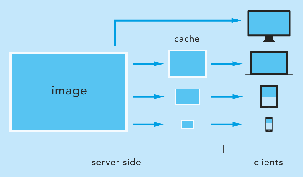
Server-side scaling and caching of images on-the-fly for Express on Node.js (npm).
basic features
- scaling by next breakpoint (default)
- scaling by query parameter (usefull for
srcset) - filetype conversion (e.g. to webp)
- cache is updated when image is modified
npm i express-responsive-imagesfrontend
<head>
    <script>document.cookie = 'screen=' + ('devicePixelRatio' in window ? devicePixelRatio : 1) + ',' + window.innerWidth + '; path=/; SameSite=strict; Secure';</script>
</head>
(not necessary for directScaling)
backend
import responsiveImages from 'express-responsive-images';
// const responsiveImages = require('express-responsive-images');

// use it before declaring static routes
app.use(responsiveImages({
    staticDir: '/public',
    watchedDirectories: ['/images', '/media'], // nested in staticDir
    // options ...
}));

// static routes, something like this:
app.use('/', express.static(path.join(__dirname, 'public')));
That's all. The default behavior should already work. If staticDir and watchedDirectories are set correctly, the images should be delivered, not much larger than the screen size of the client. The folders of watchedDirectories should then also contain chached files.
app.use(responsiveImages({
    staticDir:          '/public',
    watchedDirectories: ['/images'],
    fileTypes:          ['webp', 'jpg', 'jpeg', 'png', 'gif'],
    fileTypeConversion: '',
    cacheSuffix:        '-cache',
    cookieName:         'screen',
    scaleBy:            'breakpoint',
    breakpoints:        [320, 480, 640, 800, 1024, 1280, 1366, 1440, 1600, 1920, 2048, 2560, 3440, 4096],
    directScaling:      false,
    directScalingParam: 'w',
    directScaleSizes:   [],
    debug:              false,
}));The application's public directory with static files. For example: '/public' or '/pub' or '/dist' ...
staticDir: '/public'It should match the directory used by Express. E.g.:
app.use('/', express.static(path.join(__dirname, 'public')));Array of directories nested in staticDir to watch for images. The module is listening to requests pointing to this folders.
At least one directory must be specified!
The use of wildcards * is possible.
(following examples with staticDir: '/public')
// will match only /public/images directory, no subdirectories
watchedDirectories: ['/images']

// will match e.g. /public/img-user but not /public/img and not subdirectories e.g. /public/img/user
watchedDirectories: ['/img*']

// will match e.g. /public/images/user and /public/images/user/profile but not /public/images
watchedDirectories: ['/images/*']

// will match e.g. /public/images and /public/images/user and /public/images/user/profile
watchedDirectories: ['/images', '/images/*']Array of permitted filetypes.
fileTypes: ['webp', 'jpg', 'jpeg', 'png', 'gif']Converts images to another filetype.
fileTypeConversion: 'webp'Suffix of the cache folder name where the images should be cached.
For example, the cache folder of /public/images is /public/images-cache.
cacheSuffix: '-cache'The name of the cookie is changeable. The name must be the same as the one mentioned in the <head> tag (section "usage/frontend" above).
cookieName: 'my-cookie-name'Possible values: breakpoint or viewport.
breakpoint scales images to the next equal or higher breakpoint (see breakpoints option below).
scaleBy: 'breakpoint'viewport scales images exactly to the width of the client browser (not recommended for public websites, can bloat your webspace).
scaleBy: 'viewport'(scaleBy is ignored if directScaling: true and the parameter w is sent)
Array of allowed sizes to which images are scaled.
Example: A notebook with a width of 1280px creates and receives images scaled to a width of 1280px (exact breakpoint).
Another example: A mobile device with a width of 780px creates and receives images scaled to a width of 800px (next higher breakpoint).
breakpoints: [320, 480, 640, 800, 1024, 1280, 1366, 1440, 1600, 1920, 2048, 2560, 3440, 4096]directScaling and directScaleSizes are used to scale images directly if the query parameter w is set.
For example images/img.jpg?w=180 scales img.jpg to 180px width and stores it in images-cache/180/img.jpg.
directScaling: falseIt is recommended to combine this option with directScaleSizes to prevent your web space from getting bloated.
Example for img srcset (MDN Responsive images).
<img srcset="img.jpg?w=480 480w,
             img.jpg?w=800 800w"
     sizes="(max-width: 600px) 480px,
            800px"
     src="img.jpg?w=800"
alt="">The query parameter name for directScaling.
directScalingParam: 'myparam'The url should look then like this: img.jpg?myparam=180.
Array of allowed sizes (see directScaling option above).
If directScaling is enabled, it is recommended to specify the allowed image sizes as well.
To allow certain sizes, e.g. 180px and 260px:
directScaleSizes: [180, 260]This allows only the following parameters:
path-to/img.jpg?w=180path-to/img.jpg?w=260
Leave it empty to allow any image size (not recommended).
directScaleSizes: []Enable this option to log errors and events on the console.
debug: true