www.google.com - Drop-down menu arrows are misaligned on “Nutrition” knowledge panel #8753
Comments
|
Not sure this is significant enough to really dig further. |
|
This is site error similar in spirit to what's happening in #8635. They're basically relying on the browser engine to lay things out exactly like Chrome would when engines have too much leeway to not do so. They really should just be using flexbox so the engine lays things out according to their intent instead. For instance, it does the trick to add this rule: And drop these: |
|
@wisniewskit is this a dupe of #8642? |
|
It's similar in spirit, but they're relying on different CSS here than in #8642, and I can't tell if they rely on the same Blink code for layout. |
|
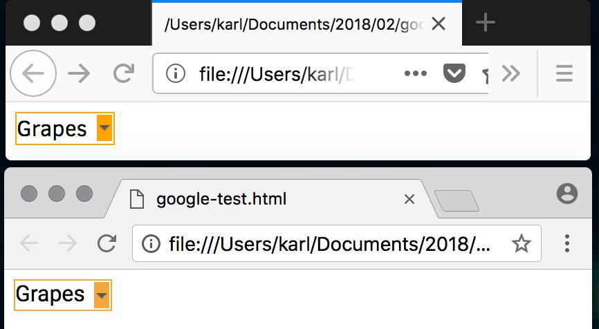
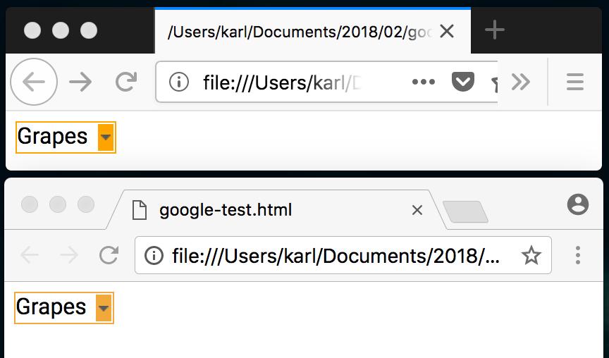
Shortened URL for ease of testing is https://goo.gl/PoywA2. I can reproduce a small difference. In addition to the arrow being slightly further up on Firefox, its diagonals are a lot more jagged, which looks worse to me than the misalignment. |
|
Does anyone already know which CSS spec governs this, and if the leeway mentioned is intentional? |
|
@foolip, I'm guessing it should be CSS Fonts? I don't know for sure because I see no spec trying to carefully define this behavior (though I'm not such an expert that I would know for sure). Note that for the current page design, Firefox is choosing the Clear Sans font rather than Roboto, because of issue #7292 (the page is using the Postscript font name "Roboto-Regular" which Blink erroneously supports, instead of just using "Roboto"). But even when I adjust the CSS to only use "Roboto", the two don't render similarly. Firefox is placing the text's baseline lower in its containing box, so the data-URL "arrow" bitmap looks to be offset a bit higher than it does in Chrome. This seems likely to be related to what I'm seeing in Firefox bug 1406552... perhaps @jfkthame can chime in here and shed some more light on the spec situation (and maybe on what could be done aside from using flexbox instead of relying on baselines being the same across browsers for alignment). As for why the bitmap arrow icon appears to be more jagged in Firefox, I'm not sure. However using a simple SVG data-URL instead of a bitmap fixes this (and strikes me as a safer solution). Something like this would do the trick, and I recall it working on modern browsers and Explorer 10/11: Edit: the PNG is a 7x4 pixel image; maybe Firefox isn't antialiasing it because of its small size, and then it looks bad when upscaled. I'll have to investigate that further. |
|
Here is a reduced version of the in-page markup, with outlines of the related elements colored differently: |
|
I've minimized this a bit further: I can't quite tell why there's a difference between Chrome and Firefox still. The next is a tad further down in Chrome, and I think that could account for the whole difference, but I don't understand why there's more whitespace below the @miketaylr @wisniewskit help? |
if I force both with |
|
Thanks @karlcow! |
|
As far as I can tell the postscript name matching is only an issue on Chrome for Mac and the only reason we get Roboto on Android is because it is the sans-serif font and aliased from Arial. See https://bugs.chromium.org/p/chromium/issues/detail?id=641861#c24 for details on the Chrome bug. TLDR; we will fix this bug on Chrome for mac but the bug is not causing Chrome for android to select Roboto. |
Ah interesting! Are there other aliases? for serif, sans-serif, etc. A link to the source code of Chrome Android is fine. Thanks. |
|
There sure are, see the mappings here: |
|
The issue is still reproducible on my side, using a Chrome UA. Tested with: |
|
I retested the issue and it is still reproducible. Tested with: |
URL: https://www.google.com/search?biw=1024&bih=720&ei=Qb-JWe3RNMXwUMDboqgH&q=Grapes+nutrition&oq=Grapes+nutrition&gs_l=mobile-gws-serp.3..0i67k1j0i20k1j0i7i10i30k1j0l2.3605.6661.0.7677.12.12.0.0.0.0.415.3728.2-4j5j2.11.0....0...1..64.mobile-gws-serp..8.4.1487...0i7i30k1.mAEFkoys2RE
Browser / Version: Firefox Mobile Nightly 57.0a1 (2017-08-07) - Chrome UA
Operating System: Nexus 9 (Android 7.1.1) - Resolution 1536 x 2048 pixels (~281 ppi pixel density)
Tested Another Browser: Yes
Problem type: Design is broken
Description: Drop-down menu arrows are misaligned on “Nutrition” knowledge panel
Steps to Reproduce:
Expected Behavior:
Arrows are centered.
Actual Behavior:
Arrows are misaligned (top side).
Note:
Watchers:
@softvision-sergiulogigan
@softvision-oana-arbuzov
sv; gs
From webcompat.com with ❤️
The text was updated successfully, but these errors were encountered: