box-open-elements is an open, framework-agnostic design system and web component library for Box-style experiences.
Community project — not affiliated with, authorized, or endorsed by Box, Inc. “Box” is a trademark of Box, Inc. This library tracks Box’s public design language for interoperability; it ships no Box code.
The library is organized around three layers:
- Foundations — design decisions as data: tokens, color, typography, iconography, accessibility, theming
- Components — accessible Web Components for single controls, organized by category
- Patterns — combinations of components that address user objectives with sequences and flows: headless controllers, transport contracts, and composed workflow surfaces, grouped by Box noun
See docs/taxonomy.md for the canonical model.
Core implementation principles:
- plain TypeScript modules, no React requirement in the core package
- state and business logic separate from rendering: controllers and stores, not framework components
- standard DOM events where a UI layer needs them
- accessibility semantics and keyboard support as part of the component contract
- injected transport contracts instead of SDK coupling
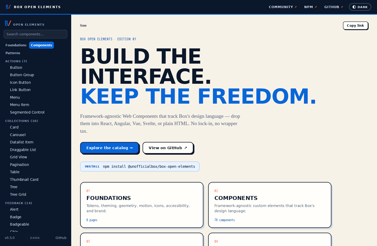
The live docs site browses the full catalog with live previews, an events/properties inspector, per-framework code snippets (React / Angular / Vue / Svelte / HTML), and the foundations pages.
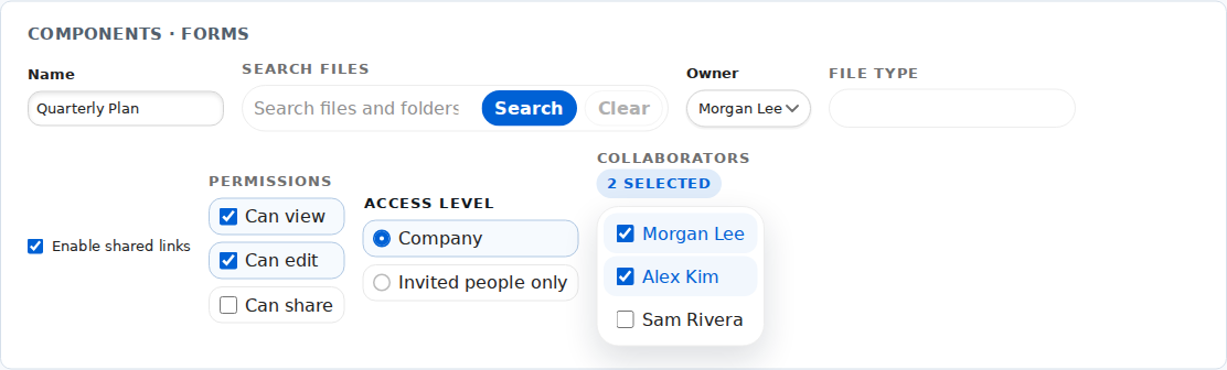
Components track Box’s design language out of the box — tokens-driven, light and dark, keyboard-accessible:
This package uses Bun as its package manager and task runner.
bun installbun run typecheck
bun run test
bun run test:coverage
bun run build
bun run verify
bun run docsbun run docs builds the library and serves the component-documentation site at http://localhost:4600 — browse the full catalog with live previews, events/properties inspectors, and foundations pages.
bun run verify is the main safety check and runs typecheck, coverage-gated tests (test:coverage), and build in sequence.
Full catalog parity with the reference repo, plus every scoped gap the research surfaced:
src/core— typed event emitter, controller base class,BaseElement(in-place shadow DOM render contract), andFormAssociatedElement(native form participation + invalid state)src/foundations/tokens— the design-system registry (tokens, icons, illustrations), the Box default bundle, and the Box dark bundle, retoned to Box's modernized Blueprint palette with an Inter typography baseline; shared interaction helpers (interaction.ts) for focus/hover/active/disabledsrc/foundations/motion— shared duration/easing vocabulary and reduced-motion CSS helpersrc/foundations/profiles— typed runtime profiles for density, geometry, typography, elevation, and motionsrc/foundations/icons— the generated Box iconography manifest and alias layertools/style-bridge— CSS/SCSS → BOE token/selector bridge (bun run style-bridge; BUE explorer:bun run style-bridge:bue-explorer)src/components— 78 components across all ten categories, including the Phase 5 gap fills (box-chip,box-divider,box-calendar,box-tag-input,box-nav-sidebar,box-sidebar-toggle-button,box-grid-view,box-fieldset,box-section,box-error-mask,box-draggable-list,box-nudge,box-pill-cloud,box-pill-selector-dropdown,box-datalist-item,box-contact-datalist-item,box-category-selector)src/patterns/content-explorer— the full headless explorer stack (collection, navigation, selection, actions, facade controller, data-source contracts, Box transport, wire schemas) plus thebox-explorer-*presentation adapters and the composedbox-content-explorersurfacesrc/patterns/{search,item,metadata,share,preview,file-request,task,governance,insights}— all nine composition/workflow areas, including contracts and wire schemas for metadata and share, the provider-neutral preview adapter stack, the pluggablebox-preview-element, and the share workflows (box-presence,box-invite-collaborators-modal,box-unified-share-modal,box-access-stats,box-collaborator-avatars)packages/box-server— a dependency-free server-side adapter: CCG auth + REST client, Box-backed explorer/share/metadata data sources, DTO mappers, and framework-neutral route handlers (see docs/integration/box-server.md)packages/{react,angular,vue,svelte}— lockstep0.1.0framework adapters forButton,TextField,Select,Dialog, and explorer selection composition. Progress is tracked in docs/integration/framework-adapters.md.storybook/— a Bun-native workshop: typed stories → identity-guarded extracted JSON → a self-contained, separately-deployable static site, with no Storybook/Vite runtime or consumer dependency (see storybook/README.md)- Docs site + CI — live GitHub Pages deploy, Storybook-backed variant dropdown, and a strict pixel-diff visual-regression gate in CI
Fidelity program: complete — Batches 0–7, the medium/low audit nits, and the design-heavy leftovers have shipped.
Everything in the components catalog and patterns catalog that carries a built marker is implemented here with dedicated tests. Remaining catalog entries are intentional generic-component gaps whose current implementations are explorer-bound; future additions are gap-driven rather than phase-gated ports.
import {
  createThemeController,
} from "@unofficialbox/box-open-elements/foundations/theming";
import { Button } from "@unofficialbox/box-open-elements";

const theme = createThemeController();
theme.start();<box-button label="Save" tone="primary"></box-button>Components consume foundation tokens (--boe-token-*) with safe fallbacks, so they render sensibly with no design system registered and restyle automatically when one is active.
import { ExplorerSelectionController } from "@unofficialbox/box-open-elements/patterns/content-explorer/selection";

const selection = new ExplorerSelectionController({ selectionMode: "multiple" });

selection.subscribe("selectionChanged", ({ selectedItemIds }) => {
  console.log(selectedItemIds);
});

selection.setItems([{ id: "1" }, { id: "2" }]);
selection.toggleSelection("1");
Workflow patterns begin as headless behavior and gain presentation adapters, so custom React components, Angular templates, Vue SFCs, Svelte components, Web Components, and plain DOM can all consume the same state.
- root exports:
@unofficialbox/box-open-elements - shared runtime:
@unofficialbox/box-open-elements/core - foundations:
@unofficialbox/box-open-elements/foundations/<module> - optimized component entrypoints:
@unofficialbox/box-open-elements/<name> - patterns:
@unofficialbox/box-open-elements/patterns/<area>and@unofficialbox/box-open-elements/patterns/<area>/<module>
The root entrypoint is the concise convenience API and registers the full catalog. Flat component entrypoints register only the imported component:
import { Accordion, Avatar, Button, Switch } from "@unofficialbox/box-open-elements";
import { TextField } from "@unofficialbox/box-open-elements/text-field";The docs index is at docs/README.md. The most important entries:
- Taxonomy
- Architecture
- API Guidelines
- Using with React, Angular, Vue, and Svelte
- Design Tokens
- Content Explorer
- Box Server Integration
See CONTRIBUTING.md for setup, the bun run verify gate, component conventions, the conformance audits, and the PR workflow. Maintainers: see RELEASING.md for publishing to npm.