The data I proposed to visualize are 2016-2018 daily weather report of Logan International Airport, and 2016-2018 Logan International Airport aviation data.
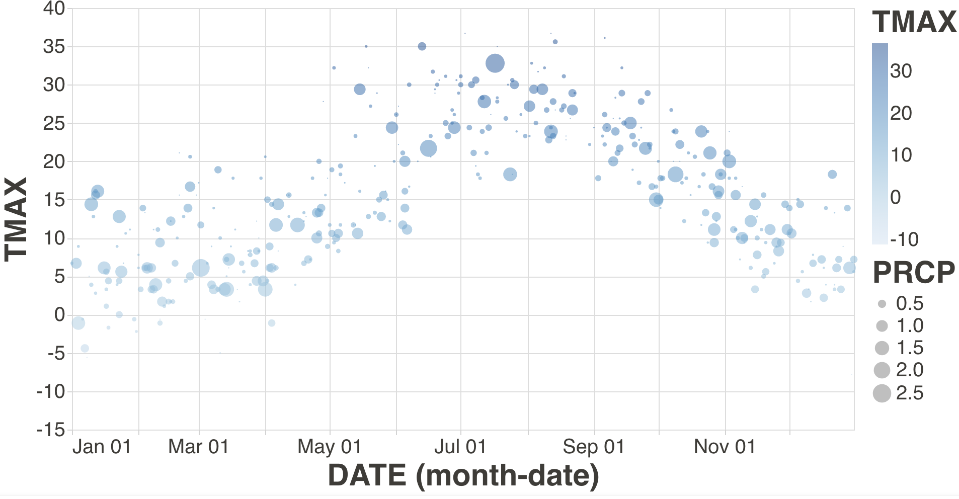
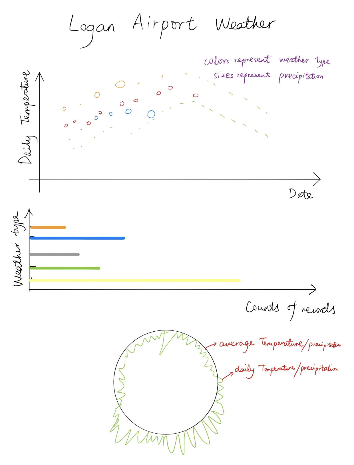
I’ve created a proof of concept visualization of this data. It's a scatter plot and it shows the max temperatures across a calendar, colored by precipitation.
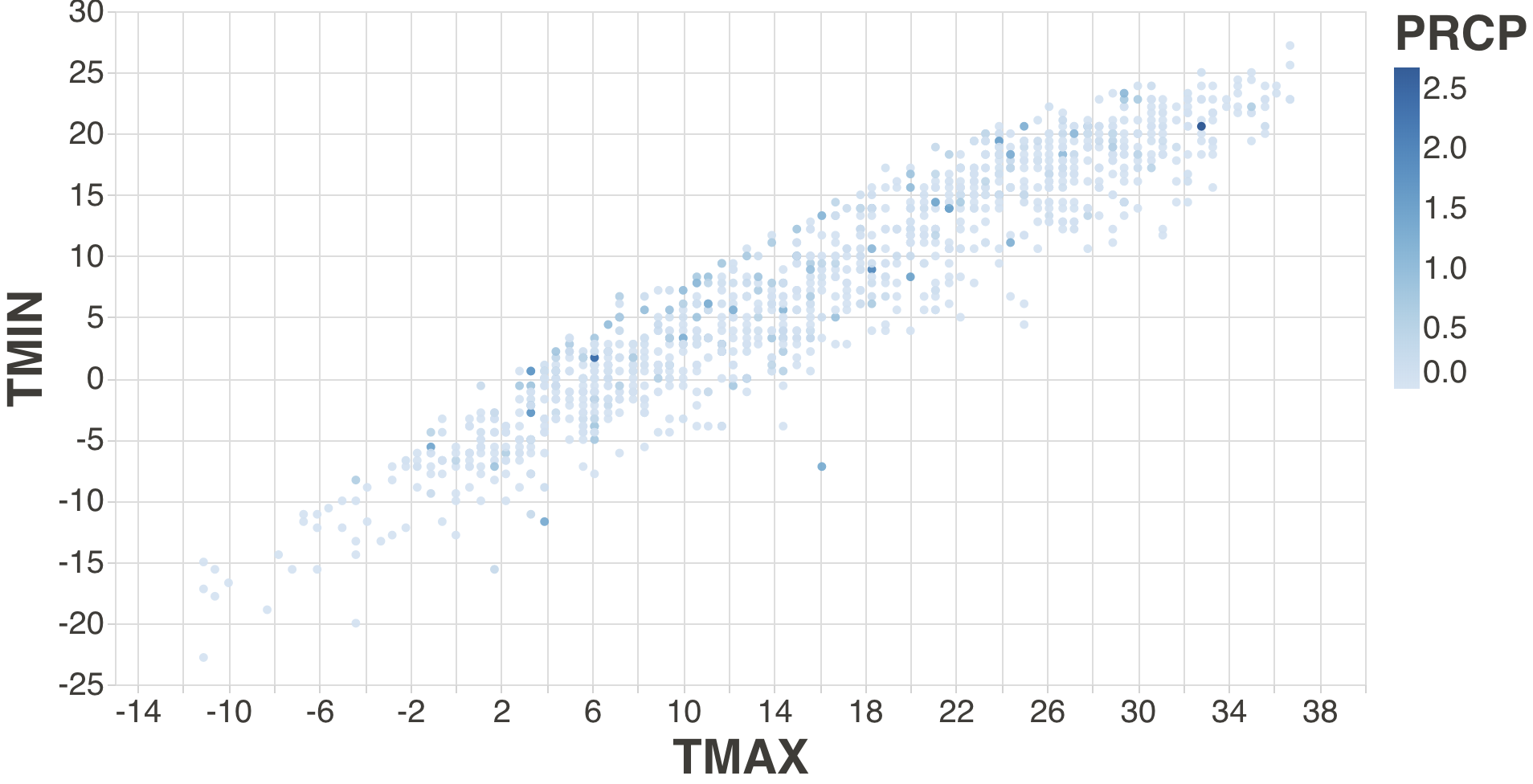
Also a scatter plot showing max temperature against min temperature, colored by precipitation.
The following tasks and questions will drive the visualization and interaction decisions for this project:
- Is the relationship between TMAX and TMIN influenced by precipitation?
- Are there interesting patterns between TMAX and precipitation?
- Do extreme weather conditions influence flights?
- How is temperature distribution across the year?
The upper part has been delivered in Prototypes.
The lower part is a circle marking the mean temperature in a year. Each angle represents a day. The point corresponding to the angle is the temperature of the day. When hovered, the points and lines should reflect the data where the mouse places.
- Make a menu to filter data of specific intervals
- Make a menu to choose different indice of temperature (snow, precipitation) and flights (cancel, delay)
- Create tooltips to reflect details of each data point
| Item | Estimated time of complete |
|---|---|
| Collect and clean data | Done |
| Use d3 to draw the basic plot like the first prototype (plus flight data) with axises and color | Sun. 10/06/2019 |
| Add interactions for above | Fri. 10/11/2019 |
| Ring chart | Sun. 10/20/2019 |
| Add interactions for ring shart | Fri. 10/25/2019 |
| Final polish | Sun. 10/30/2019 |
Aviation data are needed, but Logan Airport doesn't provide daily flight statistics. Perhaps refer to other airport.Dataset found.The "ring chart" is now beyond my capability.Addressed by Professor.
- Scatter plot
- Scatter plot with interactive color legend
- Ring chart with rectangle
- Ring chart with d3.arc()
- Ring chart with path
- Ring chart with color representing bad weather
- Ring chart with interaction
- Linked views (final version)
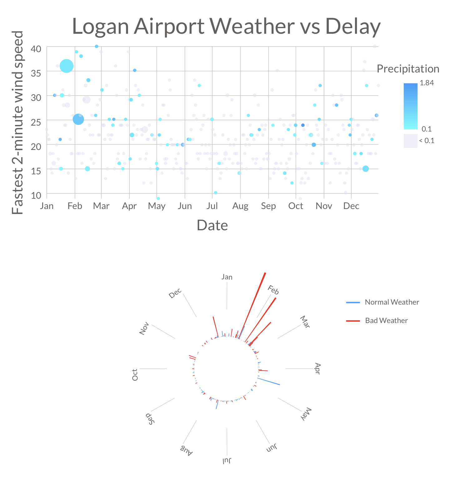
- Scatter plot
- x-axis is days in a year
- y-axis is the fastest 2-minute wind speed in the day
- Size of the circles represents the delay caused by weather
- Color represents the precipitation
- Ring chart
- Axial dimension is the delay caused by weather
- Tangential dimension is the days in a year
- Red means bad weather such as fog, glaze, and smoke
- Blue means normal weather
- Interactions
- When the circles are hovered, the color of the circle and the corresponding bar in ring chart will change
- When the direction of the bar of ring chart is hovered, thecolor of the bar and the corresponding circle in scatter plot will change
- When circle or bar are hovered, a tooltip indicating the date and delay caused by weather will show up.
- Create a menu to select different y-axises
- Rewrite with React
- Make the code dynamic
- Create a hover effect or menu to select from different years
- Add another axis to the ring chart