v5: Add new xxl grid tier and move ToC to a sidebar
#30354
Conversation
|
Right now this comes with the need to update documentation on the number of grid tiers, changing bundlesize, etc. It's a big increase, and not just motivated by adding a sidebar ToC—lots of folks have asked for a larger device tier. Here are the issues and PRs I could find mentioning Issues
PRs |
|
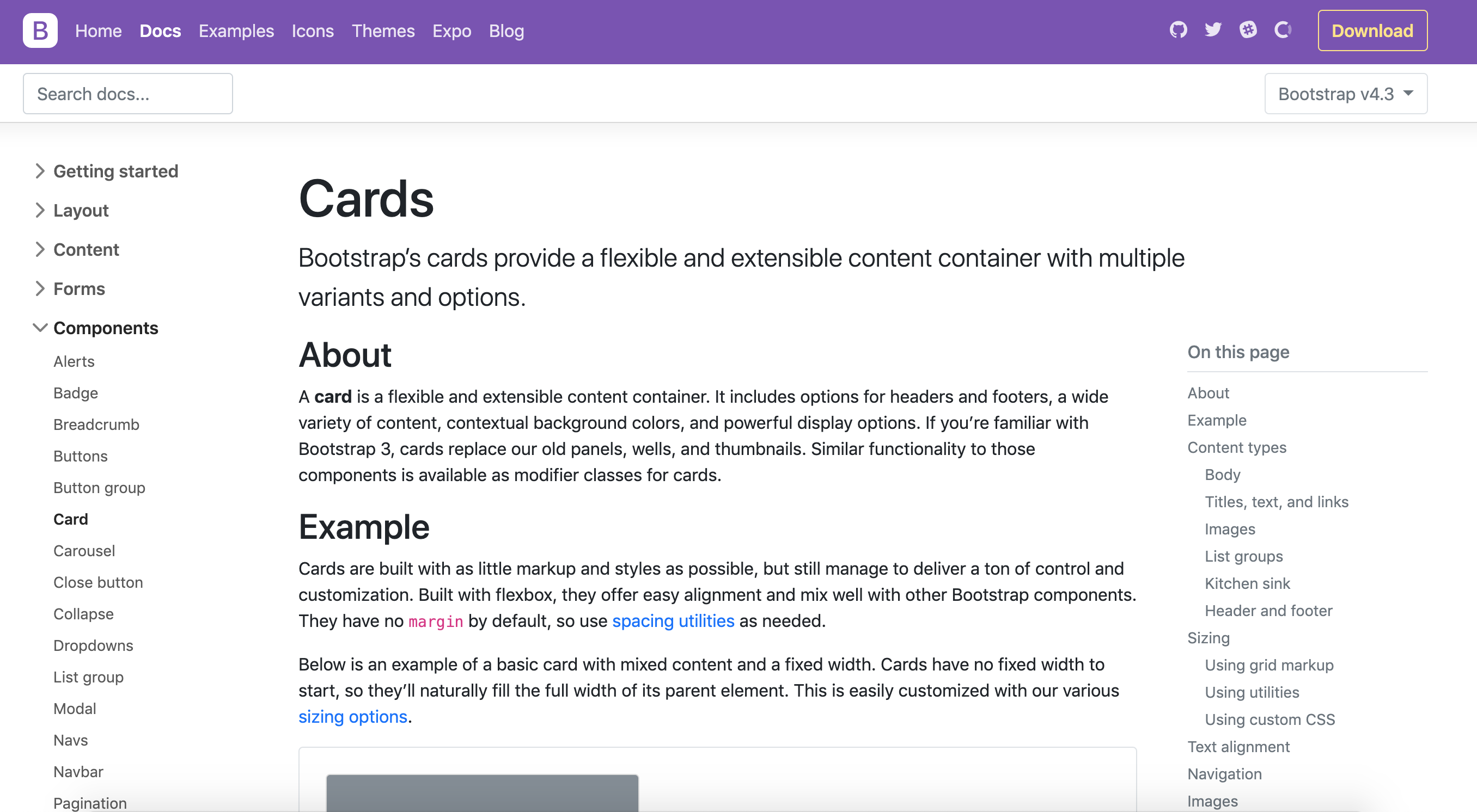
I'm not 100% sure it's a good idea to add a new grid tier just because we need it for our docs. However we can dig up this idea (which i liked very much, see my I like this approach comment): #28500 and customize the grid breakpoints only for the docs. I would also move the TOC next to the introduction, pages like the card documentation look a bit weird: https://deploy-preview-30354--twbs-bootstrap.netlify.com/docs/4.3/components/card/
|
|
We already add some grid tiers in our projects. Therefore, I'm in favour of adding a new size. My only concern is about the naming. Why |
|
+1, we already added a |
|
Current I don't really think this is a good idea. Containers will be |
|
Is it possible to write a function that extends our grid system? Have current |
0f39e79 to
16ca417
Compare
|
Wondering if we can get scrollspy to work with this table of contents nav. Thoughts @XhmikosR? |
345c192 to
c9ea73d
Compare
cdbee3e to
4649195
Compare
I remember I tried this in the past but I faced some issues with not being able to customize the ToC IDs. Better split the ToC patches to a separate PR and we can discuss this further there 🙂 |
|
I’m still okay with shipping the general ToC updates here. With or without the scrollspy, this is still an improvement :). |
1112b5c to
c42e9a4
Compare
|
@mdo, thoughts on switching to |
d1b7573 to
e212a71
Compare
I think I'm inclined to keep it as |
e212a71 to
80f1abd
Compare
|
Any other reviews from @twbs/css-review or should I go ahead and merge? :) |
|
Found some |
|
Good call @MartijnCuppens, just found some more fixes and pushed them as well. |
- Staring at my laptop, I realized I'm wasting away space. This adds a
significant amount of CSS, but it feels right already.
- Added the xxl tier with a width that divides by 12
- Motivation was originally trying to have a third column for our toc so
that our docs are more useful
- Breaks grid content across multiple pages
- Updates mentions of grid tiers from five to six
- Rewrites how it works sections to reference new options and tiers
bb20835 to
b5dc2fb
Compare
|
Squashed the last several commits into one for updating docs across the board. Taking another spin through and then likely merging :D. |
b5dc2fb to
07c8db2
Compare
- Updates mentions of number and exact tiers
- Updates grid example to include xxl container
- Adds some scss-docs references
- Cleans up other grid mentions and docs
- Updates navbar example to include an expand at XXL variant
07c8db2 to
7dedccf
Compare
Compared to v4, v5's docs have a fixed-width, center aligned container. I wanted to keep that look of a centered container, but add a third column to our docs for fitting in a sidebar table of contents. Lately, the ToC has been wildly unhelpful as the constant scrolling up and down to find a link isn't saving me anytime.
Getting that third column though means either sacrificing significant width from the content column, going fullscreen again (don't want to do), or adding a wider container. I chose the last option and rather than write CSS that limits an even wider container to just our docs, I'm adding it to the core.
Let the feedback rip!
Preview: https://deploy-preview-30354--twbs-bootstrap.netlify.com/