






A zero-dependency, fully customizable calendar date picker for React Native. Supports single, range, and multi-select date selection, week/month/year/time/datetime views, preset chips, per-day event badges, accessibility, optional web support, non-Gregorian calendars (Hijri, Persian, Buddhist), and both a simple prop-driven API and a fully headless useDatePicker() hook.
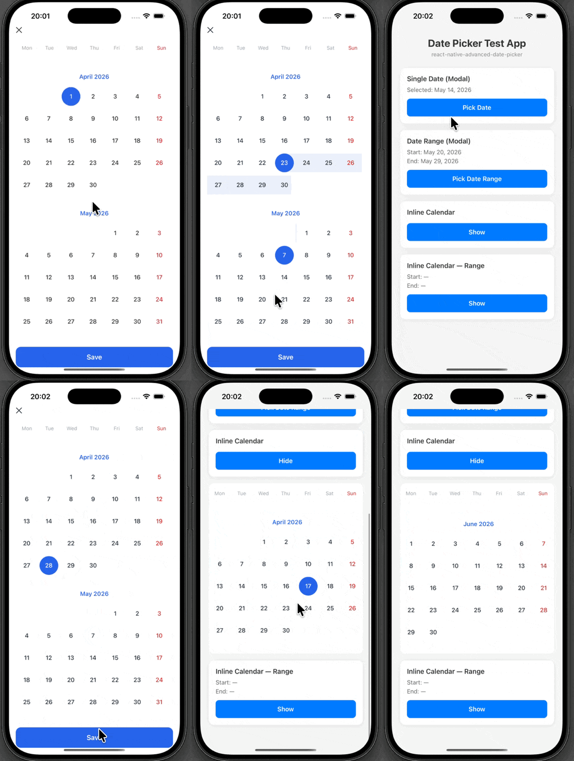
- Zero mandatory dependencies — date math uses native
IntlAPI - Single, Range & Multi-select — pick one date, a date range, or any number of independent dates
- Week / Month / Year / Time / DateTime views — granularity-aware grids, all powered by the same selection union
- Pluggable calendar engines — Gregorian (default), Hijri (Umm al-Qura), Persian (Jalali / Borkowski), Buddhist Era — algorithmic, no third-party calendar libs
- Preset chips — built-in
Today / Last 7 days / This month / Last month+ custom presets - Disabled date ranges & range-length constraints — booking-calendar friendly (
disabledRanges,minRangeLength,maxRangeLength) - Per-date event badges — up to 3 colored dots per day with
+Noverflow, fully overrideable viarenderBadge - Workday counter —
countWorkdays(start, end, { holidays, weekendDays })ships in the public API - Accessibility —
accessibilityLabel/accessibilityState/accessibilityRoleon every cell, modal announce-on-open, keyboard navigation hook (useKeyboardNav) - Headless mode —
useDatePicker()exposes the full state machine (selection,dayProps(date),handlers) so you can build a 100% custom UI without giving up the engine - Web support — optional
react-native-webpeer +*.web.tsxshadow files (CSS transitions,<div role="dialog">portal, ESC handler) - i18n ready — built-in English, Turkish, Arabic, Persian, Thai locales, add your own
- Fully themeable — colors, granular
fontSize/spacing/radiustokens, border radius, everything - Slot-based rendering — override individual layout pieces (
renderMonthHeader,renderSaveButton,renderCloseIcon,renderWeekDayHeader,renderHolidayLabel,renderBadge) without rewriting the whole picker - Per-day callbacks —
getDayColor,getDayStyle,getDayTextStyle,getDayContent,getBadgelet you tweak individual cells based on runtime state - Uniform range-fill animation — every in-range cell fades in at the same time (160 ms cubic ease-out, native driver);
disableAnimationturns it off - Safe-area aware modal — respects notch/status bar via
react-native-safe-area-contextwhen installed, platform-default fallback otherwise - Holidays support — highlight public holidays with labels, per-holiday color / icon / importance
- Modal & Inline — use as a full-screen modal or embed inline
- Style escape hatches on every surface (container, header, save/close buttons, day cells)
- Composable — use the main component or import individual parts (
CalendarList,DayCell,MonthGrid,YearGrid,WeekGrid,TimePicker,DateTimePicker,PresetBar) - TypeScript — full type definitions, including the
Selectiondiscriminated union andCalendarEngineinterface
v0.3.0 is an additive expansion — zero breaking changes. Every prop, callback shape, and import path from v0.2.x continues to work as-is.
// Multi-select — toggle any number of dates
<AdvancedDatePicker
  mode="multi"
  selectedDates={dates}
  onChange={(sel) => sel.kind === 'multi' && /* sel.dates is a Set<string> */}
/>

// Booking-calendar style range with blocked nights
<AdvancedDatePicker
  mode="range"
  disabledRanges={[{ start, end }, ...]}
  minRangeLength={2}
  maxRangeLength={14}
/>import { AdvancedDatePicker, builtInPresets } from 'react-native-advanced-date-picker'
<AdvancedDatePicker
mode="range"
presets={[...builtInPresets, { id: 'next-7', label: 'Next 7 days', range: () => /* {start,end} */ }]}
/><AdvancedDatePicker
getBadge={({ day }) =>
day.day === 12
? [{ color: '#10B981', label: 'Birthday' }, { color: '#F59E0B', label: 'Reminder' }]
: []
}
/>import { AdvancedDatePicker, hijri, ar } from 'react-native-advanced-date-picker'
// (string locales work too once the engine is wired through your own picker —
// the built-in <AdvancedDatePicker> currently consumes engine via useDatePicker)
const picker = useDatePicker({ engine: hijri, locale: ar })import { useDatePicker } from 'react-native-advanced-date-picker'
const picker = useDatePicker({ selectionMode: 'single' })
// picker.selection — discriminated union { kind, ... }
// picker.calendarData — MonthData[] (engine-aware)
// picker.dayProps(date) — { onPress, isSelected, isInRange, isDisabled, ... }
// picker.handlers.selectDate / clear / setSelectionimport { countWorkdays } from 'react-native-advanced-date-picker'
countWorkdays(start, end, { holidays, weekendDays: [0, 6] }) // → number- Day cells expose
accessibilityRole="button", dynamicaccessibilityLabel(locale-aware: weekday, date, holiday, selected, today, unavailable),accessibilityState <DatePickerModal>announces on open viaAccessibilityInfo.announceForAccessibilityuseKeyboardNav()hook drivesArrow/PageUp/PageDown/Home/End/Enter/Escapefocus on the web
react-native-web is now an optional peer dependency. The package ships DatePickerModal.web.tsx and DayCell.web.tsx — Metro / webpack platform resolution picks them automatically; the native bundle is unaffected.
Nothing to migrate — your v0.2.x code keeps working. To opt into v0.3.0 features, just start passing the new props (presets, disabledRanges, getBadge, onChange) or import the new exports (useDatePicker, useKeyboardNav, builtInPresets, countWorkdays, hijri / persian / buddhist, ar / fa / th).
npm install react-native-advanced-date-picker
# or
yarn add react-native-advanced-date-pickerFor modal safe-area support (notch/status bar awareness), install:
yarn add react-native-safe-area-contextIf not installed, the modal falls back to platform-default insets.
import { useState } from 'react'
import { AdvancedDatePicker } from 'react-native-advanced-date-picker'

const App = () => {
  const [visible, setVisible] = useState(false)
  const [startDate, setStartDate] = useState<Date | null>(null)
  const [endDate, setEndDate] = useState<Date | null>(null)

  return (
    <>
      <Button title="Pick dates" onPress={() => setVisible(true)} />
      <AdvancedDatePicker
        mode="range"
        locale="en"
        visible={visible}
        startDate={startDate}
        endDate={endDate}
        onDateChange={({ startDate, endDate }) => {
          setStartDate(startDate)
          setEndDate(endDate)
        }}
        onClose={() => setVisible(false)}
        minDate={new Date()}
      />
    </>
  )
}| Prop | Type | Default | Description |
|---|---|---|---|
mode |
'single' | 'range' |
'single' |
Date selection mode |
locale |
string | Locale |
'en' |
Locale code or custom locale object |
startDate |
Date | null |
null |
Selected start date |
endDate |
Date | null |
null |
Selected end date (range mode) |
onDateChange |
(payload) => void |
required | Called on date selection |
minDate |
Date |
— | Minimum selectable date |
maxDate |
Date |
— | Maximum selectable date |
theme |
Partial<Theme> |
default | Theme overrides |
holidays |
Holiday[] |
[] |
Holidays to highlight |
showHolidays |
boolean |
true |
Show holiday labels |
disabledDates |
(string | Date)[] |
[] |
Non-selectable dates |
months |
number |
12 |
Number of months to render |
modal |
boolean |
true |
Modal or inline mode |
visible |
boolean |
false |
Modal visibility |
onClose |
() => void |
— | Modal close callback |
onSave |
() => void |
— | Save button callback |
showSaveButton |
boolean |
true |
Show save button in modal |
renderDay |
(day, state) => ReactNode |
— | Custom day cell renderer (full override) |
| Prop | Type | Default | Description |
|---|---|---|---|
disableAnimation |
boolean |
false |
Disable the range band fill animation. When true, the band appears instantly at full opacity. |
Each accepts a standard StyleProp<ViewStyle> or StyleProp<TextStyle>. Styles are composed on top of defaults — you only override what you set.
| Prop | Target |
|---|---|
style |
Root view style (inline mode, i.e. modal={false}) |
modalContainerStyle |
Slide-up sheet container in modal mode |
headerStyle |
Modal header row (contains the close icon) |
saveButtonStyle |
Save button wrapper |
saveButtonTextStyle |
Save button text |
closeButtonStyle |
Close (X) button wrapper |
closeButtonTextStyle |
Close (X) glyph text |
Each is optional; when provided it replaces the default rendering for that slot only. All other slots keep their defaults.
| Prop | Signature |
|---|---|
renderMonthHeader |
({ month, year, theme, locale }) => ReactNode |
renderWeekDayHeader |
({ days, theme, locale }) => ReactNode |
renderHolidayLabel |
({ holiday, day, theme }) => ReactNode |
renderSaveButton |
({ onPress, theme, locale }) => ReactNode |
renderCloseIcon |
({ onPress, theme }) => ReactNode |
Called for every non-empty day cell with runtime state (isSelected, isInRange, isDisabled, isToday, isHoliday, isSunday, isSaturday). Returning undefined falls through to the default rendering.
| Prop | Signature | Effect |
|---|---|---|
getDayColor |
({ day, state, theme }) => string | undefined |
Overrides the text color for the day number |
getDayStyle |
({ day, state, theme }) => StyleProp<ViewStyle> | undefined |
Merged on top of the slot view style |
getDayTextStyle |
({ day, state, theme }) => StyleProp<TextStyle> | undefined |
Merged on top of the day text style |
getDayContent |
({ day, state, theme }) => ReactNode | undefined |
Replaces the default day-number <Text> |
Priority chain (highest wins): renderDay > getDayContent > default <Text>{day.day}</Text>.
<AdvancedDatePicker
  theme={{
    primary: '#8B5CF6',
    background: '#1F2937',
    textColor: '#F9FAFB',
    sundayColor: '#EF4444',
    holidayColor: '#34D399',
    rangeBackground: 'rgba(139, 92, 246, 0.15)',
    selectedTextColor: '#FFFFFF',
    dayBorderRadius: 12,
    fontSize: { day: 15, monthHeader: 16, saveButton: 17 },
    spacing: { monthGap: 28 },
    radius: { saveButton: 14, modal: 24 },
  }}
/>| Property | Default | Description |
|---|---|---|
primary |
#2563EB |
Selected date background |
background |
#FFFFFF |
Calendar background |
textColor |
#1F2937 |
Default text color |
disabledColor |
#9CA3AF |
Disabled date text |
rangeBackground |
#EBF0FA |
Range highlight color |
holidayColor |
#16A34A |
Holiday text color |
sundayColor |
#DC2626 |
Sunday text color |
saturdayColor |
— | Saturday text color (falls back to textColor) |
weekendColor |
— | Single color for both Sat & Sun — overrides both saturdayColor and sundayColor when set |
selectedTextColor |
#FFFFFF |
Selected date text |
dayBorderRadius |
99 |
Day cell border radius |
monthHeaderColor |
#2563EB |
Month title color |
weekDayHeaderColor |
#9CA3AF |
Weekday header color |
dividerColor |
#E5E7EB |
Divider line color |
fontFamily |
system | Custom font family |
| Key | Default | Target |
|---|---|---|
day |
14 |
Day cell text |
weekDay |
12 |
Week day header row |
monthHeader |
12 |
Month title |
holiday |
12 |
Holiday label text |
saveButton |
16 |
Save button label |
| Key | Default | Target |
|---|---|---|
monthGap |
24 |
Vertical gap between months |
weekDayHeaderGap |
16 |
Gap between the week day header divider and the first month |
holidayGap |
8 |
Gap between month grid and holiday list |
| Key | Default | Target |
|---|---|---|
saveButton |
12 |
Save button border radius |
modal |
0 |
Modal container border radius (full-screen by default) |
import type { Locale } from 'react-native-advanced-date-picker'

const german: Locale = {
  code: 'de',
  dayNamesShort: ['Mo', 'Di', 'Mi', 'Do', 'Fr', 'Sa', 'So'],
  monthNames: ['Januar', 'Februar', 'März', 'April', 'Mai', 'Juni',
    'Juli', 'August', 'September', 'Oktober', 'November', 'Dezember'],
  today: 'Heute',
  save: 'Speichern',
  cancel: 'Abbrechen',
  pastDateWarning: 'Sie können kein vergangenes Datum auswählen.',
  warningTitle: 'Warnung',
  ok: 'OK',
  // Optional (v0.2.0):
  selectDate: 'Datum wählen',
  selectRange: 'Zeitraum wählen',
  from: 'Von',
  to: 'Bis',
  clear: 'Löschen',
}

<AdvancedDatePicker locale={german} />| Field | Required | Description |
|---|---|---|
code |
yes | ISO locale code used for Intl formatting (e.g. 'en', 'tr', 'de') |
dayNamesShort |
yes | Short day names, length 7 |
monthNames |
yes | Full month names, length 12 |
today |
yes | "Today" label |
save |
yes | Save/confirm button text |
cancel |
yes | Cancel button text |
pastDateWarning |
yes | Warning shown when user selects a past date |
warningTitle |
yes | Title for the past-date warning alert |
ok |
yes | OK button text in alerts |
selectDate |
no | Title/placeholder for single date selection |
selectRange |
no | Title/placeholder for range selection |
from |
no | "From" label for range start |
to |
no | "To" label for range end |
clear |
no | Clear/reset button text |
<AdvancedDatePicker
  holidays={[
    { date: '01-01', label: 'New Year' },
    { date: '12-25', label: 'Christmas', color: '#DC2626', important: true },
    { date: '2026-07-04', label: 'Independence Day' },
  ]}
  showHolidays={true}
/>| Field | Required | Description |
|---|---|---|
date |
yes | 'MM-DD' for recurring yearly, or 'YYYY-MM-DD' for a specific date |
label |
yes | Display label shown next to/under the date |
color |
no | Override the label text color (falls back to theme.holidayColor) |
icon |
no | Optional ReactNode rendered alongside the holiday label |
important |
no | Emphasize the holiday (e.g. bold text) |
For advanced customization, import individual components:
import {
  CalendarList,
  DatePickerModal,
  WeekDayHeader,
  MonthHeader,
  DayCell,
  useCalendar,
  en,
  defaultTheme,
} from 'react-native-advanced-date-picker'

const MyCustomCalendar = () => {
  const { calendarData } = useCalendar({
    months: 6,
    locale: 'en',
    holidays: [{ date: '12-25', label: 'Christmas' }],
  })

  return (
    <CalendarList
      mode="single"
      locale={en}
      theme={defaultTheme}
      startDate={null}
      endDate={null}
      onStartDateChange={date => console.log(date)}
      onEndDateChange={date => console.log(date)}
    />
  )
}Replace individual layout pieces without rewriting the whole picker. Every other slot keeps its default.
import { Text, View, TouchableOpacity } from 'react-native'
import { AdvancedDatePicker } from 'react-native-advanced-date-picker'

<AdvancedDatePicker
  mode="range"
  renderMonthHeader={({ month, year, theme }) => (
    <View style={{ paddingVertical: 12, alignItems: 'center' }}>
      <Text style={{ fontSize: 18, fontWeight: '700', color: theme.monthHeaderColor }}>
        {month} {year}
      </Text>
    </View>
  )}
  renderSaveButton={({ onPress, theme, locale }) => (
    <TouchableOpacity
      onPress={onPress}
      style={{
        backgroundColor: theme.primary,
        paddingVertical: 14,
        borderRadius: 16,
        alignItems: 'center',
      }}>
      <Text style={{ color: theme.selectedTextColor, fontWeight: '700' }}>
        {locale.save}
      </Text>
    </TouchableOpacity>
  )}
/>Compute styles, colors, or custom content from runtime state for specific day cells.
import { View, Text } from 'react-native'

<AdvancedDatePicker
  // Tint weekends purple, keep defaults for everything else.
  getDayColor={({ state }) =>
    state.isSaturday || state.isSunday ? '#8B5CF6' : undefined
  }
  // Add a green dot badge under busy days.
  getDayContent={({ day, state, theme }) => {
    const isBusy = [5, 12, 19].includes(day.day)
    if (!isBusy) return undefined
    return (
      <View style={{ alignItems: 'center' }}>
        <Text style={{ color: state.isSelected ? theme.selectedTextColor : theme.textColor }}>
          {day.day}
        </Text>
        <View style={{
          width: 4,
          height: 4,
          borderRadius: 2,
          backgroundColor: '#16A34A',
          marginTop: 2,
        }} />
      </View>
    )
  }}
/>By default a range fills cell-by-cell from the start date with a staggered scale animation (native driver). Disable it for instant visual feedback:
<AdvancedDatePicker mode="range" disableAnimation /><AdvancedDatePicker
renderDay={(day, state) => (
<View style={{
width: 40,
height: 40,
borderRadius: 20,
backgroundColor: state.isSelected ? 'purple' : 'transparent',
alignItems: 'center',
justifyContent: 'center',
}}>
<Text style={{ color: state.isSelected ? 'white' : 'black' }}>
{day.day}
</Text>
{state.isHoliday && <View style={{ width: 4, height: 4, borderRadius: 2, backgroundColor: 'green' }} />}
</View>
)}
/><AdvancedDatePicker
modal={false}
mode="single"
startDate={selectedDate}
onDateChange={({ startDate }) => setSelectedDate(startDate)}
/>MIT