PR: Eliminate redundant links from sidebar, add standard links to readme and fix minor layout bugs #29
Conversation
|
I don't agree with this. I think we should add these links to our footer instead. |
Okay, sure—that makes more sense than cramming yet more stuff into the sidebar. Do you mean the default docs footer, or a custom footer element based on a minimized version of the one on our main site, like we did for the banner? Also, see my comment on spyder-ide/website-spyder#113 . |
|
@ccordoba12 I'll just go ahead and put them in the current footer, and if you'd like something different, let me know. |
|
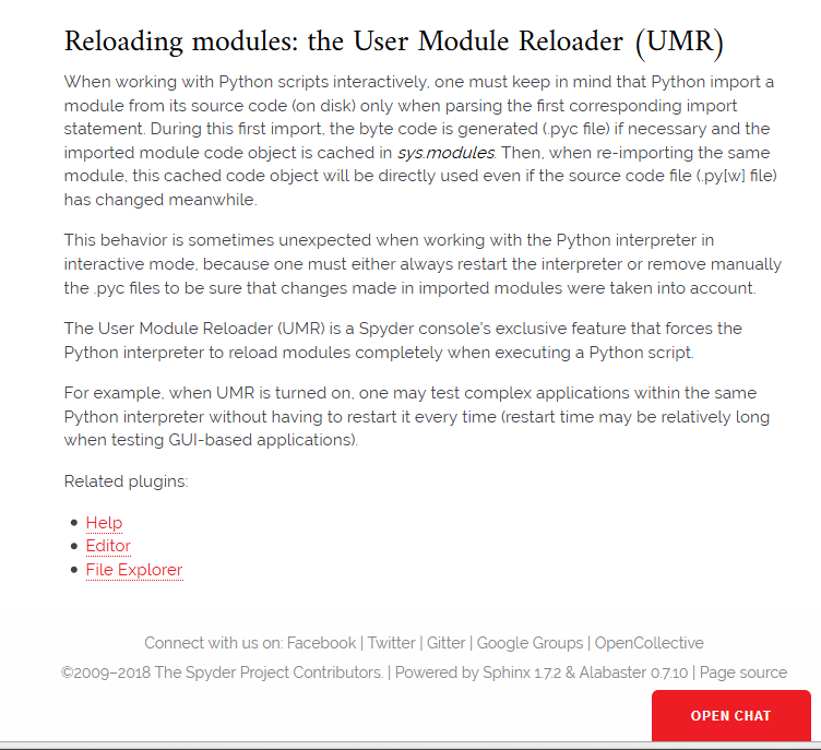
Done, after some fumbling around. There's apparently no provision to add it as a theme setting, so I had to teach myself some more html and css and do it manually. I moved a few other social media/connect with us links as well, to further reduce clutter in the sidebar and keep it thematically focused on static help resources, with the footer being the interactive help/contact options (moving Google Groups and Gitter as well, and adding OC there). I also fixed an issue where the "Open Chat" button was blocking a lot of the existing footer. Here's how it looks:
I'm a total novice with all this, so let me know what you want changed. |
|
@CAM-Gerlach, this looks nice! We should use the same footer here and in our other web pages. The custom right is to use a dark gray background for the footer, to differentiate from the rest of the page. |
Thanks for your feedback, @ccordoba12 . Okay, so do you mean using this footer on the mainpage/blog? In any case, I'm definitely not a huge fan of the existing one (at least the text layout); it takes up way too much space and the line break at the very end of the top line is really awful. If so, I would imagine we'd want to use the top "Connect with us" line verbatim, and then have the bottom one (or likely multiple) be the copyright/etc text from the current website footer instead of the docs ones (while we're at it, some rights reserved can be removed to save a little space; it doesn't add anything when the exact license is specified and linked).
Not sure I understand what you mean here... |
1 similar comment
|
Sorry for the delay. I assigned @dalthviz to work on a new footer this week. |
|
Oh, excellent—thanks for the update. I assume that'll replace this one as well as the website and blog? |
|
Yep, that's the idea. |
|
Okay, thanks. So should I remove the one I have in this PR right now, so they don't conflict (merge and otherwise)? Then this could presumably get merged, since otherwise it doesn't depend on the footer. |
|
Yes, please do. |
|
@ccordoba12 Thanks, done. So much for that, heh...but hey, I managed to learn some very basic HTML and CSS along the way. |
| 'github_banner': False, | ||
| 'travis_button': False, | ||
| 'codecov_button': False, | ||
| 'extra_nav_links': { |
There was a problem hiding this comment.
Let's remove all these extra links in this PR. We'll put them all in the footer.
There was a problem hiding this comment.
TL;DR: Due to the number of links in the footer, to maintain conceptual cohesion with what links we put where, and to ensure important links are more visible and easily accessible, we shouldn't put everything in the footer. Specifically
- Troubleshooting Guide and Dev Wiki need to stay in the sidebar due to their strong link to the content and other sidebar items
- Download (link to main page section) and Donate (direct link to OC) should go in the common top banner across all sites since those are the two actions we want people to take to help Spyder grow and thrive
- Github is a marginal case, but it can go in the footer I guess
Finally, all being important and already present, they should naturally be removed in the PR that actually adds them to the header/footer; no compelling reason to do so here.
More detailed rationale and discussion:
I'm not sure I agree. Conceptually, the main problem with putting everything in the footer, aside from the simple number of links we're stuffing in to a small space, is that footers are useful for links people specifically know and have motivation to look for, and very likely will only want until after reading at least the content on the existing page—things like the "connect with us"/social media type links I've put there, as well as legal and policy information that need to be there but we don't want to emphasize or take up too much space in the UI. If it isn't something people both know and want to look for, and is something we have at least a modest interest in actually wanting people to visit; or, otherwise is conceptually much closer to the content than the type of items in the footer, we should put it in the sidebar so people actually see it, and right away. Reviewing those characteristics for each of the links there:
The Troubleshooting Guide and the Dev Wiki definitely belong in the sidebar, not the footer, because unlike the others they are not "Connect with Spyder" resources they are directly documentation-related resources that just happen to not be hosted in the same place, and thus have a strong conceptual link with the content (basically being an extension of the items listed in the sidebar); additionally, people would not be aware of them by default and know to scroll all the way down to search for them in the footer, we strongly want people who need them to visit them, and they should be quickly accessible for interested parties.
For the Download and Donate links, these should go in the common top bar/banner for both the blog and the docs, just like we currently have them for the main page. These are the two key links we really want to make as obvious and accessible as possible, as these are the two key actions we want people to take to help them get the benefits of Spyder (and us get more users), and help make Spyder better for them and everyone. The Donate link should go direct to OpenCollective (as it really should on our main page; having it scroll to a simple button provides no additional value while increasing user time/annoyance and decreasing final conversion rate). The Download I guess should go to the download section on our main site, as it does there, since the interstitial provides significant value and we don't control the final destination page like we do for OC. Therefore, these should be left here, and removed in the PR that adds them to the banner (presuming that is desired).
The Spyder Github link is sort of a gray area; it involves both communication/interaction, is a source for information (via the readme, contrib guide etc and examining the code itself), and is also a secondary major platform we want to direct people to (for bug reports, feature requests, source downloads and most importantly to help with development). Probably not enough so to give it top billing in the sticky banner, but we still want it common across the sites. Although I'd like it to have more emphasis, I wouldn't be opposed to sticking it that one the footer, since I don't have a better idea right now.
Finally, since none of those links were added in this PR, and all are quite important, it is out of scope to remove them here, and that should rather naturally be done in the PR(s) that actually add them to the footer or top bar banner. There's no compelling reason to do so prematurely, when it would be better done, conceptually and practically, in the PR that actually adds them.
On a minor note, we might also want to put Stack Overflow in the footer since that's an important resource for a lot of user questions and is chiefly focused on interaction like the others; it isn't anywhere right now.
|
@ccordoba12 Responded to your comment. |
|
@ccordoba12 Updated to fix conflicts and ensure it is a superset of PR #62 ; namely, eliminate the Github, Download, and Donate links and the translation sectioned, and tweaked the wiki link to point to the index page instead of the dev page. So, aside from eliminating the now redundant links (and at least two others #62 missed, Gitter and Google Groups, which are now in the footer), this PR makes a few related minor tweaks:
which should be fairly straightforward and uncontroversial. |
Pull Request Checklist
Noted what issue(s) this pull request resolves, creating one if neededDescription of Changes
Currently, our Facebook and especially Twitter links aren't really linked from anywhere but our OpenCollective to my knowledge, and correspondingly have very low SEO rankings and are very hard to find. Therefore, this PR adds them to our readme and sidebar, and fixes a very minor issue with the ToC link layout (along the lines of #27 ).
Issue(s) Resolved
Minor meta-task; not needed.