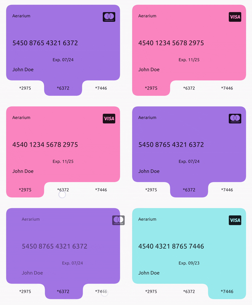
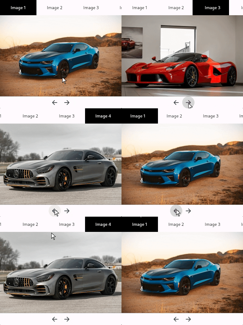
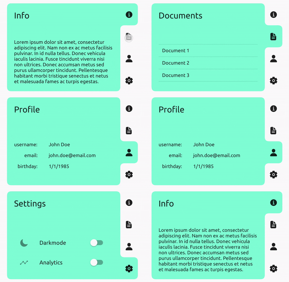
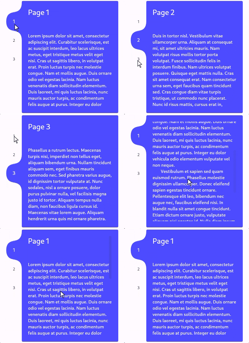
Tab view/carousel widget with a beautifully animated indicator and simple usage. Just pass in a list of children and a list of tabs and it will handle the rest, or you can customise by using a TabController, changing the tab side, adding color(s), and much more.
Check the focus and semantics sections and file any issues.
New in 3.5.0: TabContainerFocus widget.
New in 3.1.0: Automatic scrolling if there are too many tabs. (Use tabMinLength).
Check the /example folder for full examples similar to the above demo.
- Supply your own
TabControllerto manually get/set the index. - Fully control the view with
child:property alternative tochildren:, i.e, you can use it as a switch container as well as a tab container. - Specify per corner border radii.
- Customise animations.
- Wrap each tab with
MouseRegion(...Center(...if you want cursor effects. - Change tab placement and sizing.
- Wrap with TabContainerFocus.
Check the API for much more.
import 'package:tab_container/tab_container.dart';

//...

TabContainer(
  controller: _tabController,
  tabEdge: TabEdge.right,
  tabsStart: 0.1,
  tabsEnd: 0.9,
  tabMaxLength: 100,
  borderRadius: BorderRadius.circular(10),
  tabBorderRadius: BorderRadius.circular(10),
  childPadding: const EdgeInsets.all(20.0),
  selectedTextStyle: const TextStyle(
    color: Colors.white,
    fontSize: 15.0,
  ),
  unselectedTextStyle: const TextStyle(
    color: Colors.black,
    fontSize: 13.0,
  ),
  colors: [
    Colors.red,
    Colors.green,
    Colors.blue,
  ],
  tabs: [
    Text('Tab 1'),
    Text('Tab 2'),
    Text('Tab 3'),
  ],
  children: [
    Container(
      child: Text('Child 1'),
    ),
    Container(
      child: Text('Child 2'),
    ),
    Container(
      child: Text('Child 3'),
    ),
  ],
);TabContainer intentionally has no built-in focus implementation. Create your own or,
to add one that maps arrow keys to the index, you can wrap your TabContainer with TabContainerFocus:
TabContainerFocus(
  controller: _controller,
  focusDecoration: BoxDecoration(
    border: const Border.fromBorderSide(BorderSide(width: 4)),
    borderRadius: BorderRadius.circular(10),
  ),
  focusPadding: const EdgeInsets.all(3),
  child: TabContainer(
    controller: _controller,
    //...
  ),
),By default, TabContainer will no longer impose any additional semantic information onto the tabs or children.
It will just describe its own semantics configuration using onIncrease and onDecrease to change the tab index.
You can completely override this by supplying your own SemanticsConfiguration in the semanticsConfiguration: property.
If you want to prevent accessibility tools from getting stuck in your tab bar, you can wrap each tab in ExcludeSemantics or,
if you do want them to be accessed, you can wrap each one similarly to below:
final SemanticsProperties properties = SemanticsProperties(
  label: 'Tab button ${index + 1} of ${tabs.length}',
  hint: 'Press to view tab ${index + 1}',
  selected: selected,
  enabled: enabled,
  button: true,
  inMutuallyExclusiveGroup: true,
  onTap: enabled
      ? () => _controller.animateTo(index, curve: curve)
      : null,
);

return Semantics.fromProperties(
  properties: properties,
  child: tab,
);class TabContainer extends StatefulWidget {
const TabContainer({
super.key,
this.duration = const Duration(milliseconds: 300),
this.curve = Curves.easeInOut,
this.controller,
this.children,
this.child,
required this.tabs,
this.childPadding = EdgeInsets.zero,
this.borderRadius = const BorderRadius.all(Radius.circular(12.0)),
this.tabBorderRadius = const BorderRadius.all(Radius.circular(12.0)),
this.tabExtent = 50.0,
this.tabEdge = TabEdge.top,
this.tabsStart = 0.0,
this.tabsEnd = 1.0,
this.tabMinLength = 0.0,
this.tabMaxLength = double.infinity,
this.color,
this.colors,
this.transitionBuilder,
this.semanticsConfiguration,
this.overrideTextProperties = false,
this.selectedTextStyle,
this.unselectedTextStyle,
this.textDirection,
this.enabled = true,
this.enableFeedback = true,
this.childDuration,
this.childCurve,
}) : assert((children == null) != (child == null)),
assert((children != null) ? children.length == tabs.length : true),
assert(controller == null ? true : controller.length == tabs.length),
assert(!(color != null && colors != null)),
assert((colors ?? tabs).length == tabs.length),
assert(tabExtent >= 0),
assert(0.0 <= tabsStart && tabsStart < tabsEnd && tabsEnd <= 1.0),
assert(tabMinLength >= 0),
assert(tabMaxLength >= tabMinLength),
assert((selectedTextStyle == null) == (unselectedTextStyle == null));
/// Changes tab selection from elsewhere in your app.
///
/// If you provide one, you must dispose of it.
final TabController? controller;
/// The list of children you want to tab through, in order.
///
/// Must be equal in length to [tabs] and [colors] (if provided).
/// Must be null if [child] is supplied.
final List<Widget>? children;
/// Supply this if you want to control the child view yourself using [TabController].
///
/// Must be equal in length to [tabs] and [colors] (if provided).
/// Must be null if [children] is supplied;
final Widget? child;
/// What will be displayed in each tab, in order.
///
/// Must be equal in length to [children] and [colors] (if provided).
final List<Widget> tabs;
/// Sets the border radius surrounding the children
///
/// Defaults to [BorderRadius.all(Radius.circular(12.0))]
final BorderRadius borderRadius;
/// Sets the border radius surrounding each tab
///
/// Defaults to [BorderRadius.all(Radius.circular(12.0))]
final BorderRadius tabBorderRadius;
/// Sets the padding to be applied around all [children].
///
/// Defaults to [EdgeInsets.zero].
final EdgeInsets childPadding;
/// Height of the tabs perpendicular to the [TabEdge].
///
/// If the [tabs] are on the left/right then this will be the their visual width, otherwise it will be their visual height.
/// Defaults to 50.0.
final double tabExtent;
/// Determines which side the [tabs] will be on.
///
/// Defaults to [TabEdge.top].
final TabEdge tabEdge;
/// Fraction of the way down the [TabEdge] that the first tab should begin.
///
/// Defaults to 0.0.
final double tabsStart;
/// Fraction of the way down the [TabEdge] that the last tab should end.
///
/// Defaults to 1.0.
final double tabsEnd;
/// Minimum width of each tab parallel to the [TabEdge].
///
/// Defaults to 0.0
final double tabMinLength;
/// Maximum width of each tab parallel to the [TabEdge].
///
/// Defaults to [double.infinity].
final double tabMaxLength;
/// The background color of this widget.
///
/// Must not be set if [colors] is provided.
final Color? color;
/// The list of colors used for each tab, in order.
///
/// The first color in the list will be the background color when tab 1 is selected and so on.
/// Must not be set if [color] is provided.
final List<Color>? colors;
/// Duration used by [controller] to animate tab changes.
///
/// Defaults to Duration(milliseconds: 300).
final Duration duration;
/// Curve used by [controller] to animate tab changes.
///
/// Defaults to Curves.easeInOut.
final Curve curve;
/// Duration of the child transition animation when the tab selection changes.
///
/// Defaults to [duration].
/// Not used if [child] is supplied.
final Duration? childDuration;
/// The curve of the child transition animation when the tab selection changes.
///
/// Defaults to [curve].
/// Not used if [child] is supplied.
final Curve? childCurve;
/// Sets the child transition animation when the tab selection changes.
///
/// Defaults to [AnimatedSwitcher.defaultTransitionBuilder].
/// Not used if [child] is supplied.
final Widget Function(Widget, Animation<double>)? transitionBuilder;
/// The [SemanticsConfiguration] for the [RenderObject] of [TabContainer] itself, not its children or tabs.
/// You can completely control the accessibility behaviour by supplying this and wrapping your child and tabs in their own semantics.
///
/// If non-null, this will be used instead of the default implementation.
final SemanticsConfiguration? semanticsConfiguration;
/// Set to true if each [Text] tabs given properties should be used instead of the implicitly animated ones.
///
/// Defaults to false.
final bool overrideTextProperties;
/// The [TextStyle] applied to the text of the currently selected tab.
///
/// Must specify values for the same properties as [unselectedTextStyle].
/// Defaults to Theme.of(context).textTheme.bodyMedium.
final TextStyle? selectedTextStyle;
/// The [TextStyle] applied to the text of currently unselected tabs.
///
/// Must specify values for the same properties as [selectedTextStyle].
/// Defaults to Theme.of(context).textTheme.bodyMedium.
final TextStyle? unselectedTextStyle;
/// The [TextDirection] for tabs and semantics.
///
/// Defaults to Directionality.of(context).
final TextDirection? textDirection;
/// Whether tab selection changes on tap.
///
/// Defaults to true.
final bool enabled;
/// Whether detected gestures on tabs should provide acoustic and/or haptic feedback.
///
/// Defaults to true.
final bool enableFeedback;
}Icons used in the demo: Ionicons, FontAwesome5
Car photos used in the demo:
- https://unsplash.com/photos/eqW1MPinEV4
- https://unsplash.com/photos/N9Pf2J656aQ
- https://unsplash.com/photos/2AovfzYV3rc
- https://unsplash.com/photos/8qYE6LGHW-c
Please file any issues.


