Skip to content
This repository was archived by the owner on Sep 30, 2024. It is now read-only.

Add back build badge#219

Merged
nicksnyder merged 1 commit intomasterfrom
build-badge
Oct 3, 2018
Merged

Add back build badge#219
nicksnyder merged 1 commit intomasterfrom
build-badge

Conversation

@felixfbecker
Copy link
Contributor

@emidoots
Copy link
Member

emidoots commented Oct 3, 2018

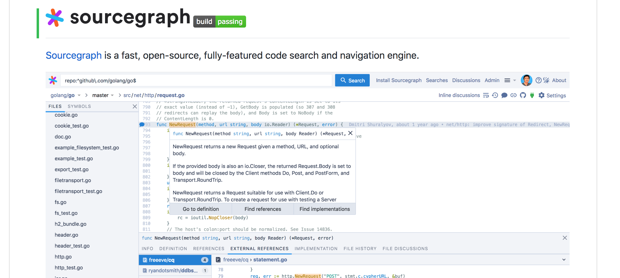
I'm fine with having the build badge, but it should be on the right of the logo not beneath it. Having a whole line of whitespace dedicated to just a badge is silly. i.e. if we're going to have it, it should be:

image

@francisschmaltz
Copy link
Contributor

Just to chime in on this:

It should be on its own line. Next to the logo looks rough.

@emidoots
Copy link
Member

emidoots commented Oct 3, 2018

Sent https://github.com/sourcegraph/sourcegraph/pull/238 which I think is better. I really do not like the idea of wasting an entire line of space just for badges.

@francisschmaltz
Copy link
Contributor

@slimsag Looks good in #238! Saw this on the train so I didn't see that. I just didn't want it to be smushed like this photo!

@nicksnyder
Copy link
Contributor

I quickly looked up a few projects. When no logo is involved I see both solutions (same line and separate line). When a logo is involved I only found examples of separate line for badges (but could be correlated to projects having a lot of badges and needing a separate line anyway).

Unless you can solve the vertical alignment issue I think a separate line (as proposed in this pr) is the least bad solution.

@emidoots
Copy link
Member

emidoots commented Oct 3, 2018

We're at a stalemate, I remain unconvinced that a build badge is worth pushing the tagline down an entire paragraph's size in whitespace. The last option I can offer you that I would be content with is ditching our logo entirely:

Sourcegraph Apache license

@francisschmaltz
Copy link
Contributor

Let's do the solution in #238 . If it looks bad on mobile we can add a css line to break it to a new line on small viewports.

@emidoots
Copy link
Member

emidoots commented Oct 3, 2018

@francisschmaltz markdown HTML is restricted you cannot use CSS

@francisschmaltz
Copy link
Contributor

francisschmaltz commented Oct 3, 2018

Ahh. I think on the right looks good and there's not a huge need to have this mobile optimized.

@felixfbecker
Copy link
Contributor Author

@slimsag I don't understand the problem with using a line for badges. Almost every open source project does exactly that - dedicate one line in the README, directly under the title, for badges.

@nicksnyder
Copy link
Contributor

#238 as it is currently is not an option (right justified badges). Its is highly unusual and there are visual defects. "Optimizing for mobile" is not a requirement. "Not proactively making it look bad on mobile" is a requirement.

The acceptable options that I see are:

  1. Merge this PR as-is: keep logo and badge on new line.
  2. Remove logo and put badges next to title as Stephen suggested in https://github.com/sourcegraph/sourcegraph/pull/219#issuecomment-426511966.
  3. Not add badges and keep the README as it is. I am actually ok with this, but I assume others are not.

Of the three, I think (1) is the best solution because

  1. Our logo is nice to have for our flagship product (thanks for adding it!)
  2. There is also plenty of precedent for putting badges on a new line, especially when there is a logo in the readme. I am sorry if you personally find this unappealing, but it seems like a broader audience has deemed this an acceptable solution.
  3. This PR is ready to merge, we have already spent more time discussing this than it is worth, and it is easy to change in the future.

With that, I am clicking the merge button.

@nicksnyder nicksnyder merged commit 790ba12 into master Oct 3, 2018
@nicksnyder nicksnyder deleted the build-badge branch October 3, 2018 15:29
@felixfbecker
Copy link
Contributor Author

Btw I definitely see the point you are making @slimsag, it's not optimal that there is a single badge on its own, and it would look better if there were more. There also used to be more, but they were removed piece by piece, so I am just trying to get at least the uncontroversial obviously useful ones back. I would be 100% for adding e.g. a license badge too as you did in #238 and I think that would already make it look better.

@nicksnyder
Copy link
Contributor

Sign up for free to subscribe to this conversation on GitHub. Already have an account? Sign in.

Labels

None yet

Projects

None yet

Development

Successfully merging this pull request may close these issues.

4 participants