
Reusable, themeable popover and alert views for UIKit, built from one base class so every popover in an app shares the same header, card style, and close behaviour.


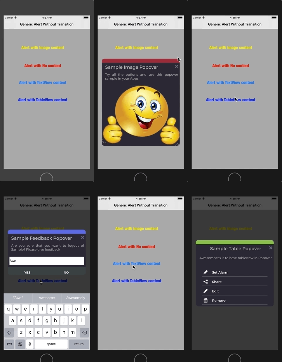
- A
PopOverBaseViewControllerwith a reusable header template: card colour, title, and subtitle are configurable per popover - Subclasses override stored properties (title, subtitle, content height) and add their own content view: image, table, or text input
- A
closePressedCallbackcontract so every subclass dismisses consistently - Keyboard-aware text input popovers that shift their content when needed
- Custom fonts and shared theming through a small
Utilshelper
PopOver/
├── PopoverBaseViewController.swift   Base class: header, card, close callback
├── PopOverSubClasses.swift           Image, table and input popovers
├── PopOverCallingClass.swift         Example of presenting each popover
└── Utils.swift                       Colours, fonts and helpers
Open GenericPopovers.xcodeproj in Xcode and run on an iPhone simulator. The popovers were designed for portrait without Auto Layout, so keep size classes off in the subclasses' storyboards.
This project was later turned into a reusable framework: SwiftGenericAlertViewController.
Built by Shruthi, iOS developer in Sydney. See my latest apps from Shruezee Studio: Ashtotra (live on the App Store), KindDose and MiniMingle Games.