Fix language selector alignment #3306
Conversation
* Adjust language icon and caret in menu-bar
* remove unused style from `language-selector.css`
|
Tests are going to fail due to #3305 I'll rebase and push once that PR lands to get the travis build to work. |
|
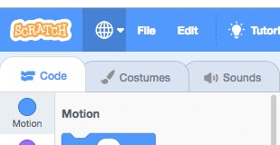
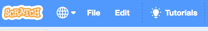
Only problem is that the width of
...if we bump this up to 3.5rem, it looks much neater: ...alternatively, if we decrease the language-icon height from 1.5rem to 1.25rem, it also looks better, and the icon size seems (to me) more in line with the other menu icons: |
 benjiwheeler
left a comment
benjiwheeler
left a comment
There was a problem hiding this comment.
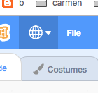
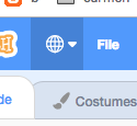
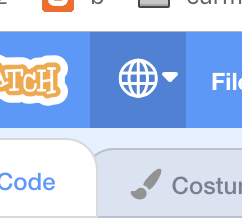
Looks good, but the width and effective right-padding seems out of whack
|
I'm concerned that we already lose most of the title in some languages on smaller screens - it doesn't seem worth adding more width to the language icon - it already has a lot of space around it. How about reducing the padding instead (using .5rem instead of .75rem): Spacing without highlight: @carljbowman what do you think? reduce the padding, reduce the icon size, or increase the width? |
|
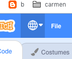
@benjiwheeler I've updated the css for the language-selector. I spoke with @carljbowman and he thought reducing the padding for the language selector was fine. |
|
BTW, you can try it here: https://chrisgarrity.github.io/scratch-gui/issue/2658-lang-select/ |
|
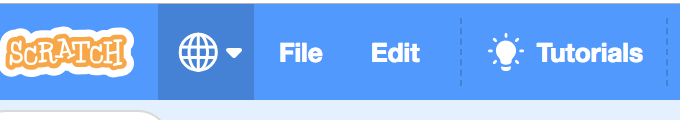
OK, LGTM. FYI, this is what it looks like now on my mac chrome:
|
|
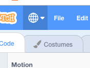
@benjiwheeler that still doesn't look quite right - I wonder if the stylesheet is getting cached? |
|
Emptied cache and hard reloaded, seems the same. (I'm not sure you create those build branches, or if they're created automatically? Should I pull the PR instead?)
|
|
Downloaded the diff and tried it locally, looks great! The built branch was just stale.
|
Resolves
Proposed Changes
language-selector.cssReason for Changes
Align language icon with Scratch logo and tutorials icon
Test Coverage
Current tests run
Browser Coverage
Check the OS/browser combinations tested (At least 2)
Mac
Windows
Chromebook
iPad
Android Tablet