Use a more saturated colour scheme #993
Conversation
964014a to
9bc04ce
Compare
|
I don't think this PR goes in the right direction:
|
|
Agreed. Firefox has some a11y devtools that help with contrast. Also a common complaint about the website styling was that it was very bright, making it more saturated doesn't help. |
|
Tried to improve the colors without changing the overral look of the website:
|

9bc04ce to
5f4d309
Compare
|
Okay, I've opted for more deeper colours, and ensured all of this colour scheme passes contrast ratios tests on all pages. @pietroalbini Once a a contrast is above 4.5:1, having higher contrast above that isn't an empiric good, there's a lot of other factors consider beyond contrast ratio. @Manishearth That kind of feedback isn't very useful for me, as it is not actionable. There's no time to that complaint, so I have nothing to compare it to, the colours have not remained the same since the redesign. Saturation is not the same as brightness, and a complaint about the website being too bright can be about a lot more than the colours being too bright. At the end of the day a lot of design is going to be subjective, and I'm going to make the changes I believe are for the better, they will never satisfy everyone.
|


|
@XAMPPRocky it's not any less actionable than this pull request: I don't want to merge a design change with very little justification when there were also complaints in the opposite direction. Yes, brightness and saturation aren't the same technical term, but when used colloquially they often are. And yes, the colors have changed since then, but a general desire to avoid very bright colors still makes sense. The deeper colors do look better and they don't look "bright". |
@XAMPPRocky The issue the PR you closed was addressing, #586, mentioned that the reporter had trouble reading the website even with the 4.5:1 contrast ratio due to their low vision, and they suggested a higher ratio. For the rest of the stuff I agree with Manish. |
5f4d309 to
d858981
Compare
|
Okay, I've opted for a slightly deeper green. Here's the current contrast ratios for white foreground on colour background. @pietroalbini For what it's worth this PR's contrast ratios are higher than the colours purposed in the reporter's fork. Original / New
|


|
Can we still try to keep the new colors as close as possible to the original ones, while increasing the accessibility? |
|
I like the deeper colors. I don't have strong preferences either way on old vs new, but if this helps a11y that's good. I'm r+ for that change but I'd like to wait for Pietro to be r+ as well. |
|
The only color I'm not too convinced about is the blue/purple... Could you keep it a little closer to the original one? |
|
@pietroalbini If this is purely a preference, I would prefer to retain my agency to make these kinds of subjective decisions while I'm the active maintainer, and keep the purposed colours as is. I don't see a reason to be precious about the current colour scheme, or this one, or any other one. I don't think we've ever made a promise to commit to a particular colour scheme and I don't see why we would now. It will never be perfect, and we'll continue to improve it over time. |
|
Uh, pietro and I have also been actively maintaining the website. I don't really have strong opinions about colors, but "let's not be precious about a color scheme" cuts both ways. |
|
@Manishearth I didn't mean to imply that you's weren't. I think if I were being being precious I wouldn't have already made a number of changes, and I think if we're at the point of discussing preference I would want to get feedback from a broader set of people and the only reasonable way to get that feedback is to deploy and test it. And in the future I do want to test and try out radically different colour schemes, however that takes a lot longer to figure out. This is meant as a small incremental improvement to the current scheme in the mean time. |
|
The current color scheme reminds me of fog. It looks okay, but it is harder to read. The new theme looks better, but I think the "build it in rust" would look better if it went in the other direction, and had the background much darker to get the contrast. I think not involving some preference is going to be impossible, if the great light vs dark theme battle is any indicator. Darker "Build it" Section
Alternate colors I tried. (I only changed enough to get the idea across)
|


d858981 to
4c2704a
Compare
|
@Zexbe The reason it looks like fog is because all of the colours are very light and when paired with a white backgrounds in other sections it looks like colours are washed out. The colours in the PR are essentially the original colours with the lightness turned down and their saturation increased. I do like the black/dark navy for "Build It In Rust" though I'm not sure it fits with the other colours. Since the discussion has slowed down, I don't want this PR to become derailed into discussing the colour scheme in general, and I want to close the contrast issues I'm going to merge this. We just deployed so this will have a decent amount of amount of time on staging so people can try it out and if anyone finds an erroneous case we can fix/revert it. This isn't a commitment to these particular colours, we can and probably will change them again in the future. Personally, I would be okay with having "seasonal" (read some period of months) colour changes. |
If the intention is to fix the accessibility problem then we should just improve the less accessible colors, and properly discuss the other color changes in another PR, without fast-tracking it. |
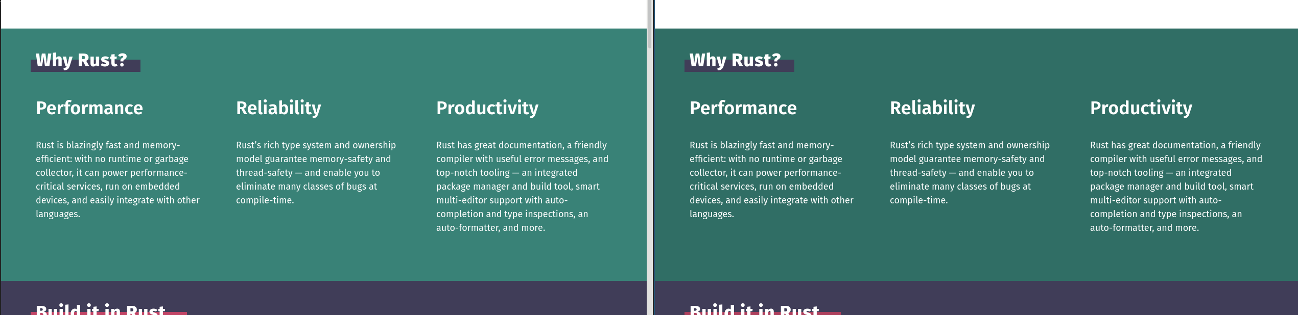
This PR changes the colour scheme to be more bright and saturated. This should improve some of the legibility issues.
Screenshots (Original / New Colours)