This is an Expo project created with create-expo-app.
I built it as a personal challenge to explore new ideas, test design concepts, and experiment with performance patterns — while proving I can move from zero to prototype quickly.
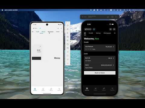
The goal was simple: build something that looks and feels real, while pushing my creativity and coding speed to the limit.
I’m excited about the results — clean design, smooth navigation, and modern animations that make the experience feel truly next-gen.
Youtube Video
-
Install dependencies
npm install
-
Start the app
npx expo start
In the output, you'll find options to open the app in a
- development build
- Android emulator
- iOS simulator
- Expo Go, a limited sandbox for trying out app development with Expo
You can start developing by editing the files inside the app directory. This project uses file-based routing.
When you're ready, run:
npm run reset-projectThis command will move the starter code to the app-example directory and create a blank app directory where you can start developing.
To learn more about developing your project with Expo, look at the following resources:
- Expo documentation: Learn fundamentals, or go into advanced topics with our guides.
- Learn Expo tutorial: Follow a step-by-step tutorial where you'll create a project that runs on Android, iOS, and the web.
Join our community of developers creating universal apps.
- Expo on GitHub: View our open source platform and contribute.
- Discord community: Chat with Expo users and ask questions.
This project leverages several powerful packages to enhance development and user experience. Below is a list of the key packages, their benefits, and how they are utilized in this project:
- Benefits: These packages provide a robust and customizable UI component library and utility functions for building consistent and reusable UI elements.
- Usage: Used to create a cohesive design system and streamline the development of UI components across the app.
- Benefits: Simplifies the integration of validation libraries like
zodwithreact-hook-form. - Usage: Used to validate form inputs seamlessly, ensuring data integrity and user-friendly error handling.
- Benefits: Expo simplifies the development of React Native apps by providing a managed workflow, while
expo-routerenables file-based routing for better navigation management. - Usage: Core to the app's structure, enabling cross-platform development and intuitive navigation.
- Benefits: Offers a collection of beautifully designed, customizable icons.
- Usage: Used to enhance the app's visual appeal with high-quality icons.
- Benefits: Brings the power of Tailwind CSS to React Native, enabling rapid styling with utility-first classes.
- Usage: Used to style components efficiently and maintain a consistent design language.
- Benefits: The foundation of the app, providing a declarative and component-based approach to building user interfaces.
- Usage: Core libraries for rendering the app on web and mobile platforms.
- Benefits: Provides accessible UI primitives to ensure the app is usable by everyone, including those with disabilities.
- Usage: Used to enhance accessibility features across the app.
- Benefits: A performant and flexible library for managing forms in React.
- Usage: Used to handle form state and validation efficiently.
- Benefits:
react-nativeenables building mobile apps using React, whilereact-native-webextends this capability to the web. - Usage: Core frameworks for developing a truly cross-platform application.
- Benefits: Simplifies the creation of beautiful and interactive charts.
- Usage: Used to visualize data in the app, such as insights and analytics.
- Benefits: Enable smooth and responsive gestures and animations.
- Usage: Used to create a dynamic and engaging user experience.
- Benefits: Handles safe area insets for notched devices.
- Usage: Ensures the app layout adapts to various screen sizes and device types.
- Benefits: Optimizes memory usage and performance by managing screens efficiently.
- Usage: Used to improve navigation performance.
- Benefits: Enables the use of scalable vector graphics (SVGs) in React Native.
- Usage: Used for rendering icons and other vector-based graphics.
- Benefits: Provides a customizable tab view component.
- Usage: Used to implement tab-based navigation in the app.
- Benefits: A utility-first CSS framework for rapid UI development.
- Usage: Used in conjunction with
nativewindto style components consistently and efficiently.
- Benefits: A TypeScript-first schema declaration and validation library.
- Usage: Used to define and validate data schemas, ensuring type safety and data integrity.