logo on main readme is unsuitable for github dark themes #2623
Description
Bug Report
What did you do?
visit the repository's main readme file in GH dark mode.
What did you expect to see?
the logo text on the top should be readable.
What did you see instead? Under which circumstances?
the logo text does not have sufficient color contrast, therefore reducing (or eliminating) readability.
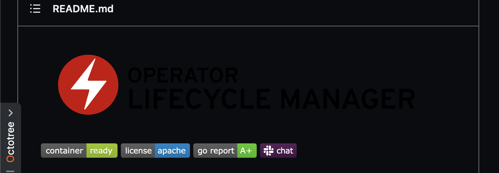
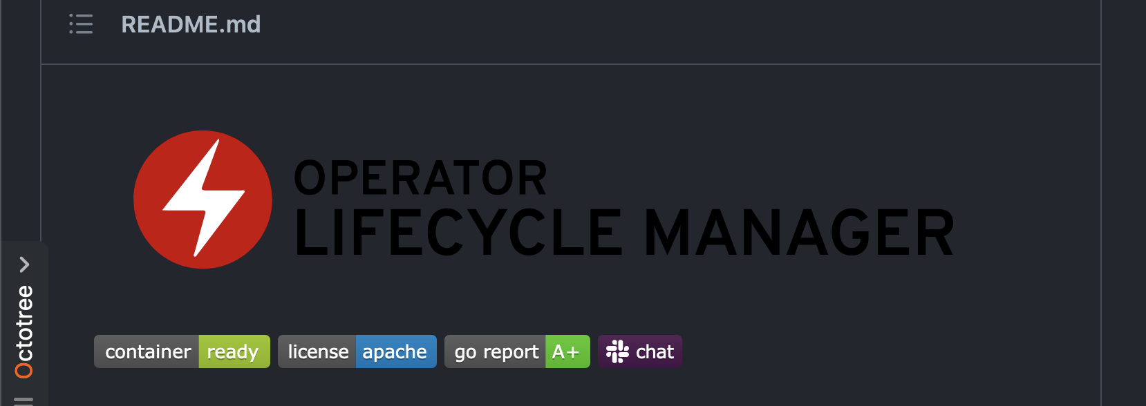
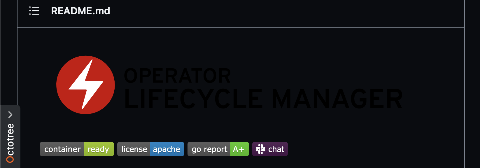
here are some screenshots of the current state, with different dark theme variants:
-
dark (default)
-
dark dimmed
-
dark high contrast
Environment
- operator-lifecycle-manager version: N/A
- Kubernetes version information: N/A
- Kubernetes cluster kind: N/A
Possible Solution
add a new logo image, with a light-colored text, and reference both images with source suffixes appended (#gh-light-mode-only / #gh-dark-mode-only).
this will conditionally display the correct image for each mode.
Additional context
N/A