
Created a design system for the website to organize the visual elements, such as colors, fonts, and text styles, to ensure design consistency.
Completed essential lessons covering the CSS box model, display and positioning, colors, and typography.
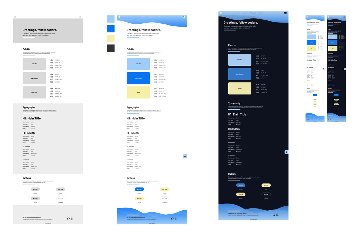
The style guide includes the following sections:
Carefully selected a unique name to identify it. Alongside the name, there's a color box to visualize the actual shade and included the corresponding CSS value used to define the color (in formats like hex, rgb(), rgba(), hsl(), or hsla()).
The Fonts section showcases the different font styles that are intended to use on the website. Specified each font name and presented various styles, such as plain, bold and italic, underlined, etc.
The Text Styles section outlines specific text styles tailored to different page elements, such as headings, subheadings, paragraphs, and more. Included all the relevant style rules, such as font-weight, font-size, font-family, etc.
To enhance the design system's aesthetics, I went beyond the basic requirements and added extra styles, including positioning, layout, additional colors, box model properties, and more.
Wireframing and prototyping before jumping right into coding allowed me to envision the layout, user experience, and interactions upfront. This approach provided room for adjustments easily and organize and group elements within the design effectively. Ultimately, it saves more time and effort.
- Additional Components: Documented various buttons and components that are planned to use on the website.
- Responsive Design: Implemented responsive design to ensure a polished look across different screen sizes.
- Navigation Bar: Divided the website into sections with a cohesive navigation system, facilitating easy access.
One of the standout features implemented in my design system is Dark Mode. When activated, Dark Mode modifies the website's colors and styles, providing a visually appealing and comfortable experience for users. This feature was implemented using JavaScript.
Building this design system has been an exciting and rewarding experience. Throughout the project, I learned the importance of creating a structured and consistent visual language for a website. The process of carefully selecting colors, fonts, and text styles allowed me to refine the overall aesthetic and friendliness of user experience.
The Dark Mode feature was a particularly enjoyable addition. Although JavaScript was out of the scope of my current learning progress, taking the project beyond the basic requirements allowed me to explore and experiment with additional styles and features. I was able to enhance the design system's appearance and functionality, making it not just a reference but an inspiring resource for future endeavors.
@Mar 2023