console: show suggestions for completion #10316
Conversation
b8cfd7e to
12d5a92
Compare
12d5a92 to
fc78a27
Compare
|
Refactored it a bit, the only new line going over 80 characters is now 272 and I think that can stay that way. |
fc78a27 to
444b721
Compare
|
Had to rebase due to conflicts. |
|
On my end it looks misaligned, apparently when completing something with |
|
No idea why that happens for you. Edit: Actually I have some idea. When looking at the order of your entries, it's like you actually have 4 columns, but it wraps around after 2. |


I don't know. How would I check? |
|
I'm currently rebasing on master and looking at the code it should already handle scaling 🤔 |
|
I'm guessing he's not using monospace font. EDIT: but it does look monospace... |
|
It looks like a monospace font and everything lines up perfectly when you consider wrapping exactly at the point where the 3rd column would begin. Edit: I've now tested scaling and it works fine for me, so there must be some other problem... Edit2: It does look like that for me when I set |

444b721 to
9578941
Compare
That prints |
|
The table formatting supports utf8 encoding now. That shouldn't really make a difference because currently all commands and properties use ascii characters, but that will avoid problems in case that changes at some point. @haasn I can only replicate how it looks for you by doubling @avih Does the default value work for you? |
b4c5521 to
386fab7
Compare
I didn't try it. |
386fab7 to
a7b7947
Compare
|
I imagine you've contemplated this before, but how much work would be needed for the script to cycle between all possible completions with every TAB keypress? |
|
I'd expect that to be pretty hard to do, sure would be nice though. |
a7b7947 to
9d06c82
Compare
|
The rows are now from the bottom up instead of from the top down (first row at the bottom), that's better because the last column isn't always full, and so a when the table gets cut of at the top, less suggestions get cut off. It's also a little bit simpler and faster. Especially noticeable (when resizing the window) was precalculating the utf8 lengths instead of always calculating them on the fly. I've also tried filling the table column-wise instead of row-wise so that all but the last row is completely filled up, but as it turns out that often results in long suggestions being next to each other instead of on top of each other, resulting in wider columns. Wider columns lead to less columns fitting on the screen, increasing the total row count and thus fewer visible suggestions (when there are enough that they get cut off at the top). |
9d06c82 to
2f797f4
Compare
2f797f4 to
40f54bd
Compare
|
@haasn does this still not work correctly for you? It has worked fine on all setups I've tried it on. |
The text styles are now in a table.
The color definitions of the theme where the colors were taken from
are now included in a comment for future reference.
The colors have been converted to BGR as is required by ASS.
f8bba50 to
3a21130
Compare
|
Download the artifacts for this pull request: |
3a21130 to
ea34f98
Compare
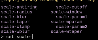
Tab completion now shows a list of all potential completions
between the log messages and prompt.
The text is colored to differentiate it from regular text.
The color matches the theme and is similar to the mpv logo.
ea34f98 to
16450b1
Compare
|
So now that I finally try this, I also seem to have the same issue as haasn with misaligned elements.
Setting |

You're using a proportional font, that's why this simple width estimation doesn't work all that well. Alternatively we could use a more sophisticated width estimation method that I made for uosc. It uses Edit: Actually we could make a separate ass event for each column, so their widths don't directly influence each other, but then there will be potential problems with text overlapping. Maybe I'll give that idea a try in the future, but that doesn't have to be part of this PR. |
|
You can maybe clarify "This has to be a monospaced font for the completion suggestions to be aligned correctly.". I also plan to keep using |
|
If it wasn't for the discussion already in this thread, I wouldn't have even expected the elements to line up. |
Completion suggestions are now nicely formatted into a table.
Maximum width of the table is estimated based on OSD size and
font size.
This requires a new scaling factor option `font_hw_ratio`.
A factor of 2.15 works great for me,
but the default is 2.0 to avoid problems with other fonts.
The space between columns is automatically adjusted to be
between 2 and 8 spaces.
It tries to use as few rows as possible.
Lines that would be outside of the visible area are now culled.
The log messages were already culled, however with the introduction
of suggestions, they also needed a small update.
16450b1 to
77e22f3
Compare
Done. |
Tab completion now temporarily shows a colored table of all potential completions
between the log messages and prompt.
The table automatically adjusts its column count depending on the space available.
As there is no way of knowing the exact width in characters, this is an estimate
and can be adjusted with the new option
font_hw_ratio.I expect the default value to work for everyone who doesn't set their own font.
The spacing between the columns also adjusts automatically, depending on
how much space is left.