


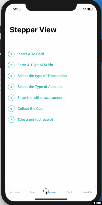
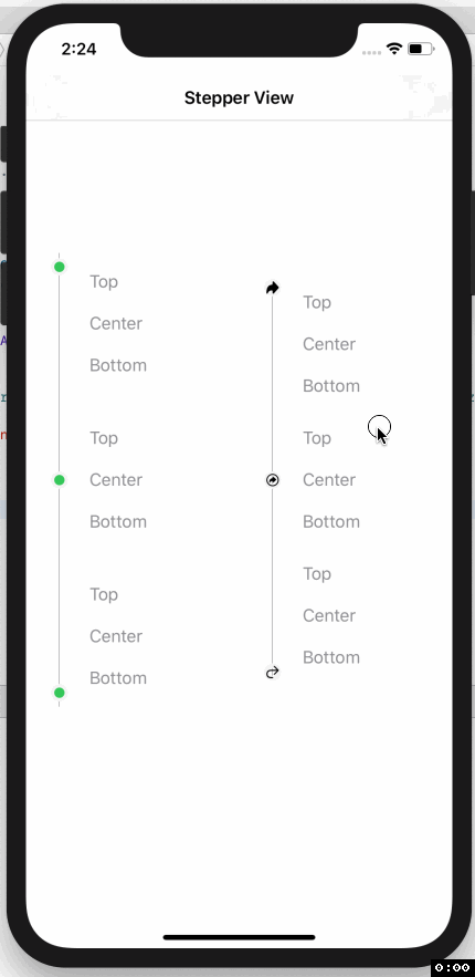
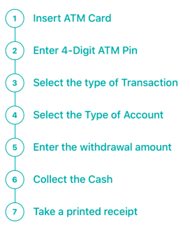
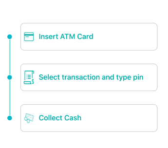
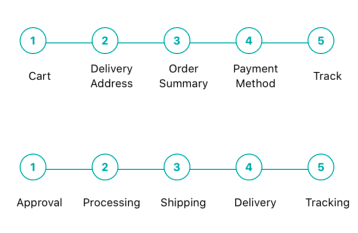
SwiftUI iOS component for Step Indications.
 |
 |
 |
To run the example project, clone the repo, and run pod install from the Example directory first.
- iOS 13.0+
- Xcode 11.2+
- Swift 5.0+
- CocoaPods 1.6.1+
StepperView is available through CocoaPods. To install it, simply add the following line to your Podfile.
pod 'StepperView','~> 1.2.0'StepperView is available through Swift Package Manager. To install it, simply add the following dependency to your Package.swift
.package(url: "https://github.com/badrinathvm/StepperView.git", from: "1.2.0")import StepperView
let steps = [ Text("Cart").font(.caption),
Text("Delivery Address").font(.caption),
Text("Order Summary").font(.caption),
Text("Payment Method").font(.caption),
Text("Track").font(.caption)]
let alignments = [StepperAlignment.center,.center,.center, .center, .center]
let indicationTypes = [StepperIndicationType.custom(NumberedCircleView(text: "1")),
.custom(NumberedCircleView(text: "2")),
.custom(NumberedCircleView(text: "3")),
.custom(NumberedCircleView(text: "4")),
.custom(NumberedCircleView(text: "5"))]
var body: some View {
var body: some View {
StepperView()
.addSteps(self.set1)
.indicators(self.indicationTypes)
.stepIndicatorMode(StepperMode.horizontal)
.spacing(50)
.lineOptions(StepperLineOptions.custom(1, Colors.blue(.teal).rawValue))
}
}
- .addSteps(_ steps: [View]) : array of views to be rendered next to step Indicator
- .alignments(_ alignments: [StepperAlignment]) : optional defaults to .center, for custom options it can be either .top, .center, or .bottom sections
- .indicatorTypes(_ indicators:[StepperIndicationType]): enum provides the options to use .circle(color, width) , .image(Image, width) or .custom(AnyView)
- .lineOptions(_ options: StepperLineOptions): to customize the line for thickness and color options.
- .spacing(_ value: CGFloat): spacing between each of the step views.
- .stepIndicatorMode(_ mode: StepperMode): enum provides the option of vertical or horizontal node for display step indications.
Refer Example for more details on usage of StepperView
Badarinath Venkatnarayansetty
Follow and contact me on Twitter or LinkedIn. If you find an issue, just open a ticket. Pull requests are welcome.
StepperView is available under the MIT license. See the LICENSE file for more info.