Breadcrumb component - Research #26481
Description
Open UI research for the upcoming Breadcrumb component.
Component structure
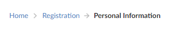
Breadcrumb component
The list of Breadcrumbs which has the following DOM structure:
<nav aria-label="breadcrumb">
  <ol>
  {children}
  </ol>
</nav>
In the majority of cases, the Breadcrumb component has BreadcrumbList and BreadcrumbItem components.
In some cases, there's a Divider component.
In V8 we have items as items prop. In Northstar there's children prop.
Proposal of Breadcrumb component structure:
1st approach:
<Breadcrumb {...props}>
    <BreadcrumbItem>Item 1</BreadcrumbItem>
    <BreadcrumbItem>Item 2</BreadcrumbItem>
    <BreadcrumbItem>Item 3</BreadcrumbItem>
</Breadcrumb>
Benefits of the 1st approach:
- RTL support might be done by the Breadcrumb component.
- A user doesn't need to think about how to use the divider. It's still can be a custom component.
- Divider can be passed as a prop in the Breadcrumb component.
2nd approach:
<Breadcrumb {...props}>
    <BreadcrumbItem>Item 1</BreadcrumbItem>
    <BreadcrumbDivider />
    <BreadcrumbItem>Item 2</BreadcrumbItem>
    <BreadcrumbDivider />
    <BreadcrumbItem>Item 3</BreadcrumbItem>
    <BreadcrumbDivider />
</Breadcrumb>
Benefits of the 2nd approach:
If we need to use different dividers, then this approach is good. But configuring LTR/RTL might be more difficult.
Example from semantic-ui:
We might want to support both approaches but then we'll need a prop e.g disableSeparator
Breadcrumb structure:
- root
navelement - list
olelement - divider - a separate component
- overflowButton
BreadcrumbDivider
Should be part of BreadcrumbItem. Can be passed from Breadcrumb but it's applied only to the item.
Notes:
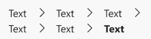
After a conversation with the designers, we agreed that only two types of separators should be supported: > and /.
We' also, had meeting with the team. We agreed to add support for the custom divider.
A divider can be:
- a component
- pseudo-element (might be performance issues)
The divider has options:
- chevron
- slash
- custom icon
Props separator=> will be passed from the Breadcrumb component. Also, it can be passed from BreadcrumbItem.separatorPosition=> can bestartandend.
OverflowButton
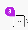
Fluent Button might be used as OverflowButton.
The default position of ellipses should be the second element because from a UX perspective root folder should be shown.
Also, we might support custom overflow button.
BreadcrumbItem component
It's a wrapper for Button, Link, and Menu components.
DOM:
<li>
  {children}
</li>
BreadcrumbItem can contain:
- Button
- Link (we can use Fluent Link)
- Text
- Menu (subfolders and collapsed items)
- Icon (optional)
It, also, will have a tooltip.
Button component
DOM:
<Button>
	{children}
</Button>
Link component
DOM:
<Link>
	{children}
</Link>
Text component
DOM:
<Text>
	{children}
</Text>
Proposal of BreadcrumbItem structure:
1 approach:
<BreadcrumbItem>Item 1</BreadcrumbItem> // non-clickable element
<BreadcrumbItem onClick={() => console.log('smth...')}>Item 2</BreadcrumbItem> // Button element
<BreadcrumbItem href="#">Item 3</BreadcrumbItem>// Link element
Benefits: easy to use.
2 approach:
<BreadcrumbItem>
	<Button onClick={() => console.log('smth...')}>
		Item 1
	</Button>
</BreadcrumbItem>
<BreadcrumbItem>
	<Link href="#">
		Item 2
	</Link>
</BreadcrumbItem>
<BreadcrumbItem>Item 3</BreadcrumbItem>
Benefits:
With this approach, there's more customization for Buttons and Links.
Notes: Ask Sarah about possible a11y issues with onClick
We decided to go with 2nd approach. But BreadcrumbItem is non needed here as a separate component. It can be as an internal component and wrapper for Button, Link and Menu.
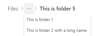
Breadcrumb menu
The menu supports only one level of hierarchy (subfolders).
It is used for collapsed items and subfolders.
Breadcrumb icon
An icon can be SVG or image.
The icon might be added as a prop:
<BreadcrumbItem icon={<IconComponent />}>Item 1</BreadcrumbItem>
<BreadcrumbItem icon="../path/name.png">Item 1</BreadcrumbItem>
This approach is good for:
- Support RTL/LTR
- User can set
icon-positionfor all the icons. - Theming/styling is consistant
Also, it might be possible to use a custom icon as achildrenprop:
<BreadcrumbItem>
	<SomeSVG />
	Item 1
</BreadcrumbItem>
Collapse functionality:
When there's no enough space or too many items the following behaviors might apply:
-
Collapse items
-
Wrap items to the next line.
After a conversation with designers, we decided not to support wrapping items as it hurts accessibility.
Collapse turns on when:
- There's not enough space
- When
maxDisplayedItemsprop is provided (TODO: check the name of this prop. This is V8 version)
Notes:
- Placement of the
ellipsesbutton might be set by theoverflowIndexprop. - Hidden items will be in the Menu component.
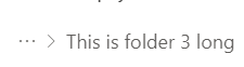
Collapse long names:
- This value should be customizable
- Recommended name length for collapse is 30 symbols
Tooltips
For working with tooltips we might add a method in Breadcrumb utils.
But they should be handled by the partners.
It's recommended to use content no longer than 80 symbols.
Opened questions:
- How should keyboard interaction work when we have opened dropdown? Should I be able to go to upper level if I click
shift+tab? Currently clicking onshift+tabdoes the same as top-arrow key. To get to the upper level I have to clickesc, is it expected behavior?
Things to consider:
- RTL/LTR support
- Localization
Notes:
- We agreed with the designers not to support Multiline wrapping.
- Compact (smaller) Breadcrumbs are not interactive.
- No need to add custom classes for V9 components because Slot system supports it by default.
- No vertical Breadcrumbs. Even on Japanese sites, horizontal Breadcrumbs are used:
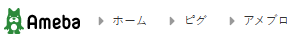
- Some well-known sites were used to check navigation: