-
Notifications
You must be signed in to change notification settings - Fork 27
Advanced Customization
In addition to the standard customization elements described here, it's possible to customize additional elements, and give the app a really distinctive design.
The tab bar appears at the bottom of almost all screens in the app. The size of this bar, as well as the size of the icons are not customizable. However, it's possible to customize:
- the drawing of the icons
- the color of the icons in different states (active or not)
- the color of the background of the bar (which is blank by default)
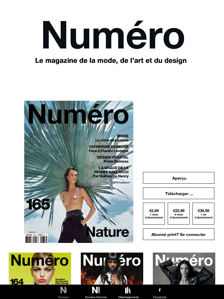
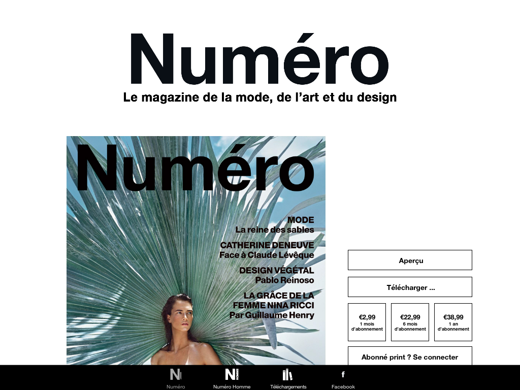
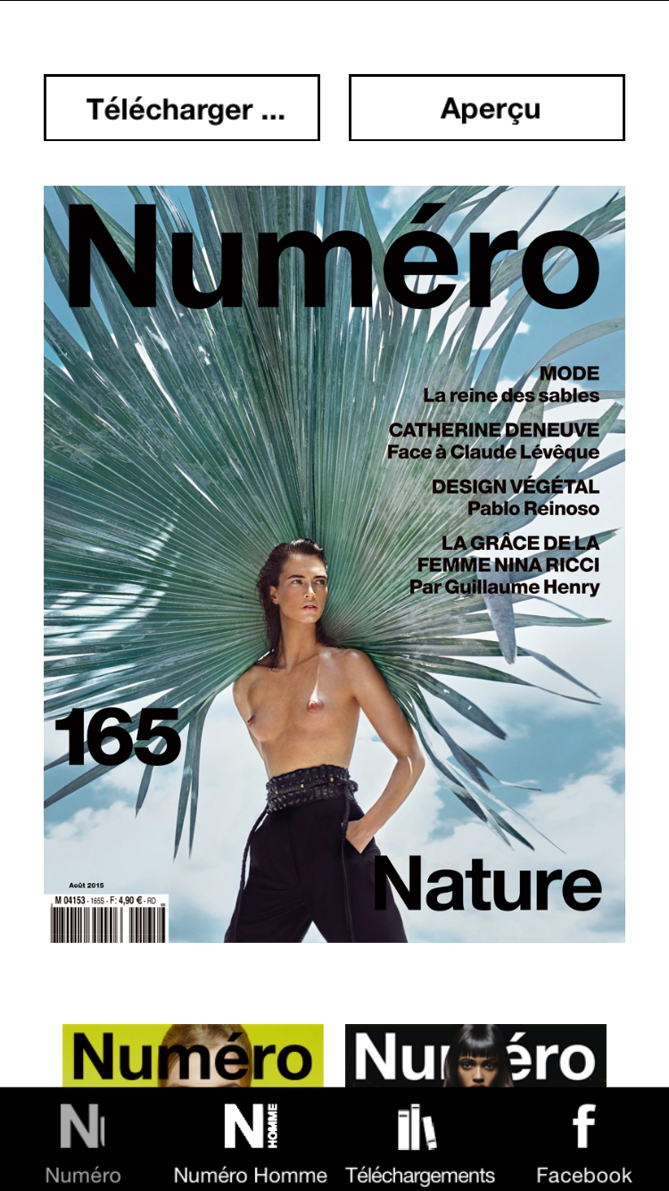
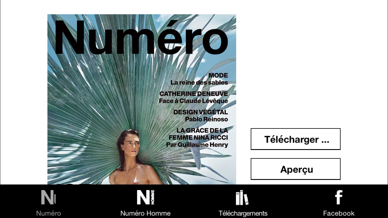
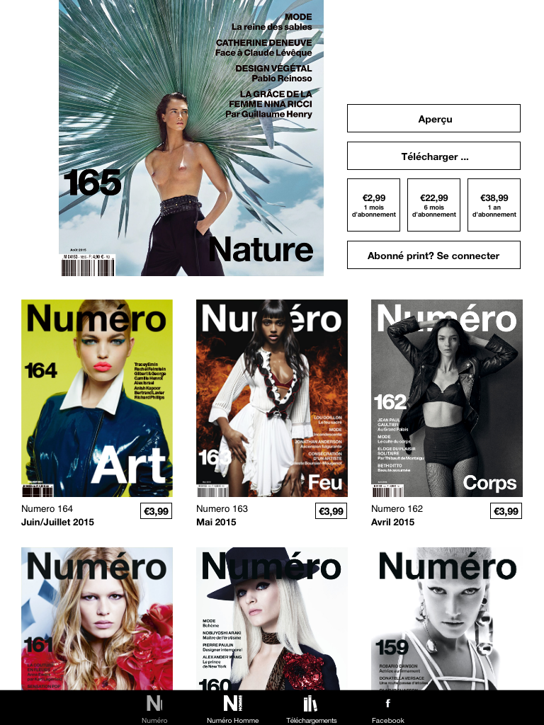
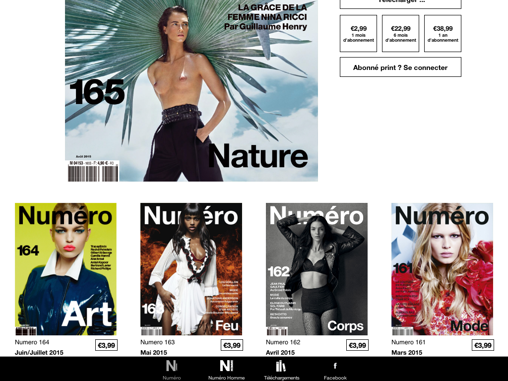
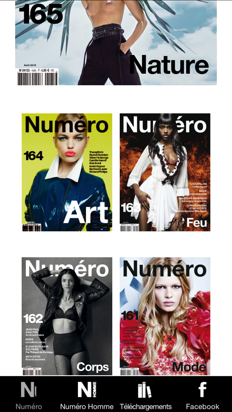
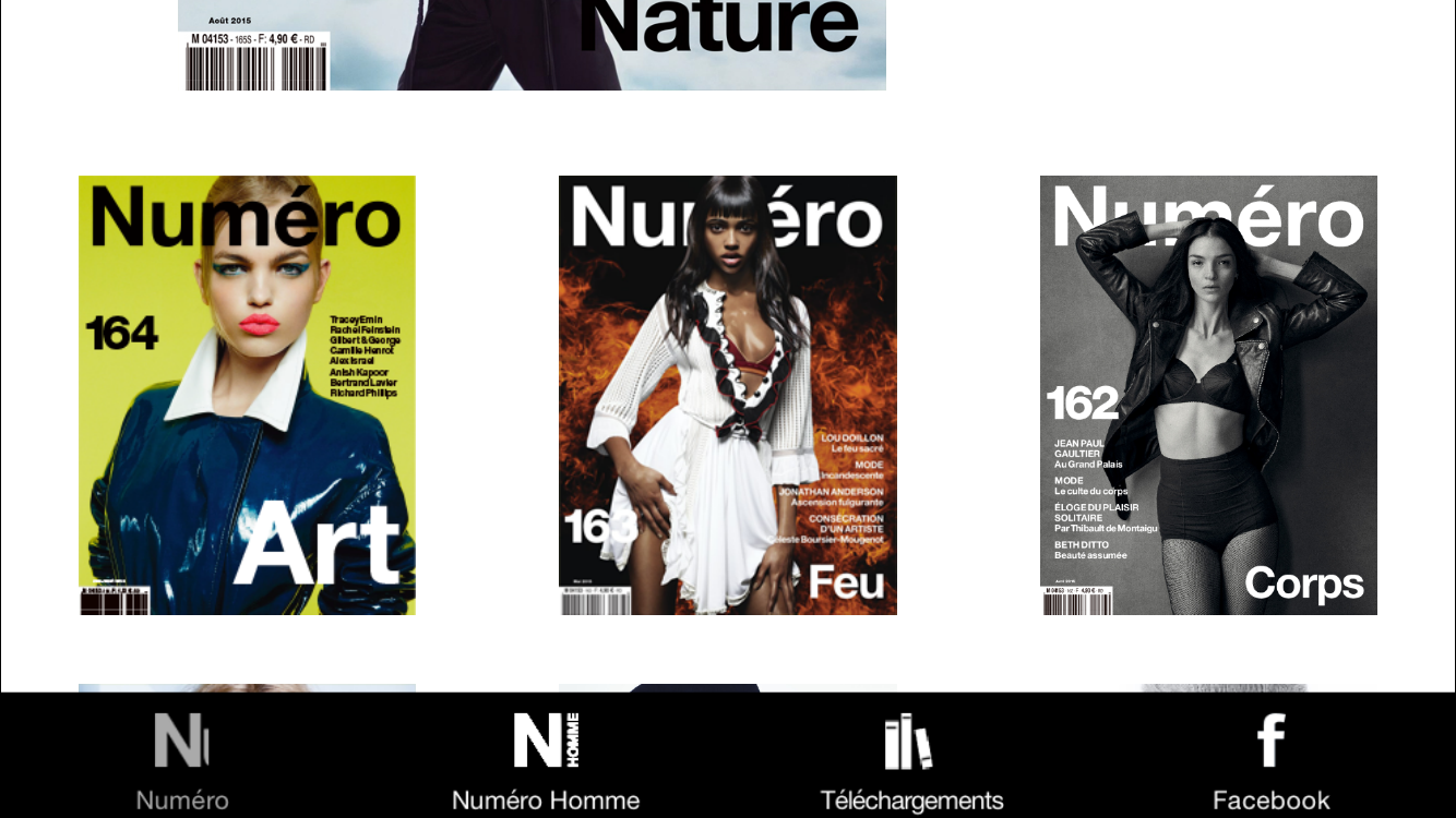
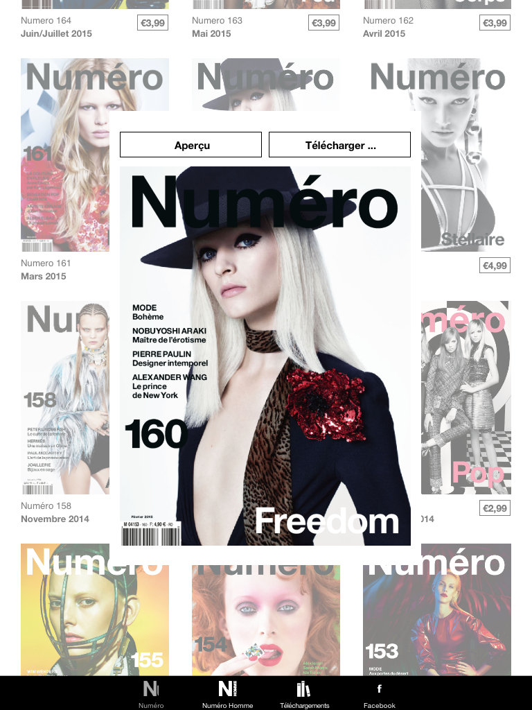
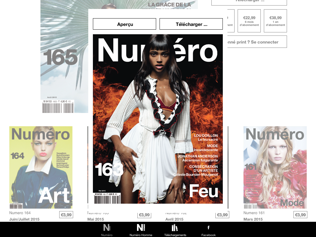
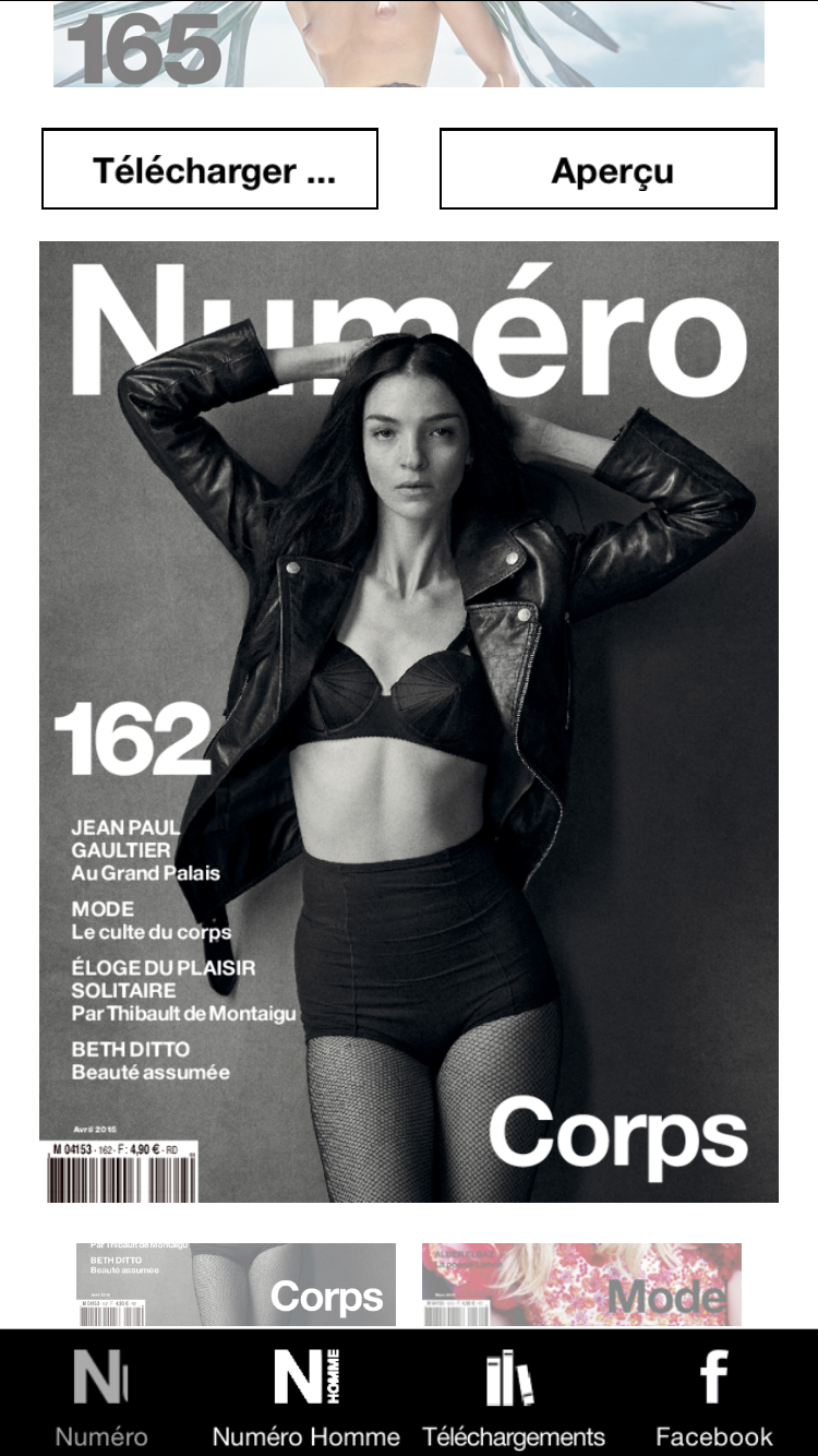
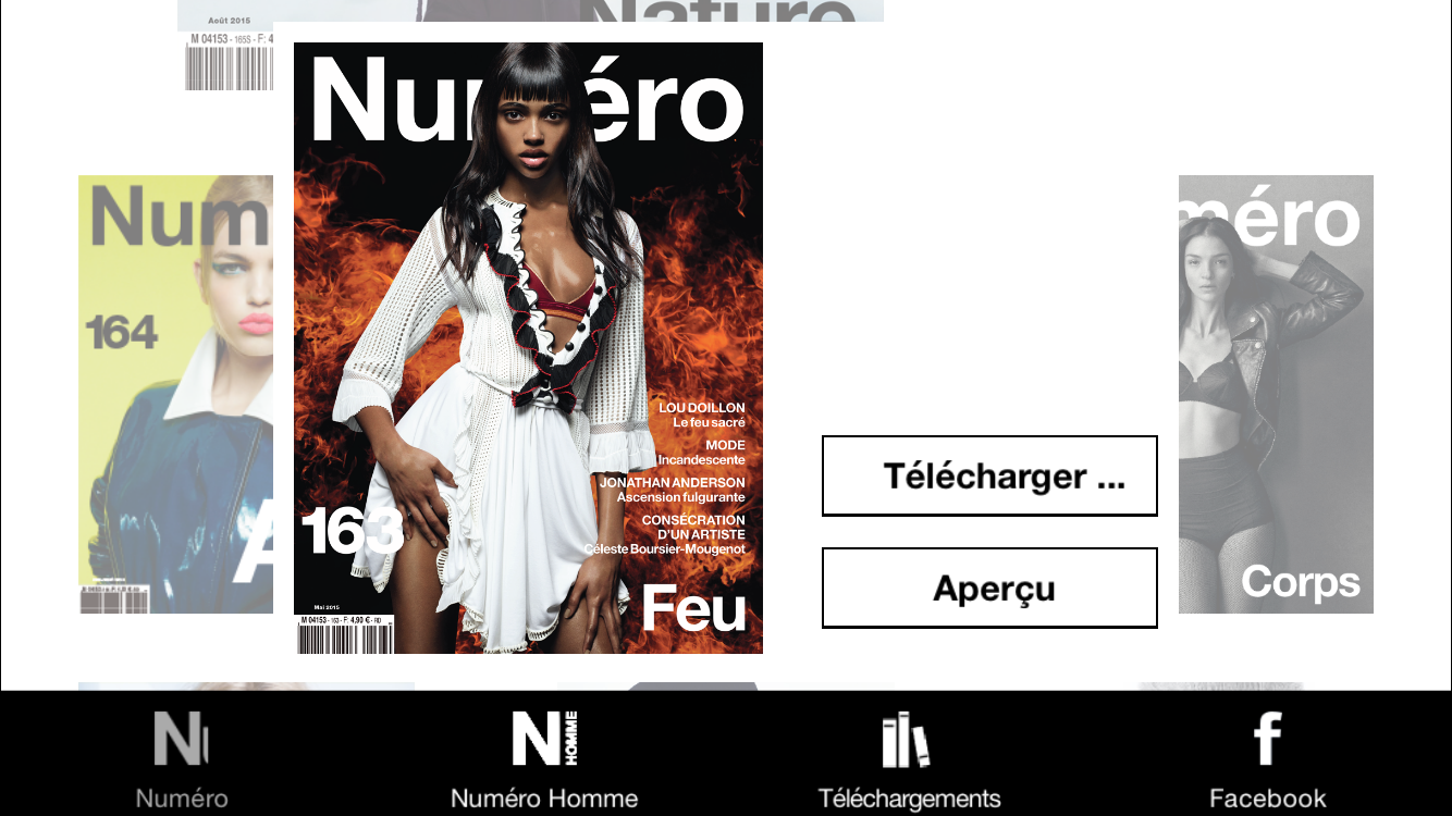
The kiosk view displays the magazine covers, and makes it possible to buy the magazines or read them. It includes a tab bar as the bottom, which can be customized as specified above.
This view includes 3 subviews:
- A header view which appears at the top, and may include the latest cover in larger size
- A grid view which displays all other covers in smaller size
- A modal view, which appears over the grid view when a small cover is tapped, and displays a large cover and additional info and buttons.
These subviews include different graphic elements, which are either optional or required (marked in bold below). The size, position, font, and color of all these elements is customizable. Here is a list of all available graphic elements:
- Covers
- Texts
- Title
- Subtitle
- Buttons
- Preview
- Download
- Read
- Subscribe
- Subscribe for 1 month
- Subscribe for 6 months
- Subscribe for 1 year
- Banner (can be managed via DoubleClick)
Specific icons should be provided in 3 sizes:
Comps need to be prepared so that Librelio or the developer of your choice customizes this view, with these technical instructions. 3 comps are needed, each in 4 versions:
- Header
- iPad portrait. Example
- iPad landscape. Example
- iPhone portrait. Example
- iPhone landscape. Example
- Grid
- iPad portrait. Example
- iPad landscape. Example
- iPhone portrait. Example
- iPhone landscape. Example
- Modal
- iPad portrait. Example
- iPad landscape. Example
- iPhone portrait. Example
- iPhone landscape. Example
- Home
- Deployment
- Enrollment
- Customization
- Building
- Submission
- Enhancement
- Management
- Upload
- Tracking
- Development
- Xibs
- 3rd party libraries