CI Status: move details into a popup #318
Merged
Conversation
This file contains hidden or bidirectional Unicode text that may be interpreted or compiled differently than what appears below. To review, open the file in an editor that reveals hidden Unicode characters.
Learn more about bidirectional Unicode characters
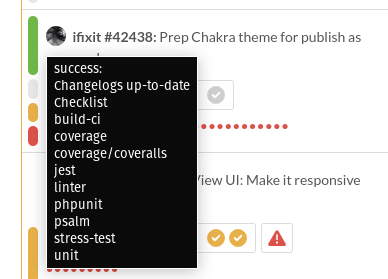
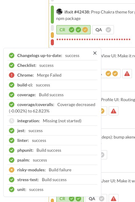
We have a *lot* of commit statuses in our main repo now, (16 or so).
This is far too many to effectively display and make clickable on the
left side of each pull.

Solution
========
Show one status bubble for each state represented, scaled roughly by how
many have that state. Make that whole section clickable and render a popup
with more details.
Most of our successes and failures look like "success" and "failure" and
that is already communicated by the color.
Object.keys() doesn't guarantee the key order, so if we want
a specific order, we have to use expressions instead of array.map()
Previous iteration was thrown together for a demo, so make it a little
more polished.

* Use icons to represent states
* Use icon color to represent states
* Subtle divider
* Drop the heading cause it's overkill
* Hover state
* Polish it for dark mode too
isLazy effectively defers the creation of the content elements until
the popover is opened. Since we have many pulls, this helps with
overall DOM complexity.
We have the icon + color that both change, but nothing explicit
says the state (like "pending") until now.
And space out the description a small bit

The context name is usually more important than the description anyway.
mlahargou
reviewed
May 16, 2022
Humans don't sort strings this way, so our tools shouldn't either.
|
QA 🐧 and deploy_block 🍰 on one issue
Issue
emptyCIBox.mp4 |
This is no longer a map, so we don't need key=
Use the no-popup version if there is only one status cause it doesn't
add anything and just gets in the way.
Member
Author
|
un_deploy_block 👍 Thanks @rickisXP !!! I fixed the issues you found and made a few small changes (commit messages explain) |
|
QA 🔢 but deploy_block 💯 on one question
Question ❓When clicking on CI statuses with only one check, is opening the CI check in GitHub the expected behavior, or should Pulldasher be showing the same CI popup? gitHubCIcheck.mp4 |
Member
Author
|
Intended cause I think the simpler behavior is better for small numbers of statuses: un_deploy_block 👍 |
mlahargou
reviewed
May 17, 2022
Sign up for free
to join this conversation on GitHub.
Already have an account?
Sign in to comment
Add this suggestion to a batch that can be applied as a single commit.
This suggestion is invalid because no changes were made to the code.
Suggestions cannot be applied while the pull request is closed.
Suggestions cannot be applied while viewing a subset of changes.
Only one suggestion per line can be applied in a batch.
Add this suggestion to a batch that can be applied as a single commit.
Applying suggestions on deleted lines is not supported.
You must change the existing code in this line in order to create a valid suggestion.
Outdated suggestions cannot be applied.
This suggestion has been applied or marked resolved.
Suggestions cannot be applied from pending reviews.
Suggestions cannot be applied on multi-line comments.
Suggestions cannot be applied while the pull request is queued to merge.
Suggestion cannot be applied right now. Please check back later.
See discussion: #316
When we have lots of CI statuses (we currently have 15 or so), the current UI works very poorly. This change moves most of it into a popup.
CI Status UI
Popup:
Popup:
Hover state