Update Wins About page,1835 #1870
Conversation
|
@hackforla/website-merge What is the next step here ? |
This needs a second reviewer, ideally not me, since I do need to leave space for other members to also practice reviewing PRs. If the issue is not particularly urgent, could this be left for another day? Is there a soft or hard time frame for a second review after the approval of a first reviewer? |
It definitely can be, but it would decrease overall velocity.If i recall last nights backend meeting conversation with Bonnie, reducing velocity is not favoured.
Not that I am aware of. 24 hours ? imho,
|
There was a problem hiding this comment.
You did a really good job matching the Figma design for the desktop view. I just have one suggestion.
This is the figma design in mobile view (iPhone X)
About Page (mobile view) figma design

This is the same section in mobile view (iPhone X) on your branch
About Page (mobile view) your branch

@anonymousanemone notice the card on your branch is currently shorter on the left/right side and not the same length as the text above it? Can you make sure the card matches the Figma design in mobile (iPhone 8-11)? It looks you may need to decrease the card margin (left/right) in mobile view.
Thank you.
|
@anonymousanemone. After doing a bit of research, I may have found the reason why it looks shrunk. The Screenshot of img/svg element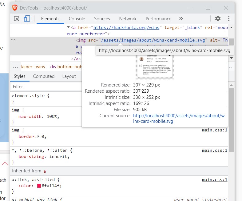
As you can see, the width of this element is 307px. But the intrinsic size for this is 338px. so it seems like we have a 31px border of extra space. We basically need to remove it. From my research within this CSS tricks article on svg, it seems like we don't have very much control of the styling of an SVG when it is nested in a We can discuss a solution with @akibrhast @Aveline-art @averdin2 and @jbubar tonight to see if we can come up with a solution at the meeting tonight. |
There was a problem hiding this comment.
@Aveline-art It seems like the SVG space is a medium separate issue. I created #1908 and moved all the relevant information over there. All your current changes look good @anonymousanemone. Thank you for your patience and understanding.
Fixes #1835
What changes did you make and why did you make them ?
Screenshots of Proposed Changes Of The Website (if any, please do not screen shot code changes)
Visuals before changes are applied
Visuals after changes are applied