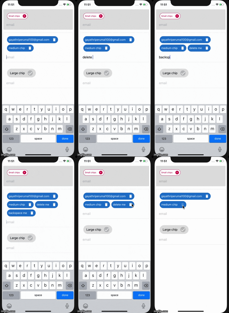
This is like material ui chip input for react native.
All React Native TextInput props are acceptable as it is.
| Name | Type | Usage |
|---|---|---|
variant |
contained outlined |
By default the chip variant is outlined |
inputVariant |
contained outlined standard |
By default TextInput variant is outlined |
size |
large medium small |
By default the chip size is medium |
showChipIcon |
true false |
By default it is false |
iconName |
close |
By default it has icon name value as close. It accepts all material design icons |
chipIconAction |
function |
By default it perform delete action. You can pass your own actions |
primaryColor |
string hex |
Acts based upon chip variant |
secondaryColor |
string hex |
Acts based upon chip variant |
inputStyle |
* |
Accepts style object as parameter for TextInput style |
placeholderStyle |
* |
Accepts style object for placeholder in TextInput |
inputTextStyle |
* |
Accepts style object for input value in TextInput |
import React from 'react';
import ReactNativeChipInput from 'react-native-chip-input';

const App = () => {
  return (
          <ReactNativeChipInput
            variant="contained"
            inputVarint="outlined"
            showChipIcon={true}
            chipIconAction={e => console.log(e)}
            label="email"
            placeholder="email"
            primaryColor="#1976d2"
            secondaryColor="#ffffff"
            autoCapitalize="none"
            autoCorrect={false}
            autoFocus={true}
          />
         );
   }
 export default App;