[Application-layout] Component review #821
Description
The current application-layout component
The sidenav component inside the application layout has a prop named mode to change the behavior (push or overlay).
- The default value for this prop is
overlay. - When
pushmode is selected, in mobile the behavior changes tooverlayby default
The prop displayArrow controls the display of the arrow bubble used for collapse and uncollapse the panel, this prop doesn't have any effect on mobile devices since the arrow is displayed by default.
Anatomy
The current navigation hierarchy is based on a TLL (Top-left-left) navigation. Where we suggest placing the primary links on the header, the second and third hierarchies on the sidenav.
The study "A comparison of three-level menu navigation structures for web design" strongly suggest the usage of a primary left menu over primary top menus being the best performing structures (LLL, LTT, TLL).
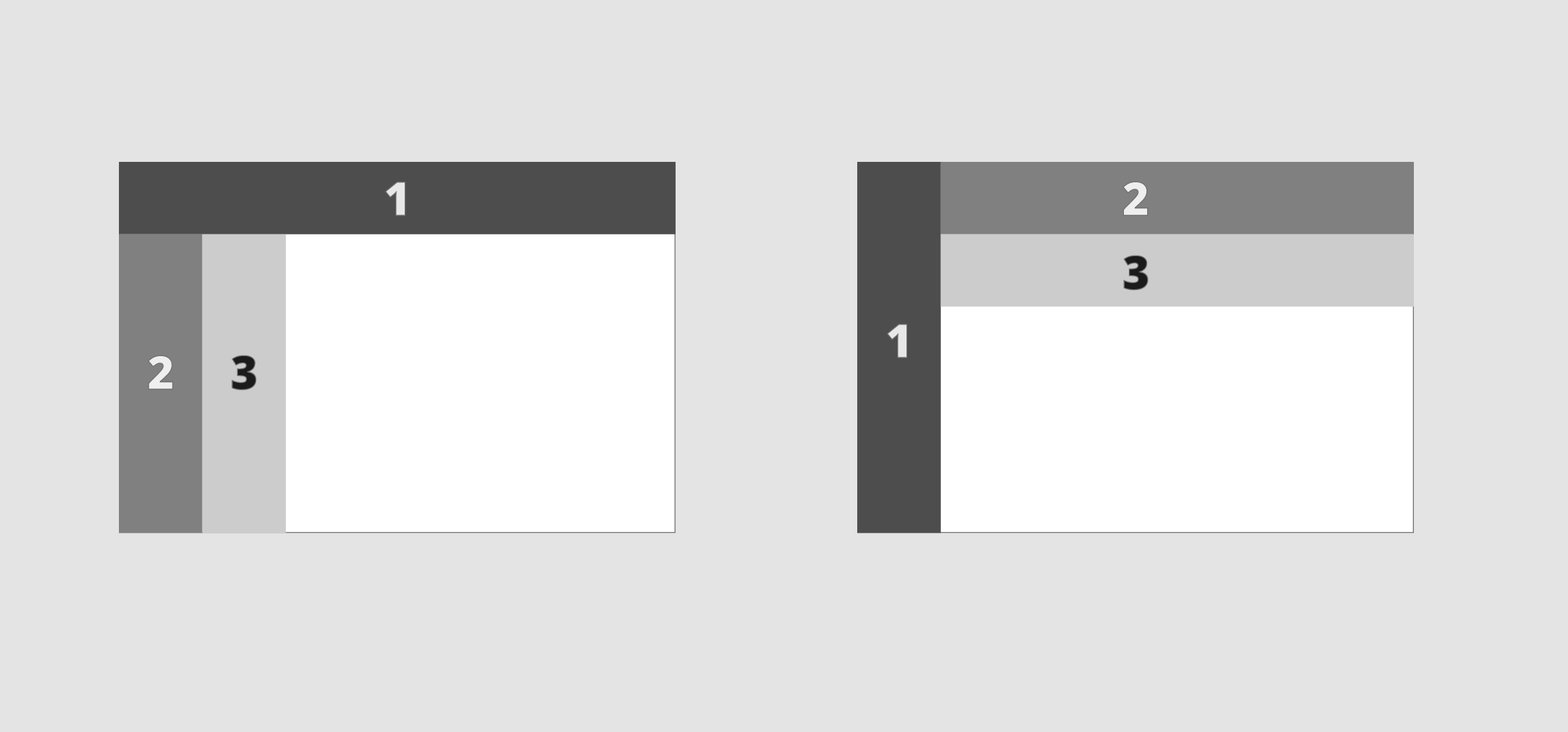
Fig. TLL (Left) vs LTT (right) navigation patterns
Defining the pattern navigation
Depending on the number of categories, the space needed, and the number of hierarchies the guidelines should reflect which navigation pattern is encouraged to use.
Single level menu navigation
- Top navigation: Use it in applications with few navigation items and without a hierarchical navigation model.
- Left navigation: Use it for complex applications with several navigation items or a hierarchical navigation model.
Vertical navigation also takes more space, so when the navigation structure is not simple but the content is also dense, either top navigation with category grouping or collapsable left navigation can be used.
Multilevel menu navigation
Behavior
Responsive transition
We have identified different possible behaviors to apply in the responsive transition:
- Group
headerandsidenavcontent in the same place (Primer) - Display two different dropdowns to access the information, one for the
headerand another for thesidenav.
Proposal
- Remove the display arrow
Desktop
- Give the option of being collapsable. Default -> Not collapsable
- Always push.
- Review arrow.
Mobile
- Always collapsable.
- Always overlay.
- Hamburguer in a subheader
Examples
- Fluent: Split navigation sidenav/header
- Primer: Joins content in a single sidenav
- Liferay: Bottom toolbar
- Carbon (to be analysed): Shell concept: Shell Header, Shell Right Panel, Shell Left Panel
Tasks
Metadata
Metadata
Assignees
Type
Projects
Status