Text component #816
Description
Epic description
Component props
Add the following functionalities to the text component:
- size: ?
- alignment:
left,center,right - weight:
light,regular,bold - as:
p,span,small,strong,em,u+strike? - Tone:
default,error,success,info,warning - Add documentation pages
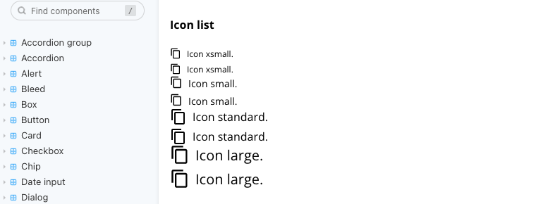
The icon size scale
The following values can be applied to the icon element to create variations depending of the font size:
const getIconSize = (size: string) => {
  switch (size) {
    case "xsmall":
      return "1rem";
    case "small":
      return "1.125rem";
    case "standard":
      return "1.5rem";
    case "large":
      return "1.75rem";
    default:
      return "1rem";
  }
};
Storybook example:
Tone
Using the default contrast context colors the text component tone can be changed via prop. The relationship between the prop values and color values can be found in the following table:
| Tone value | Color token | Color value |
|---|---|---|
default |
color-black |
#000000 |
error |
color-red-700 |
#d0011b |
success |
color-green-700 |
#24a148 |
info |
color-blue-700 |
#0086e6 |
warning |
color-yellow-700 |
#c59f07 |
Margin applied to the type element
Instead of using 10px for the margin-right, it's better to use 0.5rem
Example:
const Circle = styled.div<ListPropsType>`
  width: ${(props) => getBulletSize(props.size)};
  height: ${(props) => getBulletSize(props.size)};
  border-radius: 50%;
  border: 1px solid black;
  margin-right: 0.5rem;
`;
Metadata
Metadata
Assignees
Type
Projects
Status