[Bug]: Poor contrast in UI when using dark mode #164
Description
Describe the bug
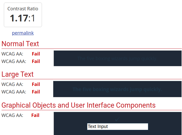
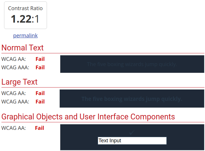
While browsing through the documentation I've noticed that some elements are either hard to read or unreadable at all when using dark mode due to lack of contrast.
To Reproduce
Steps to reproduce the behavior:
Go to the urls to see the corresponding element that lacks contrast.
I've used a contrast checker to test the contrast:


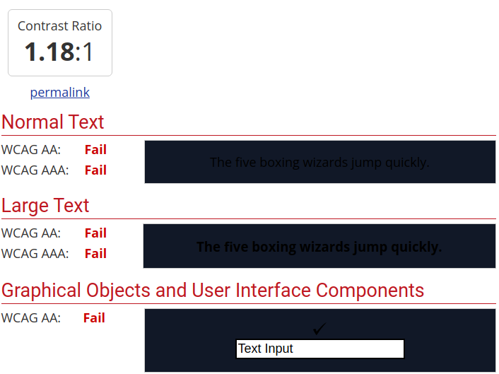


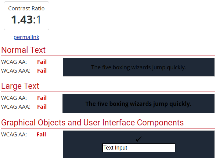


Expected behavior
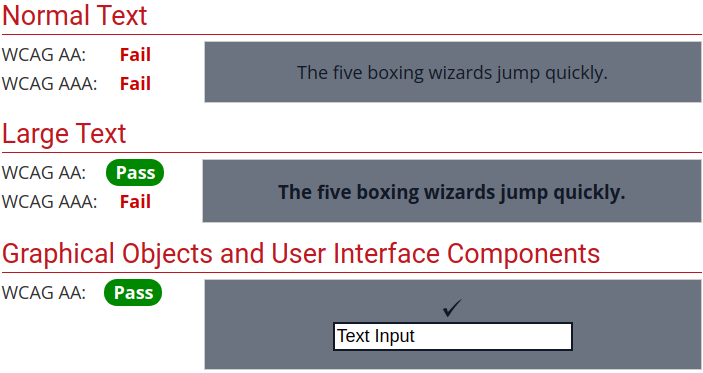
The UI should be easy to read and pass the contrast checker when using dark mode.