Skip to content
New issue

Have a question about this project? Sign up for a free GitHub account to open an issue and contact its maintainers and the community.

By clicking “Sign up for GitHub”, you agree to our terms of service and privacy statement. We’ll occasionally send you account related emails.

Already on GitHub? Sign in to your account

[CLOSED] [Core][Quick Open]: There is an extra line under Quick Open bar when resize the window. #4632

Open
core-ai-bot opened this issue Aug 29, 2021 · 9 comments

Comments

@core-ai-bot
Copy link
Member

Issue by julieyuan
Tuesday Sep 03, 2013 at 09:40 GMT
Originally opened as adobe/brackets#5029


Steps:

  1. Launch Brackets and open a file.
  2. Click Navigate>Quick Open or press Ctrl+Shift+O to invoke Quick Open bar.
  3. Input some invalid file name into the input field to make the border red.
  4. Resize the window of Edge Code.

Result:
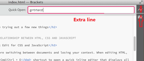
There is an extra line under the Quick Open bar and it will move its position with the change of window.

Expected:
There should not have this line.

Notes: This issue also reproduces to Go to Line , Quick Find Definition bar. It always happens on MAC, and sometimes happens on Win. So if you can not see this happening, please try again. Usually it happens when resize Edge Code window from large to small.

ENV: MAC 10.8 and Win8 English OS
Build: 0.31.0-9163 (MAC) and 0.30.0-9131(Win)

Snapshots:
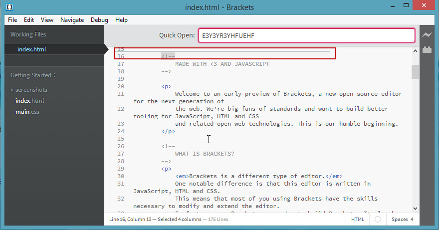
Please refer to snapshots for details:
Win OS:
extra1
MAC OS:
screen shot 2013-09-03 at 2 26 33 am
screen shot 2013-09-03 at 2 26 21 am

@core-ai-bot
Copy link
Member Author

Comment by njx
Thursday Sep 12, 2013 at 16:40 GMT


Yuck! Medium priority to me.

@core-ai-bot
Copy link
Member Author

Comment by njx
Thursday Sep 19, 2013 at 16:23 GMT


Nominating for sprint 32.

@core-ai-bot
Copy link
Member Author

Comment by njx
Tuesday Sep 24, 2013 at 20:29 GMT


That line is actually the collapsed dropdown container, which doesn't move when the window is resized due to #1157.

We could try to hide the container when there's nothing in the dropdown.@larz0, there's a comment in brackets.less in the .smart-autocomplete-container style that says: // the borders show up even if the container is empty, must set height to zero using JS. Do you know if this was actually done at some point in the JS code, or was that something that was intended to be fixed later?

@core-ai-bot
Copy link
Member Author

Comment by njx
Friday Sep 27, 2013 at 00:55 GMT


@larz0 ping - see my last comment

@core-ai-bot
Copy link
Member Author

Comment by larz0
Friday Sep 27, 2013 at 01:43 GMT


@njx I think I added that comment and I can't remember if I got rid of it using Chrome Dev Tools. I'm trying inspect it again but for some reason the modal bar keeps disappearing every time I click on the inspect icon in chrome dev tools. We should definitely hide it if it's empty.

@core-ai-bot
Copy link
Member Author

Comment by njx
Monday Sep 30, 2013 at 18:40 GMT


Changing to low pri and removing from sprint. Not a common combination of steps and it's just a cosmetic issue.

@core-ai-bot
Copy link
Member Author

Comment by Zhuyun
Tuesday Mar 18, 2014 at 05:42 GMT


Tried this issue with 0.38.0.12173 on Win & Mac, still reproduces.

@core-ai-bot
Copy link
Member Author

Comment by larz0
Saturday Mar 29, 2014 at 19:18 GMT


@Zhuyun the fix is in master now, could you check again? Thanks.

@core-ai-bot
Copy link
Member Author

Comment by Zhuyun
Monday Mar 31, 2014 at 05:42 GMT


Verified with 0.38.0.12421 on Win&Mac. Fixed and close it. Please find screenshots below.
Can't paste any images here. please find them in dropbox.
https://www.dropbox.com/s/asirmqpda9z0abw/Bug5029_Mac_ENU_38_12421.jpg
https://www.dropbox.com/s/khoap3dfilcihic/Bug5029_Win_ENU_38_12421.jpg

Sign up for free to join this conversation on GitHub. Already have an account? Sign in to comment
Labels
None yet
Projects
None yet
Development

No branches or pull requests

1 participant