Minimal slice width for "Stacked, horizontal, 100%" #514
Description
Codepen
https://codepen.io/anon/pen/yrpwmb
Explanation
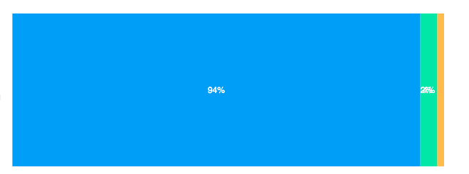
When the numerical series has very disproportionate values the chart get "truncated". Is there any options to keep a minimal width for each slice in order to keep this "percentual" properly inside the bars? Thanks for your time!
           series: [{
                name: 'TO DO',
                data: [600]
            },{
                name: 'DOING',
                data: [25]
            },{
                name: 'DONE',
                data: [10]
            }],