Adaptive Y-axis range for real time data #297
Description
Problem
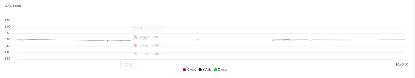
While updating real-time graphs, if the range difference is quite large between successive inputs, the chart lines often flatten out. For example, if the input for sometime varies between +/- 100 and later on varies between smaller values like +/- 1, it appears like a straight line and the changes are not shown even when the larger data is not on screen.
Expected Feature
The Y axis can be adaptive such that it changes range based on the data shown on the graph. Basically, at any point, the range should be the highest and lowest values hat are showed on the graph. So, in case, the data containing +/- 100 is not shown and all values on the graph range between +/- 1, the range of the y-axis should change to +/- 1.
Alternatives
Tried removing data slices from the array but that stops the animation, and the data does not visualise well.
Additional context
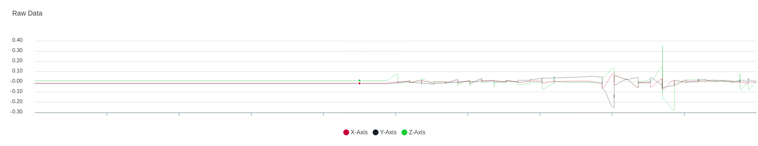
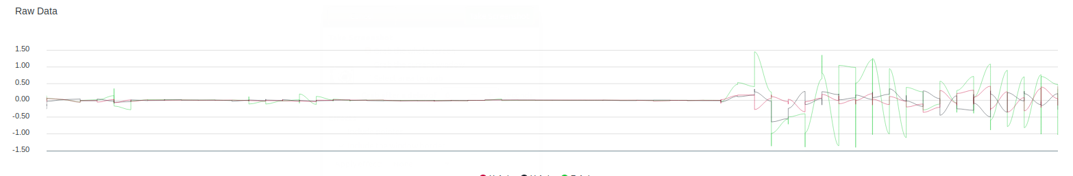
Images are added for context
(1) Initial small data input
(2) Data range increased
(3) Same data as (1)