[RFC] Amethyst UI #10
Description
Ui RFC
Here we go...
Warning: Things might be out of order or otherwise hard to understand. Don't be afraid to jump between sections to get a better view.
So here, I will be describing the requirements, the concepts, the choices offered and the tradeoffs as well as the list of tasks.
Surprisingly enough, most games actually have more work in their ui than in the actual gameplay. Even for really small projects (anything that isn't a prototype), games will have a ui for the menu, in game information display, settings screen, etc...
Let's start by finding use cases, as they will give us an objective to reach.
I will be using huge games, to be sure to not miss out on anything.
Since the use cases are taken from actual games and I will be listing only the re-usable/common components in them, nobody can complain that the scope is too big. :)
Use cases: Images


Use cases: Text
So now, let's extract the use cases from those pictures.
- 2d text
- 3d ui (render to texture)
- 3d positionned flat text
- 3d positionned text with depth
- 3d text can be visible through 3d elements or occluded by them (including partial occlusion)
- 2d world text (billboard)
- images
- color box
- color patterns (gradient)
- color filter (change saturation, grayscale, alpha, etc)
- multiple color in same text vs multiple text segments aligned
- locale support
- display data
- clicky buttons
- clicky checkboxes
- draggable elements (free positioning)
- draggable elements (constrained) (can be used to scroll through scroll views, or to move sliders heads)
- drag and drop (with constraints on what can be dropped where)
- Scroll views
- Sliders
- tab view
- menu bar
- editable text
- focusable elements
- keyboard, mouse, controller, touchscreen, rc remote, wii remote inputs
- on screen keyboard (for use with mouse or controller)
- overlays (a.k.a help bubbles/popups)
- automatic layouting
- auto-resizable text
- auto-resizable images/color boxes
- circular progress bars
- adapts to different screensizes + auto resizes content
- reactive (past a minimal size, content rearranges itself according to other layout rules)
- transparency settings for all elements
- glow effect
- transitions/animation(fade in, fade out, movements, scaling, etc..)
- draw lines (straight + curve)
- non-rectangular ui elements or triggers
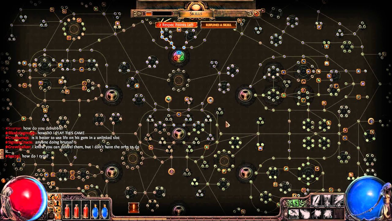
- ui scaling, working in scroll views (path of exile picture)
- draw a texture (including dynamic) to screen (also allows showing 3d objects on ui, but requires rendering in a different world)
- occlusion pattern (example: make a square image just show as a circle, removing the corners. also affecting the event triggers)
- Progress bar (gradient/image + partial display + background)
- Scrolling text (or view)
- Input fields (edit text + background + focus + keyboard handling)
- Growable lists
- Different presentation when selected
- Different presentation depending on set condition (have enough money to buy this upgrade ? white : gray)
- Can select multiple elements at once (lists)
- Expandable views (bottom button closes the window)
- Graphs!
- play sound when hovering or clicking
- change texture when hovering or clicking, or animate, or apply effect, or trigger a custom side effect in the world (click a button -> spawn an "explosion" entity in the world, triggering a state
Trans) - Links (opens browser)
- Theming (changing the color of all links to red, changing the margin or padding for some elements, etc)
- tables
- a simple in-game console to enter commands that get sent to amethyst_terminal (when it exists)


Use cases: Conclusion
There are a lot of use cases and a lot of them are really complex. It would be easy to do like any other engine and just provide the basic elements, and let the game devs do their own custom elements. If you think about it however, if we are not able to provide those while we are the ones creating the engine, do you honestly expect game developers to be able to make them from the outside?
Also, if we can implement those using reusable components and systems, and make all of that data oriented, I think we will be able to cover 99.9% of all the use cases of the ui.
Big Categories
Let's create some categories to know which parts will need to be implemented and what can be done when.
I'll be listing some uses cases on each to act as a "description". The lists are non-exhaustives.
Eventing
- User input
- Selecting
- Drag and drop
- Event chaining and side effects
Layouting
- Loading layout definitions
- Resize elements
- Ordering elements
- Dynamic sizes (lists)
- Min/Max/Preferred sizes
Rendering
- Animation
- Show text (2d, 3d billboard, 3d with rotation)
- Gradients
- Drawing renders (camera) on other textures (not specifically related to ui but required)
Partial Solutions / Implementation Details
Here is a list of design solution for some of the use cases. Some are pretty much ready, some require some thinking and others are just pieces of solutions that need more work.
Note: A lot are missing, so feel free to write on the discord server or reply on github with more designs. Contributions are greatly appreciated!
Here we go!
Drag
Add events to the UiEvent enum. The UiEvent enum already exists and is responsible of notifying the engine about what user-events (inputs) happened on which ui elements.
pub struct UiEvent {
    target: Entity,
    event_type: UiEventType,
}

enum UiEventType {
    Click, // Happens when ClickStop is triggered on the same element ClickStart was originally.
    ClickStart,
    ClickStop,
    ClickHold, // Only emitted after ClickStart, before ClickStop, and only when hovering.
    HoverStart,
    HoverStop,
    Hovering,
    Dragged{element_offset: Vec2}, // Element offset is the offset between ClickStart and the element's middle position.
    Dropped{dropped_on: Entity},
}
Only entities having the "Draggable" component can be dragged.
#[derive(Component)]
struct Draggable<I> {
    keep_original: bool, // When dragging an entity, the original entity can optionally be made invisible for the duration of the grab.
    clone_original: bool, // Don't remove the original when dragging. If you drop, it will create a cloned entity.
    constraint_x: Axis2Range, // Constrains how much on the x axis you can move the dragged entity.
    constraint_y: Axis2Range, // Constrains how much on the y axis you can move the dragged entity.
    ghost_alpha: f32,
    obj_type: I, // Used in conjunction with DropZone to limit which draggable can be dropped where.
}
Dragging an entity can cause a ghost entity to appear (semi transparent clone of the original entity moving with the mouse, using element_offset)
When hovering over draggable elements, your mouse optionally changes to a grab icon.
The Dragged ghost can have a DragGhost component to identify it.
#[derive(Component)]
struct DropZone<I> {
	accepted_types: Vec<I>, // The list of user-defined types that can be dropped here.
}
Event chains/re-triggers/re-emitters
The point of this is to generate either more events, or side effects from previously emitted events.
Here's an example of a event chain:
- User clicks on the screen -> a device event is emitted from winit
- The ui system catches that event and checks if any interactable ui element was located there. It finds one and emits a
UiEventfor that entity with event_type: Click - The
EventRetriggerSystemcatches that event (as well as State::handle_event and custom user-defined systems!), and checks if there was aEventRetriggerComponent on that entity. It does find one. This particularEventRetriggerwas configured to create aTransevent that gets added into theTransQueue - The main execution loop of Amethyst catches that
Transevent and applies the changes to theStateMachine. (PR currently opened for this.)
This can basically be re-used for everything that makes more sense to be event-driven instead of data-driven (user-input, network Future calls, etc).
The implementation for this is still unfinished. Here's a gist of what I had in mind:
Note: You can have multiple EventRetrigger components on your entity, provided they have unique In, Out types.
// The component
pub trait EventRetrigger: Component {
    type In;
    type Out;
    fn apply(func: Fn(I) -> Vec<O>);
}

// The system
// You need one per EventRetrigger types you are using.
pub struct EventRetriggerSystem<T: EventRetrigger>;
impl<'a, T> System<'a> for EventRetriggerSystem<T> {
    type SystemData = (
        Read<'a, EventChannel<T::In>>,
        Write<'a, EventChannel<T::Out>>,
        ReadStorage<'a, T>,
    );
    fn run...
    read the events, run "func", write the events
}
Edit text
Currently, the edit text behaviour is
- Hardcoded in the pass.
- Partially duplicated in another file.
All the event handling, the rendering and the selection have dedicated code only for the text.
The plan here is to decompose all of this into various re-usable parts.
The edit text could either be composed of multiple sub-entities (one per letter), or just be one single text entity with extra components.
Depending on the choice made, there are different paths we can take for the event handling.
The selection should be managed by a SelectionSystem, which would be the same for all ui elements (tab moves to the next element, shift-tab moves back, UiEventType::ClickStart on an element selects it, etc...)
The rendering should also be divided into multiple parts.
There is:
- The text
- The vertical cursor or the horizontal bar at the bottom (insert mode)
- The selected text overlay
Each of those should be managed by a specific system.
For example, the CursorSystem should move a child entity of the editable text according to the current position.
The blinking of the cursor would happen by using a Blinking component with a rate: f32 field in conjunction with a BlinkSystem that would be adding and removing a HiddenComponent over time.
Selection
I already wrote quite a bit on selection in previous sections, and I didn't fully think about all the ways you can select something, so I will skip the algorithm here and just show the data.
#[derive(Component)]
struct Selectable<G: PartialEq> {
	order: i32,
    multi_select_group: Option<G>, // If this is Some, you can select multiple entities at once with the same select group.
    auto_multi_select: bool, // Disables the need to use shift or control when multi selecting. Useful when clicking multiple choices in a list of options.
}

#[derive(Component)]
struct Selected;
Element re-use
A lot of what is currently in amethyst_ui looks a lot like other components that are already defined.
UiTransform::local + global positions should be decomposed to use Transform+GlobalTransform instead and
GlobalTransform should have its matrix4 decomposed into translation, rotation, scale, cached_matrix.
UiTranform::id should go in Named
UiTransform::width + height should go into a Dimension component (or other name), if they are deemed necessary.
UiTransform::tab_order should go into the Selectable component.
UiTransform::scale_mode should go into whatever component is used with the new layouting logic.
UiTransform::opaque should probably be implicitly indicated by the Interactable component.
I'm also trying to think of a way of having the ui elements be sprites and use the DrawSprite pass.
Defining complex/composed ui elements
Once we are able to define recursive prefabs with child overrides, we will be able to define the most complex elements (the entire scene) as a composition of simpler elements.
Let's take a button for example.
It is composed of: A background image and a foreground text.
It is possible to interact with it in multiple ways: Selecting (tab key, or mouse), clicking, holding, hovering, etc.
Here is an example of what the base prefab could look like for a button:
// Background image
(
    transform: (
        y: -75.,
        width: 1000.,
        height: 75.,
        tab_order: 1,
        anchor: Middle,
    ),
    named: "button_background"
    background: (
        image: Data(Rgba((0.09, 0.02, 0.25, 1.0), (channel: Srgb))),
    ),
    selectable: (order: 1),
    interactable: (),
),
// Foreground text
(
    transform: (
        width: 1000.,
        height: 75.,
        tab_order: 1,
        anchor: Middle,
        stretch: XY(x_margin: 0., y_margin: 0.),
        opaque: false, // Let the events go through to the background.
    ),
    named: "button_text",
    text: (
        text: "pass",
        font: File("assets/base/font/arial.ttf", Ttf, ()),
        font_size: 45.,
        color: (0.2, 0.2, 1.0, 1.0),
        align: Middle,
        password: true,
    )
    parent: 0, // Points to first entity in list
),
And its usage:
// My custom button
(
    subprefab: (
        load_from: (
            // path: "", // you can load from path
            predefined: ButtonPrefab, // or from pre-defined prefabs
        ),
        overrides: [
            // Overrides of sub entity 0, a.k.a background
            (
                named: "my_background_name",
            ),
            // Overrides of sub entity 1
            (
                text: (
                    text: "Hi!",
                    // ... pretend I copy pasted the remaining of the prefab, or that we can actually override on a field level
                ),
            ),
        ],
    ),
),
Ui Editor
Since we have such a focus on being data-oriented and data-driven, it only makes sense to have the ui be the same way. As such, making a ui editor is as simple as making the prefab editor, with a bit of extra work on the front-end.
The bulk of the work will be making the prefab editor. I'm not sure how this will be done yet.
A temporary solution was proposed by @randomPoison until a clean design is found: Run a dummy game with the prefab types getting serialized and sent to the editor, edit the data in the editor and export that into json.
Basically, we create json templates that we fill in using a pretty interface.
Long-Term Requirements
- Draw text on sprites
- Draw sprites on 3d textures
- Asset caching
- Good eventing system (in progress)
- Recursive prefabs
Crate Separation
A lot of things we make here could be re-usable for other rust projects.
It could be a good idea to make some crates for everyone to use.
One for the layouting, this is quite obvious.
Probably one describing the different ui event and elements from a data standpoint (with a dependency to specs).
And then the one in amethyst_ui to integrate the other two and make it compatible with the prefabs.
Remaining Questions
- Multiple colors in same text component VS multiple text with layout so they look like a single string
- Display data: Data binding? User defined system? impl SyncToText: Component?
- Which layout algorithm will we use? Should it be externally defined? If so, how to define default components?
- How to define occlusion patterns (pictures with alpha?). How to do the render for those?
- How to make circular filing animations?
- Theming?
- How to integrate the locales with the text?
- Make implementation designs for everything that wasn't covered yet
If you are not good with code, you can still help with the design of the api and the data layouts.
If you are good with code, you can implement said designs into the engine.
As a rule of thumb for the designs, try to make the Systems the smallest possible, and the components as re-usable as possible, while staying self contained (and small).
Imgur Image Collection
Tags explanation:
- Diff Hard: The different parts aren't all hard, but the whole thing is complex.
- Priority Important: Some things aren't super important and are there to improve the visual, others are important improvements to the api that we can't go around.
- Status Ready: Some parts are ready to be implemented (at least as prototypes), mostly the design section.
- Project Ui: This is ui
- RFC Discussing: Discussions and new designs will go on for a long long long time I'm afraid. This is the biggest RFC of amethyst I think.