Closed
Description
Expected Behavior
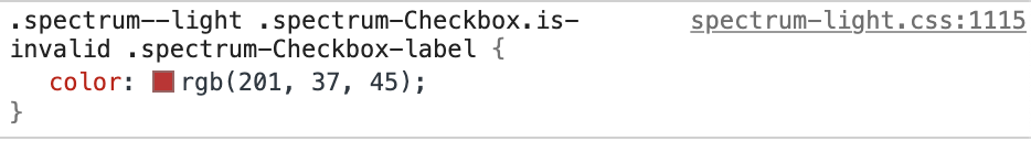
The color for the invalid state of a Checkbox should be the sam as the invalid state of a Radio Button and both reds should be rated as "accessible" in relation to their contrast with the background.
Actual Behavior
https://opensource.adobe.com/spectrum-css/2.13.0/docs/?color=light&scale=medium&method=standalone#radio is lighter than https://opensource.adobe.com/spectrum-css/2.13.0/docs/?color=light&scale=medium&method=standalone#checkbox and thus registers a 4.27:1 vs a 4.5:1 contrast which lists as "not accessible" in automated testing.
Reproduce Scenario (including but not limited to)
I want to use a Radio button in my application.
Steps to Reproduce
Use the provided CSS to create a checkbox and a radio button, compare with each other and test against accessibility based contrast requirements.
Browser name/version/os (ie Chrome Version 62.0.3202.94 (Official Build) (64-bit) MacOS)
All
Spectrum-CSS version
2.13.0
Screenshots (if applicable)