Extend columns style to support variable menu item widths #383
Description
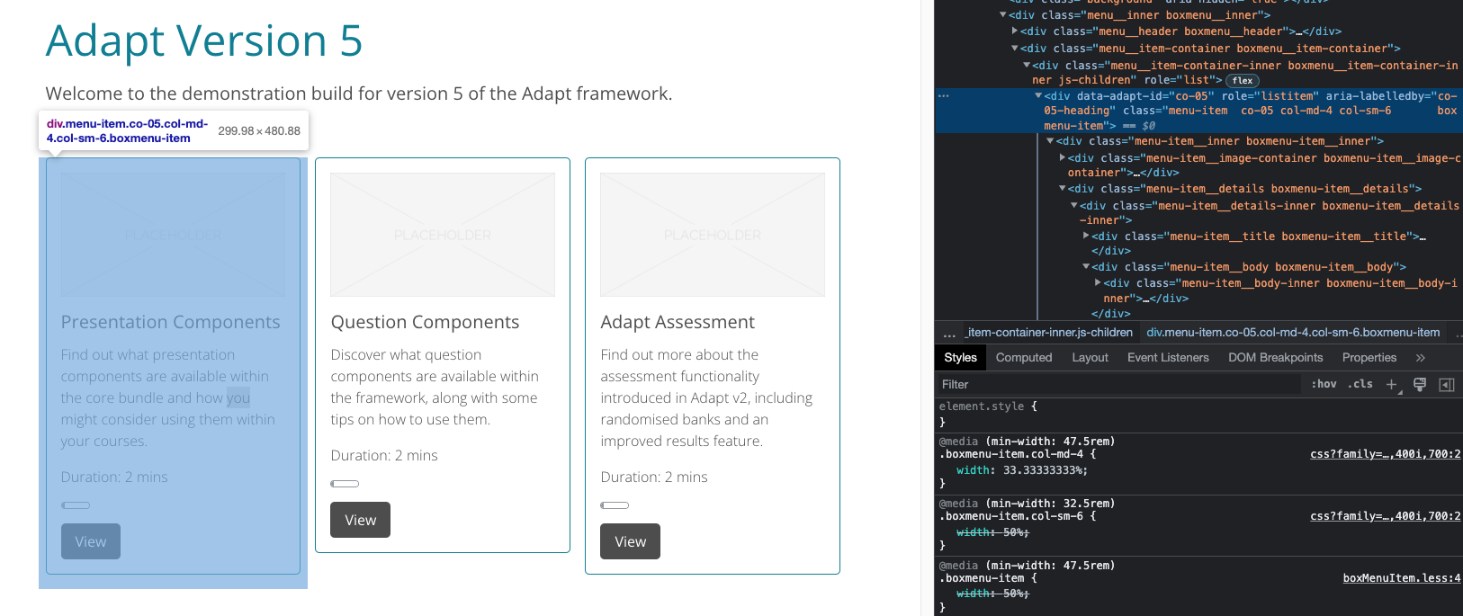
To break away from the standard two column layout in Adapt we previously implemented columns in Vanilla. Using the pre-defined classes allows variable layouts for components and these can be applied responsively.
Boxmenu by default is still bound to the two column layout (for desktop, single stack for mobile) which is quite limiting and can create very long menus for larger courses. I'm proposing we extend the existing columns style to include Boxmenu items to give us more flexibility with Boxmenu without the need for custom themes/CSS.
Extend columns.less suggestion:
.make-columns(@size, @media-query, @count, @iteration: 1) when (@count >= @iteration) {
  @media (min-width: @media-query) {
    .boxmenu-item.col-@{size}-@{iteration} {
      width: (@iteration * 100% / @count);
    }
    .component.col-@{size}-@{iteration} {
      width: (@iteration * 100% / @count);
    }
  }

  .make-columns(@size, @media-query, @count, (@iteration + 1));
}
Example of column classes applied as contentObject _classes: