Template Part block - add border states in editor.#24498
Conversation
 Addison-Stavlo
changed the title
Addison-Stavlo
requested review from
Copons,
jeyip,
noahtallen,
ockham and
vindl
Addison-Stavlo
requested review from
Soean,
ajitbohra and
talldan
as code owners
Addison-Stavlo
changed the title
Addison-Stavlo
requested review from
Copons,
jeyip,
noahtallen,
ockham and
vindl
Addison-Stavlo
requested review from
Soean,
ajitbohra and
talldan
as code owners
|
Size Change: +157 B (0%) Total Size: 1.16 MB
ℹ️ View Unchanged
|
|
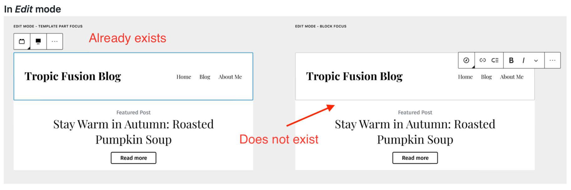
🚀 Hover state border works displays as expected in Safari, Chrome, Firefox, Edge, and IE11. Note:
|
There was a problem hiding this comment.
Thanks for handling the code changes @Addison-Stavlo. I see this as great foundation that we can iterate on and modify in future PRs.
|
I'll stick a design feedback label on here just to get some ✅ before merging :) |
|
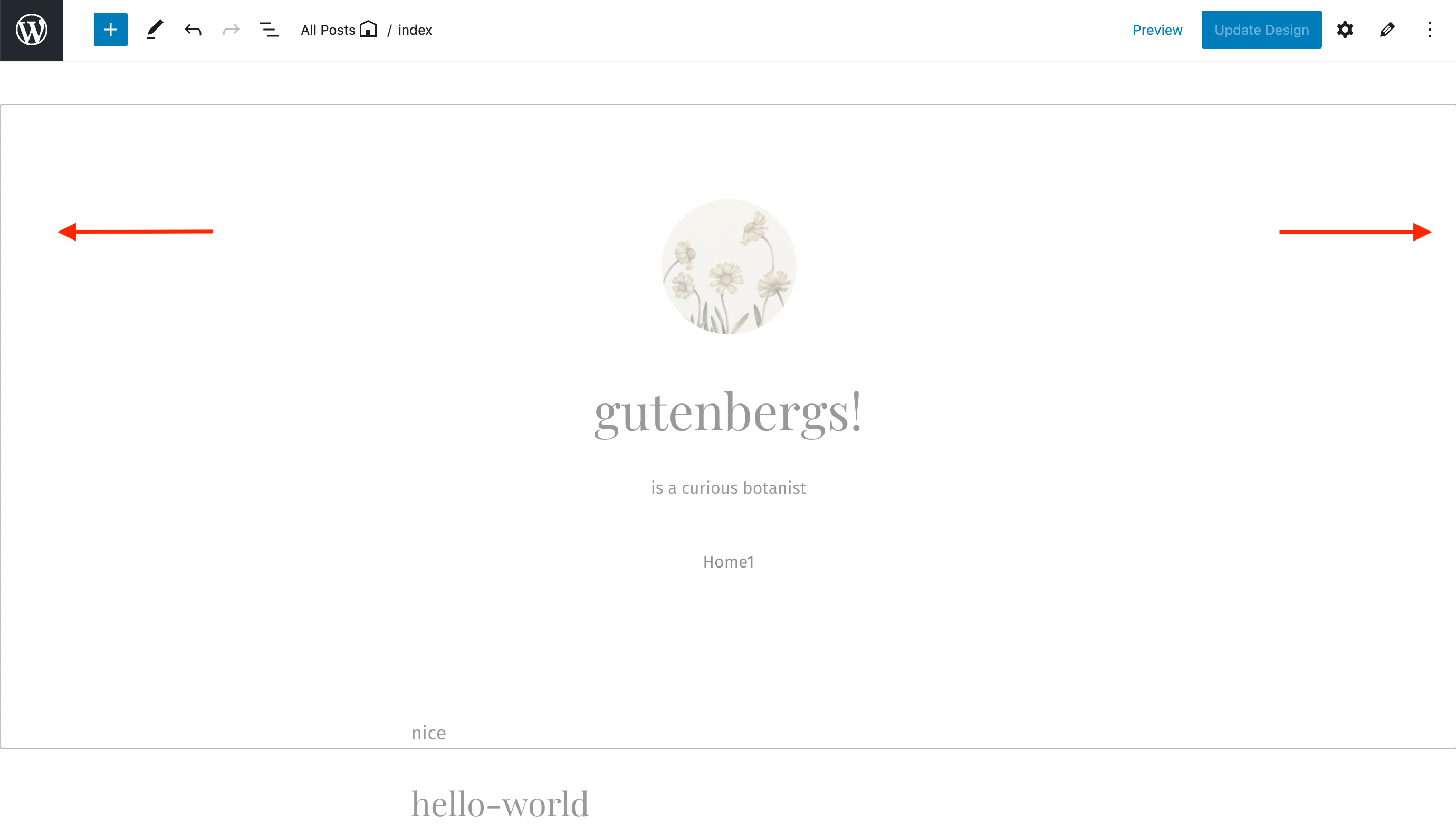
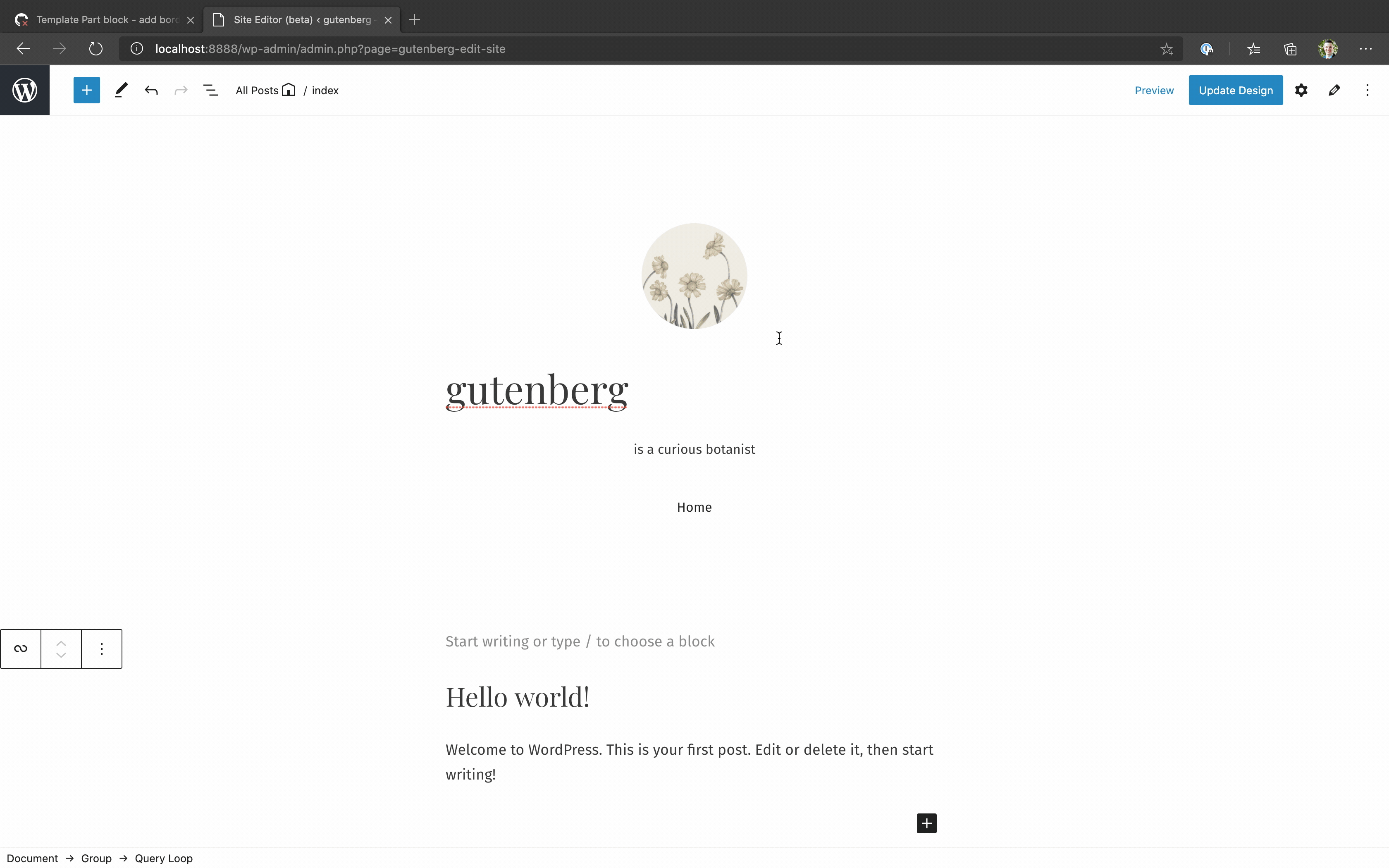
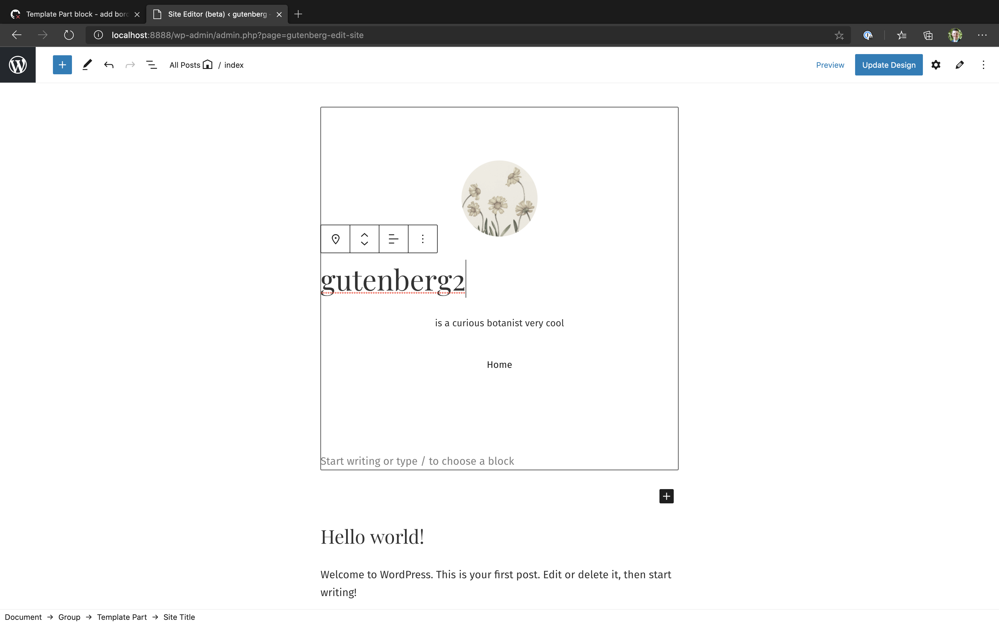
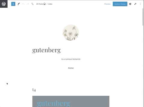
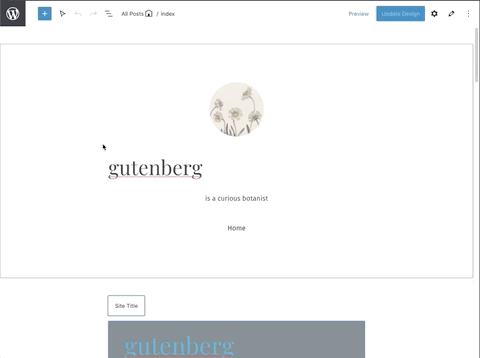
Here's a gif to see how it looks ^^ Note that in real life, it is more smooth. The frame rate of the gif is just poor. :) Here is a screenshot of editing a child block in a narrower alignment: I'm noticing that in a lot of cases, it takes an extra click to interact with child blocks (and with the inserters). I think this tradeoff is worth it, but it's definitely a consideration. If no block is selected, I'm noticing that some template part child blocks interact directly on first click (including site title and the nav block) but some take that extra click to get into (including paragraph and image blocks). It's kinda weird how that is inconsistent 🤔 And if you have a different block other than the template part selected first, then pretty much nothing will interact without that extra click. |
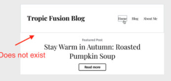
I noticed this too! I think on my screen I slightly see the border on the right side but not the left. We would see the entire border if we added the |
I see, I am noticing this too! This is a result of our last change and we are forced to select the template part (clicking on any child block selects the template part first) before being able to select a child. Maybe we should only disable the pointer events for the block inserters when the template part is not selected, so we can still get to edit existing child blocks in 1 click. 🤔 (edit: actually this does not seem as simple as anticipated.)
Yeah, im not certain either. It doesn't feel bad though. You click and it selects the template part, then you see the standard cursor options for being able to select everything inside it. |
I've been investigating this as well. It looks like the inserter is not a descendent of the block-list. It's actually rendered in a popover closer to the root of the DOM (it ends up being an ancestor's sibling). This is why we're having trouble selecting it when evaluating the hover state of I'm exploring different ways of selecting ancestor siblings with CSS, but it seems like Javascript may be the most straightforward approach. |
|
Testing it right now. It feel really nice. The two modes are making it extra complicated to get this feeling right. I love the hover in edit mode, but it feels weird that it doesn't appear everywhere. When I originally outlined this I didn't think we'd have a hover border in Edit mode since that's not how Edit mode behaves. I didn't explain this well in the original design dump though. I think we should have only the hover border appear in Select mode. And when you have Edit mode we shouldn't have any hover border, but still have the active border as outlined in this comment. Does that make sense? Would love further thoughts. |
Ahhhh. I see that in your original design dump now. I'm playing around with
Does that sound right @dubielzyk ?
As for
Let me know if I'm that's more aligned with what you were proposing for hover / focus borders. |
Exactly. That's the most subtle improvement and the one that would leave it as close to as it is today while also trying to achieve the goal. Once we have that we can build by adding labels, noticed etc. But I think it's important to build something first that tries to work within the parameters. Once we start adding borders on hover in Edit mode we start ruining the modes themselves and it would then require us to rethink how the modes work. |
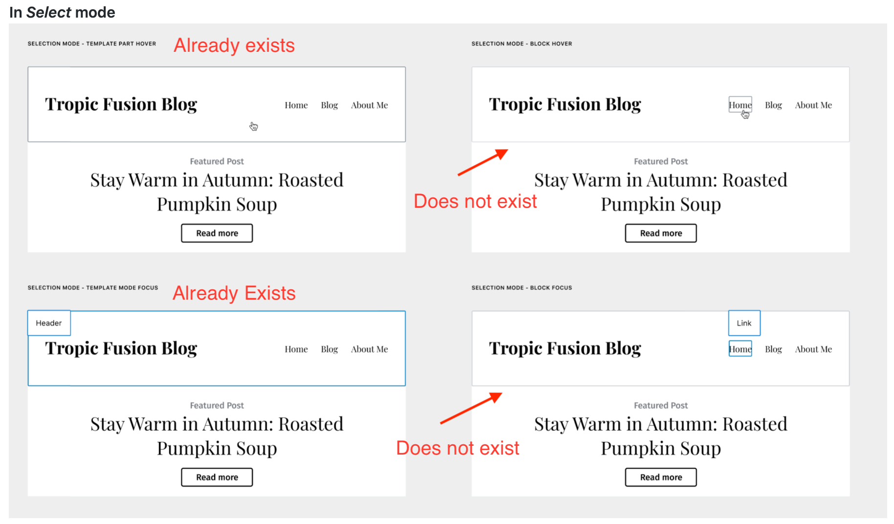
Currently select mode disables the ability to hover child blocks until either the parent is selected or other children have been selected. In case A, the parent is selected and has the blue border and children have the 'grey' border on hover. In case B, the selected child has a blue border and other children have the grey border on hover (and we have the grey border on the template part in this PR from the has-child-selected state). If our goal is to have the children of the template part hover-able before the template part is selected, that is a diversion from select mode's functionality. Not only would this currently require a bit of a 'hacky' solution (or just an overhaul of select mode itself for everything to remain consistent with other blocks), but would create inconsistencies with the behavior of select mode in the editor. This would also make the children of the template part more easily selectable and editable than children of any other types of blocks, which decreases the concern of which parent they belong to and how that might effect things differently than standard blocks. |
|
We removed the hover-state border in edit mode. So now we have: In edit mode: In select mode: I think these are subtle, non-intrusive changes that will have a pretty decent effect on visibility. I think it coveres everything from the border designs? Except for the select mode design for:
Since this type of hover state isn't possible in select mode until the parent or other children have already been selected, and there would be some concerns implementing it for template parts only (outlined more in my comment above). |
 noahtallen
left a comment
noahtallen
left a comment
noahtallen
left a comment
There was a problem hiding this comment.
This works well for me. My one nitpick is: is it possible to make the border a slight bit smaller in the "editing an inner block" state? It seems like it could be just a bit less intense, if that makes sense
|
Looks good to me 🙂 Non-blocking |
|
haha, I guess we noticed a similar thing. Either color or width or both could make it less understated, I guess |
Yeah, maybe we should try to match its width/color to the grey border applied by select mode hover state. Looking for what that is... It is matched in size to the border applied by focus/select state on the template part (the blue border). Maybe we want to keep its size matched to that and just lower the level of gray? 🤔 |
|
So we are really nitpicking at the border now, but these Gifs might help point out the confusion Im having on which style we should conform to in terms of border width: Notice the border stays the same width as we go from the blue border of the template part to the grey border when the child is selected: Notice how the grey hover-state border in select mode has a slightly smaller border width: So I wonder if it is better to conform to the border styles of the blue/focus state, or the grey hover state in select mode. 🤔 |
In my brain, it makes sense to be less prominent than this, so I can definitely see a case for matching the hover state for select mode |
Updated to match the child-selected state gray border to the gray border shown in select mode hover state. (reduced from $border-width-focus to $border-width, and from $gray-700 to $gray-600) I think it feels better this way too! |
|
This is looking good to me. Thanks for the context. If we can't select child blocks in Select mode it seems like it'll be harder to use. I like the GIF where the border widths are the same, so we should aim for that. Can we change the gray color to make it light-gray-700? Or can you point me to the color spec we're relying on and I'll select an appropriate color? |
|
Perhaps this is a better way to describe the current state of this PR: Pre-Existing Borders
Added Borders
(note the current state described above is slightly different than when those gifs were created) Gif 1 - where the border widths are the same is the same gray border used in gif 2 where the width is different from the hover border applied by select mode. So having gif 1 causes gif 2 since the 'blue focus border' and the 'gray hover border' from select mode have different widths by default. We had updated since these gifs to match the opposite, so the blue border is the only wide one ($border-width-focus) while the grey border is thinner ($border-width), which seems to make sense in the states they are used given their names. Should we increase the added gray border width to achieve the state shown in those 2 gifs again?
We can, although that seems very light? Here is light-gray-700 in contrast to the border applied by the select mode hover state (also notice these are the same widths now in this state, contrary to 'gif2' mentioned above):
Here is where the base colors live - by the comments there is seems gray-200 is the 'standard' border color, but that seems about the same as the light-gray-700 shown above. I figured it was best to match the color to the gray border in select+hover but we can change it around to whatever you feel makes sense. (Note- selecting another color may require an additional separate color selection for dark themes, $gray-600 seems to be used for both light and dark themes by select mode hover since it is neutral between the two. Ex- if we wanted to go with gray-200, maybe gray-700 would make sense for dark themes as it is roughly equidistant from black as gray-200 is from white, etc.) |
|
Thanks for the info. Let me have a look and let's tweak the colors at the last stage. There's a few other things I'm wondering:
|
Quick comment on the color. The reason for wanting a lighter color (~gray300) is so that, in Selection mode, the template hover part border and block hover border isn't the same. With them both the same we end up with this. The goal is to just highlight that you're selecting a block that's part of something bigger (the template part). Does that make sense? |
In that video the block in question is the site logo, which has that external wrapper. Currently the actual block used in this header in the example is an image block, which is not the same as site logo and lacks that outer wrapper, etc.
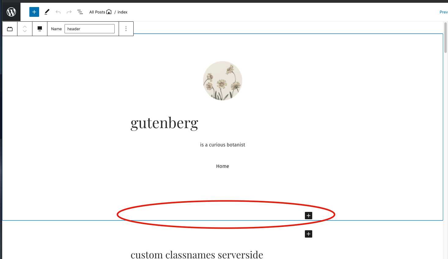
Edit - Looking more it seems less of a bug and more of an expected behavior for container blocks. When this type of block is selected, the block appender is added to the bottom of the block so the user has a straight forward way to add another child block to the parent container:
Then when unselected that appender disappears causing the 'jump around' behavior you noted. But this is more related to the actual block appender system itself and not really specific to the template part block's implementation. |
|
Re - the Colors:
100%, that makes sense. Give this a spin and see how it feels? There isnt a gray-300 defined for whatever reason, so for now this is set to gray-200 since that was listed as the standard border color in the file. We can change it to light-gray-700 if that makes more sense too. Whatever you think works best sounds good to me. Also, do you have any idea about what the dark theme color should be for this? I know its kind of an odd question since we don't have a dark block based theme currently. I currently set it to gray-700 since that should be a small contrast to a dark theme? (The other 'wp-admin-blue' border is already taken care of as that consistently turns to white in dark themes, but for our less-apparent border color we probably do need to set something for that circumstance 🤔 ). |
+1. I agree this needs to be drastically improved since it feels very rough, but we can do that in a separate issue :) |
 noahtallen
force-pushed
the
add/template-part-border-states
branch
from
noahtallen
force-pushed
the
add/template-part-border-states
branch
from
83cc4d5 to
5a73f05
Compare
noahtallen
left a comment
noahtallen
left a comment
There was a problem hiding this comment.
cc @MichaelArestad @shaunandrews do you have thoughts about this? Unless there are concerns, I think we can move forward with this!
Current look:
Regarding code, I think in the future we might want to make this more general. I could see the same style being useful for the post content block, since it is a block container in the same way. I could see us wanting to apply this style if:
- The block is an inner block controllers
- Or just if the block has inner blocks in general
But that's a discussion code wise :)
|
@noahtallen It's not really clear to me what the border alone represents or why it is there. I know there is work being done with a label as well so I'm waiting to see how the label is implemented before worrying too much about it. |
|
it's representing the area around the block area the user is editing. currently it's almost entirely impossible to tell without clicking all over the place to find where the template part ends and begins. but the label will definitely help things a lot too :) |
5 participants
Description
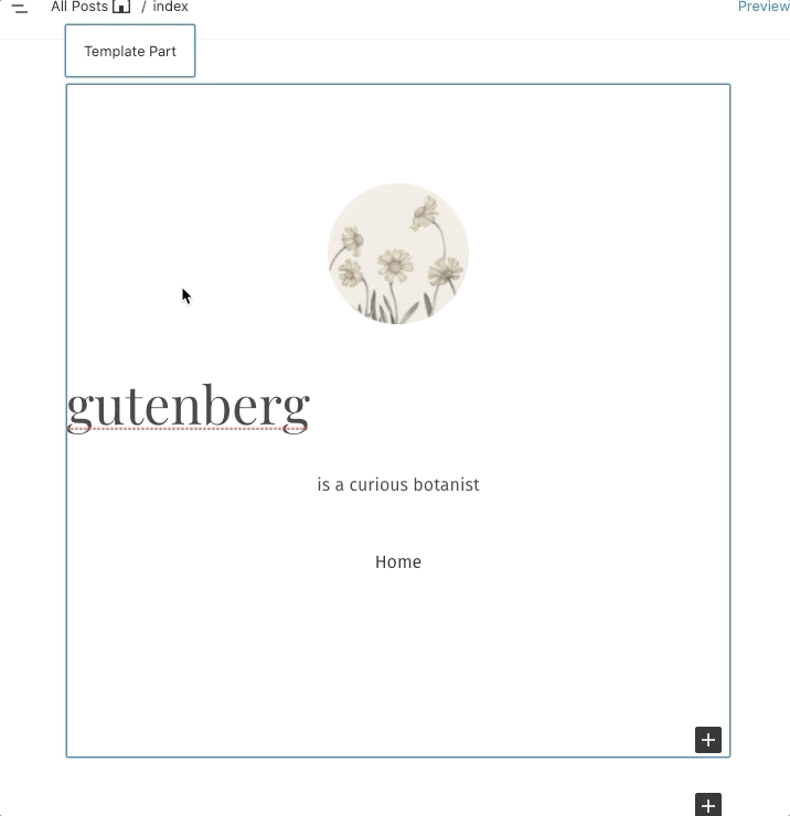
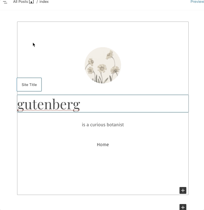
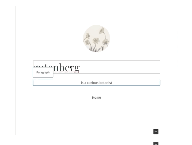
Adding is-selected, has-child-selected, and hover border states to the template part block in the editor. (as requested in #22064)
These borders styles have been intentionally matched visually to fit the style added on the focus state by the block-list component, and change the color appropriately for each state:
gutenberg/packages/block-editor/src/components/block-list/style.scss
Lines 56 to 74 in 5597947
How has this been tested?
Screenshots
Types of changes
Checklist: