Description
openedon Oct 11, 2017
The cognitive load of the chrome we show around and in context of the block unit has been an ongoing topic for a while. Concerns have been noted that it feels heavy, there are many toolbars, options, and it gets in the way of writing.
As an experiment, in this ticket are some new mockups that try to touch on many different ideas presented, including:
- Fixed-to-the-top block toolbar
- Smarter auto-hiding of block chrome
- Clearer grouping of block controls
- More light-weight writing experience with a different block boundary design and selection model
What are the pros and cons? What are the accessibility implications? Are there flows that will regress in this design?
Please add your thoughts. To focus these mockups, the sidebar is toggled off. No change to that one — it's still on by default.
The basic editor

No blocks are selected.
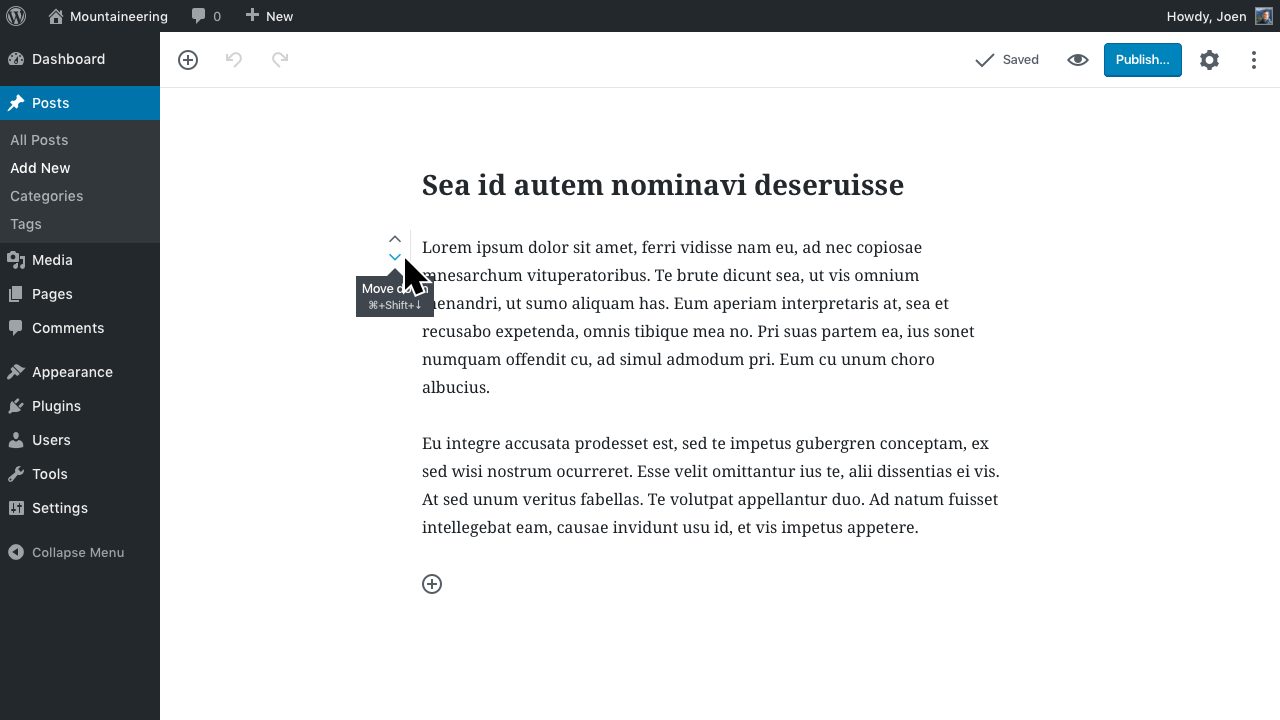
Movers and block context menu
Hover near the edges of the block to surface the movers and the context menu:

This is similar to how Google Docs handles it:
You can also hover between blocks for a shortcut to insert a block there:

If the block has the cursor, you can still tab into these.
Editing
Clicking a text block does not activate the boundaries. But it does show the quick toolbar, docked to the top of the screen:
This toolbar can be accessed, no matter where your cursor is, or which block is selected using Alt+F10 or ⌘/Ctrl (see discussion in #2960).
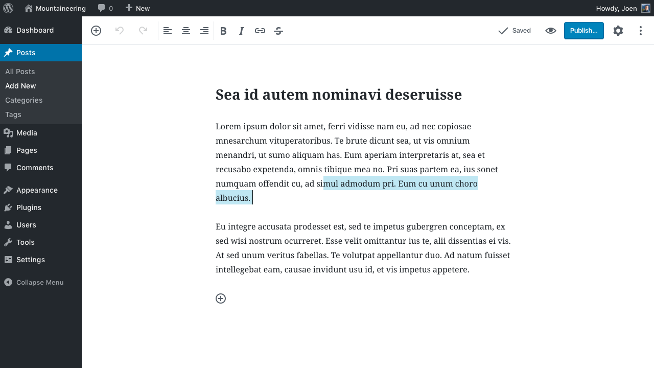
Selected blocks
If you just put the cursor in text, boundaries don't show up to highlight the block. Boundaries are shown for every other block but the text blocks. But you can still select the block, for example when you use the movers to reposition the block, or if you click the context menu:
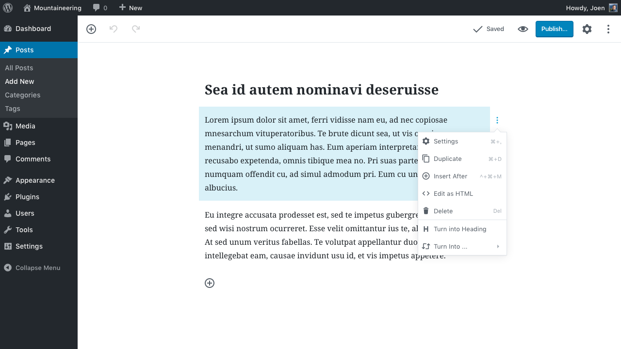
The context menu groups existing Delete, Configure options, and adds a couple of other block level niceties. See also #2980.
Selecting multiple blocks also gives you the option to convert multiple paragraphs to a list, or a quote:

Mobile
On mobile, the top-docked toolbar moves down a level and stacks:
