💡 Super flexible Vue table component base on configuration.
Strongly recommend used by the project which alread use element-ui and jsx 🐶 .
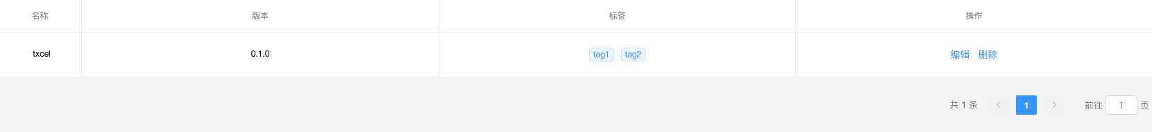
<template>
  <Txcel
    :data="tableData"
    :columns="cols"
    :pager="{
      layout: 'total,prev,pager,next,jumper',
      page: page,
      page_size: page_size,
      total: count,
    }"
    @change="handlePage"
    @cellChange="handleCellChange"
    class="mt20"
  />
</template>

<script>
import cols from './tableConfig'

export default {
  data() {
    return {
      tableData: [
        {
          name: 'txcel',
          tag: ['tag1', 'tag2'],
          version: '0.1.0',
        },
      ],
      cols: cols(this),
      page: 1,
      page_size: 10,
      count: 1,
    }
  },

  methods: {
    handleEdit() {
      console.log('edit')
    },

    handleCellChange(type, data) {
      console.log(type, data)
    },

    handlePage(page) {},
  },
}
</script>
tableConfig.js
export default function tableCols(vm) {
  return [
    {
      label: '名称',
      prop: 'name',
      width: 120,
    },
    {
      label: '版本',
      prop: 'version',
    },
    {
      label: '标签',
      prop: 'tag',
      render: (h, p) => (
        <div>
          { p.row.tag.map(tag => <el-tag size="mini">{ tag }</el-tag>) }
        </div>
      ),
    },
    {
      label: '操作',
      render: (h, p) => (
        <div>
          <el-button type="text" onClick={ vm.handleEdit }>Edit</el-button>
          <el-button type="text" onClick={ this.emitCell('delete', p.row.id) }>Delete</el-button> // provide by Txcel component,auto injected
        </div>
      ),
    },
  ]
}
result:
npm i txcel -S
# OR
yarn add txcel
After install, register component
import Txcel from 'txcel'

Vue.use(Txcel)
The default target of import is the source-code(un-handle with webpack and babel).
If you alread use element-ui and jsx in your project, you can use it directly.
If you don't use jsx. U should add transform-vue-jsx babel plugin.
Note: Vue Cli 3 auto add this dev dependency.
If you don't use element-ui in your project, you can use the packaged version:
import Txcel from 'txcel/dist/txcel.common.js'
import 'txcel/dist/txcel/css'

Vue.use(Txcel)We use jsx to handle complex table cell. If your project is created by vue-cli, you don't need do anything, just use jsx. If not, you should add transform-vue-jsx which is a babel plugin in your project。 There are 2 ways to do this, one of it is use render function
  {
    label: '操作',
    render: (h, p) => (
      <div>
        { p.row.tag.map(tag => <el-tag size="mini">{ tag }</el-tag>) }
      </div>
    ),
  },
another way is construct a Vue defination Object
  component: {
    props: { row: Object },
    render() {
      return (
        <div>
          { this.row.tag.map(tag => <el-tag size="mini">{ tag }</el-tag>) }
        </div>
      )
    },
  },
Obviously, the first one is recommended.
It's very usual that there are some button in cell or you want call some methods when click a cell. There are 2 ways to do it.
- just like the example code, there is an Edit button. We pass the vm(this) to the function who generate columns config.
data() {
  return {
    ...
    // pass this to function cols, so you can use methods in this(this Vue compomemt)
    cols: cols(this),
    ...
  }
}

// function cols,
function cols(vm) {
  return [
    {
      label: '操作',
      render: (h, p) => (
        <div>
          <el-button type="text" onClick={ vm.handleEdit }>Edit</el-button>
          <el-button type="text" onClick={ this.emitCell('delete', p.row.id) }>Delete</el-button>
        </div>
      ),
    }
  ]
}
2.use emitCell. Just like the delete button in example code above,the emitCell method is provide by the upper Txcel component and auto injected.
The basic table component use the table component of element-ui, so you can add all props of el-table-column in columns configuration(just like in tableConfig.js above)
| prop-name | description | type | options | default |
|---|---|---|---|---|
| data | the data to show in the table | Array | ||
| columns | the configuration of table-column | Array | ||
| rowSelection | is show the selection row | Boolean | false | |
| pager | pagination configuration | Object/Boolean | default pager | |
| options | raw props of el-table | Object |
| event name | description | params |
|---|---|---|
| change | trigger when page-change or sort-change | { pagination, sortInfo } |
| cellChange | trigger when explicit call emitCell in tablleConfig | type, data |
{
  layout: 'total,prev,pager,next,jumper',
  page: 1,
  page_size: 10,
  total: 0,
}