Fix evacuate buttons #1545
Fix evacuate buttons #1545
Conversation
f6bc818 to
f0d1f70
Compare
|
How come you used the Chinook's version of the Evacuate command for the Helix? While the stylised air-specific icon may be more interesting, it's also a lesser form of consistency than matching the Chinook's Evacuate command with the Helix's and arguably more confusing. If anything, I think the Chinook's Combat Drop ability and Evacuate button icons are easier to mix up than any other combination of buttons in the game. |
|
We can make follow up change and turn Chinook, Helix evac buttons to vehicle evac icon. |
For clarity, the follow up change should just be concerning the Chinook and not include a revision of a prior merge as well. |
|
Why? |
I wonder if there is a book for this stuff. These are what I believe to be fundamental principles of collaborative projects. Solution 1:You commit a simple change to this branch, undoing a potential point of controversy. The Helix Evacuate button remains visually the same as 1.04, and the other Evacuate buttons have improved usability with negligible risk. Future changes can be discussed independently as one or more standalone topics. The change is an objective improvement. Everyone is happy and the PR can be merged without issue. Solution 2:You ignore feedback and merge a controversial change mixed with other usability improvements. There is now less clarity as to the validity of the change as a whole. A modification point is needlessly added to the history. Likelihood of conflicts is increased. The promised future revision may never happen. Not only that, but there are potential problems if the future revision is combined with another controversial change - i.e. changing the Helix's Evacuate button back may be agreed upon, but changing the Chinook's Evacuate button to use the same icon may not be agreed upon. To break it down even further: Easier PR: Change Chinook Evacuate button to look like every other Evacuate button. Harder PR: Change Chinook Evacuate button to look like every other Evacuate button and revert the Helix Evacuate button icon to 1.04's state. Does this seem reasonable? |
I agree with this sentiment. At the same time I am surprised you raise this just 24 hours after claiming Overlord upgrades with 96% similarity add no confusion at all. |
I made no such claims! It is also a different problem. In the case of the Overlord upgrades, each icon is an explicit identifier of the upgrade. In the case of the Chinook, the Combat Drop icon looks more representative of an evacuation than the Evacuate button; which is likely the primary source of confusion. The difference between the Combat Drop and Evacuate icons themselves is very easy to distinguish. |
|
Quote:
The Bunker Overlord and Propaganda Overlord look very similar on the icons. There is a measurable pixel difference of just 4%. The reason you think these buttons are okay is because you are trained to recognize them. This is the same principle as Chinook Evacuate and Chinook Rappel buttons. The buttons look similar and do not do a good job of telling them apart. The reason you take issue with them is because you are trained less to differentiate them, for whatever reason. I am trying to look at these icons in a non biased way by default. Bottom line, I agree with your Chinook button feedback. |
f0d1f70 to
78e551e
Compare
|
IS NO LONGER PART OF THIS PULL
|
And humans are highly adept at discerning that 4%.
But it's an entirely different principle. The buttons are easy to tell apart. These two icons apparently have a similarity of 39.51% - and there are only two of them to distinguish - and yet I have a harder time discerning which of these two buttons does what than differentiating between the Overlord attachment upgrades.
"The reason you think these buttons are okay is because you are trained to recognize them." - this is a very biased assumption and not accurate. How have I been trained to recognise the Overlord upgrades? Have I not also been trained to recognise the Chinook button icons?
I see you have chosen the dark side; solution 2! While I agree with this direction of standardising the Chinook's Evacuate icon, it should really be proposed as a separate change. |
I cannot tell them apart at a glance. When you talk about humans you clearly exclude me and everyone like me. |
They are separate commits, so it is fine. It is ok to have multiple commits in one PR if they are closely related. |
I agree, in fact when i first saw it i was going to ask why did we use the combat drop icon for the evac button 😅 @Stubbjax didn't you say there was a specific air evac button? Which one is that?
For helix it's as it was, better than having the nook icon For the nook weirdly enough i kinda liked the original icon 😅 even though it adds confusion, i don't seem to get confused when i see both evac and combat drop at the same time because the combat drop icon is quite telling I'd like to see that air evac icon stubjax was talking about, maybe that will fix everything |
Of course, I'm talking in general. There is a bell curve we are working within. Sure, the icons are similar, but they seem to be well within the realm of readability for the overwhelming majority of players. It's not ideal to make changes that notably affect everyone just to satisfy the extreme outliers. If it can be done in a subtle and elegant way, such as a minor zoom in on the current icons without significantly altering the appearance or losing quality, then that could be potentially acceptable. As far as priorities go, however, I'd likely put this right at the bottom of the list.
It's not fine because this PR as a whole is no longer an objective improvement. I would approve it in a heartbeat if it only changed
Oh nah, I was just reading into the intent of the change. It seemed as though the Chinook's evacuate icon was applied to the Helix as a kind of 'air-based' evacuate icon, similarly to the vehicle and building variants being used for all vehicles and buildings, respectively. |
This Pull covers all Evacuate buttons. It is not necessary to split it in smaller parts. Just adds more work for me. |
|
Whatever is done shouldn't bother anyone who wants to optimize their reaction speed, those use hotkeys either how. |
|
Is this change good to go or should anything be changed? |
This pull is for all evacuation buttons. It has 4 separate commits. It is not necessary to split this pull into more 2 or more separate pulls.
 Stubbjax
left a comment
Stubbjax
left a comment
There was a problem hiding this comment.
Is this change good to go
No! The Chinook's Evacuate button icon is incorrectly altered.
or should anything be changed?
Yes! Please revert the Chinook's Evacuate button to use Command_ChinookUnload like it does in 1.04.
|
I don't get it. You raised that Chinook evac icons are confusing. So they got fixed. Why do you want this reverted? |
My initial assumption was that this Pull Request was a direct response to my comment here, and would either change both the Listening Outpost and Troop Crawler's Evacuate icons to match the other vehicles, or vice versa. As However, you made an additional design decision to change the Helix and replace its Evacuate icon with the Chinook's, which I expect was intended to achieve some level of consistency with air-based transport Evacuate icons. While consistency is obviously the entire purpose of this change, the Chinook's Evacuate icon looks significantly different to the other Evacuate icons and is nowhere near as objectively clean and risk-free as the former change. A larger change like this needs to face a lot more scrutiny and discussion before being accepted - ideally as a standalone change so that it does not affect or become impacted by the other objective improvements. I got ahead of myself and highlighted why this additional design decision was the wrong approach - a premature attempt to effectively start that discussion - rather than pointing out that it should have been excluded from this change. However, I did immediate clarify this with two follow-up comments, which were seemingly ignored or disregarded. Unfortunately, we now have the opposite problem as a result of that discussion where the Chinook's Evacuate icon has been changed to match the Helix's, which is just as big of a change, and should be excluded and proposed as a separate change for the aforementioned reasons. |
|
aesthetically I like the old nook button, would be shame if it was gone. It's also clear as is, screw consistency :P |
The drawback of keeping different button art is that we will never get to make Helix and Chinook shortcut compatible, which is a rare but real functionality discrepancy. |
|
Was aware of that, but like you said, rare. In my 40k+ games I've never faced this situation/issue. |
78e551e to
44ef45a
Compare
|
Chinook evac icon change commit split into separate pull |
44ef45a to
56e4a6d
Compare
Merge with Rebase.
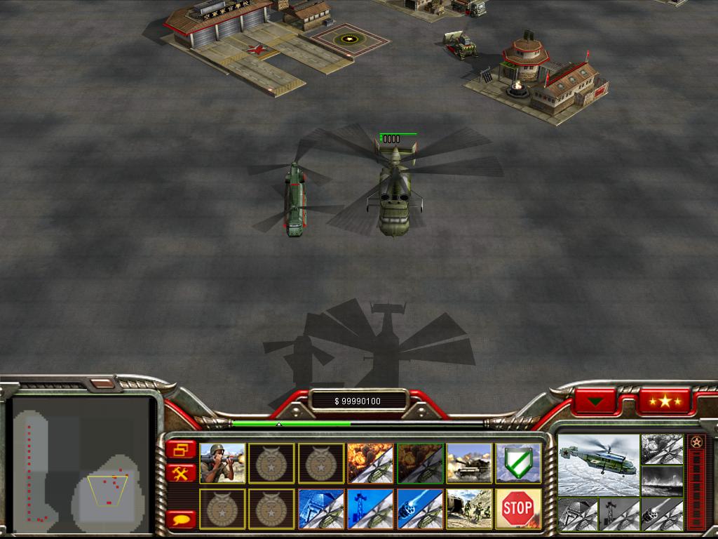
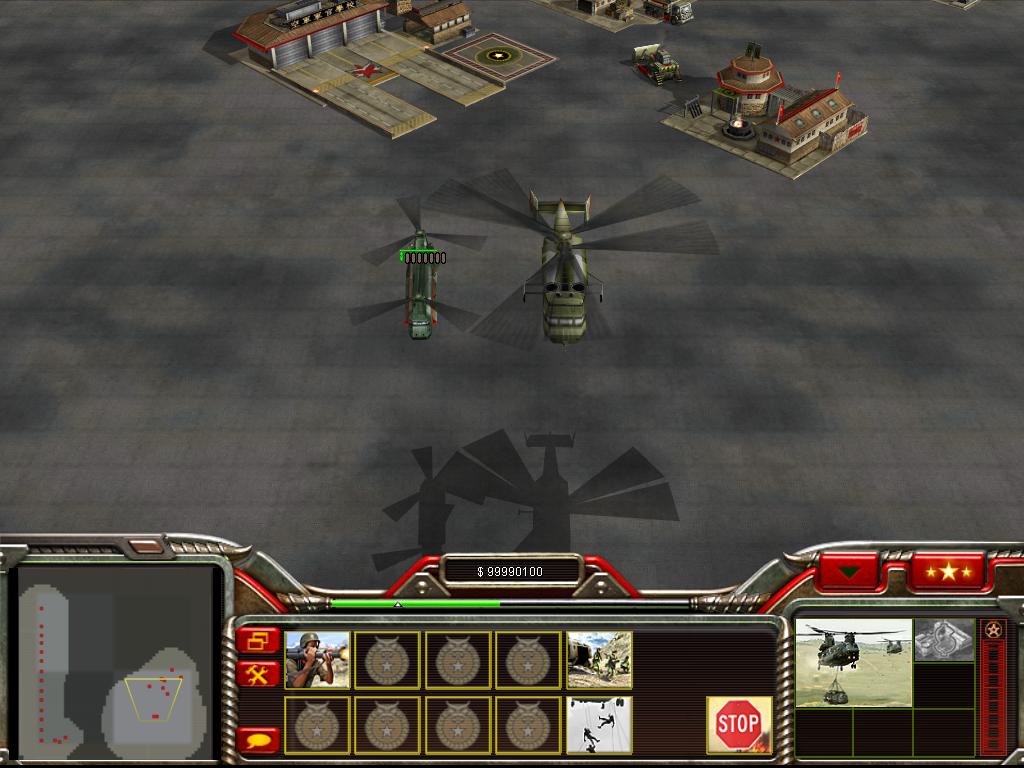
This change fixes evacuate buttons. Result:
All helicopters use the Evacuate button for vehiclesThe following faction unit buttons are affected:
Chinook, Combat ChinookWith this change it is now possible to evacuate China Outpost and Troopcrawler in group selection with other vehicles, such as Humvee and Battle Bus.
Original
Patched