Responsive Web Design
The control which designers know in the print medium, and often desire in the web medium, is simply a function of the limitation of the printed page. We should embrace the fact that the web doesn’t have the same constraints, and design for this flexibility. But first, we must 'accept the ebb and flow of things.'
John Allsopp, "A Dao of Web Design"
Responsive Web Design, at the beginning, was a response to a growing number of mobile devices that had burst onto the scene and had fundamentally disrupted the way we needed to think about web design. The opening quote of Ethan Marcotte's original article on Responsive Web Design, the above quote by John Allsopp, comes from an article written April 07, 2000. It took the web development community 10 years and two fundamentally disruptive pieces of technology, the iPhone and the iPad, for us to come up with a term to put to that quote. When originally coined, the term simply referred to sites that were "squishy"; their content could move around the screen to produce different layouts when needed. Since that time, the term has grown to be an all-encompassing term for modern web development best practices and what makes a good responsive site has morphed from a simply squishy site to something much more powerful.
Responsive Web Design isn't about Current Devices and Known Unknowns, it's about Future Devices and Unknown Unknowns
When building responsive sites now, it's so much more than just being able to be squishy. The first, and most important piece of not just Responsive Web Design, but web design in general, is having a solid understanding of one's content and user intent. This is usually helped immensely by thinking in mobile first terms: if a user doesn't need something when they have a small device and streamlined information architecture, do they really need it just because they have a larger screen? The sites we build need to be device agnostic and we need to build them with web standards, not proprietary plugins or properties only available in specific browsers. We need to build our sites to progressively enhance themselves to how the user chooses to use them and degrade nicely when their choice of access isn't as powerful as our advanced feature set would prefer. We need to be always conscious of how are design decisions will affect performance, and must design for performance.
Above all else, we need to be Future Friendly.
Of Course Responsive Web Design is Hard. It's Design.
Responsive Web Design is not easy. It cannot be done from an app. It cannot be tacked on at the end. It is not about having squishy websites or beautifully unperformant ones. Responsive Web Design is about making out sites prepared for whatever may come, and doing so in such a way that respects the web as a medium that is unique in history.
It’s not about mobile first (or just small screen first) – it's about content first. But it happens that thinking about what works for mobile does work for other things as well.
When creating any site, one obviously must think about their content first; after all styling and layout have been stripped out, what the user is actually on the site for is the content. Once content has been worked out, then comes the need to approach actually designing and building for our small screens first. To quote Luke Wroblewski:
Mobile devices require software development teams to focus on only the most important data and actions in an application. There simply isn’t room in a 320 by 480 pixel screen for extraneous, unnecessary elements. You have to prioritize.
So when a team designs Mobile First, the end result is an experience focused on the key tasks users want to accomplish without the extraneous detours and general interface debris that litter today’s desktop-accessed Web sites. That’s good user experience and good for business.
Designing and building mobile first is very similar to the principles of progressive enhancement in that one starts with a minimum experience and build on top of it based on features available.
It is important throughout the process to remain device agnostic. It is easy to get caught up in specific devices when building Mobile First. At all times, user agent sniffing should be avoided and feature detection should be employed to create the ideal user experiences. The later is extremely important as a common mistake is to assume functionality, such as touch, based on screen size. Always use feature detection, never make assumptions.
Speaking of assumptions, Josh Clark has a fantastic talk about Seven Deadly Mobile Myths whose lessons should be taken to heart when developing Mobile First. Before going any further, be sure to watch the entire video.

The point of creating [responsive] sites is to create functional (and hopefully optimal) user experiences for a growing number of web-enabled devices and contexts.
The term Device Agnostic refers to creating experiences that are not tied to specific devices or specific "classes" of devices (such as phone, tablet, desktop). This means one should not create separate iPhone or an iPad experience. Likewise, one should also not create separate tablet or desktop experiences. Doing so should do away with your need to do User Agent Sniffing. Instead, what one should do is employ a combination of progressive enhancement and feature detection, as well as a well thought-out content strategy.
Progressive Enhancement is a design and development philosophy that centers around providing a basic experience and building advanced functionality on top when advanced capabilities are present. In web design, it is most commonly employed for styling decisions and advanced or otherwise different device/browser features (such as CSS rounded corners or touch). When working progressively, you should start with a minimum experience and layer advanced features on top, being okay with less powerful and advanced devices/browsers not having access to the advanced feature set. This ensures there is a minimum usable experience for all users. The opposite of Progressive Enhancement is graceful degradation, which starts with an advanced feature set and if a browser isn't powerful enough, provides fallbacks. Some techniques work best one way, some work best the other, some are indistinguishable. Both Progressive Enhancement and/or Graceful Degradation should be employed where needed to ensure a minimum level of support (even if look/feel and functionality is not the same).
User Agent Sniffing is the act of using a browser's User Agent String to attempt to determine what browser and device a user is using, usually in an attempt to provide different experiences (many times displaying different content, strictly not displaying content, or redirecting to entirely different sites) or determine available features. All use cases for user agent sniffing are better accomplished by better means, usually a combination of feature detection and content strategy. The takeaway? Don't do it. Ever. Period.
You should always cross-check your intended browser support with what you're intending to accomplish using a tool like Can I use… with knowledge of intended fallbacks for graceful degradation. For instance, all target browsers IE9 and up, the current landscape of browser support suggests I can use border-radius without a prefix.
To quote the Modernizr Website
Modernizr is a JavaScript library that detects HTML5 and CSS3 features in the user’s browser.
Modernizr allows us to determine what features a browser actually supports and then allows us to act on that knowledge. This is in opposition to User Agent Sniffing, which is a guess of available features based on potential lie. In this way, we are able to able to accurately determine what features to support.
Modernizr provides two APIs for working with its feature detection.
Modernizr's CSS API is a fantastic way for working with feature detection from within your stylesheets. Modernizr will remove a provides no-us class add a js class to your HTML, as well as classes for each feature you are detecting. If the feature is not supported, the class name will be prefixed with no-. That means you're able to have your CSS adapt to the capabilitieses of the browser viewing the site. Take, for instance, a test to see if SVG images were supported. Your HTML element would look something like the following:
<html class="js svg">
in browsers that support SVG, and in browsers that don't support SVG, your HTML element would look something like this:
<html class="js no-svg">
This means that that in our CSS, one is able to provide different properties depending on whether or not SVG is supported.
/* If SVG is supported, set the background to be an SVG image */
.svg .foo {
  background: url('../images/bar.svg');
}

/* If JavaScript isn't available, or SVG isn't supported, fall back to a PNG */
.no-svg .foo,
.no-svg .foo {
  background: url('../images/bar.png');
}
When coupled with Sass and selector referencing, this becomes even easier to work with as one is able to encapsulate the changes very easily.
.foo {
  // SVG Support
  .svg & {
    background: image-url('bar.svg');
  }

  // No SVG Support
  .no-js &,
  .no-svg & {
    background: image-url('bar.png');
  }
}Modernizr also provides a JavaScript API for us to take advantage of. This allows us to write more intelligent JavaScript, which in turn can allow us to create more performant or better user experiences for our users. One is provided with a root level Modernizr object that has named properties for each feature test. These properties are booleans set to either true or false, allowing us to use them easily in conditional checks. Take, for instance, an example for storing information on a user's computer:
…
if (Modernizr.localstorage) {
  // Code for HTML5 Local Storage
}
else {
  // Code for JavaScript Cookie storage
}Modernizr provides a test based asset loader in custom builds, allowing for increased performance of sites by allowing for only the assets that are needed be loaded in. It can load in both CSS and JavaScript, making it very useful in loading functionality and styling all in one. You can use it in JavaScript, and with the JavaScript API, fairly easily:
Modernir.load({
  test: Modernizr.geolocation,
  yep: 'geo.js',
  nope: ['geo-polyfill.js', 'geo-polyfill.css']
});
Polyfills are a way of providing advanced HTML5 functionality in browsers that don't natively support them. Modernizr has compiled a great list of available polyfills. When choosing polyfills, it's generally best to choose ones that make the fewest number of assumptions and have the fewest dependencies (for instance, there are 5 <details> polyfills, but only one does not require jQuery, so you should look to that one first).
The viewport is the viewable area of a given browser. On windowed browsers, of which you typically find on desktop computers, the viewport's properties are usually taken directly from what is visually available (width of the window typically equals the width of the viewport, for instance). With embedded browsers, of which you typically find on mobile devices, televisions, and game consoles, the viewport's properties are typically manipulated by the operating system as to provide a perceived better user experience. A List Apart's Vexing Viewports has a good writeup on why this is so.
Many embedded browsers whose viewports are manipulated have a way for developers to change the manipulation. There are currently two ways to do this, the Viewport Meta tag and the Viewport Directive. For a preview of how various viewports behave across devices, open this page in various browsers.
Currently the de facto standard due to wide adoption thanks to its first-mover implementation on the iPhone, and now codified in in the W3C CSS Device Adaptation Working Draft. This will allow some control over the viewport. The best practice for the meta tag is to not define a fixed with or height for your viewport tag, and to allow for user scaling. The best practice tag for setting the width of the viewport to the width of the device it's being used on (for embedded browsers) looks as follows and should be placed in the <head> of your document:
<meta name="viewport" content="width=device-width, initial-scale=1">
The Viewport CSS Directive is part of the W3C CSS Device Adaptation Working Draft to standardize a way of doing device adaptation. While not yet a standard, and with limited implementation support, it can be easily missed. That being said, some embedded and non-embedded browsers, currently specifically Windows Phone and Windows 8 browsers, require this directive and will not adapt based on the Viewport Meta Tag. The above Viewport Meta Tag can be translated to the Viewport Directive as follows:
@viewport {
  width: device-width;
  zoom: 1;
}
Be sure to use appropriate vendor prefixing where needed.
Media Queries are a CSS level 3 and above extension to CSS level 4 media types, adding feature queries to more precisely query your document. Some feature queries are based on device capabilities, some based on viewport. Media queries can include a single media type (if not type query is included, all is assumed) and as many feature queries as one would like. Media queries evaluate in a boolean manner, meaning that all queries need to evaluate to be true in order for the media query to be true, otherwise the entire media query evaluates to false. One can comma separate media type/feature pairings with a comma to create or media queries, allowing for the ability to have one query evaluate to true while another evaluates false and still apply the given styling. A full list of available media features is available from the W3C. Take the following example:
// Media query looking for 'all' media types when the minimum viewport width is 576px
@media (min-width: 576px) {
  #foo {
    content: 'Bar';
  }
}

// Media query looking for the 'screen' media type, a maximum device aspect ratio of 4/3, and a landscape orientation
@media screen and (max-device-aspect-ratio: 4/3) and (orientation: landscape) {
  #bar {
    content: 'Baz';
  }
}

// Media query looking for the 'screen' media type, a minimum viewport width width of 300px, and a maximum viewport width of 500px - or - the 'print' media type with a monochrome screen
@media screen and (min-width: 300px) and (max-width: 500px), print and (monochrome) {
  #qux {
    content: 'Waldo';
  }
}
One of the most important things to understand about media queries is that, while they are a standard, there is no way to enforce that the standards are being used in a way one may expect. For instance, while there is a media query for monochrome, most popular black and white ebook devices on the market currently claim to have color screens for the purposes of media queries, which is unfortunate.
When working with media queries, it is best to have them in-place in your CSS as opposed to grouping like media queries together as it makes it easier to maintain your CSS. There is no demonstrated performance difference between in-place media queries and scattered media queries.
When using Sass, this is easy to accomplish through Media Query Bubbling.
When working with Responsive Web Design, the usage of a media querie to change aspects of our site is usually referred to as a Breakpoint. Breakpoints are circumstances in which our design is broken, and one needs to fix it. Generally our breakpoints cover a range of a feature instead of an exact spot (for instance, min/max width instead of a single width value). This makes our breakpoints more flexible. Because breakpoints are based on when designs break, not device sizes, it can be hard to pick breakpoints. I like taking Stephen Hay's advice:
Start with the small screen first, then expand until it looks like shit. TIME FOR A BREAKPOINT!
When a piece of your design looks broken, you should figure out what media features are causing it to break and write a breakpoint for it. It is likely that, in the course of designing, that you will wind up with many breakpoints, 20, 30, 40, or more, not 4 or 5 as is common in many CSS Frameworks like Twitter Bootstrap or Zurb Foundation. This is normal and is generally an indication of future-friendly, device agnostic design.
The Compass extension one is going to use to handle breakpoints is aptly called Breakpoint.
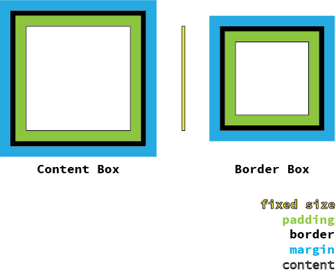
The box model describes how padding and border interact with elements with dimensions applied to them. In the image above, the yellow line with black outline represents a dimensioned height of an element. In the standard box model, known as content-box, this dimension describes the dimension of the content area, with border and padding applied to the outside of this. In the newly available border-box box model, this dimension describes the containing area, with border and padding applied inside of it. In both models, margins are applied to the outside of the containing area.
When working with fluid systems, especially with grids, one prefers the border-box model to the content-box model. Take, for example, the following CSS:
.foo {
  width: 50%;
  padding: 2em;
  border: 3px solid black;
}
In the above example, the final width of .foo would be 50% + 4em + 6px for content-box which is a fairly meaningless value and is very hard to work with if one is trying to line up another item with 50% width. With border-box, however, the width for this item would be 50%, making aligning items together much more sane.
Generally, it's a fairly good idea when building a new site to "reset" the box model to the border-box box model. As proposed by Paul Irish, one should apply this box model change to all elements using the * selector (which in this case is no less performant than a single tag selector). The below is the Sass syntax, assuming that you are using Compass functions and mixins:
*, *:before, *:after {
  @include box-sizing('border-box');
}
Grids are one of the most important aspects of building responsive websites. They provide order to your design and structure to your information. The best grids are specific to your content and your design, as they are an extension of both. Nathan Ford has a fantastic writeup on designing grids for your content. When working with Responsive Web Design, it is extremely important that one utilizes grids because, while flexing from small to large and everything in between, one needs an underlying system that one is able to reliably hang on to. Without a grid, it becomes very easy to loose consistency across pages at multiple sizes.
Grids are made up of two items: columns and gutters. Columns are generally large sections that are meant to contain content, whereas gutters are generally small sections that are meant as spacers. When working with fluid grids, column widths and gutter widths represent a proportional relationship, a way of defining related ratios. These ratios always should represent ratios to whatever container they are currently stored in, or 100%. They should not take into consideration whatever your "final [device] size" is, or any such nonsense, as your grids really should be based on your content and designs should be device agnostic.
There are two different kinds of grids that you can create: symmetric grids where each column is the same width, and asymmetric grids, where each column can have different widths. In both cases, with widths of the gutters are the same for all gutters, as their primary focus is spacing. There will be an equal number less of gutters and columns. When working with web based grids, half gutters on each side of the first and last column, as is traditional with print, are not considered gutters as part of the grid. Instead, they are considered padding, becoming part of the container in which the grid resides.
The framework for building custom grids that will be used for demonstration purposes, and is our standard, is the Compass extension Singularity. In Singularity, when defining symmetric grids, each column is given a width of 1 unit. Gutters are based on ratios to a column 1 unit in width. For asymmetric grids, column widths are done in proportion to each other. Widths for columns and gutters should not be defined with units, but rather in relative sizes. Full Singularity documentation is also available.
Symmetric grids are defined by having a certain number of equal width columns, with an equal number less one of equal sized gutters. Symmetric grids are useful when first learning about grids, as many traditional grid systems for the web are symmetric. Sometimes, symmetry in designs is called for or designs call for a number of equally sized items, and in those cases symmetric grids are also very useful.
The following example depicts a 12 column grid with 1/3 gutters. The code required to create it looks like the following:
$grids: 12;
$gutters: 1/3;
Asymmetric grids are defined by having any number of differently sized columns, with an equal number less one of equal sized gutters. Asymmetric grids are very powerful, but hard to comprehend when first used. They provide significantly more flexibility to create grids unique to one's content and design, but can be harder to picture in your head.
The following example depicts a 3 column grid with the first and third columns equal to 1/4 of the second column, with 1/6 gutters. The code required to create it looks like the following:
$grids: 1 4 1;
$gutters: 1/6;
There are generally two ways to ways to work with grids in CSS, either by creating classes for each potential incarnation of placement and size available for your grid or by writing the styles directly to the selector you'd like to attach your grid to. When working with responsive grids, it tends to be more maintainable to do the later as it's easier to see how the layout changes directly in your styling. Singularity works this way.
Flexible Media relates to allowing the multimedia we us on our sites, specifically our images and videos, flex with the rest of our site. For images and HTML5 Video, making them flex is as easy as the following CSS Snippet:
img,
video {
  max-width: 100%;
  height: auto;
}
This alone, however, is not enough to create performant sites or work with video embeds. For working performant flexible images, a responsive image technique needs to be implemented. For making video embeds (and more) work fluidly, one needs to employ intrinsic ratios.
While making images squish is easy to do through pure CSS, serving large images when only a small one is needed negatively effects front-end performance greatly. To combat this, a responsive image technique must be implemented. Unfortunately, there currently is no standard for responsive images, so use the solution that best fits the use case needed. A very popular solution is a polyfill for the proposed <picture> element called Picturefill. When Drupal, another option is the Responsive Image module that comes with the Borealis Site. The big difference between the two solutions is that, while Picture fill is based on media queries and can take images from any source, Borealis Responsive Images swaps an image based on the image's containing wrapper and can only take images from a single source. Because of this, Borealis neither works effectively in situations where an image's containing wrapper's size is determined by the size of the image it is containing, nor allows for multiple image sources and sizes to be used. That being said, in combination with ImageField Focus, it still provides the same type of editorial control over images used as Picturefill. It is also extremely user friendly to use.
Intrinsic Ratios are a CSS technique for fluidly constraining child elements to a ratio of their parent element. This allows, for instance, for an <iframe> to be fluidly constrained to a 4:3 or 16:9 ratio of its parent element, which if fluid, provides for us a fluidly scalable <iframe> entirely within our CSS. Thierry Koblentz laid out the technique well in his Creating Intrinsic Ratios for Video article. The Toolkit Compass Extension provides an easy to use mixin for working with Intrinsic Ratios:
// Toolkit's default ratio is 16-9
.fluid-16-9 {
  @include intrinsic-ratio;
}

// The default ratio can be changed as well. This is a 4-3 ratio
.fluid-4-3 {
  @include intrinsic-ratio(4/3);
}