app-grid (Material responsive grid) with Firefox, responsive style broken > 700px #528
Description
Description
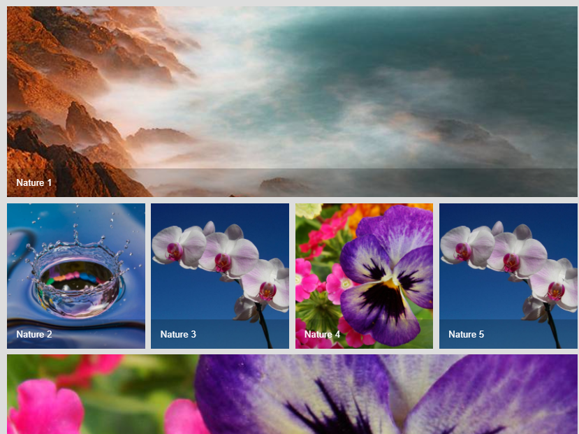
When viewing the Material responsive grid demo with Firefox 57.0 & 56.0 the responsive styling is broken. When the browser width expands so that 4 images should be shown in a row, the 4 images are not shown, only the title blocks appear, so the grid appearance is broken.
Expected outcome
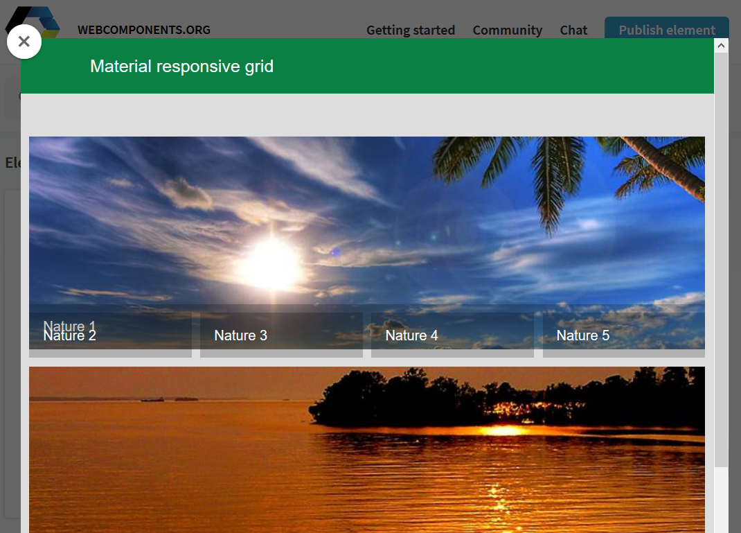
The expected outcome is that 4 mages and title blocks appear together with their correctly positions title blocks (as with Chrome and Opera)
Actual appearance
Demo
This behaviour can be seen at: https://www.webcomponents.org/element/PolymerElements/app-layout/demo/app-grid/demo/index.html
Steps to reproduce
- Use Firefox 56 or 57
- Set the browser width wide (e.g. > 800 px)
- Use the above demo url.
Browsers affected
Firefox 57 Windows
Firefox 56 Linux
Note: Although Microsoft Edge 40.15063.674.0 displays the grid it does not change the demo grid row from 2 images to 4 (like Chrome & Opera)
Browsers correct behaviour
Chrome Version 62.0.3202.94 (Official Build) (64-bit) Windows and Linux
Opera 49.0.2725.39 (PGO) & 48.0.2685.52
Browsers untested
Safari
IE